


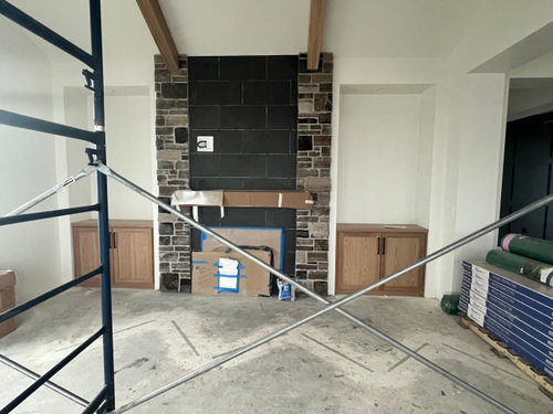
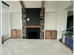
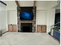
Stone fireplace debacle
Sara D
last month
last modified: last month

Featured Answer
Sort by:Oldest
Comments (21)
Related Professionals
Winton Kitchen & Bathroom Designers · Lake Arrowhead Furniture & Accessories · Easley General Contractors · Endicott General Contractors · Fargo General Contractors · Romeoville Fireplaces · Belle Glade Interior Designers & Decorators · Elmont General Contractors · Green Bay Lighting · Fruit Heights Home Builders · Bellingham General Contractors · Dunkirk General Contractors · Fort Pierce General Contractors · Greensburg General Contractors · Saginaw General Contractors
Sara D
last monthHU-910663146
last monthKendrah
last monthSara D
last monthSara D
last monthSara D
29 days agolast modified: 29 days ago


Related Stories
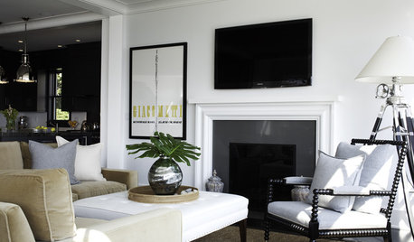
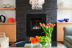
FIREPLACESSleek, Beautiful Stone Slab Fireplace Surrounds
Refresh the look of your home's fireplace with a stone slab surround
Full Story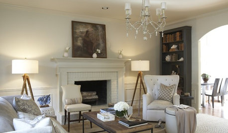
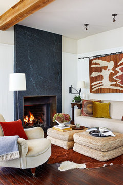
REMODELING GUIDESSurround Your Fireplace With Tile, Brick or Stone
Freshen up your fireplace with a crisp, colorful or dramatic new look
Full Story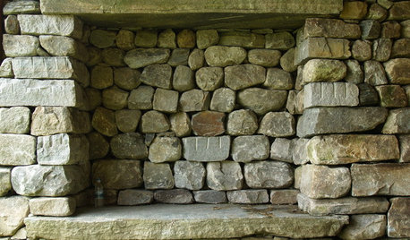
DESIGN DICTIONARYStacked Stone
Using stacked stone for walls, fireplaces and more requires a patient approach to placement
Full Story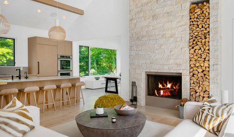
FIREPLACESBefore and After: 6 Dramatic Fireplace Makeovers
See how designers refresh the look of a fireplace with everything from a simple paint job to a new stone surround
Full Story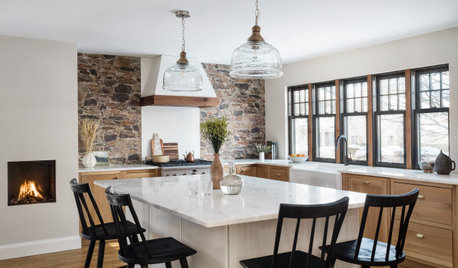
KITCHEN MAKEOVERSKitchen of the Week: Cozy Cottage Style With a Fireplace
A designer helps an empty-nest couple create a warm and inviting space with wood cabinets and a stone-look backsplash
Full Story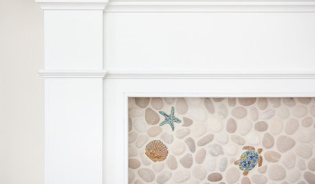
TILEDouble Take: Is That a Little Blue Crab Crawling up the Fireplace?
Handmade local accent tiles bring sea critter personality to this coastal Cape Cod living room
Full Story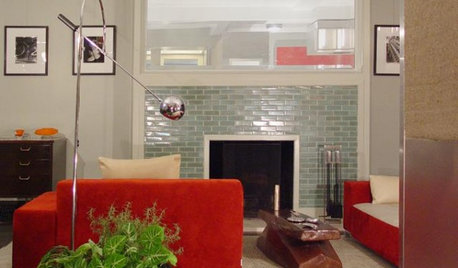
REMODELING GUIDESDesign Details: Tiled Fireplace Surrounds
Give the Hearth a Beautiful Finish With Colorful Glass, Ceramic or Classic Stone Tile
Full Story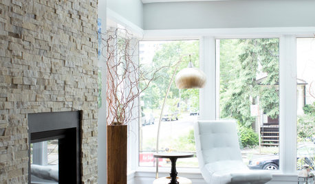
HOUSEKEEPINGHow to Clean Your Fireplace Surround
Stone, bricks, marble and wood are among the most popular surfaces for fireplace surrounds. Here’s how to clean them
Full Story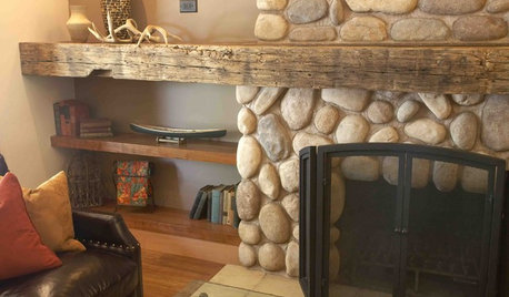
FIREPLACES9 Inventive Materials for Memorable Fireplace Mantels
Bypass plain brick in favor of these choice materials, for a fireplace mantel that's anything but ordinary
Full Story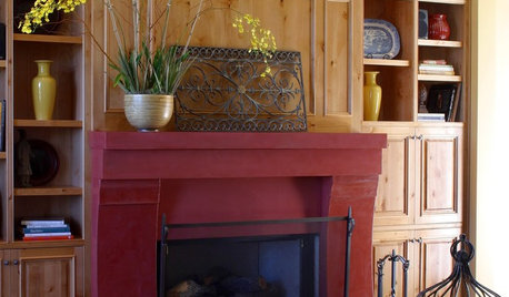
FIREPLACESPainted Fireplace Mantels Add Pizzazz
These 10 fireplace mantels show how a new coat of paint can create focal-point flair in your interior design
Full Story


Colin Etheridge