


What patio colors would look good when viewed from our interior?
Eve
5 years ago


Featured Answer
Sort by:Oldest
Comments (14)

Eve
5 years agoRelated Professionals
Bedford Landscape Contractors · Ashland Decks, Patios & Outdoor Enclosures · Hull Decks, Patios & Outdoor Enclosures · Thousand Oaks Swimming Pool Builders · Lynnwood Painters · Melrose Painters · Oakton Painters · Vista Park Painters · Clearfield Siding & Exteriors · Concord Painters · Overland Park Painters · Buckhall Painters · North Aurora Painters · Bell General Contractors · Jamestown General ContractorsEve
5 years ago PRO
PROYardvaark
5 years ago
gardengal48 (PNW Z8/9)
5 years agoEve
5 years agoEve
5 years agolast modified: 5 years ago- PRO
Yardvaark
5 years ago 
gypsyrose17
5 years ago
groveraxle
5 years agogroveraxle
5 years ago
tartanmeup
5 years agoEve
5 years agogroveraxle
5 years ago


Related Stories
GUESTHOUSESBold Colors and Big Views Star in Manhattan Guesthouse in the Sky
A nondescript penthouse is transformed into a contemporary guest space with big city views and a large private patio
Full Story
COLORFront and Center Color: When to Paint Your Door Purple
From grapelicious to lavender, a front door cloaked in the color of royalty might just reign supreme in the neighborhood
Full Story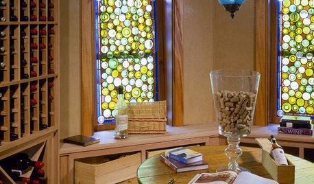
DECORATING GUIDESColor Your Home's View With Stained Glass
Interiors get an enchanting perspective with stained glass windows, doors and fixtures that dapple the light
Full Story
DECORATING GUIDESColor Feast: When to Use Purple in the Dining Room
Decadent and different, purples from lavender to plum can make a dining area a treat for the eyes
Full Story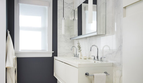
COLORBathed in Color: When to Use Black in the Bath
Dare to bring black in for a dramatic and elegant bath that's different from all the rest
Full Story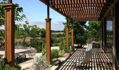
PATIOSPatio Details: A Shaded Patio Opens Up the View in Wine Country
A Douglas fir and metal pergola offers shelter from the hot sun on this scenic California property
Full Story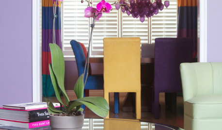
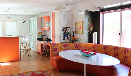
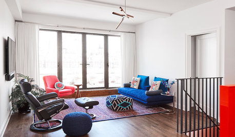
ECLECTIC HOMESHouzz Tour: Colorful and Eclectic, With a Coveted View
Nobody wanted to buy this stucco box in Los Angeles, despite the water view. But after 7 years of renovating, the owners are glad they did
Full Story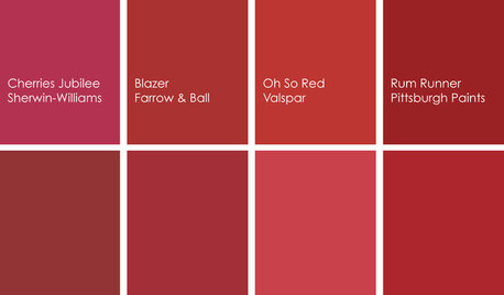
COLORBathed in Color: When to Use Red in the Bath
Rev up your space and flatter all skin tones with bold, beautiful red on bathroom walls, floors and fixtures
Full Story
COLORBathed in Color: When to Use Gray in the Bath
Go for elegance and sophistication without going overboard on coolness, using these gray bathroom paint picks and inspirational photos
Full StoryMore Discussions


Yardvaark