Chromatic Theology: Which Color is For You?
8 Ways to Design a Mood With Color

Color envelops life, consciously and subconsciously affecting our psyche. Selecting the correct color can create an interior atmosphere to suite your space, aesthetics, ambiance, and psychological needs. Never underestimate the power of color.
Allow me to introduce myself. I am an interior designer with a vested interest in Mother Earth. I edit the Shelter section at EcoSalon, a place for women of substance and style, where we present modern living with a heart (and a conscience, too). I also run a self-indulgent personal design blog, elle oh. Art supplies, alliteration, and flea markets make my pulse race, and I am completely obsessed with color. Delicious, saturated color.
As you devour the thousands of inspirational images on Houzz, this excerpt from Chromatic Theology (my series on color psychology) might help you narrow your search for the perfect image of the perfect color. First, here is a condensed glimpse of 8 simple hues with complex connotations. Where better to start than red?
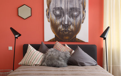
1. Red (cranberry, flamingo pink, cardinal, etc.) projects stimulation, force and intensity. Red is like a sexy negligee for your walls — dramatic and dangerous.
2. Orange (mandarin, marigold, sweet potato, etc.) is a secondary color with conflicting emotional content. Recall a few of your second grade lessons and remember that orange is a mixture of red and yellow, boasting the charisma of both colors. Orange demands attention, yet simultaneously extends a warm invitation.
3. Yellow (mustard, sunflower, buttercream, etc.) is a strong, warm color, with pleasant and optimistic emotional content. Yellow is the least problematic color, a cheerful and non-aggressive hue. This jovial color is highly-reflective, producing expansive characteristics reminiscent of sunlight.
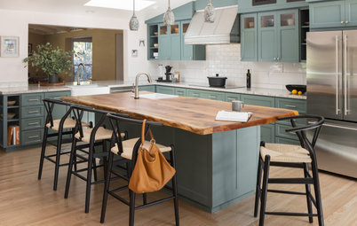
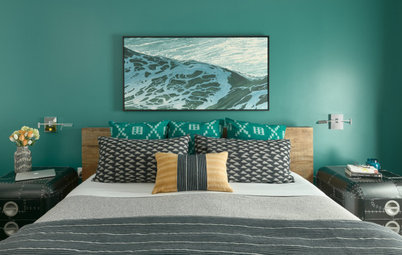
4. Green (avocado, kelly, grass, etc.) is a secondary color with harmonious emotional content. Green draws life from yellow, while blue lends a calming effect. One of the only unanimous forms of beauty is nature; green is the predominant color in nature — commonly regarded as the ideal color, carrying the positive charisma of all hues.
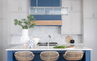
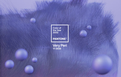
6. Violet (plum, magenta, eggplant, etc.) is a secondary color with a challenging personality. This specific combination of hues is ambivalent, as a heavy dose of tension exists within violet’s conflictions of warm and cool, calm and intense. Spaces and color schemes implementing violet are often ambiguous and dramatic.
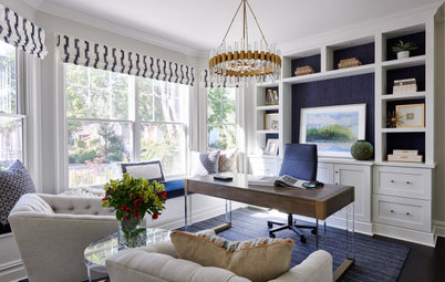
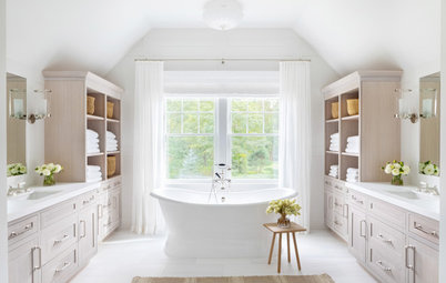
7. White (eggshell, snow, ivory, etc.) often reveals clarity, innocence, and pure simplicity. White is the perfect palette to make architectural elements sing. Nearly all colors tend to distract from and compete with architecture and furnishings, but white elevates and emphasizes style and aesthetic details. White embodies the power to transcend climate, radiating warmth and coziness in the winter and offering fresh, cool relief in the summer.
8. Black (charcoal, cast iron, pewter, etc.) is a powerful color that exhibits strength, dignity, and formality. Black can translate to the epitome of elegance and sophistication. Like white, excess black can cast the notion of emptiness or boredom, except with heavy and depressing implications.
Still craving more color? Scroll through the full series on EcoSalon to expand your knowledge of hues and their effect on your emotions. Now I’m off to sift through the treasures on Houzz!
More: How to use the color wheel to choose hues
Still craving more color? Scroll through the full series on EcoSalon to expand your knowledge of hues and their effect on your emotions. Now I’m off to sift through the treasures on Houzz!
More: How to use the color wheel to choose hues