
Olive Green: Sophisticated or Drab?
Thumbs Up or Thumbs Down: Are These Earthy Greens For You?

Olive shades are rich and earthy and blend in with all the colors of nature. Indoors, they add a serene touch of living color to our spaces. Olive green is technically considered to be a yellow and it gets its name from, you guessed it, the green olive. Olive drab, with more green and the addition of gray, is closely associated with military uniforms. Add brown to it and you have dark olive. Certainly an all-olive room would be dull. It is all in how it is used. Take a look, and tell me what you think:
This beautiful piece of art has all the shades of olive in it, and it provides a soothing backdrop for this living area. Olive drab is friends with khaki.
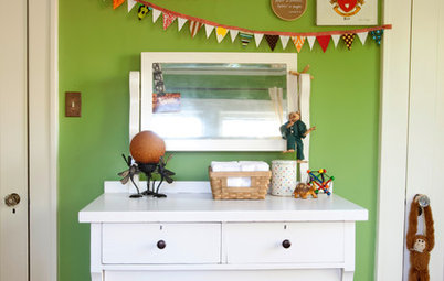
Two shades of olive green paired with crisp white trim create a cheerful home exterior.
Here is a cozy grouping of olive drab arm chairs. The addition of warm gold on the chair backs, throw pillows and ottoman, which looks like a yellow olive, provides some brightness and keeps the room from looking dull. The striated olive ceiling makes this seating arrangement feel even more intimate.
Here, olive drab trims the windows and corbels on the exterior of this wood shake house. Olive needs some lightness to balance out its dark tone. The wood shingles do that job well.
This galley kitchen leads out to a tranquil Japanese-style garden. The olive drab glass backsplash works well with the light maple cabinets.
Olive green can be used in all styles of interiors. Here it appears on contemporary curtains done in a stylish arabesque print. It is echoed in the curvy detail on the throw pillow.
Tip: To give an accent color more punch, repeat it elsewhere in the room.
Notice the chocolate brown peeking out. Olive and chocolate are a rich combination.
Tip: To give an accent color more punch, repeat it elsewhere in the room.
Notice the chocolate brown peeking out. Olive and chocolate are a rich combination.
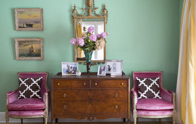
This bedroom is pure sophistication. Olive green, charcoal gray, black and taupe all playing nicely. Olive is the accent color as shown in the throw pillows, drapery print and unexpected horizontal band around the room. The icing on the cake is that fabulous zebra rug.
Similar colors are Sherwin Williams - Hearts of Palm 6415 for the band, and Burlap 6137 for the outline.
Similar colors are Sherwin Williams - Hearts of Palm 6415 for the band, and Burlap 6137 for the outline.
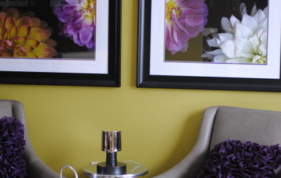
The yellow flowers really jump out at you and make a wonderful accent for this olive green pantry. This is because green and yellow are analogous colors, meaning they are next to each other on the color wheel.
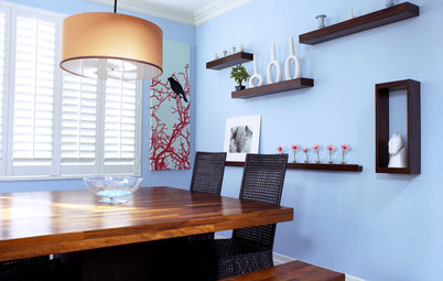
Here we see pale olive on the walls, olive drab window shades and armchair and a striped bench cushion in similar shades. The light walls and white trim allow the black tables and dark chair legs to stand out.
A similar color is Benjamin Moore - Rainforest Dew 2146-50
A similar color is Benjamin Moore - Rainforest Dew 2146-50
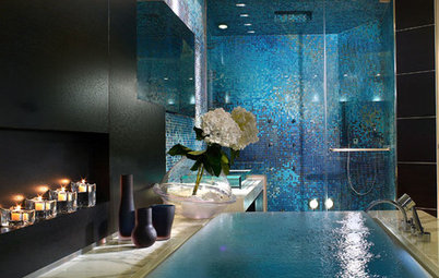
I think the designer must have had fun with this one. You can't miss the white box; it really pops in front of a dark olive wall and above a black floor. Although olive and black are a sophisticated duo, the colorful circles on the floor add playfulness and keep this powder room from looking too serious.
So what's the verdict? Drab or sophisticated?
Next: More color guides
So what's the verdict? Drab or sophisticated?
Next: More color guides