


Search results for "Long narrow room home office ideas" in Home Office Photos
Refine by:
Budget
Sort by:Relevance
161 - 180 of 4,218 photos
Item 1 of 2
Please visit my website directly by copying and pasting this link directly into your browser: http://www.berensinteriors.com/ to learn more about this project and how we may work together!
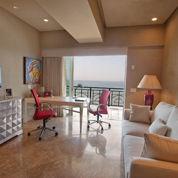
A splendid vacation home office with spectacular views of the ocean. This space also doubles as a guest room. Dale Hanson Photography
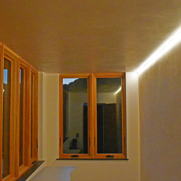
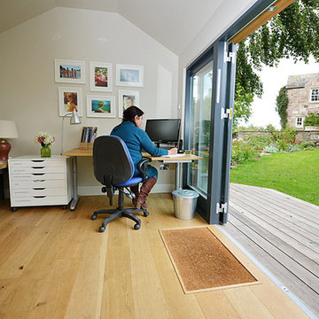
This long, narrow room was a challenge to light because we weren't sure how the room would be used. Flush fixtures, recessed lights, and sconces all felt wrong. I suggested running a corner channel with LED the entire length of the long wall. The result turned an ordinary room into something special.
Find the right local pro for your project
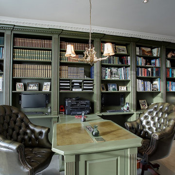
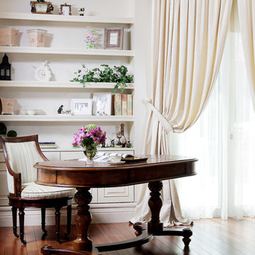
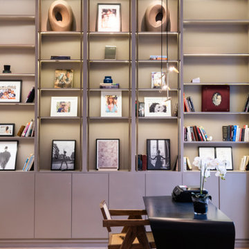
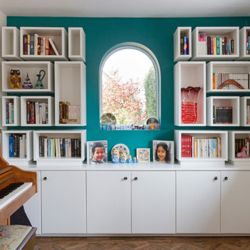
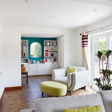
When it comes to creating a space in your home that is suitable for activities such as studying, paperwork and displaying that precious book collection - our studies and libraries make a luxurious addition to your property. This customer example illustrates how a traditional furniture style can still be configured in a practical way to accommodate his and her desk space, with his and her discreet computer consoles and a shared printer console. The detailing of the fluted pilasters with raised and fielded panelling, complement the floor to ceiling shelving in this long and narrow space. If you have an unusually shaped room which could be a likely candidate for a study or library, why not get in touch and we will be able to advise on how best to implement this into your space.
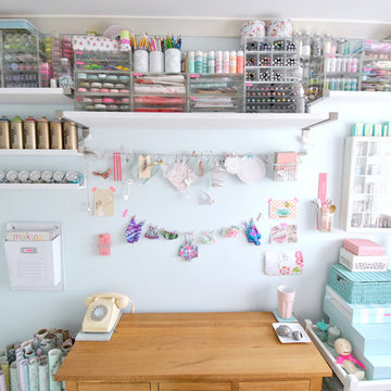
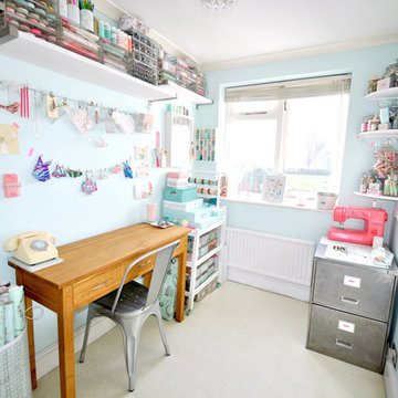
The owner of this house spends hours crafting so we designed and built this one of a kind craft room. The entire space was custom designed and built for all of her tools and paints. We were careful to plan the entire space with no handles and tamber door to achieve a clean and modern look. We finished off the space with a sink and a coffee station for those long crafting nights.
Settled within a graffiti-covered laneway in the trendy heart of Mt Lawley you will find this four-bedroom, two-bathroom home.
The owners; a young professional couple wanted to build a raw, dark industrial oasis that made use of every inch of the small lot. Amenities aplenty, they wanted their home to complement the urban inner-city lifestyle of the area.
One of the biggest challenges for Limitless on this project was the small lot size & limited access. Loading materials on-site via a narrow laneway required careful coordination and a well thought out strategy.
Paramount in bringing to life the client’s vision was the mixture of materials throughout the home. For the second story elevation, black Weathertex Cladding juxtaposed against the white Sto render creates a bold contrast.
Upon entry, the room opens up into the main living and entertaining areas of the home. The kitchen crowns the family & dining spaces. The mix of dark black Woodmatt and bespoke custom cabinetry draws your attention. Granite benchtops and splashbacks soften these bold tones. Storage is abundant.
Polished concrete flooring throughout the ground floor blends these zones together in line with the modern industrial aesthetic.
A wine cellar under the staircase is visible from the main entertaining areas. Reclaimed red brickwork can be seen through the frameless glass pivot door for all to appreciate — attention to the smallest of details in the custom mesh wine rack and stained circular oak door handle.
Nestled along the north side and taking full advantage of the northern sun, the living & dining open out onto a layered alfresco area and pool. Bordering the outdoor space is a commissioned mural by Australian illustrator Matthew Yong, injecting a refined playfulness. It’s the perfect ode to the street art culture the laneways of Mt Lawley are so famous for.
Engineered timber flooring flows up the staircase and throughout the rooms of the first floor, softening the private living areas. Four bedrooms encircle a shared sitting space creating a contained and private zone for only the family to unwind.
The Master bedroom looks out over the graffiti-covered laneways bringing the vibrancy of the outside in. Black stained Cedarwest Squareline cladding used to create a feature bedhead complements the black timber features throughout the rest of the home.
Natural light pours into every bedroom upstairs, designed to reflect a calamity as one appreciates the hustle of inner city living outside its walls.
Smart wiring links each living space back to a network hub, ensuring the home is future proof and technology ready. An intercom system with gate automation at both the street and the lane provide security and the ability to offer guests access from the comfort of their living area.
Every aspect of this sophisticated home was carefully considered and executed. Its final form; a modern, inner-city industrial sanctuary with its roots firmly grounded amongst the vibrant urban culture of its surrounds.
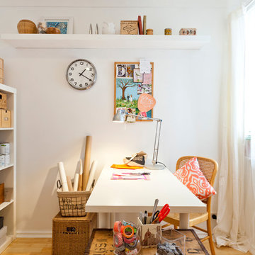
Photo Heather Robbins of Red Images Fine Photography
Craft room - mid-sized eclectic freestanding desk light wood floor craft room idea in Perth with white walls
Craft room - mid-sized eclectic freestanding desk light wood floor craft room idea in Perth with white walls
This small third bedroom in a 1950's North Vancouver home originally housed our growing interior design business. When we outgrew this 80 square foot space and moved to a studio across the street, I wondered what would become of this room with its lovely ocean view. As it turns out it evolved into a shared creative space for myself and my very artistic 7 year old daughter. In the spirit of Virginia Wolfe's "A Room of One's Own" this is a creative space where we are surrounded by some of our favourite things including vintage collectibles & furniture, artwork and craft projects, not to mention my all time favourite Cole and Son wallpaper. It is all about pretty and girly with just the right amount of colour. Interior Design by Lori Steeves of Simply Home Decorating Inc. Photos by Tracey Ayton Photography.
A study room that is filled with abundant of recessed shelvings, built-in storage cabinet, and Doric plastered columns.
Photographer : Kemal Akbar
Inspiration for a timeless freestanding desk medium tone wood floor home office remodel in Other with white walls
Inspiration for a timeless freestanding desk medium tone wood floor home office remodel in Other with white walls
Example of a trendy freestanding desk medium tone wood floor home office design in London with white walls
It was realised from the outset that since the houses on this side of Glebe Place are, at only five metres wide, rather long and narrow, the new staircase should be relocated to the middle, thus allowing for full-width rooms to front and rear.
It was also realised that the principal living floors (ground, lower ground and basement) should be opened-up, seamlessly flow-together, properly connect with the rear garden, and enjoy as much daylight and a feeling of space as possible.
Photographer: Rachael Smith
This project is the result of research and work lasting several months. This magnificent Haussmannian apartment will inspire you if you are looking for refined and original inspiration.
Here the lights are decorative objects in their own right. Sometimes they take the form of a cloud in the children's room, delicate bubbles in the parents' or floating halos in the living rooms.
The majestic kitchen completely hugs the long wall. It is a unique creation by eggersmann by Paul & Benjamin. A very important piece for the family, it has been designed both to allow them to meet and to welcome official invitations.
The master bathroom is a work of art. There is a minimalist Italian stone shower. Wood gives the room a chic side without being too conspicuous. It is the same wood used for the construction of boats: solid, noble and above all waterproof.
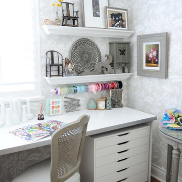
Craft room table with pretty organised storage on the shelves by Torie Jayne
Example of a cottage chic craft room design in Devon
Example of a cottage chic craft room design in Devon
My craft room pretty organised. Photo by Torie Jayne
Craft room - shabby-chic style craft room idea in Devon
Craft room - shabby-chic style craft room idea in Devon
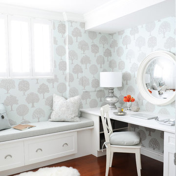
Our client never dreamed that this once cramped, dark room in her basement would become a bright and spacious home office where she enjoys spending her time. The white custom built-ins keep clutter out of sight. The cozy window seat houses 2 large file drawers while providing a comfortable place for her daughters to join her while she works. Crystal knobs and mercury glass accessories lend a distinctly feminine touch to this inviting space. Interior Design by Lori Steeves of Simply Home Decorating Inc. Photos by Tracey Ayton Photography.
In brief
Location, location, location
When looking for your perfect home where you can put down your grass roots and start a family there are many ‘must haves’ that we all have on our wish lists. The obvious contenders are price and location with many other niceties, like the number of bedrooms, layout and decor taking a back seat. As we all know, location can sell a home to those who strive to be in the right area, for transport links, local amenities and the all-important school catchment areas.
Like many other families throughout the UK our clients chose their house for its excellent location. Just ten minutes from the centre of Stafford by car, our client’s house is in a popular and sought-after suburb of the town for couples and families alike. They have always loved the location of their house for its easy access to work, schools, leisure facilities and social connections, but they were becoming increasingly frustrated with the layout of the ground floor of their home.
It’s inevitable that families will evolve and our needs from our properties will change too. Since the young family of four moved to their large four-bedroom detached house a few years ago, their property has been unable to meet their lifestyle needs and living patterns.
Although their property has adequate bedroom space for them and their two children, the layout of the downstairs living area was not functional and it obstructed their everyday life, making entertaining and family gatherings difficult.
Our First Meeting
Upon our initial consultation with our clients it was clear from the outset why they sought to make changes to the layout of their house. The property had been extended to create extra space by the previous owners, but unfortunately the design and build hadn’t been executed well at all. The rooms and layout were awkward in size and shape and it didn’t allow the family to come together and enjoy their home. They had the floor space, but it was sectioned off into separate rooms, some without a purpose.
The garden surrounds the house on all three sides and is of a good size in its entirety with different areas on each aspect. We could clearly see that the house itself didn’t address any particular aspect of the garden in any way.
Moving to a new house wasn’t an option, the family were happy with the location and size of the property. What they wanted was a modern, functional, stylish space for everyday family life, with the flexibility to accommodate their large extended family when needed and to ultimately add value to their property.
We were appointed by our clients to create a design solution to redesign the ground floor living area with a modern, light filled, open plan space that connects with the garden. It was clear from outset that our design intention was to break down the room barriers and to respond to the needs of the family, supporting their lifestyle now and for the future, bringing them together and creating a house they could call a home.
Delivering a project on time and within our client’s budget are always a top priority for our team. The family decided to stay in their house during construction, therefore it was even more essential to minimise the level of disruption to their daily lifestyle with a young family living on site.
The family needed help from our team at Croft Architecture to swiftly and successfully acquire Building Control Approval for their project to progress rapidly, ensuring project completion on time and to their determined budget.
Our Approach
Surveying the site
The client’s home is located on the entrance to a quiet cul-de-sac on a mature, leafy, suburban housing estate. Their home nestles into its well-established site, with ample space between the neighbouring properties and has considerable garden space to the rear and both sides.
During our initial visit we spent a long time with the family observing the existing layout, talking about how they currently live in the property, their annoyances with the house in its current form, how they would like to be able to live in their family home and how they aspired it to feel, look and live.
We walked through the house and it was clear that the existing layout didn’t work downstairs. The house had been extended onto before they had bought the property and the space hadn’t been well thought through in terms of how it would be used effectively.
The rooms directly to the left off the hallway, didn’t really have a proper function. The previously extended space had resulted in the house with too many rooms and subsequently this had led to a series of impractical spaces.
The long and narrow extension was home to a small U-shaped kitchen at the front of the house, which led onto the dining area and then onto a small room at the back of the extension. For the size of the house the kitchen and dining room in a much smaller and narrower area, leaving larger living areas to the rear of property with copious amounts of dead space. The small kitchen was tucked away at the front of the property which made life difficult for our clients to observe their children playing safely in the garden whilst preparing food and carrying out work in the kitchen. On the opposite side of the property there was another old extension which had a step down into it. This living area had a tiled floor and large glazed windows on all sides which made it feel almost like a conservatory.This area was rarely used by the family as it had no real function, plus it was hot in the summer and cold in the winter. It had become an under utilised space.
We walked around the property and it was clear that the house itself didn’t address their private garden space to any particular aspect in any way, meaning that the garden space was under used because of the poor connections.
The family wanted a combined kitchen, dining, lounge space for daily life and also for entertaining their family.
Design Approach
The size of the property presented the opportunity to substantially reconfigure the family home to create a series of dynamic living spaces oriented towards the large, south-facing garden.
Our team suggested removing the little kitchen from the front of the property and re positioning it within the unused glazed space at the back of the house.
The glazed room had internal French doors with a step down into the space separating it from the lounge. We proposed to remove the French doors, level the floor and make it into one room with the existing lounge.
To connect the new open plan kitchen and living space to the rear and side garden sliding and folding doors were the solution, extending the family’s usable living space by creating a seamless indoor-outdoor flow. There was already a patio area there and it made sense for the kitchen to move to the rear of the house to be close to the patio for easy outside dining.
It was therefore logical to retain the existing living space in it's current location next to the new kitchen, maintaining the natural flow of the house for the family after eating and entertaining in the kitchen.
When making decisions regarding the kitchen design, we worked closely with the family. They thoroughly enjoy spending time cooking and entertaining with their large extended family. To assist with their culinary preparations our clients had aspired to have an induction hob within their new kitchen. As they were working through the design with us, they weren’t sure about an induction hob because of different cooking methods required for certain meals that they like to produce. They particularly like making chapatis which require a round pan and a gas hob. We didn’t see this as a problem and suggested having a single gas burner for purely this purpose whilst still installing an induction hob. They decided to go ahead with our idea, choosing a single gas burner and an induction hob, and it looks great!
The existing lounge space had a corner aspect at the rear property that protruded into the garden. Positioned next to the kitchen and dining space it seemed logical to us for the living area to also open out onto the patio, thus connecting the garden to the house on a wider aspect. To enhance the connection between the garden and the living room we thought that a corner door would work extremely well to really open up this space. The clients really liked the design concept to create a feature of the corner with glazed sliding doors that would completely open the house up to the garden. They were excited about the prospect of the allowing huge amounts of natural light into their home and the flexible access it would provide to the garden.
Once the new kitchen, dining and living space had been concluded, we then had to consider what the previous kitchen and dining area was going to be used for within the small, long side extension. We talked with our clients about a few possible uses. We noticed that the family have a piano and few other musical instruments. It made sense for this space to become a quiet part of the house for them to escape to, play music, read and generally relax in a snug area.
To shorten the length of the new music room and make an additional feature in the newly created open plan kitchen, dining and living area, we reclaimed some of the space from the back of the side extension and opened it up to the main open-plan space, thus creating another new snug. We added an additional design feature within the snug by creating a timber window seat. Not only does it provide extra seating, but it’s also created a snug within a snug, a haven for reading, napping and gazing out into the garden.
As part of their brief our clients also wanted a to incorporate a log burner into their newly remodelled home. To connect the new music room and snug to the living space we proposed to position a two-way log burner where the existing gas fire was located. By retaining a fire in the original location it would minimise the disruption and work required to install the wood burner. However, the theory didn’t turn into reality and the new fire resulted in being quite a task to get it to work. When the contractor began to strip back the existing fireplace, they discovered that fitting the pipe within the building was going to be more challenging than they anticipated because of the poorly constructed extension. It was difficult to execute but it was ultimately achieved.
What lies beneath?
It’s not until you uncover the fabric of the building that you fully understand what’s going on underneath. When the contractor exposed the structure of the house, we found out that the property had been poorly constructed, and they uncovered a lot of poor workmanship from the original builders. As the build progressed the inner skin of the extended structure was exposed, we found that it wasn’t actually strong enough and we needed to make it safe in order to proceed. Going forwards we ensured that the structure was safe, and all issues were identified and immediately rectified.
The previous extensions to the house also presented further challenges as the build progressed. We found that the floors between rooms were not level. We wanted to create the appearance of one space rather than lots of chopped up areas. To do so we needed to alter the floor and ceilings to ensure that they were flush right through the new open plan living space. Also, after removing the internal French doors, the down-stand beam where the doors had previously been were subsequently left prominent down from the ceiling. The design required careful planning and attention to detail to achieve the best looking finished results for the client.
For us, in principle our clients’ scheme at the outset was quite a simple project but when the strip out commenced there was actually a more going on underneath that needed attention before the project could start to take shape. A lot of things needed to be considered to make it work structurally and properly for the family.
When the carpet was initially lifted, we found a parquet floor underneath. The family and our team were extremely excited at the prospect of having a traditional parquet floor that could be sanded down and made good. However, when ‘all’ of the carpet was removed only half of the living room had been covered in parquet flooring and the other half was actually a solid concrete floor. Unfortunately, we couldn’t proceed with the flooring and our clients chose another floor finish.
Making connections
Our team at Croft Architecture have created a new, sleek, spacious family ‘hub’ that’s light with clean lines. The open plan space unites the family of four whilst providing the ability to gather the wider family and seamlessly connecting their home with the garden through the new full length sliding doors. Although they now have plenty of space to gather with the family, they also have areas of seclusion to spread out and escape to when needed.
A strong working relationship between our team, the client and Building Control enabled us to gain the necessary permissions promptly. We enjoyed working with the project team and we’re extremely pleased to successfully deliver the completed project. Although it wasn't in accordance with our client’s timescales with the discovery of hidden structural challenges, we spent the time carefully resolving the issues to unsure that our clients home was not only safe, but also looks great and functions perfectly.
Showing Results for "Long Narrow Room Home Office Ideas"
In brief
Location, location, location
When looking for your perfect home where you can put down your grass roots and start a family there are many ‘must haves’ that we all have on our wish lists. The obvious contenders are price and location with many other niceties, like the number of bedrooms, layout and decor taking a back seat. As we all know, location can sell a home to those who strive to be in the right area, for transport links, local amenities and the all-important school catchment areas.
Like many other families throughout the UK our clients chose their house for its excellent location. Just ten minutes from the centre of Stafford by car, our client’s house is in a popular and sought-after suburb of the town for couples and families alike. They have always loved the location of their house for its easy access to work, schools, leisure facilities and social connections, but they were becoming increasingly frustrated with the layout of the ground floor of their home.
It’s inevitable that families will evolve and our needs from our properties will change too. Since the young family of four moved to their large four-bedroom detached house a few years ago, their property has been unable to meet their lifestyle needs and living patterns.
Although their property has adequate bedroom space for them and their two children, the layout of the downstairs living area was not functional and it obstructed their everyday life, making entertaining and family gatherings difficult.
Our First Meeting
Upon our initial consultation with our clients it was clear from the outset why they sought to make changes to the layout of their house. The property had been extended to create extra space by the previous owners, but unfortunately the design and build hadn’t been executed well at all. The rooms and layout were awkward in size and shape and it didn’t allow the family to come together and enjoy their home. They had the floor space, but it was sectioned off into separate rooms, some without a purpose.
The garden surrounds the house on all three sides and is of a good size in its entirety with different areas on each aspect. We could clearly see that the house itself didn’t address any particular aspect of the garden in any way.
Moving to a new house wasn’t an option, the family were happy with the location and size of the property. What they wanted was a modern, functional, stylish space for everyday family life, with the flexibility to accommodate their large extended family when needed and to ultimately add value to their property.
We were appointed by our clients to create a design solution to redesign the ground floor living area with a modern, light filled, open plan space that connects with the garden. It was clear from outset that our design intention was to break down the room barriers and to respond to the needs of the family, supporting their lifestyle now and for the future, bringing them together and creating a house they could call a home.
Delivering a project on time and within our client’s budget are always a top priority for our team. The family decided to stay in their house during construction, therefore it was even more essential to minimise the level of disruption to their daily lifestyle with a young family living on site.
The family needed help from our team at Croft Architecture to swiftly and successfully acquire Building Control Approval for their project to progress rapidly, ensuring project completion on time and to their determined budget.
Our Approach
Surveying the site
The client’s home is located on the entrance to a quiet cul-de-sac on a mature, leafy, suburban housing estate. Their home nestles into its well-established site, with ample space between the neighbouring properties and has considerable garden space to the rear and both sides.
During our initial visit we spent a long time with the family observing the existing layout, talking about how they currently live in the property, their annoyances with the house in its current form, how they would like to be able to live in their family home and how they aspired it to feel, look and live.
We walked through the house and it was clear that the existing layout didn’t work downstairs. The house had been extended onto before they had bought the property and the space hadn’t been well thought through in terms of how it would be used effectively.
The rooms directly to the left off the hallway, didn’t really have a proper function. The previously extended space had resulted in the house with too many rooms and subsequently this had led to a series of impractical spaces.
The long and narrow extension was home to a small U-shaped kitchen at the front of the house, which led onto the dining area and then onto a small room at the back of the extension. For the size of the house the kitchen and dining room in a much smaller and narrower area, leaving larger living areas to the rear of property with copious amounts of dead space. The small kitchen was tucked away at the front of the property which made life difficult for our clients to observe their children playing safely in the garden whilst preparing food and carrying out work in the kitchen. On the opposite side of the property there was another old extension which had a step down into it. This living area had a tiled floor and large glazed windows on all sides which made it feel almost like a conservatory.This area was rarely used by the family as it had no real function, plus it was hot in the summer and cold in the winter. It had become an under utilised space.
We walked around the property and it was clear that the house itself didn’t address their private garden space to any particular aspect in any way, meaning that the garden space was under used because of the poor connections.
The family wanted a combined kitchen, dining, lounge space for daily life and also for entertaining their family.
Design Approach
The size of the property presented the opportunity to substantially reconfigure the family home to create a series of dynamic living spaces oriented towards the large, south-facing garden.
Our team suggested removing the little kitchen from the front of the property and re positioning it within the unused glazed space at the back of the house.
The glazed room had internal French doors with a step down into the space separating it from the lounge. We proposed to remove the French doors, level the floor and make it into one room with the existing lounge.
To connect the new open plan kitchen and living space to the rear and side garden sliding and folding doors were the solution, extending the family’s usable living space by creating a seamless indoor-outdoor flow. There was already a patio area there and it made sense for the kitchen to move to the rear of the house to be close to the patio for easy outside dining.
It was therefore logical to retain the existing living space in it's current location next to the new kitchen, maintaining the natural flow of the house for the family after eating and entertaining in the kitchen.
When making decisions regarding the kitchen design, we worked closely with the family. They thoroughly enjoy spending time cooking and entertaining with their large extended family. To assist with their culinary preparations our clients had aspired to have an induction hob within their new kitchen. As they were working through the design with us, they weren’t sure about an induction hob because of different cooking methods required for certain meals that they like to produce. They particularly like making chapatis which require a round pan and a gas hob. We didn’t see this as a problem and suggested having a single gas burner for purely this purpose whilst still installing an induction hob. They decided to go ahead with our idea, choosing a single gas burner and an induction hob, and it looks great!
The existing lounge space had a corner aspect at the rear property that protruded into the garden. Positioned next to the kitchen and dining space it seemed logical to us for the living area to also open out onto the patio, thus connecting the garden to the house on a wider aspect. To enhance the connection between the garden and the living room we thought that a corner door would work extremely well to really open up this space. The clients really liked the design concept to create a feature of the corner with glazed sliding doors that would completely open the house up to the garden. They were excited about the prospect of the allowing huge amounts of natural light into their home and the flexible access it would provide to the garden.
Once the new kitchen, dining and living space had been concluded, we then had to consider what the previous kitchen and dining area was going to be used for within the small, long side extension. We talked with our clients about a few possible uses. We noticed that the family have a piano and few other musical instruments. It made sense for this space to become a quiet part of the house for them to escape to, play music, read and generally relax in a snug area.
To shorten the length of the new music room and make an additional feature in the newly created open plan kitchen, dining and living area, we reclaimed some of the space from the back of the side extension and opened it up to the main open-plan space, thus creating another new snug. We added an additional design feature within the snug by creating a timber window seat. Not only does it provide extra seating, but it’s also created a snug within a snug, a haven for reading, napping and gazing out into the garden.
As part of their brief our clients also wanted a to incorporate a log burner into their newly remodelled home. To connect the new music room and snug to the living space we proposed to position a two-way log burner where the existing gas fire was located. By retaining a fire in the original location it would minimise the disruption and work required to install the wood burner. However, the theory didn’t turn into reality and the new fire resulted in being quite a task to get it to work. When the contractor began to strip back the existing fireplace, they discovered that fitting the pipe within the building was going to be more challenging than they anticipated because of the poorly constructed extension. It was difficult to execute but it was ultimately achieved.
What lies beneath?
It’s not until you uncover the fabric of the building that you fully understand what’s going on underneath. When the contractor exposed the structure of the house, we found out that the property had been poorly constructed, and they uncovered a lot of poor workmanship from the original builders. As the build progressed the inner skin of the extended structure was exposed, we found that it wasn’t actually strong enough and we needed to make it safe in order to proceed. Going forwards we ensured that the structure was safe, and all issues were identified and immediately rectified.
The previous extensions to the house also presented further challenges as the build progressed. We found that the floors between rooms were not level. We wanted to create the appearance of one space rather than lots of chopped up areas. To do so we needed to alter the floor and ceilings to ensure that they were flush right through the new open plan living space. Also, after removing the internal French doors, the down-stand beam where the doors had previously been were subsequently left prominent down from the ceiling. The design required careful planning and attention to detail to achieve the best looking finished results for the client.
For us, in principle our clients’ scheme at the outset was quite a simple project but when the strip out commenced there was actually a more going on underneath that needed attention before the project could start to take shape. A lot of things needed to be considered to make it work structurally and properly for the family.
When the carpet was initially lifted, we found a parquet floor underneath. The family and our team were extremely excited at the prospect of having a traditional parquet floor that could be sanded down and made good. However, when ‘all’ of the carpet was removed only half of the living room had been covered in parquet flooring and the other half was actually a solid concrete floor. Unfortunately, we couldn’t proceed with the flooring and our clients chose another floor finish.
Making connections
Our team at Croft Architecture have created a new, sleek, spacious family ‘hub’ that’s light with clean lines. The open plan space unites the family of four whilst providing the ability to gather the wider family and seamlessly connecting their home with the garden through the new full length sliding doors. Although they now have plenty of space to gather with the family, they also have areas of seclusion to spread out and escape to when needed.
A strong working relationship between our team, the client and Building Control enabled us to gain the necessary permissions promptly. We enjoyed working with the project team and we’re extremely pleased to successfully deliver the completed project. Although it wasn't in accordance with our client’s timescales with the discovery of hidden structural challenges, we spent the time carefully resolving the issues to unsure that our clients home was not only safe, but also looks great and functions perfectly.
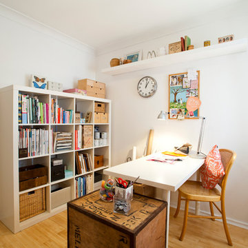
With the advice of my interior designer friend Nelly Reffet of Twinkle and Whistle, I turned this space into a much nicer and more organised room to work. One of the first things Nelly advised me to do was paint the Antique White walls Vivid White and change the cedar blinds for linen curtains. I could not believe the difference this made in making the room seem brighter and lighter. As I was on a very tight budget for this room, Nelly suggested utilising a piece of furniture I already had in the house - the IKEA Expedit - for storage. Having one large piece of furniture for storage rather than several smaller ones has freed up the space enormously. It also provides loads of storage with its deep shelves. The containers in it are all thrifted, found on the side of the road or from secondhand markets. I used a mix of cane baskets, wooden boxes and an unused draw to hide more unsightly odds and ends and make it overall look much more neat and tidy.
Photo Heather Robbins of Red Images Fine Photography
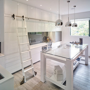
© Leslie Goodwin Photography |
Interior Design by Sage Design Studio Inc. http://www.sagedesignstudio.ca |
Geraldine Van Bellinghen,
416-414-2561,
geraldine@sagedesignstudio.ca
9