


Search results for "Moving forward" in Home Design Ideas
When it comes to finding inspiration for your house or apartment design, there are a variety of routes you can take. For some, it is important to dive into the latest trends in fashion and art, using only the most popular decor pieces and embracing the color palettes seen on runways or in home and garden magazines. But for others, it’s simply about discovering what feels most like “home.”
Ashley Steele, the creator of A Styled Affair, was part of the latter group. “Since my husband and I were moving into a space that was previously owned, I needed a way to make it feel like it was truly ours, and unique to us,” she told our team.
A Styled Affair sprang from Ashley’s passion for fashion, and need for a creative outlet. But it soon became more than that. She developed a following, and it quickly became a place where she could share her personal style, travel adventures, and lifestyle tips. “While the blogging industry has become overwhelmed with people sharing their favorite home decor or make-up tips, I think what sets A Styled Affair apart is my commitment to stay true to my unique taste. I have always marched to the beat of my own drum – and that carries through in the clothes I wear, the decor I select for our home, and the travels I plan.”
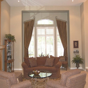
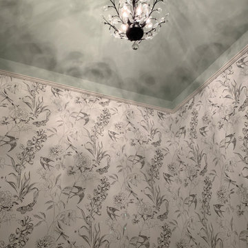
Paintzen connected with Ashley as she was settling into her new home in Boston’s Seaport District. Although she and her husband have lived in Boston for almost 8 years, they were used to smaller, more traditional spaces. Their new home is much bigger, and more modern, than any place they lived before. “I wanted to select colors of comfort, simplicity, and sophistication so we could elevate the space and make it feel more like a home.” Ashley also accurately pointed out that new construction can sometimes feel a little cold and sterile, almost industrial. “I wanted our home to feel like a peaceful oasis after coming in from the bustling city.”
Ashley chose soft white paint for her walls to bring a sense of comfort and zen. With lots of wall decor, art work and carefully selected furniture, the walls serve as a clean and comfortable palette, and allowed her more freedom when making her other design decisions throughout the space. Ashley kept the overall palette fairly neutral, and incorporated “modern bohemian” inspired decor throughout the home; the final product was clean and simple, and catered to her style.
We asked Ashley what she was most excited for now. “I’m most excited to continue to find new decor pieces to compliment the paint colors and decor we’ve already found for the space. We have been really patient with decorating and selected each piece really careful to make sure it is cohesive and flows from room to room. I’m looking forward to enjoying the space with my husband and dog, and entertaining friends and family in the spring and summer!”
A few final questions for Ashley on her experience with Paintzen:
“I would highly recommend Paintzen to anyone, especially those that live in the city. There are so many different paint companies and contractors to choose from but going through Paintzen simplified the process and made me feel comfortable that we had the right team working on our space. Their platform for booking services and choosing paint colors made the process seamless and was a great way to keep track of what we booked and chose for colors. Most importantly, the customer service team was outstanding whenever we had a question or needed to make an adjustment.”
And advice she would give someone repainting their home:
“Patience. I would recommend taking your time and doing your research before selecting paint colors. Lighting changes every color so make sure to bring paint swatches and samples into the space and look at it throughout the day to see the different tones that the light will pick up. I would also recommend researching color trends and recommendations for colors in the family you are looking for. We found our living room color through a blog post listing top-used colors by interior designers and it looks amazing.”
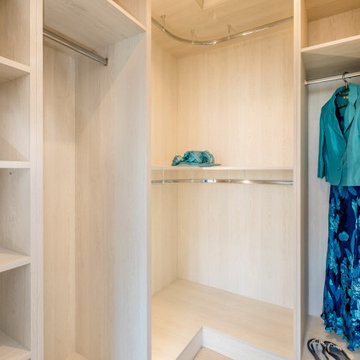
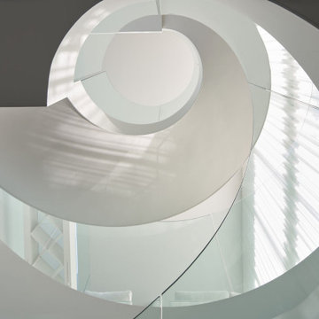
Walk in wardrobe achieved during renovation project by moving the staircase forward and releasing space behnd it. We first fixed plumbing into the space to give flexiblity for future use. Ample space for single and double hanging, suitcase storage and open shelves.
Find the right local pro for your project
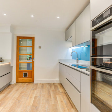
High-Tech Nobilia Kitchen in Horsham, West Sussex
In one of our most forward-thinking projects to date, designer George Harvey has designed a vibrant and technologic kitchen space that incorporates useful innovations for this local Horsham client.
Like many who visit our showrooms, this client was blown away with new technologies that can be incorporated into a kitchen space. Eventually this client’s wish of an advanced kitchen space became a reality through clever design and a bit of help from our expert installation team. As with many of our projects this kitchen makes the most of our complete installation service, opting to fill an original doorway and create a new access off the main hall whilst widening the original hall space at the same time.
The main run of units features wall units, base units and full-height units to house cooking appliances, storage and sink facilities as well as decorative shelving. A key element of this projected is tailored to the now common work from home option, with a versatile peninsula island vital to the final functioning of this space – the added option of bar seating and a large volume of storage helps to achieve this project brief. The result of this ancillary and building work is a spacious kitchen which flows nicely through to a sunny family room to the rear of the property that functions perfectly for the client.
Kitchen Furniture
Furniture from our German supplier Nobilia’s Touch range has been used throughout this kitchen and provides a subtle silky texture. Touch furniture uses bevelled corners for a premium feel. The fact that the range itself is available in several colour options has contributed to it being one of our most popular Nobilia kitchen ranges. For this project Touch furniture has been used in the contemporary Satin Grey finish, this neutral colour choice allows accents like the glass bright blue splashback to bring vast vibrancy to the kitchen.
Across the main run and island, a huge amount of storage has been incorporated, while a reduced depth sideboard style run enhances storage and worktop space further. The furniture choice has also been based around the key them of this kitchen: technology, with the handless furniture option allowing for ultra-modern LED strip lighting to be integrated in the handle wells on the island and sideboard storage.
Kitchen Appliances
The appliances used for this project are what really makes such a state-of-the-art kitchen.
Appliances like Neff’s Slide & Hide oven are commonplace in many of our installations. This kitchen though makes use of their high-specification N90 model. Incorporating an integrated cleaning system, baking and roast assistant and Home Connect capabilities to allow control through a device or smart speaker. To accompany, a N90 combination microwave also features in this kitchen which also harnesses Home Connect capabilities as well as integrated cleaning. This combination microwave also gives the client a flexible cooking option with the appliances doubling as another oven as required. An undermounted Neff fridge gives extra cold storage in addition to this client’s own appliances.
Sitting on the main run is another ultra-modern appliance, a Bora Pure venting hob. This appliance was specified by the client to increase storage space, as due to an integrated ventilation system, no extractor hood is required. Minimalistic design and a low installation height mean this appliance is integrated seamlessly into the worktops with plenty of room for cutlery and pan drawers beneath. The Bora Pure also boasts four oversized cooking zones, that use instant induction power for efficient cooking whilst a low volume extractor removes all odour and steam.
Kitchen Accessories
To continue the ultra-modern theme of this kitchen, a Quooker Flex boiling tap has been included which includes a pull-out nozzle and for this project a new Cube tank has been included as well. The Quooker Cube tank incorporates refreshing sparkling and filtered chilled water in addition to cold, hot and boiling water – which come as standard with any Quooker tank. The Quooker is set above an undermounted Blanco sink which in itself continues this kitchen aesthetic with a contemporary white finish.
To further the futuristic dynamic George has included fantastic lighting, with well-placed LED spotlights underneath wall units and LED strip lighting under handleless rails on the island and sideboard area. This lighting not only continues the theme of the kitchen, with spotlights highlighting the of quartz worktops and vibrant blue splashback on the main run. As part of this installation Karndean flooring has also been installed across the kitchen area, with the Rose Washed Oak finish used throughout the space from the popular Knight Tile range.
Our Kitchen Design & Installation Service
As with most of our installations this client has taken the opportunity to completely redesign their kitchen using our complete installation service. For this project our installation team moved and created a doorway, as well as undertaking all structural work. The final result is a kitchen that is perfectly equipped for the future thanks to a new flowing layout and innovative kitchen design and appliances.
If you’re looking to overhaul your kitchen space, then talk to one of our experienced designers about your project.
Arrange a free consultation by calling a showroom or via our website.
tangelo design
Tasteful Interior Design in Calgary
I believe every home should be as individual as the people that live in it. Over the past 25+ years, it has been a pleasure and privilege to create unique spaces for my clients. From simple to complex, I strive to make every home as beautiful as it can be. With a background in Fine Arts and a specialized certification in Kitchen, Bath and Millwork Design, I am proud to have won local and national awards for my designs. Tangelo Design services include complete material and finishing selections, colour consultation and pre-blueprint space planning. Consultations to update spaces, getting a home ready to sell and pre-move in renovations are also available. I look forward to hearing from you and assisting you through your upcoming home project!
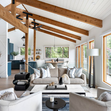
The new owners of this 1974 Post and Beam home originally contacted us for help furnishing their main floor living spaces. But it wasn’t long before these delightfully open minded clients agreed to a much larger project, including a full kitchen renovation. They were looking to personalize their “forever home,” a place where they looked forward to spending time together entertaining friends and family.
In a bold move, we proposed teal cabinetry that tied in beautifully with their ocean and mountain views and suggested covering the original cedar plank ceilings with white shiplap to allow for improved lighting in the ceilings. We also added a full height panelled wall creating a proper front entrance and closing off part of the kitchen while still keeping the space open for entertaining. Finally, we curated a selection of custom designed wood and upholstered furniture for their open concept living spaces and moody home theatre room beyond.
* This project has been featured in Western Living Magazine.
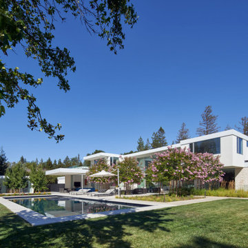
The Atherton House is a family compound for a professional couple in the tech industry, and their two teenage children. After living in Singapore, then Hong Kong, and building homes there, they looked forward to continuing their search for a new place to start a life and set down roots.
The site is located on Atherton Avenue on a flat, 1 acre lot. The neighboring lots are of a similar size, and are filled with mature planting and gardens. The brief on this site was to create a house that would comfortably accommodate the busy lives of each of the family members, as well as provide opportunities for wonder and awe. Views on the site are internal. Our goal was to create an indoor- outdoor home that embraced the benign California climate.
The building was conceived as a classic “H” plan with two wings attached by a double height entertaining space. The “H” shape allows for alcoves of the yard to be embraced by the mass of the building, creating different types of exterior space. The two wings of the home provide some sense of enclosure and privacy along the side property lines. The south wing contains three bedroom suites at the second level, as well as laundry. At the first level there is a guest suite facing east, powder room and a Library facing west.
The north wing is entirely given over to the Primary suite at the top level, including the main bedroom, dressing and bathroom. The bedroom opens out to a roof terrace to the west, overlooking a pool and courtyard below. At the ground floor, the north wing contains the family room, kitchen and dining room. The family room and dining room each have pocketing sliding glass doors that dissolve the boundary between inside and outside.
Connecting the wings is a double high living space meant to be comfortable, delightful and awe-inspiring. A custom fabricated two story circular stair of steel and glass connects the upper level to the main level, and down to the basement “lounge” below. An acrylic and steel bridge begins near one end of the stair landing and flies 40 feet to the children’s bedroom wing. People going about their day moving through the stair and bridge become both observed and observer.
The front (EAST) wall is the all important receiving place for guests and family alike. There the interplay between yin and yang, weathering steel and the mature olive tree, empower the entrance. Most other materials are white and pure.
The mechanical systems are efficiently combined hydronic heating and cooling, with no forced air required.
The new owners of this 1974 Post and Beam home originally contacted us for help furnishing their main floor living spaces. But it wasn’t long before these delightfully open minded clients agreed to a much larger project, including a full kitchen renovation. They were looking to personalize their “forever home,” a place where they looked forward to spending time together entertaining friends and family.
In a bold move, we proposed teal cabinetry that tied in beautifully with their ocean and mountain views and suggested covering the original cedar plank ceilings with white shiplap to allow for improved lighting in the ceilings. We also added a full height panelled wall creating a proper front entrance and closing off part of the kitchen while still keeping the space open for entertaining. Finally, we curated a selection of custom designed wood and upholstered furniture for their open concept living spaces and moody home theatre room beyond.
This project is a Top 5 Finalist for Western Living Magazine's 2021 Home of the Year.
Nearly two decades ago now, Susan and her husband put a letter in the mailbox of this eastside home: "If you have any interest in selling, please reach out." But really, who would give up a Flansburgh House?
Fast forward to 2020, when the house went on the market! By then it was clear that three children and a busy home design studio couldn't be crammed into this efficient footprint. But what's second best to moving into your dream home? Being asked to redesign the functional core for the family that was.
In this classic Flansburgh layout, all the rooms align tidily in a square around a central hall and open air atrium. As such, all the spaces are both connected to one another and also private; and all allow for visual access to the outdoors in two directions—toward the atrium and toward the exterior. All except, in this case, the utilitarian galley kitchen. That space, oft-relegated to second class in midcentury architecture, got the shaft, with narrow doorways on two ends and no good visual access to the atrium or the outside. Who spends time in the kitchen anyway?
As is often the case with even the very best midcentury architecture, the kitchen at the Flansburgh House needed to be modernized; appliances and cabinetry have come a long way since 1970, but our culture has evolved too, becoming more casual and open in ways we at SYH believe are here to stay. People (gasp!) do spend time—lots of time!—in their kitchens! Nonetheless, our goal was to make this kitchen look as if it had been designed this way by Earl Flansburgh himself.
The house came to us full of bold, bright color. We edited out some of it (along with the walls it was on) but kept and built upon the stunning red, orange and yellow closet doors in the family room adjacent to the kitchen. That pop was balanced by a few colorful midcentury pieces that our clients already owned, and the stunning light and verdant green coming in from both the atrium and the perimeter of the house, not to mention the many skylights. Thus, the rest of the space just needed to quiet down and be a beautiful, if neutral, foil. White terrazzo tile grounds custom plywood and black cabinetry, offset by a half wall that offers both camouflage for the cooking mess and also storage below, hidden behind seamless oak tambour.
Contractor: Rusty Peterson
Cabinetry: Stoll's Woodworking
Photographer: Sarah Shields
Contractor Transition: When the original contractor got to the point of framing the house but was not able to move the project forward, this homeowner called on us to complete the work. While stepping into another builder’s project is never a simple task, the professionals as ESBC can quickly assess what needs to be done to get back on track - without cleaning out your bank account. Owner: Youngman family, Deerfield, IL
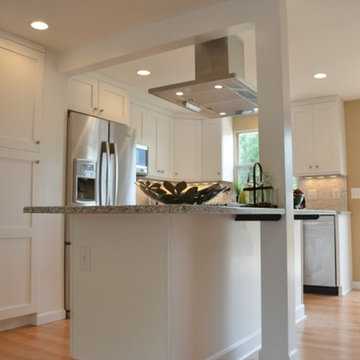
There are so many design elements to this kitchen, I almost don’t know where to start. Bright and airy with crisp clean white cabinets, the kitchen is open and welcoming. Still crisp but gently contrasting, the stainless steel appliance add depth amid the white. To keep this kitchen warm, natural oak covers the floors and a toasted wheat color washes the walls. And then there is the architectural elements. You know. That post and beam in the middle of the room. It’s the center of attention.
When you walk into a room your eyes roam around, establishing the size and shape of the room as your feet take you forward. From the front door of this home straight ahead you encountered this wall. The dining area to the right gives you a glimpse of things to come. Where there is a dining room you will usually find a kitchen.
The architecture of years gone by consistently hides the kitchen, the heart of the home, behind walls. I sympathize with my Mom, and all the other Moms, who have had to spend so much time tucked into a tight kitchen, away from the family. This wall had to go, but it was structural. We needed its support but not its bulk.
So we got rid of the bulk and only the bulk. Instead of a wall we have a post and beam, offering all of the structure we need. We could have installed a huge steel beam and reconfigure the joists to upset the beam, but why? The small beam and post add an incredible architectural element. It’s turning lemons into lemon, we simply made the most of what we had. It may be functional but it’s so fantastic. It looks like we created the effect just for the drama.
The original kitchen may have had a working triangle and some counter space, but it was fairly small, with each area only a step or two away. The dark cabinets made the space feel even smaller and the butcher block patterned laminate counter tops were very dated. The appliances were feeling their age as well, from a coil burner electric stove to a top freezer refrigerator. To keep this kitchen within its space, a half wall separated it from the dining area.
With the wall gone we borrowed some space from the living room and extended what was a U shaped kitchen into an L. At the living room window we start our new kitchen. We kept a small part of the wall to support the other end of our decorative beam. Sandwiched between a large pantry and our new French door refrigerator, the wall disappears. With our new open floor plan a sizable island was in order.
We split our cooking areas and installed a continuous grill gas cooktop into the island. A sleek island hood takes care of exhaust and adds an extra element to our architectural feature. Under the cooktop we added over-sized drawers for pots and pan storage. The frameless cabinets from New River Cabinetry are maple, painted white, with the Herndon door style. With the cooktop safely nestled into our island, we still had to add an oven.
We used the space where the old range sat for a large single oven of stainless steel and glass. If it worked for one, why not two? We created a home for a microwave in the wall cabinets. It’s perfect for heating leftovers so close to the refrigerator.
An important consideration for hot spots in your kitchen is landing zones. Each of our cooking areas have generous landing zones, one on each side of the cooktop and an entire counter area above or below the ovens, depending on which one you’re using.
We wanted to give the sink area more room so the half wall had to come out. We moved the trash and recycle cans into a cabinet, removed the heavy soffits and kept the sink under the window.
With that little bit of extra space we were able to add a larger cabinet above the dishwasher and slide it all down. This used to be where the carpeting met the vinyl floor, but all of it is gone. Long oak planks eliminate that final divide between the kitchen and the dining area, while adding visual length to the area. White wall cabinets on each side of the window reflect the sunlight for a brighter view.
With all of the darker cabinetry the backsplash walls had been painted white. Even still, there was a darkness in the corners and it wasn’t very exciting. We wanted to add visual interest and reflect the new under-cabinet lighting, eliminating the shadows in this corner.
With 1″x 2″ Arabescato Honed marble mosaics and those under-cabinet lights, we achieved the perfect balance. The marble has subtle swirls in gray and beige on a clean white background, but with the honed finish the light is softly reflected instead of glaring. For granite, we chose the soft gray tones of Luna Pearl. The speckles of gray and beige are a gentle contrast to the white cabinets and emulate the color of the stainless steel.
Between the carpet, red half wall, dark railing and dated light fixture, the dining area felt tired. Since the kitchen lacked sufficient storage, a large utility cabinet crowded the table space without adding any decorate elements.
Although it didn’t get any bigger, our dining area feels fresher and more open too. With the oak flooring joining the area to the rest of our space and the toasted wheat on the walls, the white table and chairs compliment the cabinetry while contrasting the warmer colors. We replaced the chandelier with recessed lighting and changed that railing too.
With our new open floor plan, we ended up with a fairly open area in between our foyer closet and the living room window. Not one to miss an opportunity, we filled the space with a multi-functional work space.
With the sunlight streaming in this bright corner works for anything this family needs.
There’s plenty of space for a chair under this large desk drawer. A closed cabinet below, glass doors above and lots of open shelving let you store and or showcase your belongings. We added a lite area at the top to keep away the darker corners.
The transformation is complete. This kitchen and all of its features are truly the center of attention in this home.
http://www.designsbyskill.com/
http://www.rjkconstructioninc.com/
tangelo design
Tasteful Interior Design in Calgary
I believe every home should be as individual as the people that live in it. Over the past 25+ years, it has been a pleasure and privilege to create unique spaces for my clients. From simple to complex, I strive to make every home as beautiful as it can be. With a background in Fine Arts and a specialized certification in Kitchen, Bath and Millwork Design, I am proud to have won local and national awards for my designs. Tangelo Design services include complete material and finishing selections, colour consultation and pre-blueprint space planning. Consultations to update spaces, getting a home ready to sell and pre-move in renovations are also available. I look forward to hearing from you and assisting you through your upcoming home project!
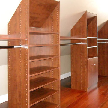
Backing was added to prevent items from falling out the back. Cleats were mounted up on shelves above hanging rods to act as stops. The walls were 22" high. Moving the units 28" forward resultede in 54' high in back units.
The new owners of this 1974 Post and Beam home originally contacted us for help furnishing their main floor living spaces. But it wasn’t long before these delightfully open minded clients agreed to a much larger project, including a full kitchen renovation. They were looking to personalize their “forever home,” a place where they looked forward to spending time together entertaining friends and family.
In a bold move, we proposed teal cabinetry that tied in beautifully with their ocean and mountain views and suggested covering the original cedar plank ceilings with white shiplap to allow for improved lighting in the ceilings. We also added a full height panelled wall creating a proper front entrance and closing off part of the kitchen while still keeping the space open for entertaining. Finally, we curated a selection of custom designed wood and upholstered furniture for their open concept living spaces and moody home theatre room beyond.
This project is a Top 5 Finalist for Western Living Magazine's 2021 Home of the Year.
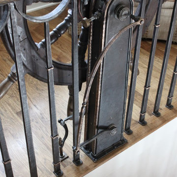
Matthew and Karine Maynard are designers,
blacksmiths and artists who use metal and
architectural space as their media. As a husband and
wife team, they specialize in hand-forged custom stair
rails, furniture and applied design. Their work has
been featured in international periodicals, given
prominence by the National Ornamental Misc. Metals
Association and the Artist Blacksmiths Association of
North America. Their larger commissions are primarily
installed in private residences throughout the Midwest
and southern United States, but smaller works reside
in homes and businesses from California to Italy.
Each element of their work reflects their professional
attention to aesthetic detail, design and function with
a focus on quality over quantity.
"We work closely with our clients throughout the
design process and look forward to collaborating with
them and creating something that will last for
generations to come".
Showing Results for "Moving Forward"
Sponsored
Over 300 locations across the U.S.
Schedule Your Free Consultation
Ferguson Bath, Kitchen & Lighting Gallery
Ferguson Bath, Kitchen & Lighting Gallery
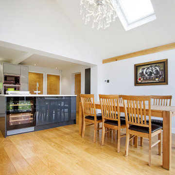
Our clients have always loved the location of their house for easy access to work, schools, leisure facilities and social connections, but they were becoming increasingly frustrated with the form and size constraints of their home.
As the family has grown and developed their lifestyles and living patterns had changed. Their three bedroomed link detached house was starting to feel small and it was proving to be increasingly unsuitable for their lifestyle. The separate downstairs living areas were dividing the family, they were struggling to fit in a room big enough to accommodate them all to sit down and eat together. As a result of the small separate living, kitchen and dining spaces they were spending little time in each other’s company. They desired to create a long term solution for their young family to grow into and enjoy.
Rather than moving house or self-building from scratch, they decided to stay in the location that they loved and to add a modern extension to their existing home. They aspired to create a modern, functional space for everyday family life, whilst improving the curb appeal of their home to add value.
We were appointed by our clients to create a design solution to replace the old, cold, and leaking conservatory to the rear of the property, with a modern, light filled, open plan home extension. The intention for the new large open living space was to break down the room barriers and respond to the needs of the family to support their home life into the foreseeable future.
Delivering on time and within budget were essential. With a young family and pets at home it was essential for minimal disruption to their daily lifestyle. The family needed help from our team at Croft Architecture to swiftly and successfully acquire Planning and Building Control Approval for their project to progress rapidly, ensuring project completion on time and to their determined budget.
In Context
A families, needs, wants, and desires are constantly changing as they mature, yet our family nests stay static, and can obstruct the ease and enjoyment of everyday life if they don’t adapt in line with modern living requirements.
Our Approach
The client’s home is located in a suburb of the city of Stoke-on-Trent in North Staffordshire. Their original house is a three bedroomed link detached family home that’s located on a mature housing estate close to the Trent and Mersey Canal.
The original home is immediately connected to the properties on either side via the garage link, with a neighbouring property flanking wall also located at the base of their rear garden too. Before progressing with the project we advised the family to inform all of their adjoining neighbours of their intention to extend. It's often much better to take the neighbourly approach and to inform neighbours of works in advace, so that they can express any concerns,which are often easily resolved.
Other matters to discuss with neighbours may be the need to have a Party Wall agreement. For more details about Party Wall Regulations click here to take a look at our blog.
To create the space that our clients aspired to achieve the neighbouring properties needed to be taken into consideration.
Design Approach
The site available was compact so a balance needed to e struck to provide a generous amount of floor space for the new extension. Our clients needed our help to create a design solution that offered them a generous amount of extra space whilst bearing no visual impact on the neighbouring properties or street scene.
The development of the design for the home extension referenced the style and character of the homes in the immediate neighbourhood, with particular features being given a contemporary twist.
Our clients had done their own research and planning with regards to the required look, finish and materials that wanted to use. They liked oak beamed structures and they wanted to create a light space that seamlessly opened into the garden, using a glazed oak beamed structure. However, oak comes a price and our clients had a determined budget for the project. Numerous companies were contacted for prices to reflect their budget and eventually perseverance paid off. The oak structure was sourced locally in Staffordshire.
The design of the newly extended family space complements the style & character of the main house, emulating design features and style of brick work. Careful design consideration has been given to ensure that the newly extended family living space corresponds well with not only, the adjoining properties, but also the neighbouring homes within the local area.
It was essential to ensure that the style, scale and proportions of the new generous family living space to the rear of the property beard no visual impact on the streetscape, yet the design responded to the living patterns of the family.
The extension to the rear of the home replaces a conservatory spanning the full width of the property, which was always too cold to use in the winter and too hot in the summer. We saw the opportunity for our clients to take advantage of the westerly afternoon/evening sun and to fill the space with natural light. We combined the traditional oak framing with modern glazing methods incorporated into the oak structure. The design of the extension was developed to receive the sunlight throughout the day using roof lights, with the evening sun being captured by the floor to ceiling grey framed bi-folding doors.
The pitched roof extension creates an internal vaulted ceiling giving the impression of a light, airy space, especially with the addition of the large roof lights.
The updated light grey, high gloss kitchen and light grey marble countertops help reflect the light from the skylights in the ceiling, with a zesty lime grey block splashback creating a perfect accent colour to reflect the family’s fun personalities and to bring life to their new living space.
The extension is an open room with the kitchen and dining room all sharing the same space. White walls have been combined with wooden flooring and oak structure to create a sense of warmth. The oak beams really come into their own in this large open plan space, especially with the vaulted ceiling and large folding doors open seamlessly into the back garden. Adding an oak framed extension with the floor to ceiling glazing has enabled the family to get the ‘wow factor’ within their budget.
Externally, our team at Croft Architecture have created a clean, traditional addition to the existing period property, whilst inside the dwelling now has a new, sleek, light and spacious family ‘hub’ that seamlessly connects with the existing home and the garden.
Our team has also worked closely with the client to consider the project as whole and not just the home extension and new additional garden space. The design of the external space has been carefully remodelled to ensure that the ground not only, works for the family, but also successfully enhance the visual appearance.
A strong working relationship between our team, the client and the planners enabled us to gain the necessary permissions promptly, rapidly propelling the project forwards within a short time frame. We enjoyed working with the project team and we’re extremely pleased to successfully deliver the completed project in accordance with our client’s timescales and budget.
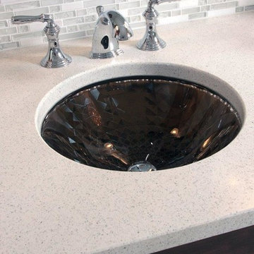
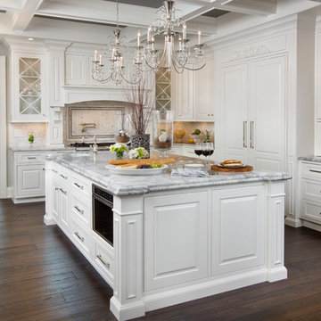
This Master Suite Addition project was initiated by our Clients’ desire to stay in their family home well into their golden years. Their wish list included a master suite and large open space for entertaining. With “Aging in Place” a main objective, our goal was to move all essential tasks to the first floor. Our design created a smooth transition between old house and new by expanding their dining room and adding a vestibule between the two spaces. This resulted in a much larger dining space and the larger entertaining area they were seeking. The master bedroom’s floor to ceiling windows on two of the walls frames picturesque views of their beloved garden outside. Vaulted ceilings, French doors to the bathroom with a transom window above express class and grandeur. Through the French doors the elegant master bathroom shines with reflections from the decorative crystal chandelier, white and grey tile, polished chrome fixtures and lighted glass bowls. A double headed shower, with dual temperature controls, and the air-jetted tub provide a true sanctuary for a relaxed bathing experience. “His and Her” elements are also fulfilled with dual vanities, and dual toilet areas. Upon completion, the homeowners passionately stated that this project turned out even better than they could have imagined. They truly love their new space in their long loved home and look forward to many more years in their new haven.
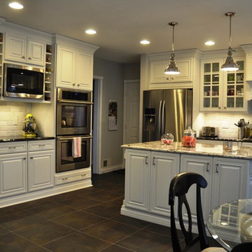
High-Tech Nobilia Kitchen in Horsham, West Sussex
In one of our most forward-thinking projects to date, designer George Harvey has designed a vibrant and technologic kitchen space that incorporates useful innovations for this local Horsham client.
Like many who visit our showrooms, this client was blown away with new technologies that can be incorporated into a kitchen space. Eventually this client’s wish of an advanced kitchen space became a reality through clever design and a bit of help from our expert installation team. As with many of our projects this kitchen makes the most of our complete installation service, opting to fill an original doorway and create a new access off the main hall whilst widening the original hall space at the same time.
The main run of units features wall units, base units and full-height units to house cooking appliances, storage and sink facilities as well as decorative shelving. A key element of this projected is tailored to the now common work from home option, with a versatile peninsula island vital to the final functioning of this space – the added option of bar seating and a large volume of storage helps to achieve this project brief. The result of this ancillary and building work is a spacious kitchen which flows nicely through to a sunny family room to the rear of the property that functions perfectly for the client.
Kitchen Furniture
Furniture from our German supplier Nobilia’s Touch range has been used throughout this kitchen and provides a subtle silky texture. Touch furniture uses bevelled corners for a premium feel. The fact that the range itself is available in several colour options has contributed to it being one of our most popular Nobilia kitchen ranges. For this project Touch furniture has been used in the contemporary Satin Grey finish, this neutral colour choice allows accents like the glass bright blue splashback to bring vast vibrancy to the kitchen.
Across the main run and island, a huge amount of storage has been incorporated, while a reduced depth sideboard style run enhances storage and worktop space further. The furniture choice has also been based around the key them of this kitchen: technology, with the handless furniture option allowing for ultra-modern LED strip lighting to be integrated in the handle wells on the island and sideboard storage.
Kitchen Appliances
The appliances used for this project are what really makes such a state-of-the-art kitchen.
Appliances like Neff’s Slide & Hide oven are commonplace in many of our installations. This kitchen though makes use of their high-specification N90 model. Incorporating an integrated cleaning system, baking and roast assistant and Home Connect capabilities to allow control through a device or smart speaker. To accompany, a N90 combination microwave also features in this kitchen which also harnesses Home Connect capabilities as well as integrated cleaning. This combination microwave also gives the client a flexible cooking option with the appliances doubling as another oven as required. An undermounted Neff fridge gives extra cold storage in addition to this client’s own appliances.
Sitting on the main run is another ultra-modern appliance, a Bora Pure venting hob. This appliance was specified by the client to increase storage space, as due to an integrated ventilation system, no extractor hood is required. Minimalistic design and a low installation height mean this appliance is integrated seamlessly into the worktops with plenty of room for cutlery and pan drawers beneath. The Bora Pure also boasts four oversized cooking zones, that use instant induction power for efficient cooking whilst a low volume extractor removes all odour and steam.
Kitchen Accessories
To continue the ultra-modern theme of this kitchen, a Quooker Flex boiling tap has been included which includes a pull-out nozzle and for this project a new Cube tank has been included as well. The Quooker Cube tank incorporates refreshing sparkling and filtered chilled water in addition to cold, hot and boiling water – which come as standard with any Quooker tank. The Quooker is set above an undermounted Blanco sink which in itself continues this kitchen aesthetic with a contemporary white finish.
To further the futuristic dynamic George has included fantastic lighting, with well-placed LED spotlights underneath wall units and LED strip lighting under handleless rails on the island and sideboard area. This lighting not only continues the theme of the kitchen, with spotlights highlighting the of quartz worktops and vibrant blue splashback on the main run. As part of this installation Karndean flooring has also been installed across the kitchen area, with the Rose Washed Oak finish used throughout the space from the popular Knight Tile range.
Our Kitchen Design & Installation Service
As with most of our installations this client has taken the opportunity to completely redesign their kitchen using our complete installation service. For this project our installation team moved and created a doorway, as well as undertaking all structural work. The final result is a kitchen that is perfectly equipped for the future thanks to a new flowing layout and innovative kitchen design and appliances.
If you’re looking to overhaul your kitchen space, then talk to one of our experienced designers about your project.
Arrange a free consultation by calling a showroom or via our website.
105