


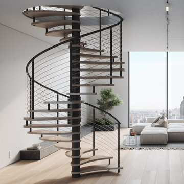
Search results for "Semi detached house landscaping ideas" in Home Design Ideas
Our Houston landscaping team was recently honored to collaborate with renowned architectural firm Murphy Mears. Murphy Mears builds superb custom homes throughout the country. A recent project for a Houston resident by the name of Borow involved a custom home that featured an efficient, elegant, and eclectic modern architectural design. Ms. Borow is very environmentally conscious and asked that we follow some very strict principles of conservation when developing her landscaping design plan.
In many ways you could say this Houston landscaping project was green on both an aesthetic level and a functional level. We selected affordable ground cover that spread very quickly to provide a year round green color scheme that reflected much of the contemporary artwork within the interior of the home. Environmentally speaking, our project was also green in the sense that it focused on very primitive drought resistant plant species and tree preservation strategies. The resulting yard design ultimately functioned as an aesthetic mirror to the abstract forms that the owner prefers in wall art.
One of the more notable things we did in this Houston landscaping project was to build the homeowner a gravel patio near the front entrance to the home. The homeowner specifically requested that we disconnect the irrigation system that we had installed in the yard because she wanted natural irrigation and drainage only. The gravel served this wish superbly. Being a natural drain in its own respect, it provided a permeable surface that allowed rainwater to soak through without collecting on the surface.
More importantly, the gravel was the only material that could be laid down near the roots of the magnificent trees in Ms. Borow’s yard. Any type of stone, concrete, or brick that is used in more typical Houston landscaping plans would have been out of the question. A patio made from these materials would have either required cutting into tree roots, or it would have impeded their future growth.
The specific species chosen for ground cover also bear noting. The two primary plants used were jasmine and iris. Monkey grass was also used to a small extent as a border around the edge of the house. Irises were planted in front of the house, and the jasmine was planted beneath the trees. Both are very fast growing, drought resistant species that require very little watering. However, they do require routine pruning, which Ms. Borow said she had no problem investing in.
Such lawn alternatives are frequently used in Houston landscaping projects that for one reason or the other require something other than a standard planting of carpet grass. In this case, the motivation had nothing to do with finances, but rather a conscientious effort on Ms. Borow’s part to practice water conservation and tree preservation.
Other hardscapes were then introduced into this green design to better support the home architecture. A stepping stone walkway was built using plain concrete pads that are very simple and modern in their aesthetic. These lead up to the front stair case with four inch steps that Murphy Mears designed for maximum ergonomics and comfort.
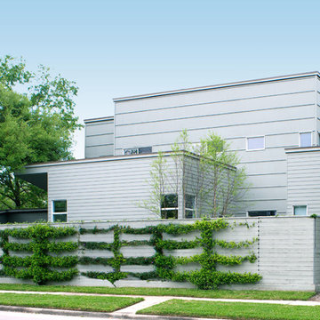
There were a few softscape elements that we added to complete the Houston landscaping design. A planting of River Birch trees was introduced near the side of the home. River Birch trees are very attractive, light green trees that do not grow that tall. This eliminates any possible conflict between the tree roots and the home foundation.
Murphy Mears also built a very elegant fence that transitioned the geometry of the house down to the city sidewalk. The fence sharply parallels the linear movement of the house. We introduced some climbing vines to help soften the fence and to harmonize its aesthetic with that of the trees, ground cover, and grass along the sidewalk.
A Memorial-area art collector residing in a chic modern home wanted his house to be more visible from the street. His yard was full of trees, and he asked us to consider removing them and developing a more modern landscape design that would fully complement the exterior of his home. He was a personal friend of ours as well, and he understood that our policy is to preserve as many trees as possible whenever we undertake a project. However, we decided to make an exception in his case for two reasons. For one thing, he was a very close friend to many people in our company. Secondly, large trees simply would not work with a landscape reflective of the modern architecture that his house featured.
The house had been built as story structure that was formed around a blend of unique curves and angles very reminiscent of the geometric patterns common in modern sculpture and art. The windows had been built deliberately large, so that visitors driving up to the house could have a lighted glimpse into the interior, where many sculptures and works of modern art were showcased. The entire residence, in fact, was meant to showcase the eclectic diversity of his artistic tastes, and provide a glimpse at the elegant contents within the home.
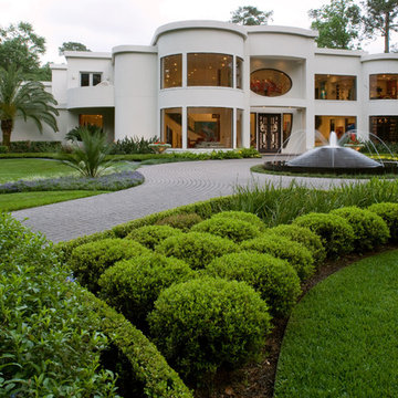
He asked us to create more modern look to the landscape that would complement the residence with patterns in vegetation, ornamentation, and a new lighted water fountain that would act like a mirror-image of the home. He also wanted us to sculpt the features we created in such a way as to center the eye of the viewer and draw it up and over the landscape to focus on the house itself.
The challenge was to develop a truly sophisticated modern landscaping design that would compliment, but in no way overpower the façade of the home. In order to do this, we had to focus very carefully on the geometric appearance of the planting areas first. Since the vegetation would be surrounding a very large, circular stone drive, we took advantage of the contours and created a sense of flowing perspective. We were then very careful to plant vegetation that could be maintained at a very low growth height. This was to prevent vegetation from behaving like the previous trees which had blocked the view of the house. Small hedges, ferns, and flowers were planted in winding rows that followed the course of the circular stone driveway that surrounded the fountain.
We then centered this new modern landscape plan with a very sophisticated contemporary fountain. We chose a circular shape for the fountain both to center the eye and to work as a compliment to the curved elements in the home’s exterior design. We selected black granite as the building material, partly because granite speaks to the monumental, and partly because it is a very common material for modern architecture and outdoor contemporary sculpture. We placed the fountain in the very center of the driveway as well, which had the effect of making the entire landscape appear to converge toward the middle of the home’s façade. To add a sense of eclectic refinement to the fountain, we then polished the granite so that anyone driving or walking up to the fountain would see a reflection of the home in the base. To maintain consistency of the circular shape, we radius cut all of the coping around the fountain was all radius cut from polished limestone. The lighter color of the limestone created an archetypal contrast of light and darkness, further contributing to the modern theme of the landscape design, and providing a surface for illumination so the fountain would remain an established keynote on the landscape during the night.
A local Houston art collector hired us to create a low maintenance, sophisticated, contemporary landscape design. She wanted her property to compliment her eclectic taste in architecture, outdoor sculpture, and modern art. Her house was built with a minimalist approach to decoration, emphasizing right angles and windows instead of architectural keynotes. The west wing of the house was only one story, while the east wing was two-story. The windows in both wings were larger than usual, so that visitors could see her art collection from the home’s exterior. Near one of the large rear windows, there was an abstract metal sculpture designed in the form of a spiral.
When she initially contacted us, the surrounding property had only a few trees and indigenous grass as vegetation. This was actually a good beginning point with us, because it allowed us to develop a contemporary landscape design that featured a very linear, crisp look supportive of the home and its contents. We began by planting a garden around the large contemporary sculpture near the window. Landscape designers planted horsetail reed under windows, along the sides of the home, and around the corners. This vegetation is very resilient and hardy, and requires little trimming, weeding, or mulching. This helped unite the diverse elements of sculpture, contemporary architecture, and landscape design into a more fluid harmony that preserved the proportions of each unique element, but eliminated any tendency for the elements to clash with one another.
We then added two stonework designs to the landscape surrounding the contemporary art collection and home. The first was a linear walkway we build from concrete pads purchased through a retail vendor as a cost-saving benefit to our client. We created this walkway to follow the perimeter of the home so that visitors could walk around the entire property and admire the outdoor sculptures and the collections of modern art visible through the windows. This was especially enjoyable at night, when the entire home was brightly lit from within.
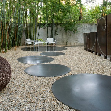
To add a touch of tranquility and quite repose to the stark right angles of the home and surrounding contemporary landscape, we designed a special seating area toward the northwest corner of the property. We wanted to create a sense of contemplation in this area, so we departed from the linear and angular designs of the surrounding landscape and established a theme of circular geometry. We laid down gravel as ground cover, then placed large, circular pads arranged like giant stepping stones that led up to a stone patio filled with chairs. The shape of the granite pads and the contours of the graveled area further complimented the spirals and turns in the outdoor metal sculpture, and balanced the entire contemporary landscape design with proportional geometric forms of lines, angles, and curves.
This particular contemporary landscape design also has a sense of movement attached to it. All stonework leads to a destination of some sort. The linear pathway provides a guided tour around the home, garden, and modern art collection. The granite pathway stones create movement toward separate space where the entire experience of art, vegetation, and architecture can be viewed and experienced as a unity.
Contemporary landscaping designs like create form out of feeling by using basic geometric forms and variations of forms. Sometimes very stark forms are used to create a sense of absolutism or contrast. At other times, forms are blended, or even distorted to suggest a sense of complex emotion, or a sense of multi-dimensional reality. The exact nature of the design is always highly subjective, and developed on a case-by-case basis with the client.
Find the right local pro for your project
FAMILY HOME IN SURREY
The architectural remodelling, fitting out and decoration of a lovely semi-detached Edwardian house in Weybridge, Surrey.
We were approached by an ambitious couple who’d recently sold up and moved out of London in pursuit of a slower-paced life in Surrey. They had just bought this house and already had grand visions of transforming it into a spacious, classy family home.
Architecturally, the existing house needed a complete rethink. It had lots of poky rooms with a small galley kitchen, all connected by a narrow corridor – the typical layout of a semi-detached property of its era; dated and unsuitable for modern life.
MODERNIST INTERIOR ARCHITECTURE
Our plan was to remove all of the internal walls – to relocate the central stairwell and to extend out at the back to create one giant open-plan living space!
To maximise the impact of this on entering the house, we wanted to create an uninterrupted view from the front door, all the way to the end of the garden.
Working closely with the architect, structural engineer, LPA and Building Control, we produced the technical drawings required for planning and tendering and managed both of these stages of the project.
QUIRKY DESIGN FEATURES
At our clients’ request, we incorporated a contemporary wall mounted wood burning stove in the dining area of the house, with external flue and dedicated log store.
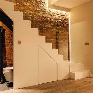
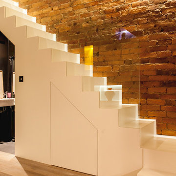
The staircase was an unusually simple design, with feature LED lighting, designed and built as a real labour of love (not forgetting the secret cloak room inside!)
The hallway cupboards were designed with asymmetrical niches painted in different colours, backlit with LED strips as a central feature of the house.
The side wall of the kitchen is broken up by three slot windows which create an architectural feel to the space.
FAMILY HOME IN SURREY
The architectural remodelling, fitting out and decoration of a lovely semi-detached Edwardian house in Weybridge, Surrey.
We were approached by an ambitious couple who’d recently sold up and moved out of London in pursuit of a slower-paced life in Surrey. They had just bought this house and already had grand visions of transforming it into a spacious, classy family home.
Architecturally, the existing house needed a complete rethink. It had lots of poky rooms with a small galley kitchen, all connected by a narrow corridor – the typical layout of a semi-detached property of its era; dated and unsuitable for modern life.
MODERNIST INTERIOR ARCHITECTURE
Our plan was to remove all of the internal walls – to relocate the central stairwell and to extend out at the back to create one giant open-plan living space!
To maximise the impact of this on entering the house, we wanted to create an uninterrupted view from the front door, all the way to the end of the garden.
Working closely with the architect, structural engineer, LPA and Building Control, we produced the technical drawings required for planning and tendering and managed both of these stages of the project.
QUIRKY DESIGN FEATURES
At our clients’ request, we incorporated a contemporary wall mounted wood burning stove in the dining area of the house, with external flue and dedicated log store.
The staircase was an unusually simple design, with feature LED lighting, designed and built as a real labour of love (not forgetting the secret cloak room inside!)
The hallway cupboards were designed with asymmetrical niches painted in different colours, backlit with LED strips as a central feature of the house.
The side wall of the kitchen is broken up by three slot windows which create an architectural feel to the space.
La Caracola seashore house
Design 2004, finish built 2010-11
Located at Tres Vidas Golf Course seashore of the Pacific Ocean, the house is integrated by a set of boxes that are displayed in order to enjoy a variety of different views. The heart of the house remains as an open central space which gathers the ground level deck and the swimming pool area.
The boundary between the private plot and the Gulf Course is lost. This idea of "a none identify limit" provoke amplitude landscape vision reading strategy. And the house is to be perceived as being inside the gulf course. The main landscape layout is composed by a grid of superimposed transversal lines, which achieve the effect of vegetation planes framing the construction.
The Master bedroom is an elevated structural concrete tube supported by two rectangular column points, by doing this, the bedrooms main area is divided in two, creating open space that performs as a large observatory deck.
Making shadow areas is of paramount importance to respond to the vey heat and humid conditions of the seashore.
The pool designed by Architect Greta Hauser is treated as a sole plan or a rug, making a poetic apparition into the gulf course a main element of landscape and recreation.
Credits:
Design Architect: Paul Cremoux W.
Project Manager: José Ingacio Echeverría
Pool Design: Greta Hauser
Special Design furniture: Greta Hauser
Location: Tres Vidas Gulf Course, Guerrero, MEXICO
Gross area: 600m2
Owner: Privet or on demand
Photo by PCW
Item 3 of 7
Roger Casas
Mid-sized trendy white two-story stucco flat roof photo in Barcelona
Mid-sized trendy white two-story stucco flat roof photo in Barcelona
A house is one’s sanctuary of dreams, emotions & hope. And what better way to bring this etymology to life than a home that expresses just this. Drive down about hundred kilometers off the coast of the bustling city of Mumbai and nestled amidst the Sahyadris Mountains, is interior designer Rohit Bhoite’s recent heartfelt project. When he was approached for the Linear House Project, it was simply barren land and the creative brief was to design a space that reflected the diverse yet cognitive personalities of the home owners keeping in mind that it had to be kid friendly too.
From the day Rohit’s team started ideating and drafting their initial thoughts to where the complete home stands today, its been an overwhelming and fulfilling journey of over two years. Layout orientation diagrams and computer simulations where discussed with the homeowners, iterated and concluded with great detailing, keeping in mind the philosophy and personas of all.
The pristine architectural structure, pool deck, landscaping, interior design and execution, each aspects of the project had been well planned and executed with timelines. Nature and urban contemporary visuals had to blend extremely well into each other. It was the perfect opportunity to create an abode of tranquility with a colour palette of industrial shades with earthy hues and tones that evoke a sense of clam.
Overlooking the expansive mountain range the house was designed in a horizontally stretch with the living room & dining being placed right in the centre as the focal point where family and friends would love to spend time together. The two master bedrooms fondly knows as the Black and White rooms put at extreme ends. There is also a kids room and a guest bedroom apart from the comprehensive kitchen.
The living space practically has no walls but folding shuttered glass paned French windows on custom designed track channels that allow them to fully open up on both sides. One side being the landscaped lawns and the other being the pool and the barbeque gazebo. The idea was that one can embrace the feeling of sitting outdoors even while inside the leisure of the living room… literally re-creating an inside out look. The flooring selected was a blended ash grey shade with Diesel tiles to offset with the industrial feel. The chalet style sloping pitched roof is as capacious with an 18 feet height at its highest point in the center running through the entire living and dining area. Walls were hand crafted in textured grey and subway tiles as one of the highlighters, with the couch in pure linen fabric and relaxed rattan wicker chairs to offset the colours of the walls. Planters that are about nine feet in height were placed strategically. The icing on the cake was the handmade glass mesh chandelier discovered by Rohit on one of his travels and literally an instant hit with the home owners too. Apart from this, canescent lighting has always been a must have on his projects. He strongly recommends this offering to his clients at most times.
The dining table is a solid wood plank and polished off in a complimenting natural wood tinge with a clear glass bottom to ensure that the dimensional view of the house does not get blocked. It is fondly known as the floating table in the family!
Geometry with tiles and forms has been a focal point in Rohit’s structural designs, especially when it comes to bathrooms. The powder bathroom is a classic example of just that with extensive use of hexagonal tiling. A custom granite sink with brass details around the periphery and edges of the mirror is the focal point and forms the visual balance of the small yet utilitarian space.
There are 4 bedrooms to the Uday Villa. Two Master bedrooms, one kids room and a guest room. One bedroom which the team terms as ‘His Black Room’ was designed simply to the preference of the gentleman and ‘Her White Room’ designed to the choice of the lady of the house. The black and white room have the same layout but are situated at both the extreme ends of the house, each overlooking the greens and the azure pool with tall glass retractable French top to bottom windows.
The black room has a beautiful choice of natural hues of deep and tan browns, greens and a grey concrete wall giving the room an industrial look. The opposite wall holds the much loved yet tricky to use aluminium checked Tiles. Polished kadappa (slate) flooring holds the visual identity together and almost completes the look of the black shera(cement) board panel with a deep wooden texture. A tan cosy corner chair, which happens to be one of Rohit’s steals while scouting for local designer portfolios, at the rear end; Adds to the eccentric highlight that you see in the other details as well, such as the bed frame and the word work around the room. A metal mesh light weight glass tube adds a fantastic delicate highlight almost completing the room to perfection.
Apart from keeping the bathroom clutter free, practical and trendy, it incorporates the palette of the room, here as well with brass detailing, Diesel tiles and fittings in a clean and trend setting chrome finish.
The white room made to the choice of the lady of the family, has a strong feminine voice yet keeps to the integrity of Rohit’s design style. The walls are textured with concrete finish light grey colour with Diesel tiles and the ceiling is masked with shera board in an ash wood shade. The industrial looks is softened with a smart chic choice in upholstery to add warmth. A signature Rohit Bhoite custom designed four poster urban bed with light sheers was a mush have for the lady in the house and it was honoured. It was created in house from scratch and holds a natural veneer polish. To offset the industrial grey, earthy tones of greens were used by way of planters and browns in the carpet. The bathroom door adds a touch of nature to the entire space. The pendant & ceiling light fittings have a touch of brass to compliment the room and add finesse.
The bathroom was designed with granite and hued concrete that supports the industrial tone of design language that Rohit is trying to bring about to the project.
The kids room is a eclectic blend of yellow, grey and tan brown. The little home owners insisted on slumber party bunk beds and given this fun brief, custom made beds were designed with a height of 15 feet so they do not need to bend over or have heads hitting the roofs when at play. The lights form yet another highlight of this room, that juxtapose floating cloud formations, symbolizing ideas that can creatively flow in thin air. Cement tiles in the flooring, textured walls and fabrics in earthy tones truly complete this room.
Shades of blue are the highlight of the guest room. The angular yet non symmetrical geometric patterned flooring offsets the colour tones of the custom-made bed, the head board and the roof. Concrete tiles form the base and the half and half wall , cuts the monotony of a plain white wall that runs across the length and height of the room. The colours of the room spill over the bathroom with the coloured concrete walls and flooring. The raw look with refined designer fittings was Rohit’s way of incorporating technique into his art form.
The pool being a highlight for the kids in the family, was designed in the length of 15 mts. x 5 meters to cover the exact expanse of the house, so it is visible not only from the living and dining areas, but also both the black and white rooms at both ends of the constructed structure. There is a practical and aesthetically clear glass porch with matt black gazebo work where the open to air bar, BBQ grill and open to air outdoor furniture has been placed for outdoor dining on a beautiful winter day or a hot summer evening. The family hopes to spend much of their time here as the kids love to make a splash on most days.
The landscape design holds a special place for Rohit. This was a design avenue he had been assigned for the very first time. With a lot of in-depth research about flora and fauna with climate durability in mind, the plan was all about juxtaposing natural elements with the existing rock formations originally found in the same space as discovered. Everything was designed around the original being of these mini boulders to represent his ideology of aligning it all into a beautifully orchestrated form without having to compromise on the integrity of the design planned.
To finish off the project Rohit and the home owners added the final touches to the bold hues with customized furniture elements, paintings and eye-catching curios from all across the world. A dream realized… an idea fulfilled… a happy family.
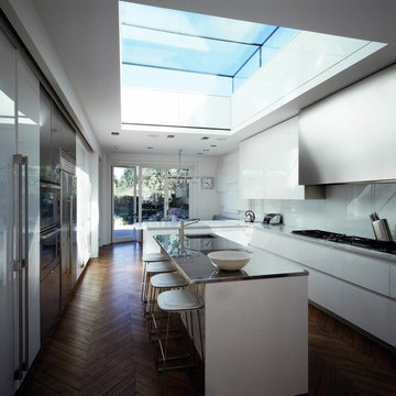
Extension and refurbishment of a semi-detached house in Hern Hill.
Extensions are modern using modern materials whilst being respectful to the original house and surrounding fabric.
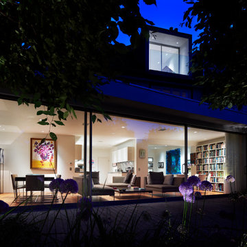
Views to the treetops beyond draw occupants from the entrance, through the house and down to the double height kitchen at garden level.
From the playroom window seat on the upper level, children (and adults) can climb onto a play-net suspended over the dining table.
The mezzanine library structure hangs from the roof apex with steel structure exposed, a place to relax or work with garden views and light. More on this - the built-in library joinery becomes part of the architecture as a storage wall and transforms into a gorgeous place to work looking out to the trees. There is also a sofa under large skylights to chill and read.
The kitchen and dining space has a Z-shaped double height space running through it with a full height pantry storage wall, large window seat and exposed brickwork running from inside to outside. The windows have slim frames and also stack fully for a fully indoor outdoor feel.
A holistic retrofit of the house provides a full thermal upgrade and passive stack ventilation throughout. The floor area of the house was doubled from 115m2 to 230m2 as part of the full house refurbishment and extension project.
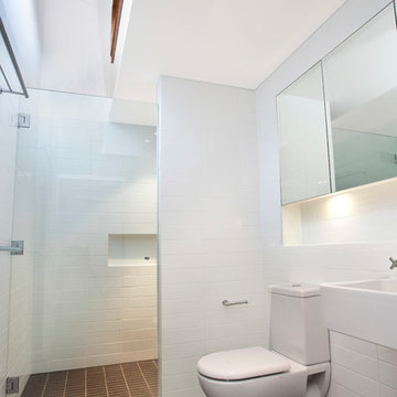
A huge master bathroom is achieved with a freestanding bath, double sink, double shower and fantastic views without being overlooked.
The master bedroom has a walk-in wardrobe room with its own window.
The children's bathroom is fun with under the sea wallpaper as well as a separate shower and eaves bath tub under the skylight making great use of the eaves space.
The loft extension makes maximum use of the eaves to create two double bedrooms, an additional single eaves guest room / study and the eaves family bathroom.
5 bedrooms upstairs.
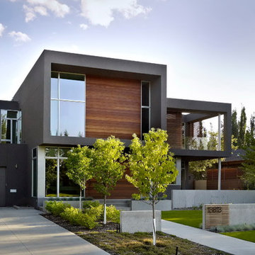
Project :: SD House
Design by :: www.thirdstone.ca
Photography: merle prosofsky
Inspiration for a modern wood exterior home remodel in Edmonton
Inspiration for a modern wood exterior home remodel in Edmonton
The choice of wood cladding adds warmth and contrast to the modern exterior while defining each half of these two semi detached homes.
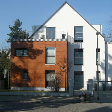
Mid-sized modern three-story mixed siding gable roof idea in Berlin
Mid-sized modern three-story mixed siding gable roof idea in Berlin
Our latest project combines a modern resort style with contemporary hard structures that deal with the sites steep topography. Incorporating the pool as part of the retaining has helped create a stunning landscape to live within. Steve Taylor
Significant alterations and additions are proposed for this semi detached dwelling on Clovelly Rd, including a new first floor and major ground floor alterations. A challenging site, the house is connected to a semi, which has already carried out extensive additions and has a 4-storey face brick unit building to the East.
The proposal aims to keep a lot of the ground floor walls in place, yet allowing a large open plan living area that opens out to a newly landscaped north facing rear yard and terrace.
The existing second bedroom space has been converted into a large utilities room, providing ample storage, laundry facilities and a WC, efficiently placed beneath the new stairway to the first floor.
The first floor accommodation comprises of 3 generously sized bedrooms, a bathroom and an ensuite off the master bedroom.
Painted pine lines the cathedral ceilings beneath the gable roof which runs the full length of the building.
Materials have been chosen for their ease and speed of construction. Painted FC panels designed to be installed with a minimum of onsite cutting, clad the first floor.
Extensive wall, floor and ceiling insulation aim to regulate internal environments, as well as lessen the infiltration of traffic noise from Clovelly Rd.
High and low level windows provide further opportunity for optimal cross ventilation of the bedroom spaces, as well as allowing abundant natural light.
When architect, Gregory Phillips and his family bought a semi detached
house 8 years he didn't realise that the house would become a laboratory
for ideas that he would use on some of the most glamorous houses in
England.
Gregory Phillips Architects has won national and international awards for
both the interior design of houses and the architecture. He designs new
houses and substantial extensions and refurbishments.
His clients include many from’ the rich list’ and many are leaders in their
fields in the world of finance, technology, property and sport as well as
entrepreneurs. He does also work on more modest projects that offer
interest and excitement to the office.
Working on his own house over 8 years has allowed him to make sure his
ideas and products that he uses work well and to ensure that he
understands how houses have to accommodate the changing needs of a
family. He has also developed his own tastes and the upgrades to the house mirror the increase in expectation that his clients have demonstrated over the last 8 years.
The house he bought was at first glance a very ordinary metropolitan
style semi detached 30s house. It had been left in a poor state and had
an extremely ugly rear extension that looked more like a portakabin than
a house. ( you have the image) Over 8 years Gregory carried out several distinct projects as and when funds were available and when the family's needs changed.
Gregory advises his clients to carry out the work at one time, it's
easier for them that way as Gregory can take care of all their needs, he
is both a members of the Royal Institute of British Architects and
Institute of Interior Design. His office designs the architecture,
interiors and landscape, offering a total solution¹ where clients wish.
However on his own house, he extended the level of control and also
project managed the works sourcing the labour and all materials. He would not advise you do this at (your) home!
In the first six months after the purchase, the wiring was replaced and
plumbing upgraded. Walls and ceilings were plastered. Gregory says this
phase was necessary just to make the house safe and live able.
Whilst this was happening, planning consent was achieved for the future
ground floor and roof extensions to the house.
Then after a year, the major project was carried out whereby the house
was extended, the garage converted to be part of the house and the
kitchen and bathrooms were replaced. The house was decorated and
furnished with Gregory's favourite pieces. After this the house started
winning awards and gaining acclaim. Including (see website for
details)
http://www.gregoryphillips.com/p/awards/muswell-hill-2
http://www.gregoryphillips.com/p/awards/muswell-hill-3
http://www.gregoryphillips.com/p/awards/muswell-hill-4
People loved the house because of the extensive use of glass, the
inside/outside experience. Truly a modern house hidden behind a standard
30s semi. (See articles on web site).
http://www.gregoryphillips.com/wp-content/uploads/SundayTimes08.pdf
http://test.gregoryphillipsarchitects.com/wp-content/uploads/Spaces.pdf
http://www.gregoryphillips.com/wp-content/uploads/BritishTalents.pdf
Then after a gap of 4 years, Gregory decided that with his youngest
daughter now 10 years old, that he and his wife would enjoy a luxury
bedroom suite on their own floor, so a roof conversion that included a
spectacular balcony with views of the garden was in order.
The project included a bedroom with beautiful whitened ash flooring and
straight grain stained grey oak cabinetry, all to Gregorys specification.
There is a dedicated dressing room area with shelves for Sara¹s shoe
collection, ever women¹s dream? Then their is the marble ensuite bathroom with
free standing bath, steam room shower (with built in sound system), all
with views of the trees. Ample storage is provided a there is even a ‘man
cave¹ and loft spaces for extra storage. The bedroom is set up with a
home cinema audio/visual system, lutron lighting giving mood settings and
with the balcony, it truly gives you everything a main bedroom needs.
The new top floor illustrated Gregory’s growing love of exquisite finishes
and craftsmanship, something he likes to provide for his clients.
Following on from this, in the next stages of work, gregory upgraded the
front garden and continued with developing the rear garden , one of his
passions and an on going project since 2007.
What he did to the front garden involved, upgrading the yorkstone paving,
a new resin bonded gravel drive, new planting including 3 dramatic
Quercus Ilex trees adjacent to the garden entrance path and beautiful planting.
The rear garden evolved as follows….initially when the extension was
added to the house, Gregory redesigned the garden adding 7 bleached beech
trees, hedging and a stunning assortment of plants, bulbs and grasses. However
more recently a yorkstone path and a new lawn with drainage has been
added. Gregory has formalised the garden into external rooms¹ with the
most emphasis on the room most visible from the house. Always keeping in
mind the painterly view that there should be a near view, mid view and
long perspective.
Gregory says ‘if you have a lot of glass, you need a fantastic view"
Gregory's work always incorporates internal spaces that enjoy the
exterior spaces.
Gregory has a different approach to many other architects and designers. Some consider big ideas. Many designers concentrate on making objects, some can achieve high levels of craftsmanship, some consider energy conservation. There are those that can select furniture but need help on the bigger picture. Gregory considers the project in a holistic manner. For him it is about lifestyle, comfort and all of the above. It is not a linear process but iterative and his experience building houses for himself and others benefits every new project.
He views the house as a sanctuary as well as support for your lifestyle.
Gregory and his wife have always been followers of the contemporary art
world. Indeed Sara worked at the Royal Academy. Gregory has designed
several commercial art galleries in London and has worked for art
collectors. So the house incorporates modern art that they have bought
and inherited from family, including Sara¹s grandmother Tania Gordon who
painted vibrant canvasses with the use of thick oil paint. However
Gregory has also added to the collection with his own paintings. Which include large abstract paintings and some figurative work.
The house has accommodated large parties from friends, teenage parties,
regular family dinners, children¹s sleep overs as well as life drawing
classes which Gregory organises, local community talks and meetings.
Gregory has found that over the last 8 years his clients expectations for their houses have risen. Everybody wants a high level of luxury and most of his clients have stayed in fantastic hotels around the world and want to replicate the luxury. However they want to create a home that is bespoke for them. Gregory’s office is situated in Savile Row, so combined with his approach to design, Gregory knows how to provide bespoke houses and aims to replicate and surpass the level of service obtained when you have a bespoke suite made.
However if you ask Gregory has he finished, he will say, no, I still have
a few more projects in the house up my sleeve and then I will think
about, one day, building a new house.
Arnal Photography
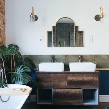
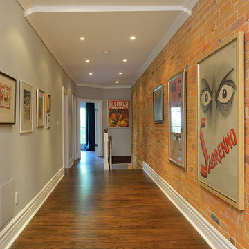
This homeowner renovated semi-detached home in Toronto is one of those rare spaces I recently photographed for a realtor friend. From what the homeowner has told me, the stained glass and light fixtures were with the house… in the attic… when they purchased it. Over a period of years they removed plaster, revealing the brick behind it, closed in the wall between the dining room and the living room (which had been opened by a previous owner) using the stained glass panels. The interesting thing was that the stained glass panels were all slightly different sizes, so their treatment in mounting them had to be especially careful.
They also paid particular attention to maintaining the heritage look of the space while upgrading utilities and adding their own more modern touches. The eclectic blend just adds to the charm of the home. Not afraid of bright colour, the daughter’s room is a shocking shade of orange, but somehow, it works!
Unfortunately, being the photographer, I have little information on sourcing aside from knowing that the kitchen is from Ikea. That said, I think this is a space that holds inspiration beyond the imagination!
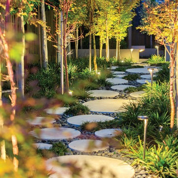
Podology Landscape Architecture, Construction and Maintenance
Tom Ferguson Photography
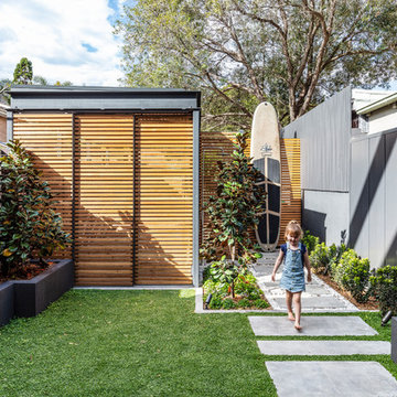
Photo of a contemporary backyard garden path in Sydney.
Photo of a contemporary backyard garden path in Sydney.
Showing Results for "Semi Detached House Landscaping Ideas"
The works involved the complete refurbishment of a 1920's red brick and hanging tile detached house within a conservation area in Hampstead. The house had been in single occupation for many years, and had been extended in a 70's style not in keeping with either our clients new functional requirements or the orginal logic of the house. The client sought to subtly mix of the aesthetic of the orginal Arts and Crafts style with their passion for 1930/40's French deco and the practicality of a modern home. The existing footprint at ground floor but the more shoddy extensions were shorn and the orginal walls were tweaked to provide a better flow and circulation. The later and less durable alterations in the upper floors were completely removed as well as a dilapidated wooden pool house and crazy paving landscape of a similar era to the internal alterations were completely remodeled. The project exemplifies our approach of undertaking all aspects of the design, including the designed aspect of the design from the table linen to the architectural design and the landscape work.
Significant alterations and additions are proposed for this semi detached dwelling on Clovelly Rd, including a new first floor and major ground floor alterations. A challenging site, the house is connected to a semi, which has already carried out extensive additions and has a 4-storey face brick unit building to the East.
The proposal aims to keep a lot of the ground floor walls in place, yet allowing a large open plan living area that opens out to a newly landscaped north facing rear yard and terrace.
The existing second bedroom space has been converted into a large utilities room, providing ample storage, laundry facilities and a WC, efficiently placed beneath the new stairway to the first floor.
The first floor accommodation comprises of 3 generously sized bedrooms, a bathroom and an ensuite off the master bedroom.
Painted pine lines the cathedral ceilings beneath the gable roof which runs the full length of the building.
Materials have been chosen for their ease and speed of construction. Painted FC panels designed to be installed with a minimum of onsite cutting, clad the first floor.
Extensive wall, floor and ceiling insulation aim to regulate internal environments, as well as lessen the infiltration of traffic noise from Clovelly Rd.
High and low level windows provide further opportunity for optimal cross ventilation of the bedroom spaces, as well as allowing abundant natural light.
7