


Search results for "Wife's age" in Home Design Ideas
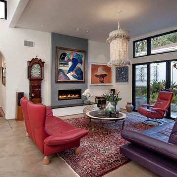
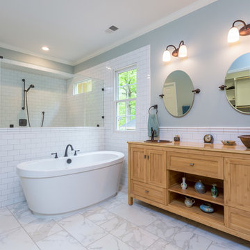
The goal for these clients was to build a new home with a transitional design that was large enough for their children and grandchildren to visit, but small enough to age in place comfortably with a budget they could afford on their retirement income. They wanted an open floor plan, with plenty of wall space for art and strong connections between indoor and outdoor spaces to maintain the original garden feeling of the lot. A unique combination of cultures is reflected in the home – the husband is from Haiti and the wife from Switzerland. The resulting traditional design aesthetic is an eclectic blend of Caribbean and Old World flair.
Jim Barsch Photography
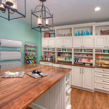
A couple wished to turn the unfinished half of their Creve Coeur, MO basement into special spaces for themselves and the grandchildren. Four functions were turned into 3 separate rooms: an arts and crafts room for the grandkids, a gift wrapping room for the wife, with office space for both of them, and a work room for the husband (not pictured).
The 3 rooms are accessed by a large hall, which houses a deep, stainless steel sink operated by foot pedals, which comes in handy for greasy, sticky or paint-smeared hands of all ages.
The gift wrapping room is adult art projects plus an office work space. Grandparents can leave their projects out and undisturbed by little ones by simply closing the French doors. Custom Wellborn cabinetry becomes work tables with the addition of wood tops. The impressive floor-to-ceiling hutch cabinet that holds gift wrapping supplies is custom-designed and built by Mosby to fit exact crafting needs.
Photo by Toby Weiss
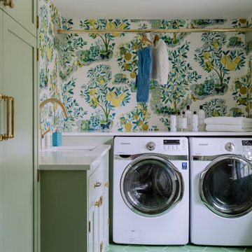
The homeowners wanted to adapt the space into a home where they could age-in-place. This meant reworking a three-season porch into a space that could accommodate an extra bathroom with a laundry space
Photo by David J. Turner
Find the right local pro for your project
A new home plans for 'aging in place' that allows the homeowners to comfortably live in their home as the age.
Woodmeister Master Builders - General Construction and Custom Cabinetry
Nashawtuc Architects - Architecture
Elm Bank Studio - Interior Design
Gary Sloan Studios - Photography
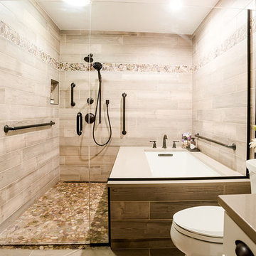
This master bath remodel features a beautiful corner tub inside a walk-in shower. The side of the tub also doubles as a shower bench and has access to multiple grab bars for easy accessibility and an aging in place lifestyle. With beautiful wood grain porcelain tile in the flooring and shower surround, and venetian pebble accents and shower pan, this updated bathroom is the perfect mix of function and luxury.
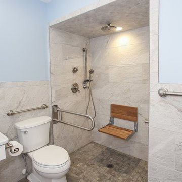
Curb-less roll-in porcelain tiled shower with rainfall shower head, teak fold down seat, hand shower, and strategic grab bar placement
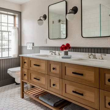
Mid-sized transitional 3/4 gray tile and porcelain tile porcelain tile and gray floor bathroom photo in Atlanta with furniture-like cabinets, white cabinets, a two-piece toilet, blue walls, an undermount sink, quartz countertops and white countertops
Mid-sized transitional 3/4 gray tile and porcelain tile porcelain tile and gray floor bathroom photo in Atlanta with furniture-like cabinets, white cabinets, a two-piece toilet, blue walls, an undermount sink, quartz countertops and white countertops
Susan and Doug loved their two-story home set on a lovely large and secluded wooded lot in a quiet and centrally located neighborhood in Apex, NC.
They decided that they would retire in the home, but were aware of their need to transition to a first-floor fully accessible living environment as they aged so that they could remain in their home as long as possible. Our solution was to design and build a first-floor Master Bedroom suite that flows seamlessly into the other living areas on their first floor, and also serves to bring more of the “outdoors in”, allowing them to enjoy more of their lovely large wooded back yard and gardens.
The Aging in Place and Special Needs Accessible Master Bedroom Suite Addition transformed their two-story home into a fully accessible and functional 1st Floor retirement home, with guest suites on the 2nd Floor!
The Master Suite Addition features a large master bedroom with generous windows that looks out on the lovely wooded back yard and creates a light and bright interior. The large master bathroom features an amazing tiled barrier-free shower, large closet, free-standing tub, and fully wheelchair accessible water closet.
Beautiful natural finish hardwood floors flow into the fully wheelchair accessible and barrio-free kitchen, dining room, and family room. The large wrap-around deck extends the living space into the large private back yard, and ties the master bedroom in with the screened porch.
Special Features:
Fully Aging in Place and Special Needs Accessible 1st Floor Home.
Generous windows to bring in natural light and the lovely private and wooded back yard.
Energy efficient advanced building science techniques.
Amazing tiled barrier-free shower and master bath.
Integration of sentimental heirloom vanity and several hand-made pottery vessel sinks.
Beautiful natural finish hardwood floors.
Wrap-around deck that extends the barrier-free living spaces into the private back yard.
This aging in place bathroom was designed to invoke a spa feel while offering the homeowner safety features throughout such as the grab bar towel holder.
Transformed un-used living room into new spacious kitchen. Opened wall up to form open plan living space of kitchen, dining and living. Jen air appliance package supplied by Mrs. G Appliances
Photography by: Jeffrey E Tryon
Transformed un-used living room into new spacious kitchen. Opened wall up to form open plan living space of kitchen, dining and living.
Photography by: Jeffrey E Tryon
Construction by SoCalContractor.com
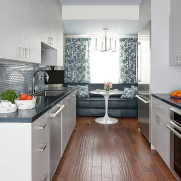
Inspiration for a transitional galley eat-in kitchen remodel in Los Angeles with an undermount sink, flat-panel cabinets, gray cabinets, solid surface countertops, gray backsplash, ceramic backsplash and stainless steel appliances
Inspiration for a transitional galley eat-in kitchen remodel in Los Angeles with an undermount sink, flat-panel cabinets, gray cabinets, solid surface countertops, gray backsplash, ceramic backsplash and stainless steel appliances
The owners of this kitchen had spent the money to upgrade the finishes in their kitchen upon building the home 12 years ago, but after living in the space for several years they realized how nonfunctional the layout really was. The (then) two preschool aged children had grown into busy, hungry teenagers with many friends who also liked to hang out at the house. So the family needed a more functional kitchen with better traffic flow, space for daily activities revolving around the kitchen at different times of day, and a kitchen that could accommodate cooking for and serving large groups. Furthermore, the dark, traditional finishes no longer reflected the homeowners’ style. They requested a brighter, more relaxed, coastal style that reflected their love of the seaside cities they like to visit.
Originally, the kitchen was U-shaped with a narrow island in the middle. The island created narrow aisles that bottle-necked at the dishwasher, refrigerator, and cooktop areas. There was a pass-through from the foyer into the kitchen, but the owners never liked that the pass-through was also located so close to the powder room. The awkward proximity was unappealing and made guests feel uncomfortable.
The kitchen’s storage was made up of lots of narrow cabinets, apothecary drawers, clipped corner units, and very few drawers. It lacked useful storage for the larger items the family used on a daily basis. And the kitchen’s only pantry was small closet that had only builder-grade, narrow shelving with no illumination to be able to see the contents inside.
Overall, the kitchen’s lighting plan was poorly executed. Only six recessed cans illuminated the entire kitchen and nook areas. The under cabinet lighting was not evenly distributed either. In fact, the builder had mis-placed the under cabinet lighting around the decorative pilasters which made for choppy, dark cubbies. Further, the builder didn’t include any lighting over the sink or the bar area, which meant whoever was doing the dishes was always in their own shadow. That, coupled with the steep overhang of the game room above made the bar area feel like a dim, cavernous space that wasn’t inviting or task oriented. The kitchen looked out into the main living space, but the raised bar and a narrow wall (which held the only large cabinet in the kitchen) created more of a barrier than a relationship to the living room or breakfast nook. In fact, one couldn’t even see the breakfast nook from the cooktop or sink areas due to its orientation. The raised bar top was too narrow to comfortably sit to either dine at or chat from due to the lack of knee space. The the homeowners confided that the kitchen felt more like a dark, dirty prison than place where the family, or their guests, wanted to gather and commune.
The clients' needs and desires were:
➢ to create a kitchen that would be a space the family loved to be in; to relate to the adjacent spaces all around, and to have better flow for entertaining large groups
➢ to remove the walls between the breakfast nook and living area and to be able to utilize the natural light from the windows in both those areas
➢ to incorporate a functional chopping block for prepping fresh food for home cooked meals, an island with a large sink and drain board, 2 pull out trash cans, and seating for at least the 2 teens to eat or do homework
➢ to design a kitchen and breakfast nook with an airy, coastal, relaxed vibe that blended with the rest of the house's coastal theme
➢ to integrate a layered lighting plan which would include ample general illumination, specific task lighting, decorative lighting, and lots of illuminated storage
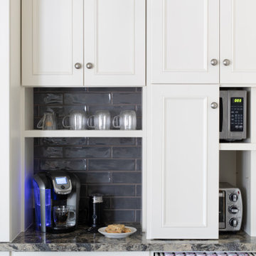
➢ to design a kitchen with not only more storage for all the husband’s kitchen gadgets and collection of oils and spices, but smart storage, including a coffee/breakfast bar and a place to store and conceal the toaster oven and microwave
➢ to find a way to utilize the large open space between the kitchen, pantry area, and breakfast nook
Twelve Stones Designs achieved the owner's goals by:
➢ removing the walls between the kitchen and living room to allow the natural light to filter in from the adjacent rooms and to create a connection between the kitchen, nook, and living spaces for a sense of unity and communion
➢ removing the existing pantry and designing 3 large pantry style cabinets with LED tape lights and rollout drawers to house lots of kitchen appliances, gadgets, and tons of groceries. We also took the cabinets all the way up to the 9’ ceiling for additional storage for seasonal items and bulk storage.
➢ designing 2 islands - 1 with a gorgeous black walnut chopping block that houses a drawer for chopping and carving knives and a custom double pull out trash unit for point of use utilization - and 1 that houses the dishwasher, a large Blanco Gourmet sink with integrated drain board, woven baskets for fresh root vegetables and kitchen towels, plenty of drawer storage for kitchen items, and bar seating for up to 4 diners.
➢ closing off the space between the kitchen and the powder room to create a beautiful new private alcove for the powder room as well as adding some decorative storage. This also gave us space to include more tall storage near the new range for precision placement of the husband’s extensive oil and spice collection as well as a location for a combo-steam oven the wife wanted for baking and cooking healthy meals.
The project is enhanced functionally by:
➢ incorporated USB and standard receptacles for the kids’ laptops and phone charging in the large island
➢ designing the small island to include additional open shelving for items used on a daily basis such as a variety of bowls, plates, and colanders. This set up also works well for the husband who prefers to “plate” his dinners in restaurant-style fashion before presenting them to the table.
➢ the integration of specific storage units, such as double stacked cutlery drawers, a custom spice pull-out, a Kuerig coffee and tea pod drawer, and custom double stacked utensil drawers
➢ moving the refrigerator to the old oven location - this eliminated the bottle neck as well as created a better relationship to the eating table. It also utilizes the floor space between the pantry, nook, and kitchen
➢ creating a banquet style breakfast nook - this banquette seating not only doubles the amount of seating for large gatherings but it better utilizes the odd space between the kitchen and the previous nook area. It also helps to create a distinct pathway from the mudroom room through the pantry area, kitchen, nook, and living room.
➢ the coffee/breakfast bar area which includes the perfect location for the concealed microwave and toaster oven, convenient storage for the coffee pods and tea accoutrements. Roll-out drawers below also house the smoothie maker, hot water kettle, and a plethora of smoothie-making ingredients such as protein powders, smoothie additives, etc. Furthermore, the drawers below the Keurig house measuring utensil, cutlery, baking supplies and tupperware storage.
➢ incorporating lots of wide drawers and pullouts to accommodate large cookware.
➢ utilizing as much vertical space as possible by building storage to the ceiling which accommodates the family’s abundant amount of serving platters, baking sheets, bakeware, casserole dishes, and additional cutting boards.
The project is enhanced aesthetically by:
➢ new 5-piece Versailles pattern porcelain tile that now seamlessly joins the entire down stairs area together creating a bright, cohesiveness feeling instead of choppy separated spaces - it also adds a coastal feeling
➢ designing a cabinet to conceal the microwave and toaster oven
➢ the coastal influenced light fixtures over the nook table and island
➢ the sandy colors of the Langdon Cambria countertops. The swirling pattern and sparkling quartz pieces remind the homeowner of black-and-tan sandy beaches
➢ the striped banquet seating whose creamy white background and blue-green stripes were the inspiration for the cabinet and wall colors.
➢ All the interior doors were painted black to coordinate with the blacks and grays in the backsplash tile and countertop. This also adds a hint of tailored formality to an otherwise casual space.
➢ the use of WAC's Oculux small aperture LED units for the overhead lighting complimented with Diode LED strips for task lighting under the cabinets and inside the pantry and glass wall cabinets. All of the lighting applications are on separate dimmer switches.
Innovative uses of materials or construction methods by Realty Restoration LLC:
➢ Each 1-1/2” x 3” block of reclaimed end-grain black walnut that makes up the center island chopping block was hand milled and built in the shop. It was designed to look substantial and proportional to the surrounding elements, executed by creating the 4 inch tall top with a solid wood chamfered edge band.
➢ The metal doors on either side of the vent hood were also custom designed for this project and built in the Realty Restoration LLC shop. They are made 1x2, 11-gauge mild steel with ribbed glass. Weighing 60 lbs a piece, heavy duty cabinet hinges were added to support the weight of the door and keep them from sagging.
➢ Under-cabinet receptacles were added along the range wall in order to have a clean, uninterrupted backsplash.
Design obstacles to overcome:
➢ Because we were removing the demising walls between the kitchen and living room, we had to find a way to plumb and vent the new island. We did this by tunneling through the slab (the slab had post tension cables which prevented us from just trenching) to run a new wet vent through a nearby structural wall. We pulled the existing hot and cold lines between upper floor joists and ran them down the structural wall as well and up through a conduit in the tunnel.
➢ Since we were converting from wall overs to a gas range it allowed us to utilize the 220 feed for the wall ovens to provide a new sub panel for all the new kitchen circuits
➢ Due to framing deficiencies inherited from the original build there was a 1-1/2” differential in the floor-to-ceiling height over a 20 foot span; by utilizing the process of cutting and furring coupled with the crown moulding details on the cabinet elevations we were able to mask the problem and provide seamless transitions between the cabinet components.
Evidence of superior craftsmanship:
➢ uniquely designed, one-of-a-kind metal “X” end panels on the large island. The end panels were custom made in the Realty Restoration LLC shop and fitted to the exact dimensions of the island. The welding seams are completely indistinguishable - the posts look like they are cut from a single sheet of metal
➢ square metal posts on the small island were also custom made and designed to compliment and carry through the metal element s throughout the kitchen
➢ the beautiful, oversized end panels on the pantry cabinets which give the breakfast nook a tailored look
➢ integrating a large format 5 piece Versailles tile pattern to seamlessly flow from the existing spaces into the new kitchen space
➢ By constructing a custom cabinet that jogged around a corner we could not remodel (housing the entry way coat closet) we were able to camouflage the adjacent wall offset within the upper and lower cabinets. By designing around the existing jog in the structural walls we accomplished a few things: we were able to find the space to house, and hide, the microwave and toaster oven yet still have a clean cohesive appearance from the kitchen side. Additionally, the owners were able to keep their much needed coat closet and we didn’t have to increase the budget with unnecessary structural work.
Sponsored
Over 300 locations across the U.S.
Schedule Your Free Consultation
Ferguson Bath, Kitchen & Lighting Gallery
Ferguson Bath, Kitchen & Lighting Gallery
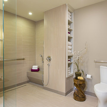
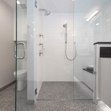
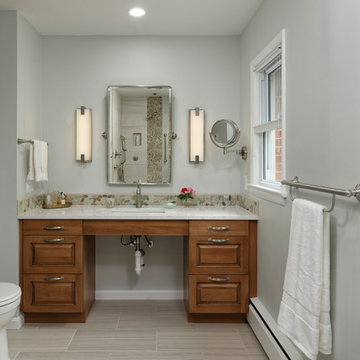
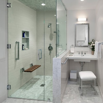
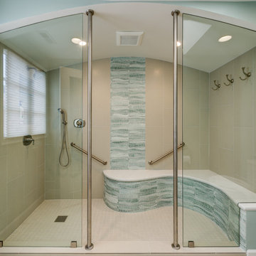
This bathroom remodel was designed for a baby-boomer couple in Austin. Previously, in order to reach their shower, toilet and bathtub, the homeowners had to step onto a raised platform. This was a safety concern for the couple, and a potential barrier to remaining in the home as they age. Our design firm designed the new space to be a beautiful contemporary space that is also barrier free and accessible. The bathroom includes many universal design features such as a roll-in shower, a linear drain, a built-in shower bench with a nearby hand-held shower head, designer grab bars, European vanities, and improved lighting.
Photographs by Bella Vista Photography
Summary of Scope: gut renovation/reconfiguration of kitchen, coffee bar, mudroom, powder room, 2 kids baths, guest bath, master bath and dressing room, kids study and playroom, study/office, laundry room, restoration of windows, adding wallpapers and window treatments
Background/description: The house was built in 1908, my clients are only the 3rd owners of the house. The prior owner lived there from 1940s until she died at age of 98! The old home had loads of character and charm but was in pretty bad condition and desperately needed updates. The clients purchased the home a few years ago and did some work before they moved in (roof, HVAC, electrical) but decided to live in the house for a 6 months or so before embarking on the next renovation phase. I had worked with the clients previously on the wife's office space and a few projects in a previous home including the nursery design for their first child so they reached out when they were ready to start thinking about the interior renovations. The goal was to respect and enhance the historic architecture of the home but make the spaces more functional for this couple with two small kids. Clients were open to color and some more bold/unexpected design choices. The design style is updated traditional with some eclectic elements. An early design decision was to incorporate a dark colored french range which would be the focal point of the kitchen and to do dark high gloss lacquered cabinets in the adjacent coffee bar, and we ultimately went with dark green.
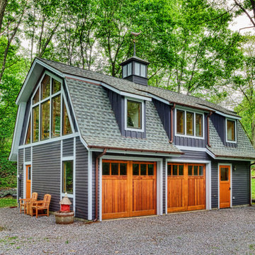
The conversion of this iconic American barn into a Writer’s Studio was conceived of as a tranquil retreat with natural light and lush views to stimulate inspiration for both husband and wife. Originally used as a garage with two horse stalls, the existing stick framed structure provided a loft with ideal space and orientation for a secluded studio. Signature barn features were maintained and enhanced such as horizontal siding, trim, large barn doors, cupola, roof overhangs, and framing. New features added to compliment the contextual significance and sustainability aspect of the project were reclaimed lumber from a razed barn used as flooring, driftwood retrieved from the shores of the Hudson River used for trim, and distressing / wearing new wood finishes creating an aged look. Along with the efforts for maintaining the historic character of the barn, modern elements were also incorporated into the design to provide a more current ensemble based on its new use. Elements such a light fixtures, window configurations, plumbing fixtures and appliances were all modernized to appropriately represent the present way of life.
Showing Results for "Wife's Age"
Jim Bartsch Photography
Bathroom - mid-sized transitional master white tile and subway tile mosaic tile floor and gray floor bathroom idea in Los Angeles with a wall-mount sink, gray walls, a hinged shower door and a niche
Bathroom - mid-sized transitional master white tile and subway tile mosaic tile floor and gray floor bathroom idea in Los Angeles with a wall-mount sink, gray walls, a hinged shower door and a niche
A young couple with three small children purchased this full floor loft in Tribeca in need of a gut renovation. The existing apartment was plagued with awkward spaces, limited natural light and an outdated décor. It was also lacking the required third child’s bedroom desperately needed for their newly expanded family. StudioLAB aimed for a fluid open-plan layout in the larger public spaces while creating smaller, tighter quarters in the rear private spaces to satisfy the family’s programmatic wishes. 3 small children’s bedrooms were carved out of the rear lower level connected by a communal playroom and a shared kid’s bathroom. Upstairs, the master bedroom and master bathroom float above the kid’s rooms on a mezzanine accessed by a newly built staircase. Ample new storage was built underneath the staircase as an extension of the open kitchen and dining areas. A custom pull out drawer containing the food and water bowls was installed for the family’s two dogs to be hidden away out of site when not in use. All wall surfaces, existing and new, were limited to a bright but warm white finish to create a seamless integration in the ceiling and wall structures allowing the spatial progression of the space and sculptural quality of the midcentury modern furniture pieces and colorful original artwork, painted by the wife’s brother, to enhance the space. The existing tin ceiling was left in the living room to maximize ceiling heights and remain a reminder of the historical details of the original construction. A new central AC system was added with an exposed cylindrical duct running along the long living room wall. A small office nook was built next to the elevator tucked away to be out of site.
The client's purchased an 80's condo unit of the 4th floor.
The main goal(s): To create a space suitable for aging-in-place and to successfully incorporate pre-existing furniture and decor from the client's previous home.
The challenges:
- To be able to fully incorporate existing furniture into a smaller space, as the client's had down-sized by moving into a condo unit.
- Creating and providing a wide range of accessibility and universal design to accommodate certain health issues of one of the clients.
Inspiration: Existing arches throughout the home.
Treve Johnson Photography
1