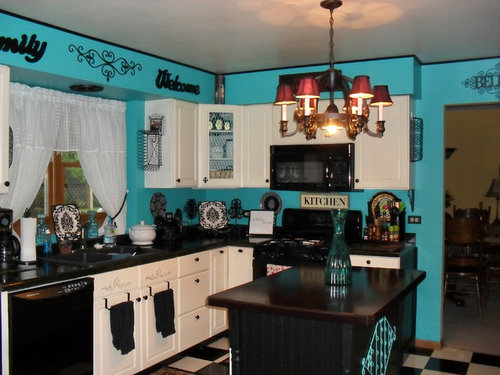
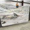
Wanted to brighten my dark Red Tuscan kitchen.
bush39612
11 years ago
Featured Answer
Sort by:Oldest
Comments (24)
User
11 years agolast modified: 11 years agoRelated Professionals
Fort Lewis Architects & Building Designers · Frisco Architects & Building Designers · Hemet Kitchen & Bathroom Designers · North Versailles Kitchen & Bathroom Designers · Waianae Kitchen & Bathroom Designers · Franklin Furniture & Accessories · Bay Shore General Contractors · Leon Valley General Contractors · Midlothian General Contractors · Palatine General Contractors · Palestine General Contractors · Randolph General Contractors · Vermillion General Contractors · Waianae General Contractors · Waterville General Contractorsbush39612
11 years agotdelforge
11 years agomichigammemom
11 years agoSouthern Patina Home
11 years agoAmber Vercler
11 years agoTRS Designs, Inc (Kitchens, Baths, & More)
11 years agoSusan Jablon Mosaics
11 years agolefty47
11 years agoseverns
11 years agoSusan Jablon Mosaics
11 years agoanitajoyce
11 years agocpdjustice
11 years agoMichelle Chamberlain
11 years agopaigefar
11 years agolast modified: 11 years agoelcieg
11 years agoRhonda
11 years agohockey456
11 years agovictorianbungalowranch
11 years agogullybansal
11 years agoWendy Hamilton
8 years agoJennifer Vance
8 years agoGato Playa
8 years ago
Related Stories
KITCHEN DESIGNKitchen of the Week: A Dark Kitchen Brightens Up
A cooking space honors the past while embracing the present
Full Story
KITCHEN DESIGNKitchen of the Week: All-American Style Brightens a Craftsman
Fire destroyed it, but this Portland kitchen came back better than ever thanks to its remodel's focus on light and storage
Full Story
DECORATING GUIDESLighten Up — or Brighten Up — With Yellow
You can use this versatile color to create a buttery backdrop, add a zesty accent or make a bold design statement
Full Story
HOUZZ TOURSMy Houzz: Creative Flair Brightens a San Francisco Apartment
Furniture hacks and a cheery color palette personalize a couple’s apartment in a converted Victorian
Full Story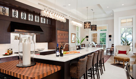
KITCHEN OF THE WEEKKitchen of the Week: Bling Brightens a Luxe Florida Kitchen
Sparkly chandeliers and decorative iron rings dress up a streamlined cooking space filled with ebony and ivory hues
Full Story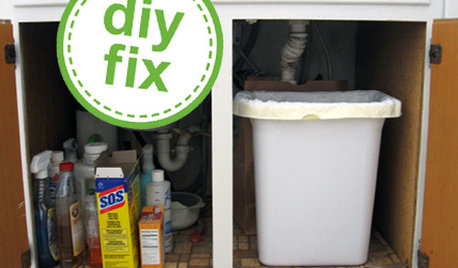
KITCHEN DESIGNQuick Project: Brighten the Space Under Your Kitchen Sink
Give yourself a lift with a refreshed place for your kitchen cleaning supplies
Full Story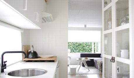
HOUZZ TOURSMy Houzz: White Interiors Brighten a Dutch Cottage
Snowy finishes and minimal accessories give a compact 2-bedroom home for a family of 5 a more open feel
Full Story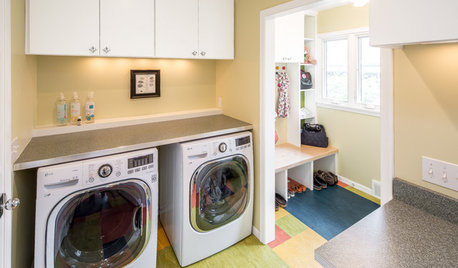
MOST POPULARA Colorful Place to Whiten Whites and Brighten Brights
This modern Minnesota laundry-mudroom gets a smarter layout and a more lively design
Full Story
HOUZZ TOURSHouzz Tour: A New Conservatory Brightens a Converted Carriage House
A year in Barcelona and fond memories of London spur a new sunny addition and a whole-house refresh
Full Story







Southern Patina Home