Shop Products
Houzz Logo Print
auroraborelis

Grey Paint Color ideas - leaning towards BM edgecomb grey

auroraborelis
10 years ago

Anyone have any great light grey paint colors to share? I'm leaning towards BM edgecomb grey and Revere Pewter, but I am at a complete decision overload moment and need some help considering other ideas.

Any suggestions?

Comments (19)

  • MFatt16
    10 years ago

    Don't use those two together. They will not contrast enough to show a difference. Have you looked on Houzz? They have great images of painted rooms.

    Some others from to consider are Elephant Gray, Portland Gray,Shenandoah Taupe, Cape hatteras sand, Pismo dunes, and Sandlot gray.

    Have fun!

  • pps7
    10 years ago

    Look at BM gray owl too.

    We used BM Natural cream, which is almost identical to edgeomb. Revere pewter was a close second but the natural cream flowed better with our other color choices.

  • virgilcarter
    10 years ago

    Ummm....what do you plan to do with the paint, i.e., what will you be painting? Seems like that's important to know before recommending anything. For example, all paint looks very different on the exterior in natural daylight than it does on the interior in reduced lighting intensity.

    Good luck on your project.

  • MFatt16
    10 years ago

    You always have to come on here pointing out what all the rest of us miss Virgil! Quit making sense all the time. :) J/K

  • auroraborelis
    Original Author
    10 years ago

    Sorry, I am looking for interior wall colors.

  • virgilcarter
    10 years ago

    MFatt16, my bad! It's just the way my little brain seems to work (when it works at all)! :)

  • pbx2_gw
    10 years ago

    As with any paint, you really need to get it on your wall & maybe an entire room in your light to see what it looks like in 4D!

    To us, the EG looks like a linen/beigier grey but you never know with pictures only.

    We went with Grey Owl ourselves but when we first put a swatch on our walls, it actually looked a bit green. But then it went on an entire room & looked exactly the we had imagined it - lighter grey.

    Here is a link that might be useful: [BM Edgecomb grey[(https://www.houzz.com/photos/benjamin-moore-edgecomb-gray-phbr0lbl-bl~l_192)

  • my4cowboys
    10 years ago

    Another good one is Alaskan Husky. Very similar to Grey Owl, but with blue-ish undertones, rather than green.

  • chispa
    10 years ago

    I did BM edgecomb gray in a few areas and I'm slowly repainting. A bit too drab and depressing for my taste. Most of my downstairs is BM Grant Beige, greigy-green or greeny greige!! Just a bit more depth and warmth than the EG.

  • bridget helm
    10 years ago

    Check out Ben moores winds breath

    I've heard good things about Sherwin wills sensible hue

  • virgilcarter
    10 years ago

    Am I the only one who wonders about those who name paint colors? I mean, who comes up with names like "Wind's Breath" and "Grey Owl"? What kind of people are in the marketing departments of the paint manufacturers?

    And the names change periodically, so there's an entirely new line of ridiculous names for the same colors! Can you imagine Monet or Homer struggling to choose between "Sunset Glow" or "Coastal Fog"?

    For example, anyone for "Shenandoah Taupe", "Cape Hatteras Sand", "Pismo Dunes", and "Sandlot Gray"?

    Thank goodness no serious (artist) painter is burdened with such consumer nonsense! Just a thought--not trying to start a paint name war.

  • virgilcarter
    10 years ago

    LOL! I wouldn't say "Ballet White" either!

  • MFatt16
    10 years ago

    This thread is crackin me up!

  • view_west
    10 years ago

    Gray has an undertone of green, purple or blue... best to match those with the surrounding colors.

    Maria Killam (of Colour me Happy blog) has a few rules for selecting gray shades. She is working out of Canada, but translation for the paint names should be available. Her posts on gray undertones including color samples are also very informative.

    -VW

    Working with Grays: 5 Rules of Thumb By Maria Killam

    1. Decide whether you want your gray to have a green, purple or blue undertone, it will make it much easier to choose.
    2. Consider your fixed elements when choosing a gray undertone.
    3. Work with the light in the room.
    4. If the house is empty at the start of a project, do not fill the walls with 10 samples of gray paint colours.
    5. Choose your fabrics first.

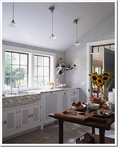
    If you look closely at this kitchen (above) the stone countertop and flooring and subway tile have a green undertone while the interior panels of the doors have been painted a blue-gray. It's subtle and doesn't look necessarily wrong (to the untrained eye) but can you see it now that I'm describing the difference? Most people can.

    Here is a link that might be useful: Image Source: What Everyone should know about Gray

  • view_west
    10 years ago

    Home Decorating & Design is also a good source.

    Here is a link that might be useful: Greys (some photos are getting a bit out of date)

  • User
    10 years ago

    It's not just about "blue, green or purple" tinted grays.

    Mixing equal quantities of the 3 primary colors (red, blue and yellow) produces black so artists don't need to own a tube of black paint or gray paint. Gray (or "grey" for those not of American persuasion) is some proportion of the 3 primary colors plus a lot of white. Varying the amounts of these 3 colors endlessly varies the color of the gray mixture. Knowing the proportion of the primary colors allows the selection of the appropriate complimentary color for a given gray.

  • virgilcarter
    10 years ago

    Actually, one can make a gray using two complementary colors, i.e., red/green, blue/orange or yellow/violet. One many also create a "tone" or "shade" by mixing a single color with gray or black.

    Gray may have a bias of any color, in other words, a "neutralized" yellow, orange, red, violet, blue, green, etc. There is no limit to the hue bias one may choose for a neutralized or gray color.

    A more useful approach may be to think about temperature--a "cool" gray or a "warm" gray. There are many, many neutralized cool and warm hues.

    A quick review of a color wheel or hue circle will help illustrate the temperature and hue bias that will work with other colors.

  • User
    10 years ago

    That's true because by definition any 2 complementary colors will contain some of all 3 primary colors so they will make near black. Adding white somewhere along the line will make the result gray.