


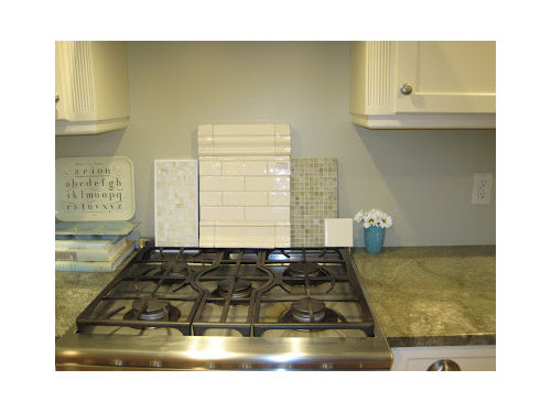
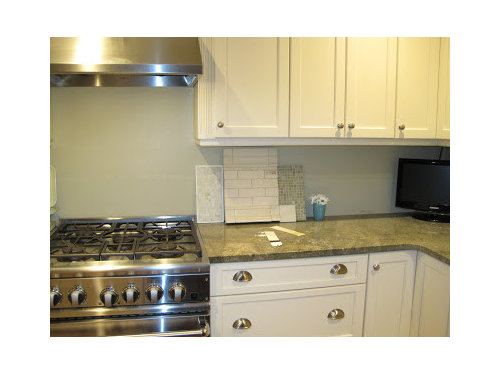
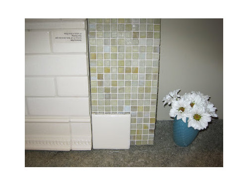
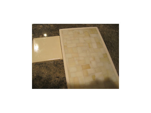
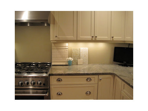
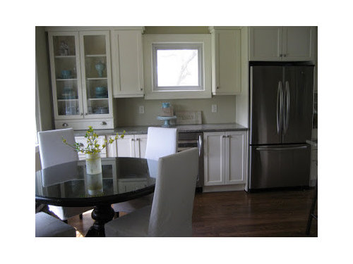
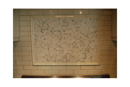
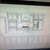
What do you think of my backsplash choices(pics)
positano
14 years ago
Sort by:Oldest
Comments (20)
Related Stories
SMALL KITCHENS10 Things You Didn't Think Would Fit in a Small Kitchen
Don't assume you have to do without those windows, that island, a home office space, your prized collections or an eat-in nook
Full Story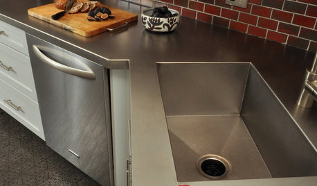
KITCHEN DESIGNKitchen Counters: Stainless Steel, the Chefs' Choice
Professional-grade strength and shining beauty unite in classic stainless steel countertops for the kitchen
Full Story
KITCHEN DESIGNReaders' Choice: The 10 Most Popular Kitchens of 2012
Citing savvy organizational solutions, gorgeous lighting and more, Houzzers saved these kitchen photos in droves
Full Story
KITCHEN DESIGNReaders' Choice: The Top Kitchens of 2010
The Year's Most Popular Kitchens Had White Cabinets, Black Accents, Floating Shelves or Uber-Organized Pantries
Full Story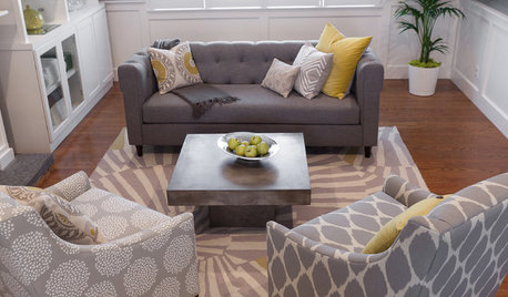
LIVING ROOMSReaders' Choice: The 10 Most Popular Living Rooms of 2012
Every design style gets a shout-out in the most saved living room photos of the past year — see if any elements speak to your own tastes
Full Story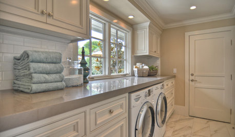
Readers' Choice: The Top 20 Laundry Rooms of 2011
Make doing the wash easier (and even fun) with ideas from the year's most popular laundry room designs
Full Story
BATHROOM WORKBOOKStandard Fixture Dimensions and Measurements for a Primary Bath
Create a luxe bathroom that functions well with these key measurements and layout tips
Full Story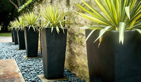
CONTAINER GARDENSWant Compelling Garden Minimalism? Think One Plant, One Pot
Highlight a show-worthy stunner or elevate a pedestrian plant by giving it a solo starring role in the garden
Full Story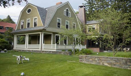
PETSSo You're Thinking About Getting a Dog
Prepare yourself for the realities of training, cost and the impact that lovable pooch might have on your house
Full Story
LIFEStop the Toy Takeover by Changing the Way You Think
Make over your approach and get gift givers onboard with your decluttering efforts by providing meaningful toy alternatives
Full StorySponsored
Central Ohio's Trusted Home Remodeler Specializing in Kitchens & Baths
More Discussions


desertsteph
theresse
Related Professionals
Schaumburg Kitchen & Bathroom Designers · South Farmingdale Kitchen & Bathroom Designers · Eagle Mountain Kitchen & Bathroom Remodelers · Brentwood Kitchen & Bathroom Remodelers · Champlin Kitchen & Bathroom Remodelers · Glendale Kitchen & Bathroom Remodelers · Los Alamitos Kitchen & Bathroom Remodelers · North Arlington Kitchen & Bathroom Remodelers · Rolling Hills Estates Kitchen & Bathroom Remodelers · Wilmington Island Kitchen & Bathroom Remodelers · Black Forest Cabinets & Cabinetry · Fort Lauderdale Cabinets & Cabinetry · Holt Cabinets & Cabinetry · Red Bank Cabinets & Cabinetry · Aspen Hill Design-Build Firmstheresse
rhome410
megpie77
annie.zz
positanoOriginal Author
bestyears
ridgewood_reno
positanoOriginal Author
bestyears
sweeby
positanoOriginal Author
willowdecor
pluckymama
ridgewood_reno
sofla
positanoOriginal Author
positanoOriginal Author
pluckymama