


Bought a pair of Baker bergere chairs, need paint help ASAP (pics
Valerie Noronha
16 years ago
Sort by:Oldest
Comments (48)
Related Stories
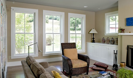
LIGHTINGSo You Bought a Cave: 7 Ways to Open Your Home to Light
Make the most of the natural light your house does have — and learn to appreciate some shadows, too
Full Story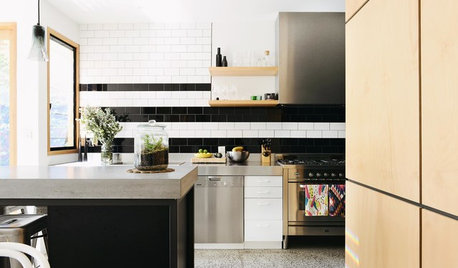
COLOR10 Pair-Ups for Black in the Kitchen
Combine black with other colors to add drama, polish and modernity. It also can make a kitchen look more spacious
Full Story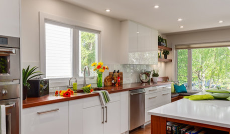
KITCHEN DESIGNThe Best Backsplashes to Pair With Wood Counters
Simplify your decision-making with these ideas for materials that work well with wood counters
Full Story
HOUZZ TOURSMy Houzz: Saturated Colors Help a 1920s Fixer-Upper Flourish
Bright paint and cheerful patterns give this Spanish-style Los Angeles home a thriving new personality
Full Story
HOUZZ TOURSMy Houzz: 38 Years of Renovations Help Artists Live Their Dream
Twin art studios. Space for every book and model ship. After four decades of remodeling, this farmhouse has two happy homeowners
Full Story
DECLUTTERINGDownsizing Help: Choosing What Furniture to Leave Behind
What to take, what to buy, how to make your favorite furniture fit ... get some answers from a homeowner who scaled way down
Full Story
MOST POPULAR7 Ways to Design Your Kitchen to Help You Lose Weight
In his new book, Slim by Design, eating-behavior expert Brian Wansink shows us how to get our kitchens working better
Full Story
LIFEDecluttering — How to Get the Help You Need
Don't worry if you can't shed stuff and organize alone; help is at your disposal
Full Story
DECORATING GUIDESDecorate With Intention: Helping Your TV Blend In
Somewhere between hiding the tube in a cabinet and letting it rule the room are these 11 creative solutions
Full Story
DECLUTTERINGDownsizing Help: How to Edit Your Belongings
Learn what to take and what to toss if you're moving to a smaller home
Full Story


budge1
redbazel
Related Professionals
Garden Acres Interior Designers & Decorators · Fayetteville Furniture & Accessories · Franklin Furniture & Accessories · Santa Barbara Furniture & Accessories · Toledo Furniture & Accessories · Topeka Furniture & Accessories · Duluth Furniture & Accessories · Encinitas Furniture & Accessories · Northridge Furniture & Accessories · Kingsburg Furniture & Accessories · Palm Springs Lighting · York Lighting · New Baltimore Window Treatments · Orange County Window Treatments · St. Louis Window Treatmentsles917
teacats
bristlingacres
amysrq
teeda_2006
reno_fan
Valerie NoronhaOriginal Author
Valerie NoronhaOriginal Author
squirrelheaven
oceanna
squirrelheaven
Valerie NoronhaOriginal Author
moonshadow
squirrelheaven
teacats
johnatemp
hoosiergirl
Valerie NoronhaOriginal Author
johnatemp
Valerie NoronhaOriginal Author
flyingflower
brutuses
squirrelheaven
Valerie NoronhaOriginal Author
redbazel
squirrelheaven
moonshadow
squirrelheaven
moonshadow
squirrelheaven
les917
onourway2nc
Valerie NoronhaOriginal Author
Valerie NoronhaOriginal Author
Valerie NoronhaOriginal Author
budge1
Kathleen McGuire
Valerie NoronhaOriginal Author
squirrelheaven
les917
parma42
squirrelheaven
Valerie NoronhaOriginal Author
kabergs
Valerie NoronhaOriginal Author
johnatemp