


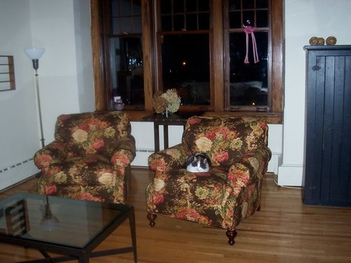
Do these drapes go? Are there drapery rules?
budge1
16 years ago
Sort by:Oldest
Comments (31)
Related Stories
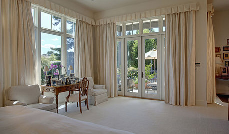
WINDOW TREATMENTSHow Low Should Your Drapes Go?
Hover, brush the floor or pool like Scarlett O'Hara's tears — we give you the lowdown on curtain length options
Full Story
DECORATING GUIDES11 Area Rug Rules and How to Break Them
How big should an area rug be? These guidelines will help you find the right size and placement
Full Story
DECORATING GUIDES22 Divine Draperies That Indulge and Delight
Yards of luscious fabrics, luxuriously swagged and layered, create drapes that gratify the senses
Full Story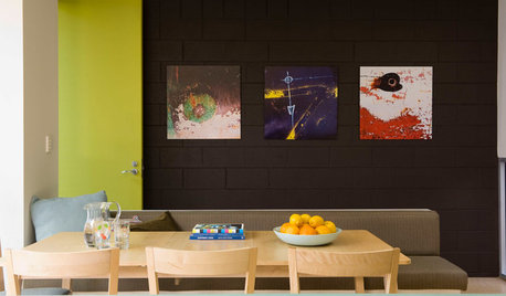
PAINTING10 Rules for Your Next Painting Project
Take your next painting journey from ‘argh!’ to ‘ta-da!’ with these designer tricks
Full Story
TASTEMAKERSAsk an Expert: What Is the One Design Rule You Live By?
Eight home experts share their top design rules
Full Story
DECORATING GUIDESFeel Free to Break Some Decorating Rules
Ditch the dogma about color, style and matching, and watch your rooms come alive
Full Story
PETSHouzz Pets Survey: Who Rules the House — Dogs or Cats?
New data shows that pets make people happy, and pet owners love spending big to return the favor
Full Story
HOUZZ TOURSMy Houzz: Creative Renters Triumph Over the ‘No Paint’ Rule
Not allowed to paint and limited with nails, a design-minded couple uses furnishings and textiles to make their rooms stand out
Full Story
GARDENING GUIDESRegal Lavender Rules Gardens Coast to Coast
Learn how to grow this fragrant, beautiful herb and show off its full beauty in the landscape
Full Story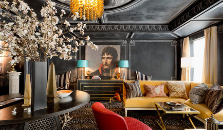
DESIGNER SHOWCASESGlamour and Colors Rule at 2016 Kips Bay Decorator Show House
See how 21 designers from around the U.S. outfitted a 1940 townhouse with vivid wall treatments and edgy furnishings
Full Story

mlraff53
jerseygirl_1
Related Professionals
Mount Sinai Interior Designers & Decorators · Bronx Furniture & Accessories · Dallas Furniture & Accessories · Fort Wayne Furniture & Accessories · Houston Furniture & Accessories · North Myrtle Beach Furniture & Accessories · Moraga Furniture & Accessories · Naples Furniture & Accessories · Norwalk Furniture & Accessories · Potomac Furniture & Accessories · Carpinteria Furniture & Accessories · Diamond Bar Lighting · South Miami Lighting · Spring Lighting · Phoenix Window Treatmentsflowermum
User
Valerie Noronha
Valerie Noronha
funkyart
mpwdmom
nanny2a
budge1Original Author
jerseygirl_1
Ideefixe
les917
jerseygirl_1
les917
budge1Original Author
squirrelheaven
budge1Original Author
budge1Original Author
squirrelheaven
Valerie Noronha
prairiegirlz5
Valerie Noronha
prairiegirlz5
budge1Original Author
jerseygirl_1
squirrelheaven
squirrelheaven
jerseygirl_1
budge1Original Author
squirrelheaven