


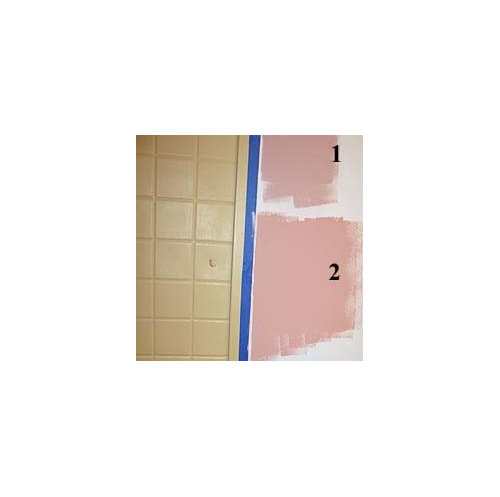
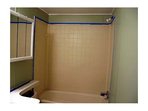
Need help with bathroom wall color please
tnpgw
13 years ago
Sort by:Oldest
Comments (14)
Related Stories


HOME OFFICESQuiet, Please! How to Cut Noise Pollution at Home
Leaf blowers, trucks or noisy neighbors driving you berserk? These sound-reduction strategies can help you hush things up
Full Story
BATHROOM DESIGNUpload of the Day: A Mini Fridge in the Master Bathroom? Yes, Please!
Talk about convenience. Better yet, get it yourself after being inspired by this Texas bath
Full Story
SELLING YOUR HOUSE10 Tricks to Help Your Bathroom Sell Your House
As with the kitchen, the bathroom is always a high priority for home buyers. Here’s how to showcase your bathroom so it looks its best
Full Story
BATHROOM WORKBOOKStandard Fixture Dimensions and Measurements for a Primary Bath
Create a luxe bathroom that functions well with these key measurements and layout tips
Full Story
BATHROOM MAKEOVERSRoom of the Day: See the Bathroom That Helped a House Sell in a Day
Sophisticated but sensitive bathroom upgrades help a century-old house move fast on the market
Full Story
BATHROOM DESIGNKey Measurements to Help You Design a Powder Room
Clearances, codes and coordination are critical in small spaces such as a powder room. Here’s what you should know
Full Story
COLORPaint-Picking Help and Secrets From a Color Expert
Advice for wall and trim colors, what to always do before committing and the one paint feature you should completely ignore
Full Story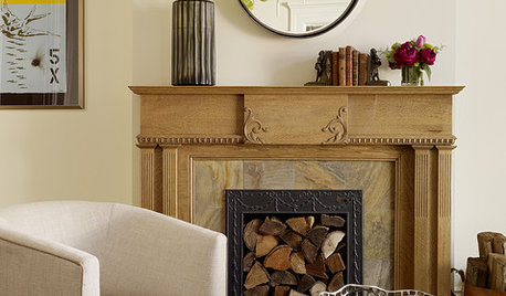
DECORATING GUIDESDownsizing Help: Color and Scale Ideas for Comfy Compact Spaces
White walls and bitsy furniture aren’t your only options for tight spaces. Let’s revisit some decorating ‘rules’
Full Story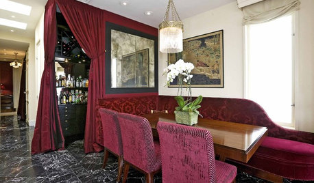
Yes, Please: Parisian Hotel Flair
Bring on the Bling to Recreate the City of Romance at Home
Full StorySponsored
Zanesville's Most Skilled & Knowledgeable Home Improvement Specialists
More Discussions


avesmor
avesmor
Related Professionals
Austin Furniture & Accessories · Manhattan Furniture & Accessories · Queens Furniture & Accessories · Fallbrook Furniture & Accessories · Hilton Head Island Furniture & Accessories · Kansas City Furniture & Accessories · Zionsville Furniture & Accessories · New Hope Furniture & Accessories · Green Bay Lighting · Hunters Creek Lighting · Wilmington Lighting · Campbell Window Treatments · Clinton Window Treatments · East Bridgewater Window Treatments · El Sobrante Window TreatmentstnpgwOriginal Author
Stacey Collins
differentdreamer
gmp3
yayagal
tnpgwOriginal Author
tnpgwOriginal Author
loribee
tnpgwOriginal Author
uesjo
Happyladi
tnpgwOriginal Author