Shop Products
Houzz Logo Print
mizlizzie_gw

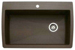
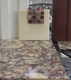
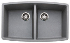
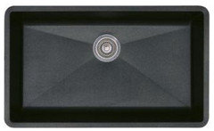
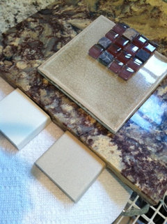
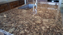
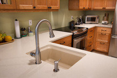
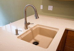
Silgranit biscotti, Cambria Shirebrook, and which Rixi?

MizLizzie
11 years ago

At long last, I got my hands on a Silgranit biscotti sample. The KD says we still have time to change the stainless sinks out, as the cabinets have only just arrived.

Unfortunately, biscotti clashes with my lovely yellow (dore) Grazie Rixi. So to have a Silgranit sink, I must switch back to Rixi noce, the more neutral taupe shade. The Rixi dore was, admittedly, a little too pastel in some lights, but it's so warm and pretty, and I can make it work. But it MUST have stainless sinks.

Below is a picture of my quartz, my cabinet finish (Holiday's Nantucket, unglazed) and a piece of Rixi dore. The dark cherry is my island, which will have a matching prep sink and countertop. (Cambria Shirebrook.) Paint right now is BM Lenox Tan, which I'll likely keep.

In my next post, I'll show the noce . . .

Comments (30)

  • corgimum
    11 years ago

    Did you look at a truffle silgranite sample? It looks like it matches the taupe in your quartz and would play nicely with either tile.

  • MizLizzie
    Original Author
    11 years ago

    Corgimum, I did look at that. It was, in fact, the shade I had my eye on. But it just didn't work somehow. Well, I say that . . . Hmm. It certainly did not work with the yellow Rixi. I cannot recall if it would have worked with the taupe Rixi. And I have given those chips away to my KD.

    If I decide that having Silgranit is worth giving up the yellow tile, I will get that chip back and double check it. Thanks for mentioning it.

  • badgergal
    11 years ago

    Both tiles look good with your cabinets and counters but I agree with you that the first one is a warmer look. Have you seen the new color called cinder. It sounds like it would go well with the first tile.
    This is what the website has to say about it. "BLANCO presents Cinder, a striking shade of dark grey with a natural, stone-like appeal and delicate hints of brown that give it an inviting warmth. This timeless modern color is positioned somewhere between Anthracite and Metallic Grey, and is a shade that is reminiscent of dark natural stones such as slate."
    I have had my silgranite sink for over a year now and it looks just like day one. I know a stainless steel sink would not have faired as well with the way we use our sink.
    Hope you can find a color that works for you

  • corgimum
    11 years ago

    Show us the biscotti sample too. I tried to get one for months and finally gave up! The Rixi Noce looks very similar to truffle if not a match. Hard to trust an online image completely.

  • alwaysfixin
    11 years ago

    Just wondering - on your thread from mid-Feb. ("if you had to go with a stainless sink..") I advised against biscotti, saying its yellowish-orange tone would not work with your Cambria Shirebrook and Rixi. I suggested the biscuit color instead. Did you try the biscuit color?

  • a2gemini
    11 years ago

    I agree - I would avoid the Biscotti sink - I used the Cafe Brown with my Cambria Buckingham and the sink just is in the background but not the forefront. My DM liked it - I was also leaning toward truffle.

  • MizLizzie
    Original Author
    11 years ago

    I will get a pic of the biscotti w/the Shirebrook tomorrow. In some of the photos I saw, biscotti looked almost orange or blotchy. On Blanco's website, it looks that way. But the sample they sent me is very neutral. Dark bone, I'd call it. The biscuit is nearly white. Like the old "bisque" appliance color (which, sadly, no one uses anymore . . ) I dunno. Somehow my eye can't see any of the Silgranit colors as a neutral the way I see stainless as a neutral. But they are all just shades of gray. Duh.

  • MizLizzie
    Original Author
    11 years ago

    For example, look at this link to Blanco's Silgranit portfolio. What color would you assign (without looking) to sinks #1, 8, 9, and 13?

    To my eye, #1 is ugly orange. So is #13. #8? Not so bad. Kind of matches the yellow-butterscotch swirls in some of my Cambria. But . . . they must all be biscotti, right? What else could they be?

    Shoot me now . . .

    Here is a link that might be useful: Blanco's Silgranit colors

  • User
    11 years ago

    I have Biscotti and I'd call it a very warm beige/tan. The sink itself gives a darker, warmer appearance than the sample imo. I don't see any orange or blotchyness.

    I did not like the Biscuit. It looked like regular old white chalk to me.

  • User
    11 years ago

    If you think #1 is ugly orange, you should probably steer clear of Biscotti. It's closer to that than the others. I also think it will clash horribly with the red mosaic. I think I'd use the gray in the quartz as the neutral for your sink. Gray is good with red.

  • breezygirl
    11 years ago

    I think you need to look at other silgranit colors. How about Cafe Brown?

  • breezygirl
    11 years ago

    Or Cinder?

  • breezygirl
    11 years ago

    Or Truffle?

  • breezygirl
    11 years ago

    Or Metallic Gray? (I own two of this color.)

  • breezygirl
    11 years ago

    Or Anthracite?

  • a2gemini
    11 years ago

    Breezy - greaet job posting pictures.

    MizzLizzie
    From these pictures - I think I like the cinder best. I think it will work with that lovely Dore tile.
    How are you planning to use the mosaic? The colors seem to pick up your Sherbrooke nicely. I used a mosaic accent with my Rixi tile as well.

    Can't wait to see your decision!

    This post was edited by a2gemini on Tue, Apr 16, 13 at 6:54

  • MizLizzie
    Original Author
    11 years ago

    a2gemini, I am probably going to do something very like yours. Just an accent strip somewhere near the bottom. I still think about your beautiful kitchen. I definitely want my field tile harlequined. That's what I have now, and I like it. Very undecided about over-the-cooktop. I thought about framing a square of the accent tile behind it -- Rixi has some nice molding pieces -- but I will have to see how rich that accent tile goes when they enhance it. Right now, unless you dampen it, some of the grays and ivories are too cold for that red-veined Cambria.

  • MizLizzie
    Original Author
    11 years ago

    May_flowers, ITA on the biscuit. The white, too, looked very chalky IIRC. In the right setting, however, either could work nicely.

    Breezy, THANK you for those pics. How smart you are. I love Truffle, but it won't work, will it? Hmm. Metallic gray is yummy. I wonder if I had that one? Must borrow them back from KD. I had the unfortunate experience of getting two unlabeled samples from Blanco. Two of the gray shades. One must have been MG. The other . . . Cinder? Anthracite was labeled.

    Here is a pic of the two Silgranit chips Blanco sent. That is biscuit on the left and biscotti on the right. I love the biscotti, which I didn't expect. I would rather have something darker, but this chip didn't look anything like what I expected.

  • corgimum
    11 years ago

    I think any of the sink colors that Breezy posted are good candidates. The thing is, the taupe tile seems too dark. Your cabinets are dark, your counters are dark, your floors? Anyways, the yellow is light and the contrast looks good. The biscotti sink colors looks okay but I prefer the sink to blend in instead of contrast so the darker sink colors look better to me. I found a photo of Shirebrook and it looks like the sink was either truffle or grey. (May not be Blanco but similar.)

    [Contemporary Kitchen Countertops[(https://www.houzz.com/products/contemporary-kitchen-countertops-prbr1-br~t_439~s_2103) by Other Metro Tile Stone And Countertop Accent Surfaces

    See how this one contrasts and says "Look at me instead of the countertop". The matchiness of the sink and the tile isn't helping either.

    [Traditional Kitchen[(https://www.houzz.com/photos/traditional-kitchen-ideas-phbr1-bp~t_709~s_2107) by Bakersfield Kitchen And Bath Blue River Cabinetry

  • MizLizzie
    Original Author
    11 years ago

    My cabinets are Holiday's Nantucket finish, which is a creamy white. My floors are traditional oak hardwood -- the narrow, golden color that nearly everyone has.

    I don't care for either of those sinks with the Shirebrook. Thanks for finding them; I hadn't seen either pic. Sigh. It is very hard to work with this countertop. I begin to wish I didn't love it so much. But I needed some dark red desperately, and it was Shirebrook or Typhoon Bordeaux granite, and that is so inconsistent I feared I couldn't find a good slab.

  • corgimum
    11 years ago

    And here I thought the cherry was your perimeter cabinet color! My reading comprehension is poor. Does the white go with the countertop? I completely missed it in the original photo and thought is was a wall. The white looks stark next to your countertop and tile choice. I know internet photos lie sometimes so maybe it works. Anyhow, do you want the sink to blend in or stand out? Blend in- go darker. Stand out- go lighter. Do you have a Blanco dealer nearby that you could visit to see all of the color samples at once?

  • MizLizzie
    Original Author
    11 years ago

    I want the sink to blend. No Blanco dealers around save for Ferguson's. That's where I saw what I thought was an orange-ish sink. It was the only Blanco they had on display. I begin to wonder if I mis-remembered the color.

    Below is a link someone very kindly posted before. A fabricator who has a pretty good looking sink installed in a slab of Shirebrook. I've written him to ask what it is.

    Here is a link that might be useful: Check out the sink, third pic on second row.

  • User
    11 years ago

    Mine matches my Caesarstone Buttermilk pretty good.

    I understand where you're coming from in needing a warm color. My DR/LR is all warm colors, and I could not use any whites or grays for a countertop.

  • User
    11 years ago

    In this photo, it looks more tan. So your lighting could play a role. It also might look lighter against a dark counter.

  • MizLizzie
    Original Author
    11 years ago

    So, I got a quick response from Steve Pollock at Tops By Cop in Oklahoma. In that link I posted, the picture is indeed a Silgranit biscotti in Cambria Shirebrook.

    I think this is one of those colors that alters drastically depending upon lighting and what it is mounted in.

    Thanks for the pics, may_flowers. Gorgeous kitchen.

  • corgimum
    11 years ago

    A description I read about Shirebrook said it has black in it. Would Anthracite work?

    "Cranberry, gray, taupe and black roil about in the perfect random fusion of dark and light."

    Also, did you pick up color swatches of the BM colors that Cambria says coordinate with Shirebrook? Maybe a sink color could come from them.

  • maplebirch
    8 years ago

    Dear Mayflowers, Help! I see you have Ceasarstone Buttermilk countertop. What colour is your sink? Biscuit or biscotti? I've only been able to compare the Buttermilk with a biscotti sink. I thought it looked ok. Darker but nice. Since I've come to learn that "biscuit" is also available. Is that a better match and blend-in colour than biscotti?

  • User
    8 years ago
    last modified: 8 years ago

    I have Biscotti, which I've decided can best be described as oatmeal. It's not a color I love but it went best with Buttermilk to bring out the darker circular areas. I didn't care for the white of Biscuit. I think I'm going to be limited in what color I can use for my backsplash because what matches the counter probably will look a little off with the sink, so I'll probably need to use a white tile or a mix of colors.

  • maplebirch
    8 years ago
    Thank you, Mayflower! I was very interested in the biscuit or biscotti sinks, but in the end I decided on a Khan chef sink for two reasons. One was to pull together the stainless steel appliances in the kitchen but more so, I was afraid it would be too challenging (as you said) to introduce another colour with the cabinets, the countertop, the backsplash. For me it would have been a painful and costly mistake. Choosing the stainless sink was safer and I think I'll be happier. Thank you for helping me decide on this:) All the best to you!