


Please Critique Listing (X-posted)
greenthumbfish
10 years ago
Sort by:Oldest
Comments (24)
Related Stories
SUMMER GARDENINGHouzz Call: Please Show Us Your Summer Garden!
Share pictures of your home and yard this summer — we’d love to feature them in an upcoming story
Full Story
BEFORE AND AFTERSMore Room, Please: 5 Spectacularly Converted Garages
Design — and the desire for more space — turns humble garages into gracious living rooms
Full Story
HOUSEPLANTSMother-in-Law's Tongue: Surprisingly Easy to Please
This low-maintenance, high-impact houseplant fits in with any design and can clear the air, too
Full Story
HOLIDAYSHouzz Call: Share Your Favorite Christmas Tradition
Is there one thing you do, watch or eat that heralds the arrival of Christmas? Post a photo and let us know!
Full Story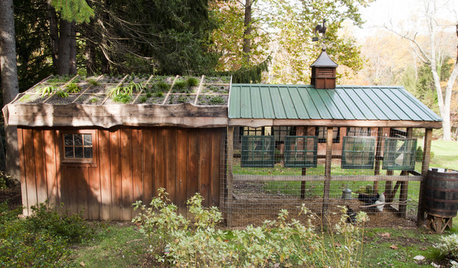
FARM YOUR YARDHouzz Call: Show Us Your One-of-a-Kind Chicken Coops
Do you have a fun or stylish backyard shelter for your feathered friends? Post your pictures and stories in the Comments!
Full Story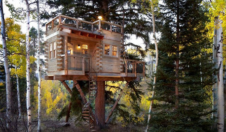
TREE HOUSESHouzz Call: Show Us Your Well-Designed Treehouse or Tree Fort!
Got a great treehouse or tree fort? We want to see it! Post yours in the Comments and we’ll feature the best in a future article
Full Story
HOLIDAYSHouzz Call: Share Your Personal Holiday Traditions
What winter rituals mean the most to you and yours? Post your stories and pictures
Full Story
FALL GARDENINGHouzz Call: Show Us Your Fall Color!
Post pictures of your fall landscape — plants, leaves, wildlife — in the Comments section. Your photo could appear in an upcoming article
Full Story
KITCHEN DESIGN12 Breakfast Bars With Coffee Shop Appeal
Give even a small kitchen a sociable vibe by inserting a stylish seating post
Full Story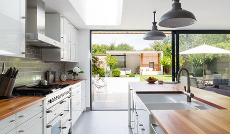
KITCHEN DESIGNA Designer Shares Her Kitchen-Remodel Wish List
As part of a whole-house renovation, she’s making her dream list of kitchen amenities. What are your must-have features?
Full StoryMore Discussions

dabunch
User
Related Professionals
Henderson Architects & Building Designers · Portsmouth Architects & Building Designers · South Elgin Architects & Building Designers · Abington General Contractors · Clive General Contractors · Everett General Contractors · Fort Salonga General Contractors · Hutchinson General Contractors · Jefferson Valley-Yorktown General Contractors · Lincoln General Contractors · Niles General Contractors · Port Huron General Contractors · Sheboygan General Contractors · Woodland General Contractors · Lincolnwood Home StagersRooseveltL
jack707
tishtoshnm Zone 6/NM
rrah
morz8 - Washington Coast
xamsx
sweet_tea
ncrealestateguy
stolenidentity
littlebug5
RooseveltL
Happyladi
cocontom
graywings123
lazy_gardens
nancylouise5me
littlebug5
Acadiafun
Debbie Downer
mrshanson1
kats_meow
TxMarti