


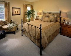
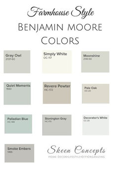
Color to go with Quiet Moments?
distantsun
10 years ago
Featured Answer
Sort by:Oldest
Comments (17)

caminnc
10 years agorunninginplace
10 years agoRelated Professionals
View Park-Windsor Hills Interior Designers & Decorators · Eagan Furniture & Accessories · North Myrtle Beach Furniture & Accessories · Owensboro Furniture & Accessories · Golden Glades Furniture & Accessories · Naples Furniture & Accessories · Potomac Furniture & Accessories · Rogers Furniture & Accessories · Sahuarita Furniture & Accessories · San Diego Furniture & Accessories · Kendall Furniture & Accessories · Baldwin Park Lighting · Wells Branch Lighting · Rancho Santa Margarita Window Treatments · Ridgewood Window Treatmentsdistantsun
10 years agodistantsun
10 years ago PRO
PROBeverlyFLADeziner
10 years agodistantsun
10 years agonosoccermom
10 years agopps7
10 years agodistantsun
10 years agotannatonk23_fl_z9a
10 years agorunninginplace
10 years agodistantsun
10 years agodonna_messer1
5 years ago
Lil S
5 years ago
eastautumn
5 years agolast modified: 5 years agoHU-2650832
8 months ago
Related Stories
ATTICSRoom of the Day: Quiet Moments in a Seaside Sitting Room
A converted attic offers a private retreat for a couple who enjoy hosting guests in their Delaware vacation home
Full Story
DECORATING GUIDESHaving a Design Moment: The Hallway
High-traffic areas are often wasted design opportunities. Here's how to make the most of them
Full Story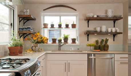
KITCHEN DESIGNHaving a Design Moment: The Kitchen
Take a peek at 11 design opportunities you shouldn't overlook in the kitchen
Full Story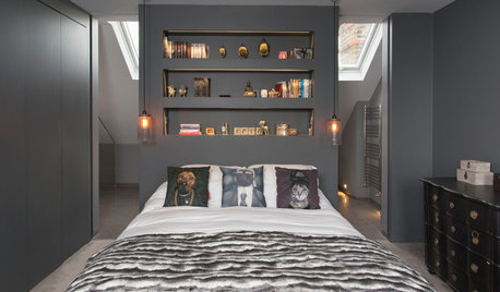
DECORATING GUIDESHaving a Design Moment: The Bedroom
See 11 ways to add something special to this all-important room
Full Story
GARDENING GUIDESBackyard Birds: Go Owling in October
These stealthy nocturnal hunters fill North American skies with their quiet wings and distinct calls
Full Story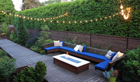
LANDSCAPE DESIGNDesign Your Landscape for Peace and Quiet
Block unwanted noise with plantings, barriers and water features for a more soothing outdoor experience
Full Story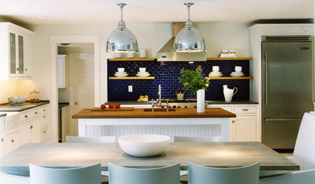
COASTAL STYLE10 Ways to Go Coastal With a Modern Edge
Don't drown your home in beachy kitsch. Get a more sophisticated seaside style with these ideas that take a subtle approach
Full Story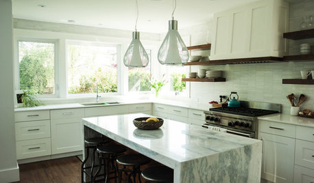
MOST POPULAR15 Remodeling ‘Uh-Oh’ Moments to Learn From
The road to successful design is paved with disaster stories. What’s yours?
Full Story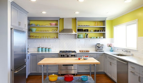
KITCHEN DESIGNKitchen of the Week: An 'Aha' Tile Moment in San Francisco
Design inspiration sometimes strikes in the place you'd least expect
Full Story
FLOORSHave Your Own Red Carpet Moment Anytime
Make every day feel like an event by rolling out a red carpet at home. Autograph hounds optional
Full StoryMore Discussions


nosoccermom