


Does "warm" grey paint color with blue tone exist?
rantontoo
9 years ago

Featured Answer
Sort by:Oldest
Comments (32)

ravencajun Zone 8b TX
9 years agolast modified: 9 years agoravencajun Zone 8b TX
9 years agolast modified: 9 years agoRelated Professionals
Hybla Valley Kitchen & Bathroom Designers · St. Louis Kitchen & Bathroom Designers · Adelphi Kitchen & Bathroom Remodelers · Plainview Kitchen & Bathroom Remodelers · Forest Hill Kitchen & Bathroom Remodelers · Honolulu Kitchen & Bathroom Remodelers · Londonderry Kitchen & Bathroom Remodelers · Olney Kitchen & Bathroom Remodelers · Port Charlotte Kitchen & Bathroom Remodelers · Terrell Kitchen & Bathroom Remodelers · Tuckahoe Kitchen & Bathroom Remodelers · Wilson Kitchen & Bathroom Remodelers · Wells Branch Cabinets & Cabinetry · Fayetteville Tile and Stone Contractors · Niceville Tile and Stone Contractors
rococogurl
9 years agolast modified: 9 years ago
GenB
9 years agolast modified: 9 years agoGenB
9 years agolast modified: 9 years agorantontoo
9 years agolast modified: 9 years ago
sheloveslayouts
9 years agolast modified: 9 years agorantontoo
9 years agolast modified: 9 years ago
mom2samlibby
9 years agolast modified: 9 years ago
a2gemini
9 years agolast modified: 9 years agoMizLizzie
9 years agolast modified: 9 years agorococogurl
9 years agolast modified: 9 years ago
raee_gw zone 5b-6a Ohio
9 years agolast modified: 9 years ago
allen456
9 years agolast modified: 9 years agosheloveslayouts
9 years agolast modified: 9 years agorantontoo
9 years agolast modified: 9 years agorantontoo
9 years agolast modified: 9 years ago
oldbat2be
9 years agolast modified: 9 years agorantontoo
9 years agolast modified: 9 years agooldbat2be
9 years agolast modified: 9 years agomeddam
9 years agolast modified: 9 years agomeddam
9 years agolast modified: 9 years agojerzeegirl
9 years agolast modified: 9 years agorantontoo
9 years agolast modified: 9 years agorantontoo
9 years agolast modified: 9 years agosheloveslayouts
9 years agolast modified: 9 years agochibimimi
9 years agolast modified: 9 years agorantontoo
9 years agolast modified: 9 years agooldbat2be
9 years agolast modified: 9 years agolascatx
9 years agolast modified: 9 years agobrowniepie
9 years agolast modified: 9 years ago


Related Stories

EXTERIOR COLORExterior Color of the Week: 7 Ways With Warm Gray
See why this hue can be the perfect neutral for any house
Full Story
DECORATING GUIDESColor of the Week: Decorating With Warm Gray
Tired of tan? Getting gloomy from cool gray? Make warm gray your new go-to neutral
Full Story
DECORATING GUIDESTry a Handmade Oushak Rug for Warm Spice Tones and Softness Underfoot
Lovely to look at and delightful to touch, these sumptuous Turkish rugs work with a range of room styles
Full Story
COLORHow to Layer Tones of Gray for Depth and Harmony
Use texture, pattern, contrast and more to create a subtle, sophisticated look with this popular color
Full Story
GRAYChoosing Paint: How To Pick the Right Gray
Which Version of Today's 'It' Neutral Is For You?
Full Story
DECORATING GUIDESHot Color Combo: Cool Blues and Warm Brass
It's trending all over, but navy or royal blue with brass or gold just also might become a new classic pairing
Full Story
DECORATING GUIDESColor Guide: How to Work With Charcoal Gray
The most modern neutral, charcoal gray looks great in dining rooms, living rooms and even nurseries. Here's how to use it best
Full Story
INSIDE HOUZZHow Much Does a Remodel Cost, and How Long Does It Take?
The 2016 Houzz & Home survey asked 120,000 Houzzers about their renovation projects. Here’s what they said
Full Story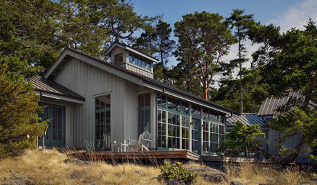
EXTERIOR COLORWhen to Paint Your Home Gray
This perfectly neutral and highly versatile color can create subtle distinctions among exterior architectural elements or stand on its own
Full Story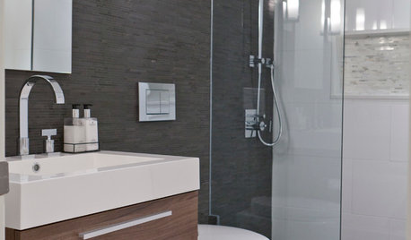
COLORBathed in Color: When to Use Gray in the Bath
Go for elegance and sophistication without going overboard on coolness, using these gray bathroom paint picks and inspirational photos
Full Story


Etera