


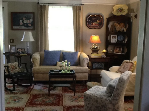
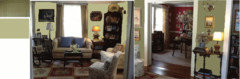
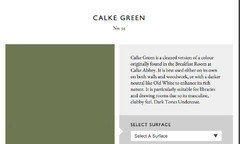
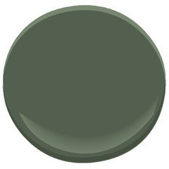
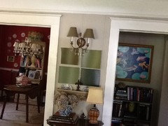
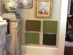
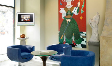
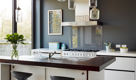
Going green ... Dark green that is!
gigi35976
9 years ago
Featured Answer
Sort by:Oldest
Comments (64)

User
9 years agonini804
9 years agoRelated Professionals
Morton Grove Interior Designers & Decorators · Shorewood Interior Designers & Decorators · Stanford Interior Designers & Decorators · Charleston Furniture & Accessories · Houston Furniture & Accessories · Carlsbad Furniture & Accessories · Genova Furniture & Accessories · Glenview Furniture & Accessories · Hawthorne Furniture & Accessories · Northridge Furniture & Accessories · Potomac Furniture & Accessories · San Juan Capistrano Furniture & Accessories · Laguna Beach Lighting · Warwick Lighting · Mount Pleasant Window Treatmentsnini804
9 years agoUser
9 years agolast modified: 9 years agogigi35976
9 years ago
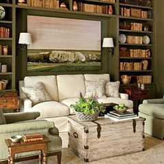
tibbrix
9 years agotibbrix
9 years ago
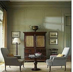
awm03
9 years agoawm03
9 years agotibbrix
9 years agogigi35976
9 years ago
Suzi AKA DesertDance So CA Zone 9b
9 years agolast modified: 9 years agoKelly Fumarola
9 years ago
MtnRdRedux
9 years agolast modified: 9 years agoawm03
9 years agotibbrix
9 years ago
laughablemoments
9 years ago
lizzierobin
9 years agolast modified: 9 years agogigi35976
9 years agohancockheather
9 years agolaughablemoments
9 years ago
Annie Deighnaugh
9 years agotracie_erin
9 years agotheclose
9 years agogigi35976
9 years agotibbrix
9 years agolast modified: 9 years agonosoccermom
9 years agoMtnRdRedux
9 years agoUser
9 years agogigi35976
9 years agolizzierobin
9 years ago PRO
PROwww.therugshopuk.co.uk
9 years agonosoccermom
9 years agomustangs81
9 years agoUser
9 years ago
emmarene9
9 years agotibbrix
9 years ago
2pups4me
9 years ago
jlc712
9 years agoroarah
9 years agolizzierobin
8 years agolast modified: 8 years ago
Bonnie
8 years agoDebbie Downer
8 years agobusybee3
8 years agotheclose
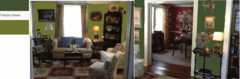
8 years agogigi35976
8 years ago
Holly- Kay
8 years agolast modified: 8 years ago
the_foxes_pad
8 years agogigi35976
8 years ago


Related Stories
GREEN DECORATINGGo Cuckoo for Coconut Furniture and Surfaces
Crack open a lesser-known ecofriendly design option: tiles, flooring, tables and more made from coconut shell and palm wood
Full Story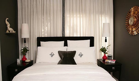
DECORATING GUIDES10 Ways to Go Dark in a Contemporary Kitchen
Moody is big news in kitchen design. Find inspiration with these interpretations
Full Story
HOUZZ TOURSHouzz Tour: Los Angeles Condo Gives Green the Go
A profusion of leafy textiles, jade-painted pieces and green trellis patterns create a fresh feel against crisp white backdrops
Full Story
DECORATING GUIDESCrisp, Fresh: Go for Green Apples
On the Walls or Au Natural, Green Apples Pack a Decorative Bite
Full Story
DECORATING GUIDESGo for the Green: Artificial Grass Surprises, Inside and Out
Synthetic turf springs up on patios, living rooms, furniture and walls. Basement golf, anyone?
Full Story
GARDENING GUIDESHealthy Home: How to Go Green With a Living Wall or Roof
See 10 ways to add this earth-friendly element to your home
Full StoryMore Discussions


gigi35976Original Author