


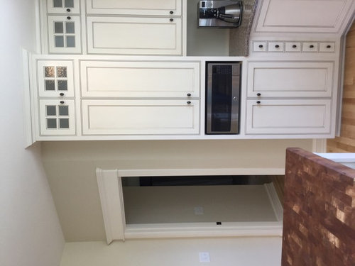
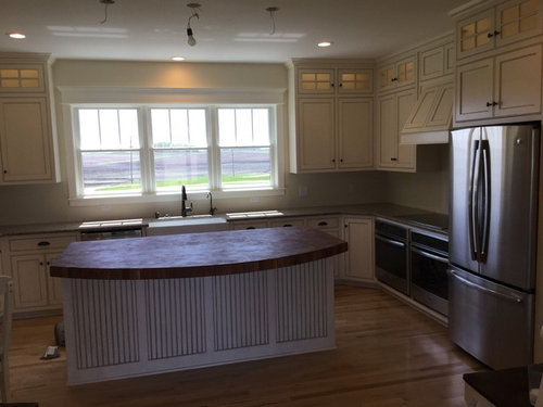
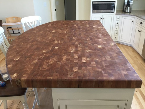
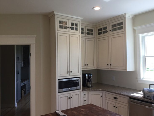
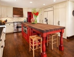
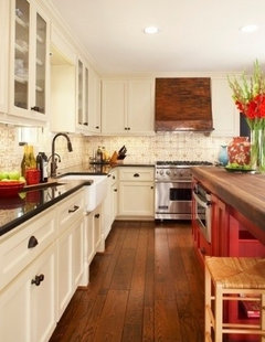
Crying over design disaster and it's my fault. Can you help me fix it?
Yellow House On The Farm
8 years ago
last modified: 8 years ago


Featured Answer
Sort by:Oldest
Comments (147)

sanje1961
8 years agochris81996
8 years agoRelated Professionals
Washington Interior Designers & Decorators · Bonney Lake Architects & Building Designers · Four Corners Kitchen & Bathroom Designers · Hershey Kitchen & Bathroom Designers · Midvale Kitchen & Bathroom Designers · La Mirada Furniture & Accessories · Tucker Furniture & Accessories · Asheboro General Contractors · Cottage Grove General Contractors · DeRidder General Contractors · Duncanville General Contractors · Montebello General Contractors · Rancho Cordova General Contractors · Sterling General Contractors · Sun Prairie General Contractorstoriat
8 years ago
Ann
8 years agotoriat
8 years ago
BirchPoint
8 years agocucina1990
8 years agoBetsy Theis
8 years agoUser
8 years agopdk920
8 years agoAlternatives
8 years agoAlternatives
8 years agohelixg1
8 years agoJudy Woods
8 years ago
Danielle Lyn
8 years agosuezbell
8 years agolast modified: 8 years ago
Kathi Ball
8 years ago PRO
PROTheFurnitureCollection
8 years agofairfax66
8 years agosheilaskb
8 years ago- PRO
TheFurnitureCollection
8 years ago 
Stacy Lawrence
8 years ago PRO
PROGN Builders L.L.C
8 years agoYellow House On The Farm
8 years agolast modified: 8 years agoYellow House On The Farm
8 years agokm kane
8 years agopdk920
8 years ago- PRO
GN Builders L.L.C
8 years ago 
Cindy Breeding
8 years ago
funny face
8 years ago- PRO
TheFurnitureCollection
8 years agolast modified: 8 years agoYellow House On The Farm thanked TheFurnitureCollection 
Lisa R
8 years agosmdrovetto
8 years agolast modified: 8 years ago


Related Stories

MOST POPULAR9 Real Ways You Can Help After a House Fire
Suggestions from someone who lost her home to fire — and experienced the staggering generosity of community
Full Story
SELLING YOUR HOUSE5 Savvy Fixes to Help Your Home Sell
Get the maximum return on your spruce-up dollars by putting your money in the areas buyers care most about
Full Story
WORKING WITH PROS3 Reasons You Might Want a Designer's Help
See how a designer can turn your decorating and remodeling visions into reality, and how to collaborate best for a positive experience
Full Story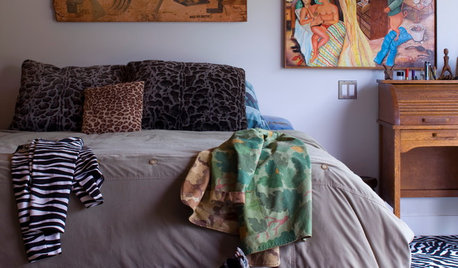
DECORATING GUIDESFix Those 'Whoopsies': 9 Fast Solutions for Decorating Mistakes
Don't suffer in silence over a paint, furniture or rug snafu — these affordable workarounds can help
Full Story
MOVINGRelocating Help: 8 Tips for a Happier Long-Distance Move
Trash bags, houseplants and a good cry all have their role when it comes to this major life change
Full Story
DISASTER PREP & RECOVERY7 Ways to Help Someone Hit by a Hurricane
The best things you can do in the wake of devastation are sometimes the most surprising
Full Story
DESIGN FOR GOODShelter in a Storm: Architects Improve Global Disaster Relief
Temporary housing takes a well-designed turn with affordable, easily stored structures that address privacy
Full Story
HOME TECH7 Ways to Charge Up and Connect After Disaster
Products and tips for communicating and keeping essential items running till the power's back on
Full Story
KITCHEN DESIGNKey Measurements to Help You Design Your Kitchen
Get the ideal kitchen setup by understanding spatial relationships, building dimensions and work zones
Full Story
DISASTER PREP & RECOVERYHow to Prep for Disaster Insurance Claims
Tools and tips for making an inventory list, documenting damage to your home, and working with your adjuster
Full StorySponsored
Your Custom Bath Designers & Remodelers in Columbus I 10X Best Houzz
More Discussions


lucidos