


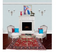
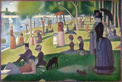
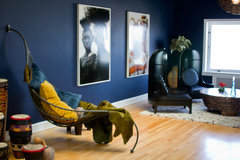
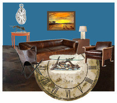
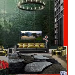
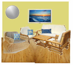
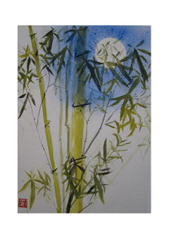
Design Around This #2- Artwork Inspired Room
jlc712
8 years ago
Featured Answer
Sort by:Oldest
Comments (127)

Nothing Left to Say
8 years agopalimpsest
8 years agoRelated Professionals
Cusseta Interior Designers & Decorators · Linton Hall Interior Designers & Decorators · Miami Furniture & Accessories · Oshkosh Furniture & Accessories · Portland Furniture & Accessories · Reston Furniture & Accessories · Scottsdale Furniture & Accessories · Champlin Furniture & Accessories · Discovery Bay Furniture & Accessories · Fillmore Furniture & Accessories · Stamford Furniture & Accessories · Englewood Lighting · La Jolla Lighting · Modesto Lighting · Mount Sinai Window TreatmentsNothing Left to Say
8 years agoUser
8 years agolast modified: 8 years agoUser
8 years agolast modified: 8 years agopalimpsest
8 years agopalimpsest
8 years agoUser
8 years ago
Annie Deighnaugh
8 years agolast modified: 8 years agoNothing Left to Say
8 years ago
MtnRdRedux
8 years agolast modified: 8 years agoNothing Left to Say
8 years agoflowerpwr45
8 years ago
cawaps
8 years agocawaps
8 years ago
missymoo12
8 years agoUser
8 years agolast modified: 8 years ago
jlc712
8 years agopalimpsest
8 years agolast modified: 8 years ago
just_terrilynn
8 years agolast modified: 8 years agoMtnRdRedux
8 years agolast modified: 8 years agocawaps
8 years agoUser
8 years agojust_terrilynn
8 years agopalimpsest
8 years agojlc712
8 years agoAnnie Deighnaugh
8 years agolast modified: 8 years ago
rebunky
8 years agolast modified: 8 years agoNothing Left to Say
8 years agoMtnRdRedux
8 years agocawaps
8 years agocawaps
8 years agolast modified: 8 years agorebunky
8 years agolast modified: 8 years agopalimpsest
8 years agoAnnie Deighnaugh
8 years agoAnnie Deighnaugh
8 years agoUser
8 years agolast modified: 8 years agoAnnie Deighnaugh
8 years agoAnnie Deighnaugh
8 years agocawaps
8 years agojust_terrilynn
8 years agolast modified: 8 years agonosoccermom
8 years agorebunky
8 years agoNothing Left to Say
8 years agocawaps
8 years agojust_terrilynn
8 years agorebunky
8 years agoAnnie Deighnaugh
8 years agojust_terrilynn
8 years agojlc712
8 years ago


Related Stories
DECORATING GUIDESWorld of Design: Decorating Ideas From 10 Renters Around the Globe
Even if you don’t own your home, you can live beautifully. Browse these ideas from international tenants who’ve made their spaces special
Full Story
LIVING ROOMSNew This Week: 5 Living Rooms Designed Around the Fireplace
Overcome one of design’s top obstacles with tips and tricks from these living rooms uploaded recently to Houzz
Full StoryDECORATING GUIDESWeekend Project: 9 Ways to Branch Out Around the House
Natural pieces can change the feeling of a room, whether you use them to hang pots or to serve as chandeliers
Full Story
DECORATING GUIDES5 Ways Art Can Improve Your Room Design
Artwork can bring together the elements of a room by being a focal point, a color inspiration, a harmonizer and more
Full Story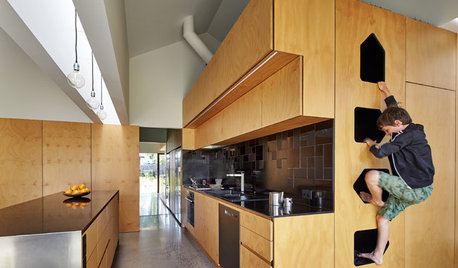
MOST POPULARKitchens Down Under: 20 Design Ideas to Inspire You
These popular Australian kitchens have exciting ideas to borrow no matter where you live
Full Story
LIVING ROOMSLiving Rooms That Don’t Revolve Around the TV
In these spaces, the television takes a back seat to conversation, relaxation and aesthetics
Full Story
KITCHEN DESIGNWorld of Design: Favorite Recipes From Food Lovers Around the Globe
Travel with your tastebuds and experience for yourself these international foodies' favorite dishes
Full Story
ARCHITECTUREWorld of Design: 10 Homes That Lap Up the Landscape Around Them
As building techniques develop, architects all over the globe are finding new ways — and new places — to integrate houses with nature
Full Story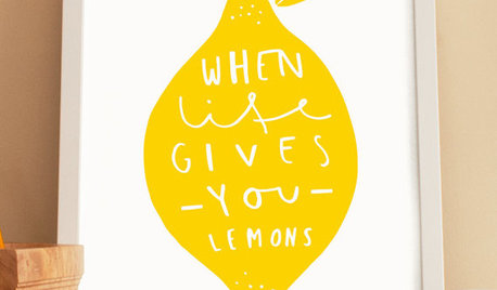
PRODUCT PICKSGuest Picks: Juice Up Your Rooms With Fruit-Inspired Designs
Zesty colors and fruit renderings on artwork and accessories give your home a burst of flavor
Full Story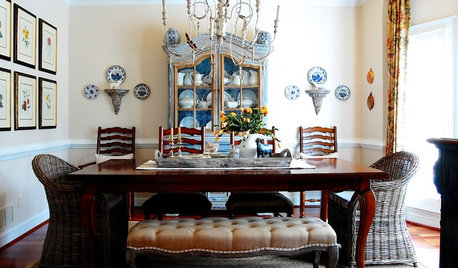
DECORATING GUIDES5 Questions to Ask Before You Design Your Dining Room
Set up your dining room with the colors, furnishings and artwork you love, and you'll never be hungry for style satisfaction again
Full StoryMore Discussions


cawaps