


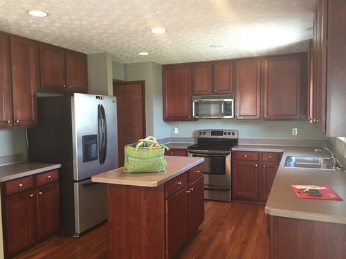
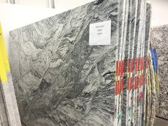
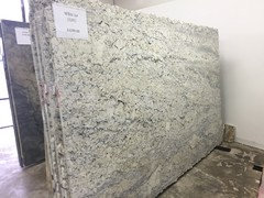
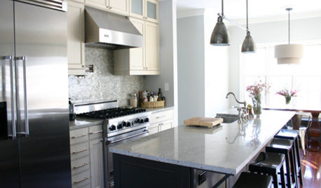
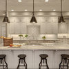
Countertop indecision round #2 + more questions (backplash, edge)
fldhkybnva
7 years ago


Featured Answer
Sort by:Oldest
Comments (46)

Lori
7 years ago
Lisa G
7 years agoRelated Professionals
Caledonia Interior Designers & Decorators · Struthers Interior Designers & Decorators · Henderson Kitchen & Bathroom Designers · Eagan Furniture & Accessories · Racine Furniture & Accessories · Boardman General Contractors · Fairview General Contractors · Geneva General Contractors · Holly Hill General Contractors · Jacksonville General Contractors · Kyle General Contractors · Manalapan General Contractors · Riverdale General Contractors · Roselle General Contractors · Tamarac General Contractors
fldhkybnva
7 years ago- PRO
Patricia Colwell Consulting
7 years ago fldhkybnva
7 years ago PRO
PROHaven Design and Construction
7 years agofldhkybnva
7 years ago PRO
PROFlo Mangan
7 years agofldhkybnva
7 years ago- PRO
Flo Mangan
7 years ago hsharrington
7 years agohsharrington
7 years agofldhkybnva
7 years agofldhkybnva
7 years ago- PRO
Flo Mangan
7 years ago  PRO
PROCK Hoffman Design
7 years agoVicki Kennedy
7 years agoVicki Kennedy
7 years agofldhkybnva
7 years agofldhkybnva
7 years agofldhkybnva
7 years agofldhkybnva
7 years agofldhkybnva
7 years agonancykbowman
7 years agofldhkybnva
7 years ago PRO
PROJudyG Designs
7 years agolast modified: 7 years agoalicejean
7 years agofldhkybnva
7 years agofldhkybnva
7 years ago
kjoy1
7 years agoVicki Kennedy
7 years agofldhkybnva
7 years ago PRO
PROCreative Visual Concepts, Kevin Strader
7 years agofldhkybnva thanked Creative Visual Concepts, Kevin Straderfldhkybnva
7 years ago- PRO
Creative Visual Concepts, Kevin Strader
7 years ago fldhkybnva
7 years agofldhkybnva
7 years agoleelee
7 years ago PRO
PROJulie - Carpet Mill Store of Milwaukee
7 years agofldhkybnva
7 years ago- PRO
Julie - Carpet Mill Store of Milwaukee
7 years ago fldhkybnva
7 years agoLori
7 years agofldhkybnva
7 years ago


Related Stories
KITCHEN DESIGNKitchen Details: The Right Edge for Your Countertop
Square, Mitered, Waterfall or Bullnose? See What Counter-Edge Style Looks Best to You
Full Story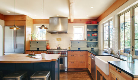
MOST POPULAR8 Questions to Ask Yourself Before Meeting With Your Designer
Thinking in advance about how you use your space will get your first design consultation off to its best start
Full Story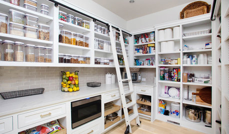
KITCHEN DESIGN9 Questions to Ask When Planning a Kitchen Pantry
Avoid blunders and get the storage space and layout you need by asking these questions before you begin
Full Story
DECORATING GUIDESGet Your Edge On: 11 Ideas for Style in the Fast Lane
Show off your personality and give your design a surprising twist with one of these slightly edgier touches
Full Story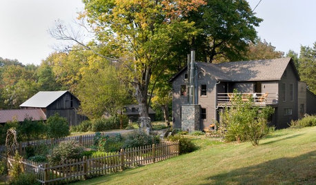
ECLECTIC HOMESHouzz Tour: Farmhouse Retreat With a Sophisticated Edge
Humor is part of the mix in a Pennsylvania weekend house decorated with antiques, art and repurposed vintage farm items
Full Story
VACATION HOMESHouzz Tour: More Room to Relax in a Michigan Retreat
Tired of cramming their family and friends into a compact space, a family adds a guesthouse and an addition big enough for a crowd
Full Story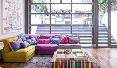
ECLECTIC HOMESMy Houzz: A Basketball Court, a Rooftop Kitchen and More in Manhattan
This 5-story tour de force by the stars of ‘9 by Design’ puts the focus on family, work and fun
Full Story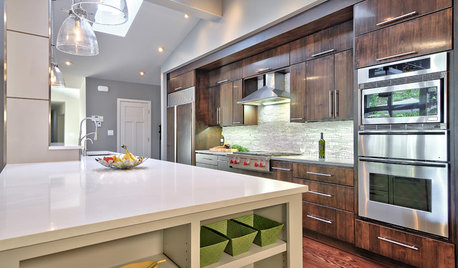
KITCHEN COUNTERTOPS7 Low-Maintenance Countertops for Your Dream Kitchen
Fingerprints, stains, resealing requirements ... who needs ’em? These countertop materials look great with little effort
Full Story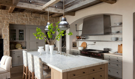
KITCHEN DESIGNHouzz Quiz: What Kitchen Countertop Is Right For You?
The options for kitchen countertops can seem endless. Take our quiz to help you narrow down your selection
Full Story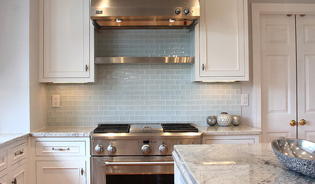
KITCHEN DESIGN5 Favorite Granites for Gorgeous Kitchen Countertops
See granite types from white to black in action, and learn which cabinet finishes and fixture materials pair best with each
Full StoryMore Discussions

Haven Design and Construction