


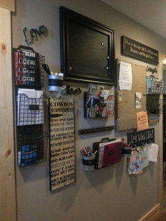
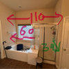
Does this collage look bad?
J Kildman
7 years ago
last modified: 7 years ago


Featured Answer
Sort by:Oldest
Comments (28)
Related Professionals
Baltimore Architects & Building Designers · Clute Kitchen & Bathroom Designers · Commerce City Kitchen & Bathroom Designers · Franklin Furniture & Accessories · Queens Furniture & Accessories · Potomac Furniture & Accessories · Barrington General Contractors · Bartlesville General Contractors · Dover General Contractors · Lakeside General Contractors · Milford General Contractors · Pine Hills General Contractors · Richfield General Contractors · Tabernacle General Contractors · Troutdale General Contractors
J Kildman
7 years agoJ Kildman
7 years ago
Kathi Steele
7 years agoJ Kildman
7 years agoJ Kildman
7 years ago PRO
PROCoates Design Architecture + Interiors
7 years ago
justbeckyg
7 years agojustbeckyg
7 years agofelizlady
7 years agoJ Kildman
7 years ago
chloebud
7 years agoJ Kildman
7 years agochloebud
7 years agocpaul1
7 years agoJ Kildman
7 years agoKathi Steele
7 years ago


Related Stories

INSIDE HOUZZHow Much Does a Remodel Cost, and How Long Does It Take?
The 2016 Houzz & Home survey asked 120,000 Houzzers about their renovation projects. Here’s what they said
Full Story
FUN HOUZZ10 Truly Irritating Things Your Partner Does in the Kitchen
Dirty dishes, food scraps in the sink — will the madness ever stop?
Full Story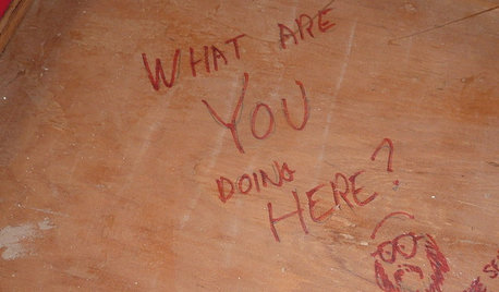
FUN HOUZZDoes Your Home Have a Hidden Message?
If you have ever left or found a message during a construction project, we want to see it!
Full Story
REMODELING GUIDESBathroom Workbook: How Much Does a Bathroom Remodel Cost?
Learn what features to expect for $3,000 to $100,000-plus, to help you plan your bathroom remodel
Full Story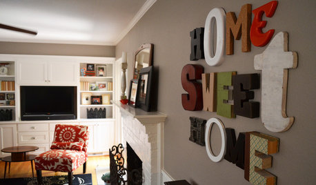
MOST POPULARWhen Does a House Become a Home?
Getting settled can take more than arranging all your stuff. Discover how to make a real connection with where you live
Full Story
DECORATING GUIDESRex Ray's Joyous Collages Come to the Home
San Francisco artist Rex Ray talks about his work in the music world, his new home products and his belief that art is for everyone
Full Story
GARDENING AND LANDSCAPINGBid Bad Garden Bugs Goodbye and Usher In the Good
Give ants their marching orders and send mosquitoes moseying, while creating a garden that draws pollinators and helpful eaters
Full Story
WINDOW TREATMENTS6 Ways to Deal With a Bad View Out the Window
You can come out from behind the closed curtains now. These strategies let in the light while blocking the ugly
Full Story
REMODELING GUIDES7 Bad Things Your Home May Be Hiding
What you don't know about your home could cost you during a remodel. Here's what to plan for
Full Story
HOUZZ TOURSMy Houzz: Collective Panache for an 1890s Home
Meaningful collages mix with globally gathered mementos in a mom and son’s engaging Montreal house
Full Story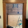

indybullterrier