


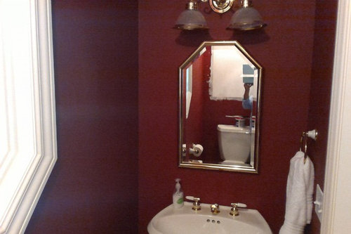
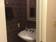
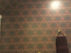
Tiny Powder Room
Bluebell66
7 years ago
last modified: 7 years ago

Featured Answer
Sort by:Oldest
Comments (32)
Related Professionals
Mount Laurel Interior Designers & Decorators · Queens Interior Designers & Decorators · Beaufort Furniture & Accessories · Brooklyn Furniture & Accessories · Skokie Furniture & Accessories · Washington Furniture & Accessories · Atlantic Beach Furniture & Accessories · Irmo Furniture & Accessories · Sahuarita Furniture & Accessories · Vail Furniture & Accessories · Lake Magdalene Furniture & Accessories · University Lighting · Patchogue Window Treatments · Ridgewood Window Treatments · Salt Lake City Window Treatments
Bluebell66
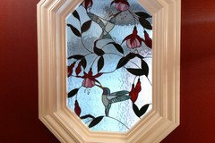
7 years agoBluebell66
7 years agoBluebell66
7 years agoBluebell66
7 years agoBluebell66
7 years ago
User
7 years agoBluebell66
7 years agoBluebell66
7 years agoBluebell66
7 years ago
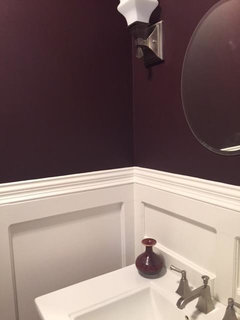
monicakm_gw
7 years ago


Related Stories
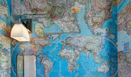
WALL TREATMENTSA Tiny Powder Room Gets a Map-tastic Look
Creative cartography adds cheer and personality to the walls of a compact half bath
Full Story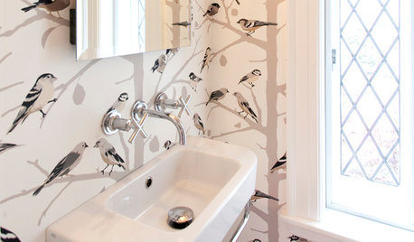
BATHROOM MAKEOVERSRoom of the Day: Tiny Powder Room With a Treehouse Feel
Clean lines and whimsical wallpaper create a delightful jewel box under the stairs in a Connecticut home
Full Story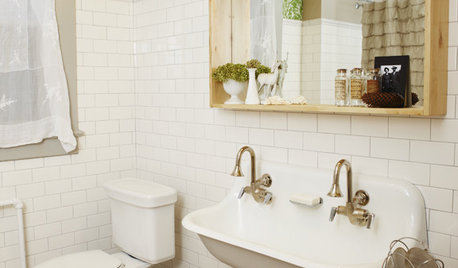
BATHROOM DESIGNSmall-Bathroom Secret: Free Up Space With a Wall-Mounted Sink
Make a tiny bath or powder room feel more spacious by swapping a clunky vanity for a pared-down basin off the floor
Full Story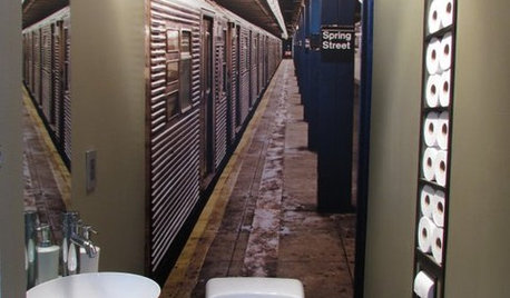
POWDER ROOMSNow Arriving on Platform 2, a Playful Powder Room
Subway graphics from a New York City station add unexpected depth and humor to a tiny half bath in California
Full Story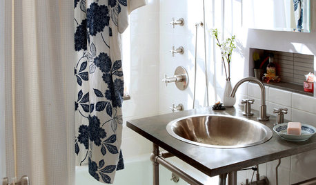
BATHROOM DESIGN8 Tiny Bathrooms With Big Personalities
Small wonders are challenging to pull off in bathroom design, but these 8 complete baths do it with as much grace as practicality
Full Story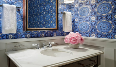
BATHROOM DESIGNYes, You Can Go Bold With Wallpaper in a Powder Room
The smallest room in the house can make the biggest design impact. Here are 10 of our favorite papered powder rooms
Full Story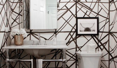
BATHROOM DESIGNNew This Week: 5 Bold Wallcovering Ideas for Powder Rooms
Take cues from these spaces to supercharge one of the most used rooms in your home
Full Story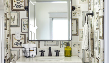
BATHROOM DESIGNKey Measurements to Help You Design a Powder Room
Clearances, codes and coordination are critical in small spaces such as a powder room. Here’s what you should know
Full Story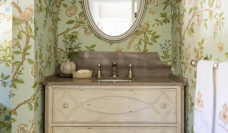
BATHROOM DESIGNDesign Details: Powder Room Vanity Styles With Personality
Powder rooms often get squeezed into tight spaces. You can use this design opportunity to express your style and delight your guests
Full Story
BATHROOM DESIGN9 Big Space-Saving Ideas for Tiny Bathrooms
Look to these layouts and features to fit everything you need in the bath without feeling crammed in
Full Story


User