


Warm vs cool tones. Amateur question.
Shannonkelli
7 years ago
Featured Answer
Sort by:Oldest
Comments (14)

User
7 years agolast modified: 7 years ago
deegw
7 years agoRelated Professionals
Linton Hall Interior Designers & Decorators · Greer Furniture & Accessories · Mansfield Furniture & Accessories · Savannah Furniture & Accessories · Newton Furniture & Accessories · Woodbury Furniture & Accessories · Chaska Furniture & Accessories · Encinitas Furniture & Accessories · Hoffman Estates Furniture & Accessories · Carpinteria Furniture & Accessories · Paradise Custom Artists · Palm Desert Lighting · Suitland Lighting · Clinton Window Treatments · San Jose Window TreatmentsJane
7 years ago
aprilneverends
7 years agoaprilneverends
7 years agoBoopadaboo
7 years agoaprilneverends
7 years agolast modified: 7 years ago- PRO
User
7 years ago aprilneverends
7 years agoaprilneverends
7 years ago- PRO
User
7 years ago aprilneverends
7 years ago
lazy_gardens
7 years ago
Related Stories
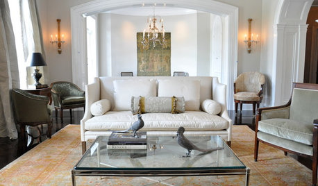
DECORATING GUIDESTry a Handmade Oushak Rug for Warm Spice Tones and Softness Underfoot
Lovely to look at and delightful to touch, these sumptuous Turkish rugs work with a range of room styles
Full Story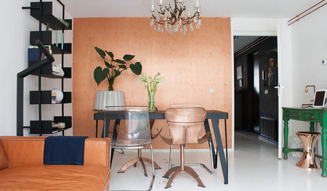
HOUZZ TOURSMy Houzz: Copper Tones Warm an Amsterdam Apartment
Paint, editing and a crush on copper help an Amsterdam resident conquer his compact space
Full Story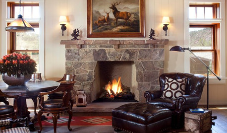
HOUZZ TV FAVORITESHouzz TV: Flickering Virtual Fireplaces to Warm Your Heart
Sit back and enjoy a crackling fire set to seasonal music and surrounded by ideas for your own dream living room
Full Story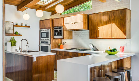
KITCHEN CABINETSNew This Week: 3 Modern Kitchens That Rock Warm Wood Cabinets
Looking for an alternative to bright white? Walnut cabinetry offers the perfect tone to warm things up
Full Story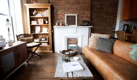
HOUZZ TOURSMy Houzz: Warm Industrial Style in a Brooklyn Apartment
Natural tones and travel-inspired mementos decorate this cozy Park Slope rental
Full Story
FEEL-GOOD HOMEThe Question That Can Make You Love Your Home More
Change your relationship with your house for the better by focusing on the answer to something designers often ask
Full Story
LIGHTING5 Questions to Ask for the Best Room Lighting
Get your overhead, task and accent lighting right for decorative beauty, less eyestrain and a focus exactly where you want
Full Story
GREEN BUILDINGConsidering Concrete Floors? 3 Green-Minded Questions to Ask
Learn what’s in your concrete and about sustainability to make a healthy choice for your home and the earth
Full Story
REMODELING GUIDES13 Essential Questions to Ask Yourself Before Tackling a Renovation
No one knows you better than yourself, so to get the remodel you truly want, consider these questions first
Full StoryMore Discussions


Lori A. Sawaya