


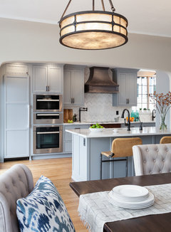
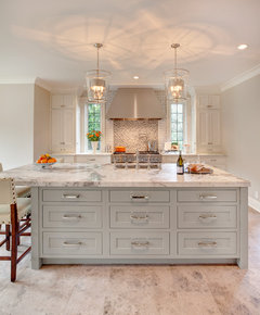
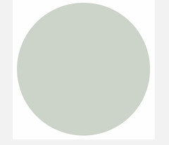
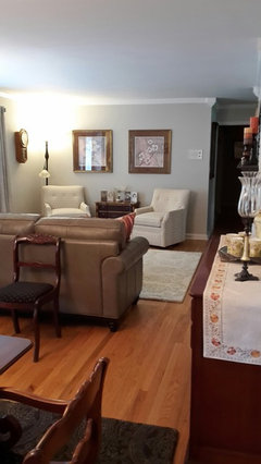
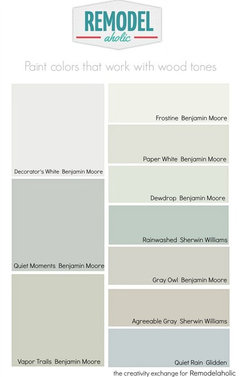
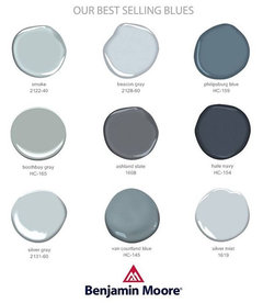
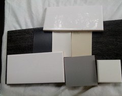
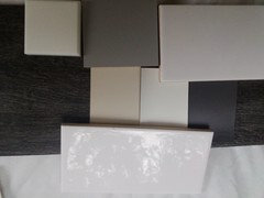
Need gray SW paint color to go with Waypoint "stone" cabinets.
Chromatic
6 years ago

Featured Answer
Sort by:Oldest
Comments (22)

herbflavor
6 years agolast modified: 6 years agoRelated Professionals
Crest Hill Painters · Orem Painters · Silver Spring Painters · Bellwood Cabinets & Cabinetry · Brushy Creek Flooring Contractors · San Carlos Flooring Contractors · St. Johns Flooring Contractors · Glens Falls Architects & Building Designers · Lebanon Furniture & Accessories · Sahuarita Furniture & Accessories · North Lauderdale General Contractors · Eureka Kitchen & Bathroom Remodelers · Schiller Park Kitchen & Bathroom Remodelers · Graham Cabinets & Cabinetry · Parsippany Cabinets & Cabinetry
apple_pie_order
6 years ago
Chromatic
6 years ago
Cara Lewis-Watts
6 years ago PRO
PROCreative Visual Concepts, Kevin Strader
6 years ago PRO
PROLori A. Sawaya
6 years ago- PRO
Lori A. Sawaya
6 years ago  PRO
PROBeth H. :
6 years agoChromatic
6 years agoChromatic
6 years agoChromatic
6 years ago PRO
PROFlo Mangan
6 years agoChromatic
6 years agoAshley M
6 years agoChromatic
6 years agoAshley M
6 years agoChromatic
6 years agoAshley M
6 years agoChromatic
6 years agoAshley M
6 years agoChromatic
5 years ago


Related Stories

GRAYDesigners Share Their Favorite Light Gray Paints
These versatile neutrals can help create a range of moods in any room
Full StoryBEFORE AND AFTERSGray Cabinets Update a Texas Kitchen
Julie Shannon spent 3 years planning her kitchen update, choosing a gray palette and finding the materials for a transitional style
Full Story
GRAYChoosing Paint: How To Pick the Right Gray
Which Version of Today's 'It' Neutral Is For You?
Full Story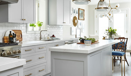
BEFORE AND AFTERSKitchen of the Week: Gray Cabinets, Mixed Metals and Italian Love
Bold white, soft gray, touches of wood and brass, and a European-style coffee station enliven a new kitchen
Full Story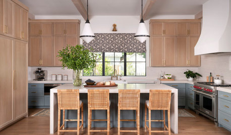
KITCHEN CABINETSPainted vs. Stained Kitchen Cabinets
Wondering whether to go for natural wood or a painted finish for your cabinets? These pros and cons can help
Full Story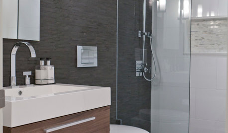
COLORBathed in Color: When to Use Gray in the Bath
Go for elegance and sophistication without going overboard on coolness, using these gray bathroom paint picks and inspirational photos
Full Story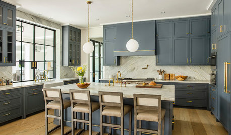
KITCHEN CABINETSNew This Week: 6 Blue Paints for Stylish Kitchen Cabinets
See how undertones in blue cabinets create diverse styles and moods, from playful and fun to daring and dramatic
Full Story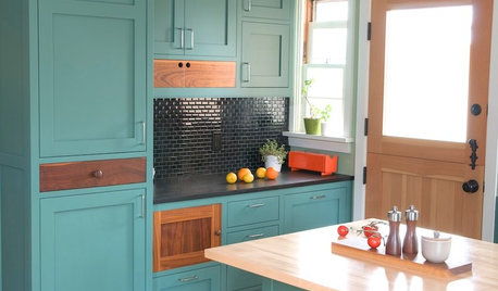
KITCHEN CABINETSKitchen Cabinet Color: Should You Paint or Stain?
Learn about durability, looks, cost and more for wooden cabinet finishes to make the right choice for your kitchen
Full StoryMOST POPULARFrom the Pros: How to Paint Kitchen Cabinets
Want a major new look for your kitchen or bathroom cabinets on a DIY budget? Don't pick up a paintbrush until you read this
Full Story
COLORA Designer Shares Her 5 Go-To Paint Colors
Whether she’s looking for something playful or dramatic, Jennifer Ott knows these paint colors will always deliver
Full Story

User