


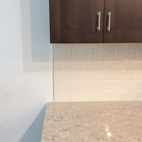
Regrets, I've had a few...
tj edward
5 years ago
last modified: 5 years ago
Featured Answer
Sort by:Oldest
Comments (36)

K R
5 years ago
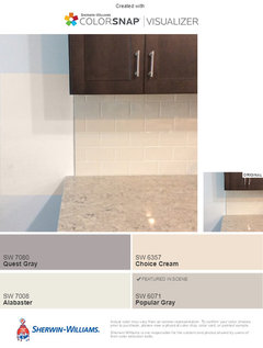
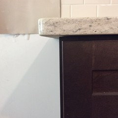
tj edward
5 years agoRelated Professionals
Hutto Painters · Midlothian Painters · Murfreesboro Painters · Eastvale Painters · Hayward Painters · Melrose Park Painters · Norwell Painters · Arlington Flooring Contractors · Dracut Flooring Contractors · Mill Valley Flooring Contractors · Superior Flooring Contractors · Saint Paul Architects & Building Designers · Green Bay General Contractors · Davidson Tile and Stone Contractors · Santa Rosa Tile and Stone Contractors
nuthinontv
5 years agolast modified: 5 years agotj edward
5 years agotj edward
5 years agotj edward
5 years ago PRO
PROKRE Group LLC
5 years agotj edward
5 years agoartistsharonva
5 years ago PRO
PRODiana Bier Interiors, LLC
5 years ago
Molly D. Zone4B
5 years ago
grapefruit1_ar
5 years agotj edward
5 years agotj edward
5 years agotj edward
5 years agosarahlps
5 years ago
Melissa R
5 years agoMelissa R
5 years agotj edward
5 years agotj edward
5 years agotj edward
5 years agotj edward
5 years agolast modified: 5 years agoMelissa R
5 years agoartistsharonva
5 years agoshelayne
5 years agoElizabeth M
5 years agosarahlps
5 years ago


Related Stories

COFFEE WITH AN ARCHITECTA Few Things I Would Like to Ask Frank Lloyd Wright
It could take a lifetime to understand Frank Lloyd Wright's work — less if we had answers to a few simple questions
Full Story
LIFEYou Said It: ‘I Knew This Home Had to Be Mine’ and More Quotables
Design advice, inspiration and observations that struck a chord this week
Full Story
DECORATING GUIDESThe Dumbest Decorating Decisions I’ve Ever Made
Caution: Do not try these at home
Full Story
FEEL-GOOD HOME12 Very Useful Things I've Learned From Designers
These simple ideas can make life at home more efficient and enjoyable
Full Story
FUN HOUZZEverything I Need to Know About Decorating I Learned from Downton Abbey
Mind your manors with these 10 decorating tips from the PBS series, returning on January 5
Full Story
REMODELING GUIDES10 Biggest Remodeling Regrets and How to Avoid Them
We’ve asked a panel of experts to reveal the most common renovating mistakes — and how to steer clear of them
Full Story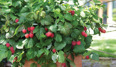
CONTAINER GARDENSPatio-Perfect Berry Bushes Like You’ve Never Seen
Small enough for pots but offering abundant fruit, these remarkable bred berries are a boon for gardeners short on space
Full Story
PAINTINGHelp! I Spilled Paint on My Clothes — Now What?
If you’ve spattered paint on your favorite jeans, here’s what to do next
Full Story
ORGANIZINGDo It for the Kids! A Few Routines Help a Home Run More Smoothly
Not a Naturally Organized person? These tips can help you tackle the onslaught of papers, meals, laundry — and even help you find your keys
Full Story
GARDENING GUIDESHow I Learned to Be an Imperfect Gardener
Letting go can lead to a deeper level of gardening and a richer relationship with the landscape. Here's how one nature lover did it
Full Story


artistsharonva