


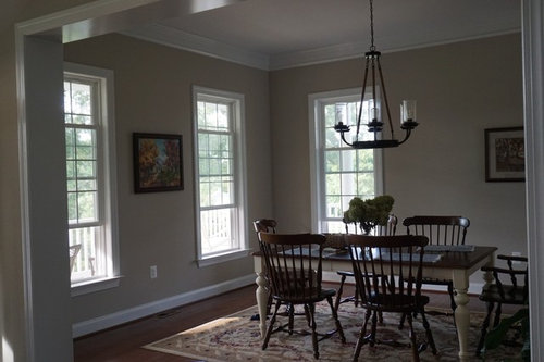
My overly brown dining room needs paint color help
Katie S.
5 years ago
Featured Answer
Sort by:Oldest
Comments (17)

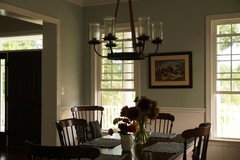
Elle
5 years ago
beckysharp Reinstate SW Unconditionally
5 years agolast modified: 5 years agoRelated Professionals
East Patchogue Interior Designers & Decorators · Garden City Interior Designers & Decorators · Wanaque Interior Designers & Decorators · Stuart Furniture & Accessories · Hilton Head Island Furniture & Accessories · San Francisco Lighting · University Lighting · South Gate Cabinets & Cabinetry · Tahoe City Interior Designers & Decorators · Freehold Kitchen & Bathroom Designers · Palm Harbor Kitchen & Bathroom Designers · Ridgefield Kitchen & Bathroom Designers · United States Kitchen & Bathroom Designers · Hanover Township Kitchen & Bathroom Remodelers · Shawnee Kitchen & Bathroom Remodelers
Bri Bosh
5 years ago
Katie S.
5 years agoElle
5 years agoElle
5 years agoKatie S.
5 years agobeckysharp Reinstate SW Unconditionally
5 years agoKatie S.
5 years agobeckysharp Reinstate SW Unconditionally
5 years agoKatie S.
5 years agobeckysharp Reinstate SW Unconditionally
5 years agoKatie S. thanked beckysharp Reinstate SW UnconditionallyKatie S.
5 years agobeckysharp Reinstate SW Unconditionally
5 years ago
WalnutCreek Zone 7b/8a
5 years agoKatie S.
5 years ago


Related Stories
REMODELING GUIDESRoom of the Day: Antiques Help a Dining Room Grow Up
Artfully distressed pieces and elegant colors take a formerly child-focused space into sophisticated territory
Full Story
SMALL HOMESRoom of the Day: Living-Dining Room Redo Helps a Client Begin to Heal
After a tragic loss, a woman sets out on the road to recovery by improving her condo
Full Story
KIDS’ SPACESWho Says a Dining Room Has to Be a Dining Room?
Chucking the builder’s floor plan, a family reassigns rooms to work better for their needs
Full Story
DINING ROOMSDesign Dilemma: I Need Ideas for a Gray Living/Dining Room!
See How to Have Your Gray and Fun Color, Too
Full Story
DINING ROOMSDesign Dilemma: My Dining Room Needs Revamping!
Watch a dining-room makeover unfold in the Houzz Questions forum
Full StoryDINING ROOMSRoom of the Day: Grown-Up Style in a Family Dining Room
Easy-care fabrics, a lighter color palette and a great furniture save help a Boston-area family get the transitional look they were after
Full Story
DECORATING GUIDESRoom of the Day: Romancing a Maine Dining Room
Glossy paint and country-style furnishings make a 19th-century interior an affair to remember
Full Story
ROOM OF THE DAYRoom of the Day: Making Over a Harlem Living Room From 3,000 Miles Away
Using photos, video and email, San Francisco designer Jacqueline Palmer created a stylish living room for a New York City entrepreneur
Full Story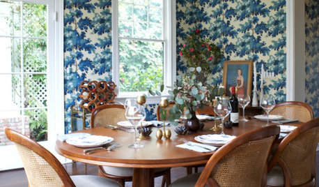
DINING ROOMSRoom of the Day: Traditional Dining Room Shaken With a Twist
This home's colonial architecture inspires formality, while the room's bold color, a mix of styles and a glossy bar update the look
Full Story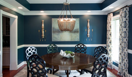
DINING ROOMSRoom of the Day: A Dining Room Makes a Dramatic Entrance
A bold color palette and sophisticated decor set the tone for visitors to a Baltimore waterfront home
Full StorySponsored
Columbus Area's Luxury Design Build Firm | 17x Best of Houzz Winner!
More Discussions


Elle