


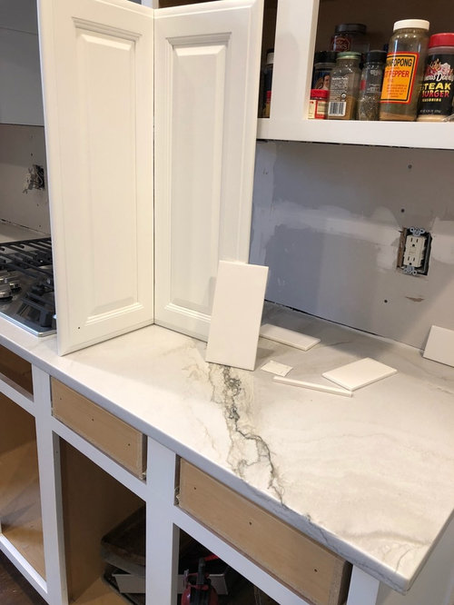
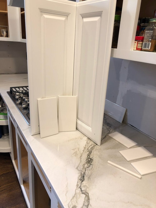
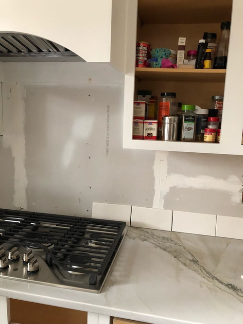
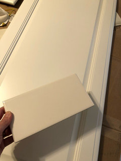
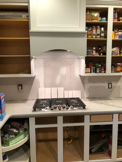
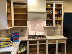
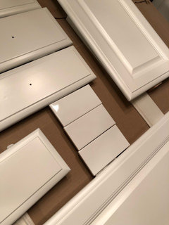
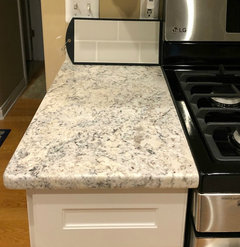
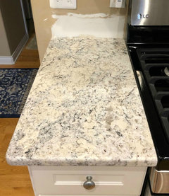
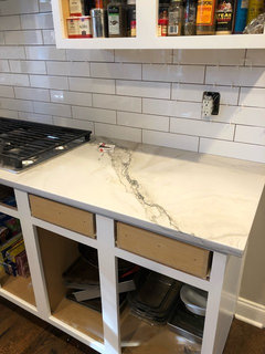
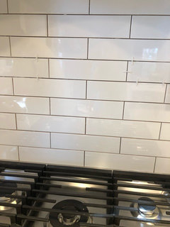
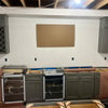
kitchen subway tile help
J Kildman
5 years ago

Featured Answer
Sort by:Oldest
Comments (24)

J Kildman
5 years agoJ Kildman
5 years agoRelated Professionals
Clayton Architects & Building Designers · Enterprise Architects & Building Designers · Lexington Architects & Building Designers · Yeadon Architects & Building Designers · Tulsa Furniture & Accessories · Wilmington Furniture & Accessories · Fargo Furniture & Accessories · Irmo Furniture & Accessories · Beloit General Contractors · Converse General Contractors · De Luz General Contractors · Fredonia General Contractors · Northfield General Contractors · Riverside General Contractors · Troutdale General Contractors PRO
PROJudyG Designs
5 years agolast modified: 5 years ago
chiflipper
5 years agolast modified: 5 years agohummingalong2
5 years ago PRO
PROSkippack Tile & Stone
5 years ago
K R
5 years agoJ Kildman
5 years ago PRO
PRODistinction Tile
5 years agoleelee
5 years ago
Christine Hatt-Pyne
5 years agoJ Kildman
5 years ago PRO
PRODiana Bier Interiors, LLC
5 years agoGreg P.
5 years agofelizlady
5 years ago
vintagestuf
5 years agolast modified: 5 years ago
RedRyder
5 years agoleelee
5 years agoleelee
5 years agolast modified: 5 years agomimimomy
5 years agoJ Kildman
5 years agovintagestuf
5 years agoRedRyder
5 years ago


Related Stories
KITCHEN OF THE WEEKKitchen of the Week: Graphic Floor Tiles Accent a White Kitchen
Walls come down to open up the room and create better traffic flow
Full Story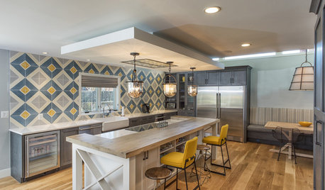
KITCHEN DESIGNKitchen of the Week: Tile Sets the Tone in a Modern Farmhouse Kitchen
A boldly graphic wall and soft blue cabinets create a colorful focal point in this spacious new Washington, D.C.-area kitchen
Full Story
KITCHEN DESIGNPatterned Tile Showcases an Open Kitchen’s New Minibar
A couple’s kitchen update puts the focus on entertaining by inviting guests in for a drink
Full Story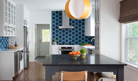
KITCHEN BACKSPLASHESThis Kitchen’s Geometric Blue Tile Steals the Show
An Asian-inspired island, newly stained floors and white cabinets complete the look
Full Story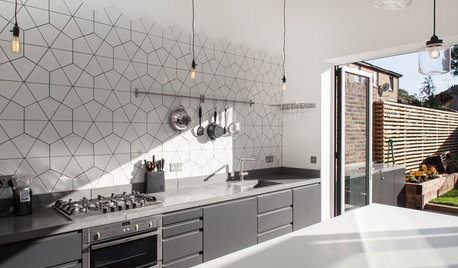
KITCHEN DESIGNKitchen of the Week: Geometric Tile Wall in a White Kitchen
Skylights, bifold doors, white walls and dark cabinets star in this light-filled kitchen addition
Full Story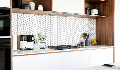
KITCHEN BACKSPLASHESLove a White Backsplash but Not Subway Tile? Try One of These
If you want to go beyond the classic rectangle, consider these 11 white backsplash tile options
Full Story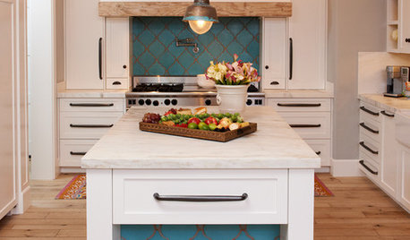
KITCHEN DESIGN10 Gorgeous Backsplash Alternatives to Subway Tile
Artistic installations, back-painted glass and pivoting windows prove there are backsplash possibilities beyond the platform
Full Story
KITCHEN DESIGNSubway Tile Picks Up Gray Grout
Heading into darker territory, subway tile offers a graphic new look for kitchens, bathrooms and more
Full Story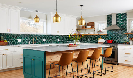
KITCHEN MAKEOVERSKitchen of the Week: Backsplash Dazzles in Green Geometric Tile
A designer helps a growing family function better at home with a new kitchen, mudroom and dining room bar
Full Story
BEFORE AND AFTERSKitchen of the Week: Bungalow Kitchen’s Historic Charm Preserved
A new design adds function and modern conveniences and fits right in with the home’s period style
Full StoryMore Discussions


Sina Sadeddin Architectural Design