


What’s a lighter version of SW Zurich White
Jennifer Svensson
5 years ago
last modified: 5 years ago

Featured Answer
Sort by:Oldest
Comments (10)

Jennifer Svensson
5 years agoRelated Professionals
Bound Brook Painters · Hermosa Beach Painters · Des Plaines Flooring Contractors · Englewood Flooring Contractors · Charleston Interior Designers & Decorators · Carlsbad Furniture & Accessories · Greenwood Village Furniture & Accessories · Maplewood Furniture & Accessories · Gadsden Window Treatments · College Park Kitchen & Bathroom Designers · Redmond Furniture & Accessories · Jacinto City Furniture & Accessories · Harvey General Contractors · Noblesville General Contractors · Troy General Contractors PRO
PROLori A. Sawaya
5 years agoJennifer Svensson
5 years agolast modified: 5 years agoJennifer Svensson
4 years ago- PRO
Lori A. Sawaya
4 years ago Jennifer Svensson
4 years agocalidesign
4 years agoAlyssa B
8 months agoJennifer Svensson
8 months ago

Related Stories

MOST POPULARWhat’s Your Neutral: Beige or Gray?
A designer shares 10 tips for using the neutral shade that works best for you
Full Story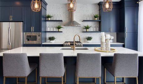
KITCHEN DESIGNWorking the Room: What’s Popular in Kitchens Now
We break down 9 kitchen design ideas that are making people happy — and show how to make them work for you
Full Story
PRODUCT PICKSGuest Picks: What’s Purple All Over?
With kitchen appliances, pillows, chairs and more in shades of lavender to plum, your home can be as purple as you please
Full Story
LIFEHouzz Call: What’s Your Perfect House Size?
How big is too big? How small is too small? Please tell us which home size is just right for you
Full Story
WHITEWhat to Know Before You Paint Your Walls White
A coat of white paint can do wonders in one room and wreak havoc in another. Here are tips for using the popular hue
Full Story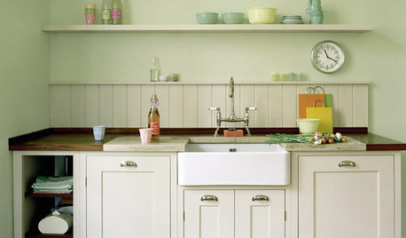
KITCHEN DESIGNSeeing Green: Some Kitchens Ditch White for Mother Nature’s Neutral
It’s typically the primary color in gardens. Now green is having a moment in the kitchen
Full Story
KITCHEN DESIGNWhat to Do if Your Kitchen Is Simply Too White for You
Does your all-white kitchen have you craving a little color? Here are some ways to introduce it
Full Story
MOST POPULARMust-Try Color Combo: White With Warm Off-White
Avoid going too traditional and too clean by introducing an off-white palette that brings a touch of warmth and elegance
Full Story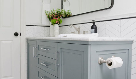
BATHROOM OF THE WEEKWhite Paint and Patterned Tile Freshen Up a 5-by-11-Foot Bathroom
A designer uses a light palette and hardworking cabinetry to update a couple’s 1970s hallway bathroom
Full Story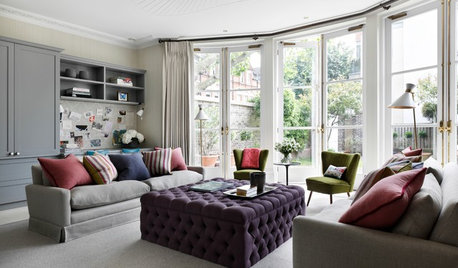
DECORATING GUIDES10 Ideas for a Lighter, Brighter Living Room
Give your space a boost all year round by making the most of every bit of daylight
Full Story


Lori A. Sawaya