


guidelines to colors that work together using chroma and color theory?
C DeV
4 years ago
Featured Answer
Sort by:Oldest
Comments (21)
 PRO
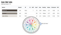
PROLori A. Sawaya
4 years agolast modified: 4 years agoRelated Professionals
Anaheim Painters · Damascus Painters · Hartselle Painters · Lake Forest Painters · Sunnyvale Painters · Towson Painters · Toledo Flooring Contractors · Wesley Chapel Flooring Contractors · West Bend Flooring Contractors · Carson City Furniture & Accessories · Oak Lawn Lighting · Potomac Furniture & Accessories · Leon Valley General Contractors · Rolla General Contractors · View Park-Windsor Hills General Contractors
C DeV
4 years ago- PRO
Lori A. Sawaya
4 years ago 
J Williams
4 years agoC DeV
4 years agoJ Williams
4 years agoC DeV
4 years ago
Amy Kennair
2 years agoAmy Kennair
2 years ago- PRO
Lori A. Sawaya
2 years ago


Related Stories
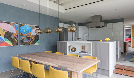
COLORGo for the Bold: 6 Small Ways to Use Big Color
These 12 spaces celebrate vibrant color in everything from feature walls to furniture without going garish
Full Story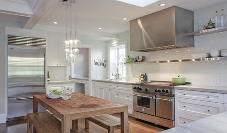
KITCHEN DESIGNCooking With Color: When to Use White in the Kitchen
Make sure your snowy walls, cabinets and counters don't feel cold while you're riding white's popularity peak
Full Story
COLORHow to Use Marsala, Pantone’s 2015 Color of the Year
Pantone digs deep and goes earthy with its selection. Here are ways to make it work in your home
Full Story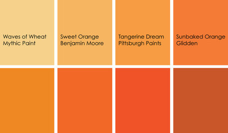
COLORCooking With Color: When to Use Orange in the Kitchen
Try a dash of Cayenne or swaths of Sweet Orange for zesty, high-energy kitchen flavor
Full Story
DECORATING GUIDESTaste a Rainbow: 11 Top Home Decorating Colors and How to Use Them
Prime yourself for spring painting season with our color-happy guide to working with popular shades around the home
Full Story
APARTMENTSHouzz Tour: Fearless Use of Color in a Chicago Co-Op
Works by Matisse, Miró, Rothko and others inspire a striking renovation for an art-loving couple
Full Story
COLORBest Uses for the Boho Blue Color of 2015
PPG Pittsburgh Paints’ Color of the Year is a bold bohemian blue best used in small doses
Full Story
COLORHow to Pick the Perfect Accent Color
Not sure what colors go together in a room? Here are suggested combinations for different moods and effects
Full Story
COLOROpposites Attract: Complementary Color Combos
Use the power couples of the color wheel — blue and orange, purple and yellow, red and green — to spice up any decor scheme
Full Story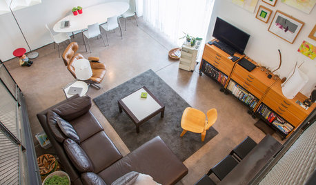
LOFTSMy Houzz: Splashes of Color in a Modern Arizona Loft
Artwork, travel mementos and midcentury furniture come together in this home in a Tucson residential community
Full Story


Lori A. Sawaya