


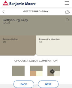
Another color similar to the warm side of Edgecomb Gray but lighter?
laura_04
4 years ago
Featured Answer
Sort by:Oldest
Comments (24)

jck910
4 years ago
Jennifer Hogan
4 years agoRelated Professionals
Franklin Architects & Building Designers · Bloomington Kitchen & Bathroom Designers · San Juan Capistrano Furniture & Accessories · Sugar Hill Furniture & Accessories · Lakewood Park General Contractors · Port Huron General Contractors · Westerly General Contractors · Waggaman Paint & Wall Coverings · Spring Painters · Hanover Park Painters · Huntsville Painters · Tukwila Painters · Martinsville Painters · Branford Flooring Contractors · Land O' Lakes Flooring Contractorslaura_04
4 years agolaura_04
4 years agoJennifer Hogan
4 years agoJennifer Hogan
4 years agolaura_04
4 years ago- PRO
Patricia Colwell Consulting
4 years ago Jennifer Hogan
4 years agolaura_04
4 years agolaura_04
4 years agoJennifer Hogan
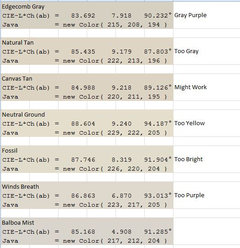
4 years agoMarleneM
4 years ago PRO
PROLori A. Sawaya
4 years agolaura_04
4 years ago- PRO
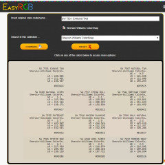
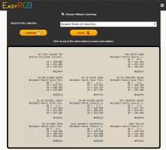
Lori A. Sawaya
4 years agolast modified: 4 years ago - PRO
Lori A. Sawaya
4 years ago laura_04
4 years agoMary Elizabeth
3 years ago- PRO
Lori A. Sawaya
3 years ago Jennifer Hogan
3 years agoMary Elizabeth
3 years agolast modified: 3 years agoOpdos
3 years ago


Related Stories

EXTERIOR COLORExterior Color of the Week: 7 Ways With Warm Gray
See why this hue can be the perfect neutral for any house
Full Story
DECORATING GUIDESColor of the Week: Decorating With Warm Gray
Tired of tan? Getting gloomy from cool gray? Make warm gray your new go-to neutral
Full Story
BATHROOM MAKEOVERSBefore and After: Brass Warms a White-and-Gray Bathroom
New features, fixtures and hardware update this remodeled D.C. bathroom to give it a fresh and inviting feel
Full Story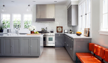
KITCHEN DESIGN8 Gray Kitchens That Nail Warmth and Balance
Look to subtle undertones and the right mix of cool and warm tones in your color choices
Full Story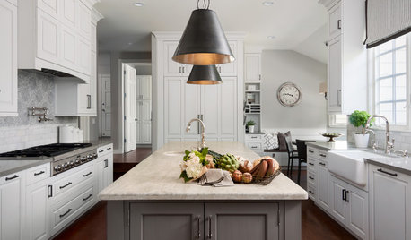
KITCHEN OF THE WEEKKitchen of the Week: Open and Gray Save the Day
A workhorse island replaces an awkward storage tower, and a neutral palette brings a balance of cool and warm tones
Full Story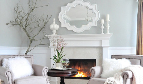
GRAYColor Guide: How to Work With Light Gray
The hottest new neutral can be cool or warm, formal or casual, and feminine or masculine. Talk about versatile
Full Story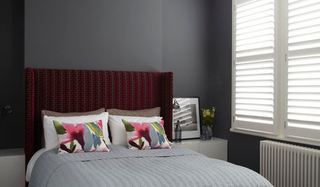
COLORDreaming in Color: 8 Gorgeous Gray Bedrooms
With this versatile hue, you can go dark and bold or slip into something more soothing
Full Story
KITCHEN DESIGNNew This Week: 3 Stunning White-and-Gray Kitchens
See how the classic color palette works wonders in spaces in a variety of styles
Full Story
DINING ROOMSColor Feast: When to Use Gray in the Dining Room
The right shade of gray pairs nicely with whites and woods to serve up elegance and sophistication
Full Story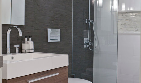
COLORBathed in Color: When to Use Gray in the Bath
Go for elegance and sophistication without going overboard on coolness, using these gray bathroom paint picks and inspirational photos
Full StoryMore Discussions


Molly D. Zone4B