


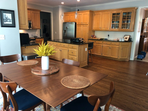
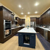
Island color for agreeable gray kitchen- at my wits end!
Kate Horowitz
3 years ago

Featured Answer
Sort by:Oldest
Comments (16)

Ephma
3 years ago
Kate Horowitz
3 years agoRelated Professionals
Saint Augustine Kitchen & Bathroom Remodelers · Niceville Tile and Stone Contractors · Jacksonville Painters · Lawndale Painters · Silver Spring Painters · Lakeside Cabinets & Cabinetry · Linton Hall Interior Designers & Decorators · Daly City Architects & Building Designers · Agoura Hills Kitchen & Bathroom Designers · Boston Furniture & Accessories · Phoenix Furniture & Accessories · Carson City Furniture & Accessories · Dardenne Prairie General Contractors · Springfield General Contractors · Summit General ContractorsKate Horowitz
3 years agocat_ky
3 years agolast modified: 3 years agoKate Horowitz
3 years ago
cawaps
3 years agoKate Horowitz
3 years agoMarylee H
3 years agoMarylee H
3 years agoMarylee H
3 years agoMarylee H
3 years agoMarylee H
3 years agoMarylee H
3 years agoMarylee H
3 years agomxk3 z5b_MI
3 years ago

Related Stories
KITCHEN ISLANDSNew This Week: 4 Storage Ideas for the End of Your Kitchen Island
See the ways to design drawers, shelves, racks and more for this island area
Full Story
KITCHEN DESIGNSleek Toronto Kitchen Warms Up With Rich Gray Cabinets
A designer balances a kitchen’s chic quartz wall and sculptural island with warm-tone cabinets and gray-washed floors
Full Story
KITCHEN OF THE WEEKKitchen of the Week: Open and Gray Save the Day
A workhorse island replaces an awkward storage tower, and a neutral palette brings a balance of cool and warm tones
Full StoryKITCHEN OF THE WEEKKitchen of the Week: White and Gray and Storage-Packed
Open space, natural light and a palette of neutrals create a bright contemporary kitchen for a growing family
Full Story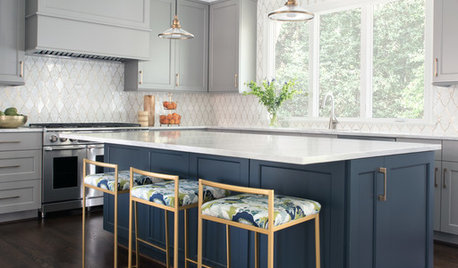
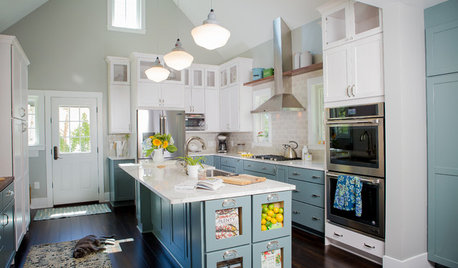
KITCHEN DESIGNThoughtful Style and Storage in a Gray-and-Blue Kitchen
This North Carolina kitchen features a marble-and-brass backsplash and carefully planned cabinet organization
Full Story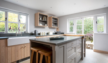
INSIDE HOUZZWhat’s Popular for Kitchen Islands in Remodeled Kitchens
Contrasting colors, cabinets and countertops are among the special touches, the U.S. Houzz Kitchen Trends Study shows
Full Story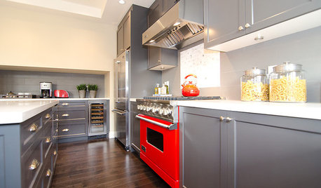
COLORCooking With Color: When to Use Gray in the Kitchen
Try out Trout or shake up some Martini Shaker gray for a neutral-based kitchen that whispers of sophistication
Full Story
KITCHEN OF THE WEEKKitchen of the Week: A Soothing Gray-and-White Open Concept
A smart redesign gives an active family a modern kitchen with soft tones, natural elements and mixed metals
Full StoryBEFORE AND AFTERSA Casual Gray Kitchen Effortlessly Blends Looks and Functionality
Durable, family-friendly finishes and cool tones help this San Diego kitchen keep a laid-back profile
Full Story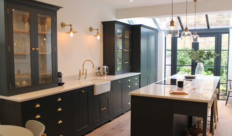
KITCHEN DESIGNBeautiful Dark Gray Cabinets in a Light-Filled English Kitchen
Simplicity, symmetry and attention to detail characterize this modern-meets-Victorian kitchen
Full StoryMore Discussions


Kate HorowitzOriginal Author