


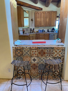
Kitchen cabinet color help
desi84b
3 years ago


Featured Answer
Sort by:Oldest
Comments (45)

K R
3 years ago
herbflavor
3 years agoRelated Professionals
Fort Wayne Furniture & Accessories · Browns Mills General Contractors · Lakeville Painters · Bainbridge Island Painters · Bethany Painters · Watertown Painters · Leicester Painters · Sunrise Manor Cabinets & Cabinetry · Lynbrook Flooring Contractors · Massapequa Flooring Contractors · Idaho Falls Kitchen & Bathroom Remodelers · Port Angeles Kitchen & Bathroom Remodelers · Sunrise Manor Cabinets & Cabinetry · Corsicana Tile and Stone Contractors · Calumet City Design-Build Firms- PRO
Patricia Colwell Consulting
3 years ago desi84b
3 years agocat_ky
3 years agoMarylee H
3 years agosusan49417
3 years agoMarylee H
3 years ago PRO
PROSabrina Alfin Interiors
3 years agoMarylee H
3 years agolast modified: 3 years agodesi84b
3 years agocat_ky
3 years agolast modified: 3 years agodesi84b
3 years agoMarylee H
3 years agodesi84b
3 years agodesi84b
3 years agoMarylee H
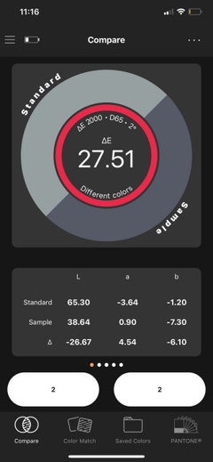
3 years ago PRO
PROLori A. Sawaya
3 years agodesi84b
3 years agodesi84b
3 years agoMarylee H
3 years agodesi84b
3 years agoMarylee H
3 years agodesi84b
3 years agodesi84b
3 years agoMarylee H
3 years agoMarylee H
3 years agolast modified: 3 years agoMarylee H
3 years agoMarylee H
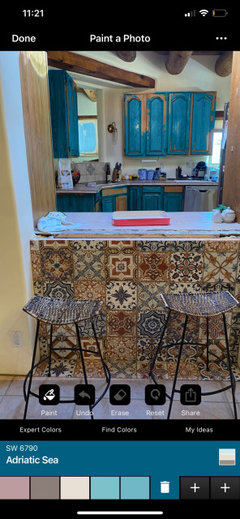
3 years agodesi84b
3 years agodesi84b
3 years agoMarylee H
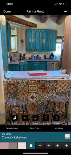
3 years agodesi84b
3 years agodesi84b
3 years agoMarylee H
3 years agoMarylee H
3 years agodesi84b
3 years agoMarylee H
3 years agodesi84b
3 years agoMarylee H
3 years agoMarylee H
3 years agodesi84b
3 years agoMarylee H
3 years agodesi84b
3 years ago


Related Stories
KITCHEN DESIGNHere's Help for Your Next Appliance Shopping Trip
It may be time to think about your appliances in a new way. These guides can help you set up your kitchen for how you like to cook
Full Story
KITCHEN DESIGNKey Measurements to Help You Design Your Kitchen
Get the ideal kitchen setup by understanding spatial relationships, building dimensions and work zones
Full Story
MOST POPULAR7 Ways to Design Your Kitchen to Help You Lose Weight
In his new book, Slim by Design, eating-behavior expert Brian Wansink shows us how to get our kitchens working better
Full Story
DECORATING GUIDESDecorate With Intention: Helping Your TV Blend In
Somewhere between hiding the tube in a cabinet and letting it rule the room are these 11 creative solutions
Full Story
Storage Help for Small Bedrooms: Beautiful Built-ins
Squeezed for space? Consider built-in cabinets, shelves and niches that hold all you need and look great too
Full Story
KITCHEN DESIGNDesign Dilemma: My Kitchen Needs Help!
See how you can update a kitchen with new countertops, light fixtures, paint and hardware
Full Story
SELLING YOUR HOUSE10 Tricks to Help Your Bathroom Sell Your House
As with the kitchen, the bathroom is always a high priority for home buyers. Here’s how to showcase your bathroom so it looks its best
Full Story
LIFEDecluttering — How to Get the Help You Need
Don't worry if you can't shed stuff and organize alone; help is at your disposal
Full Story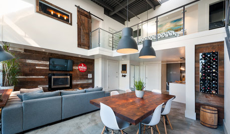
HOUZZ TOURSHouzz Tour: A Modern Loft Gets a Little Help From Some Friends
With DIY spirit and a talented network of designers and craftsmen, a family transforms their loft to prepare for a new arrival
Full Story
STANDARD MEASUREMENTSKey Measurements to Help You Design Your Home
Architect Steven Randel has taken the measure of each room of the house and its contents. You’ll find everything here
Full Story


Marylee H