Neutral paint color - not too pink, not quite gray
Can anyone suggest a paint color, preferably Sherwin Williams, that hits the sweet spot of not quite tipping into gray but going as far as possible from a pink toned beige white still technically being a pink undertoned beige? I assume it would be a taupe or greige color. I hope I am describing this well enough for you to understand what I'm looking for. It makes sense in my head!
I would also love to find a gray that is almost light brown yet still technically gray. Again, if that makes sense.
Thank you.
Comments (29)
Marylee H
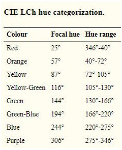
3 years agoI think you might really benefit from reconsidering your colour perspective in terms of objective Hue Families rather than personally subjective undertones - as everyone perceives those differently.
My greige might be your beige etc..
Have a look at the Colorographies at The Land of Color. See if you can find something that fits your description in any aspect. e.g.
Right for you in terms of lightness (Value), colourfulness (Chroma), Hue ( in which Hue Family neighbourhood it belongs)
Then you will have really helpful guideposts from which to narrow your search so that others can aid you usefully.


Patricia Colwell Consulting
3 years agoIMO all of those are leaning to pink and why do you want pink “undertones”. Colors are chosen for how they work in your space with your stuff and in your lighting. I have no idea what any of that looks like so there is no way to advise a color. You will need to narrow your search to 3 colors max then get some poster boards paint them with 2 coats of the colors and move them around in your spces. All the understanding of chroma etc is great but the color still needs to work in your space . BTW to make this a bit easier change all your bulbs to LED 4000K (daylight) then at least the lighting is pretty much the same in each space.
Related Professionals
Atlanta Painters · Clayton Painters · Kirkland Flooring Contractors · Waunakee Flooring Contractors · Mansfield Interior Designers & Decorators · North Bergen Furniture & Accessories · Ogden Interior Designers & Decorators · Charleston Furniture & Accessories · Short Hills Furniture & Accessories · Beloit General Contractors · Hagerstown General Contractors · Irving General Contractors · Kettering General Contractors · Rossmoor General Contractors · Watertown General Contractorsamyhamme
3 years agoReticence SW 6064 and Popular Gray SW 6071 are both gray/beige/warm but not gray or brown or too cold or too much of a pink undertone. I have both in my house and love them as a lighter tone. For corresponding darker versions I like Versatile Gray SW 6072 or Benjamin Moore’s Silver Fox 2108-50
simplechoices
3 years agoThis from a houzz user 8 years ago
I tried SW Reticence (6064) as this seemed about the right saturation warmth for a gray. Once on the walls it looks ENTIRELY PALE PINK! Room has one large east facing window.
SW Popular Gray will probably act the same.
If you have an aversion to pink, you may want to rethink your goal. Marylee's Hue Parent chart from Camp Chroma is a good start to help you narrow your vision.
bondia
Original Author3 years agoThank you so much to all who have replied, you've all been so helpful.
thelandofcolor.com is a great website, so interesting and useful.
I do understand that color needs to work in my space but as we are making several changes I don't have any fixed finishes yet to deal with and only two furnished objects that may be changed in the future. And I understand that paint needs to be chosen last, not first. But I need to actually like the paint color, I'd hate to use something that combines well with my fixed finishes (if I had them) but is a color I hate. Right now I'm just gathering information to potentially be used.
Popular Gray looks like a contender, at least on the color chip, I appreciate that recommendation. But I will test it, I understand lighting makes a big difference and I appreciate the heads up on the possibility of it going pink on me. And thank you for the 4000K bulbs recommendation, I am going to work toward that (lots of bulbs to change.)
I actually love true pink, all shades. But I like a neutral on my walls and while I want it to be a pale taupe or brownish color (not interested in true gray or white walls), I don't want it to read pink, I want the pink tone to be as minimal and unobtrusive as possible. I don't like yellow undertoned browns. Green undertoned are a maybe. So that's what I'm looking for in a recommendation.
I know everyone says paint is cheap but we are doing our entire main floor (for the first time in 20 years) and due to circumstances have to hire someone to do it, so really paint is not at all cheap in our case and I need to get it right, a do over will be too expensive for me.
Thank you all again.simplechoices
3 years agoI hate it when people say paint is cheap. It might be the least expensive element, but it's certainly not cheap, especially in a quality paint. Which is one of the reasons you should invest in painting large sample boards of the colors you think will work. Lori is THE color guru, so definitely give her recommendation consideration.
bondia
Original Author3 years agoThank you, Lori! I am really liking the look of Grey Heron.
simplechoices, exactly! And I definitely will.
Yayagal
3 years agoHere's a link that might be helpful as it shows photos along with the paint color. I would recommend SW smokey taupe but here is the link to the others. https://www.thespruce.com/best-greige-paint-colors-4587332
bondia
Original Author3 years agoYayagal, Smokey Taupe is Benjamin Moore I think. Thank you for the link to the greige colors, it is helpful to see them.
Jennifer Hogan, your information is very helpful!!! And I really appreciate the list of taupes, I am saving the list and will be looking at all the colors. Thank you so much for doing that. The painters I am getting bids from all use SW paints so C2 isn't an option, unfortunately.
To all of you who have responded - thank you for being so generous with your time and expertise.Kim Reiner
3 years agoCheck out Benjamin Moores Pale Oak, it is a very neutral Greige, I’m sure SW can match it if that’s the paint you like to use. It looks grey later in the day and on cloudy days, but a beautiful beige when the sun is shining in, definitely NOT pinky toned at all. Now, our builder beige was pinky toned and horrible......Good luck.
bondia
Original Author3 years agoI haven't been able to access the Emerald colors yet. Looking at all the other colors mentioned here, using my fan deck, not yet paying attention to what looks good in my space, with my light, not using samples or being scientific - SW 6071, Popular Gray, seems to best fit the description of what I am picturing. It seems gray until you put it next to a true gray and then it's clear it is also in the taupe category. I am going to do all the things I'm supposed to do when choosing a paint, but somehow for my own mental processes to keep going forward, I needed to see what a color like this would look like. Thank you all for your help. And I welcome any other suggestions.
bondia
Original Author3 years agoKim Reiner, I'll stop at the BM store and get a paint chip of Pale Oak, thank you. (And I do understand how limited the value of a paint chip or fan deck is.) No pink tone sounds good!
salonva
3 years agoI am NOT an expert, but from personal experience I can share that I stumbled on Modern Gray and liked it. I used it in a guest bedroom in our last house . It was one of those colors that just worked beautifully and while I had a few other beautiful beiges and greiges in the house, this one Modern Gray got so many compliments. It's in the list above---- These are the colors that have a light value between 72 and 86, chroma between 4 and 7 and a hue between 58 and 86,

bondia
Original Author3 years agosalonva, when you look at Modern Gray on your walls, does it read as a gray? Or does it change according to the light? In the paint deck it looks noticeably grayer than Popular Gray.
salonva
3 years agoI just answered and it went pffft
Well, ok so I wa saying that Modern Gray was a beigey gray to me. It didn't read so gray. I had it in guest room with pale green blue, with beige carpet and it was really nice and warm. I think the room had an eastern exposure . to me, Popular Gray seems a lot more gray.......I guess this is why lighting and one's own space is key.
bondia
Original Author3 years agoThat is very interesting. Yes, the lighting and so many other factors all can make a drastic difference. I once tried a sample of a paint that looked perfect in my next door neighbor's house but totally different in mine.
tartanmeup
3 years agoNot a pro but I've spent an inordinate amount of time thinking about paint colours in my day. I can certainly understand wanting a colour we can envision and describe. What you're describing sounds lovely, btw. The Jan-Feb issue of Canadian House and Home features two taupes which might tickle your fancy (bolding mine):
-Hidden Cove, Cloverdale Paint: "...This smoky, silver-tinged hue is a great alternative to stark white. It travels well around the house as a wall colour or as a trim, and pairs nicely with both warm and cool colours. It's perfect for those who find creamy whites too yellow."
-Frozen Tundra, Sico: "Taupe is making a comeback, and this soft, putty version feels fresh and new. Try it in a living room to add depth and warmth while keeping an airy, sanctuary-like vibe."
On the printed page, both look lovely - not warm, not cool - but I know pictures in a magazine lie (Photoshop). These colours might have more chroma that you want also but their descriptions might be helpful in your search.
In no particular order, my list of tips and reminders (reiterates some of the great advice upthread and might be worth a reminder for lurkers):
1) Don't trust pictures when looking up a particular colour. Monitors and screens rarely render true and printed photographs are manipulated. Meaning, don't fall in love with a colour in a picture nor dismiss it.2) Beware of too narrow a colour vision. It can be easy to fall into the "perfect paint colour" rabbit hole and our focus becomes limiting rather than liberating. The goal is to have a cohesive space so paint last makes the most sense, as you know. If you start with hard finishes you like, how could you end up with a wall colour you don't? Don't let trends or colour names influence you too much either. It's about what looks and feels good in your space. (I'm swayed by paint colour names as much as I am by lipstick names. Silly, really. Sometimes, the paint colour with the less enchanting name is the better choice. :P)
3) If your eyes start drowning in a sea of potential colours, look at each chip against a white sheet of copier paper. The colour's "undertone" will be more apparent.
4) Once you've narrowed down the colours to three or four candidates, go for the large paint samples (Samplize or paint inexpensive art canvases) because size affects a colour's impact. A colour that delights on a paint chip might overwhelm on a wall and suffocate in a whole room.
5) Consider an on-site paint consultation to get a second opinion in your space, in your light, with your hard finishes. It's more affordable than a mistake and saves time. (My local BM stores have designers who offer this at reasonable hourly rates.)
6) Consider "creating" your colour. For that, you'd need to find a paint store willing to mix you sample pots of your ideas. I don't know that all paint stores are willing or able but I had one local BM store whose owner offered to "brighten" a colour or "darken" another one for me. (Amazing to find someone who understood how none of the paint chips hit the exact spot for me.)
7) Colour matching an item is another possibility that can save time. Most non-reflective surfaces can be matched. But again, get a sample pot to test before committing.
Good luck in your search, bondia, and I hope you'll report back that you found the colour that makes your heart (and eyes) sing in your home. Colour is so personal and I totally agree about paint not being a cheap endeavour!! Especially when choosing quality paint.Jennifer Hogan
3 years agotartanmeup has a lot of great advice.
I often wish I could go to the OPs house with my collection of samples. I have about 400 8 1/2 x 11 painted color samples. I have them organized in large binders and separated by color families.
It doesn't take long when you are in a space to see how colors are reacting in the space or I often take colors outside to test them when the interior has too much distraction.
I bought my home and it had gold metallic wallpaper in the living spaces and bathrooms had black velvet and gold wallpaper and black and gold countertops. Even with a lot of experience I couldn't see past the wallpaper to figure out colors. It was overwhelming.
Here is a picture of my color test. I took the new flooring, Wall tile, countertop and some of my things that had colors I love outside to see what they looked like together and color samples that I had that I thought might work - switched some out and landed on something I liked together.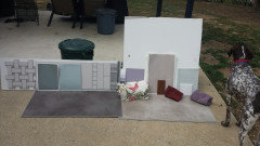
I am still working slowly toward my final choices as I remove wallpaper and put the flooring down in each room, but I know I like the various teals, reds and purples with a taupe wall color and with the taupe flooring.
Devine Cappuccino was the taupe I used in my last home and matched the darker taupe in the lighter colored flooring perfectly. But my last home was in Southern California and I had bright light streaming through huge windows in every room. I moved to central Pennsylvania where we get a lot more rain and snow and cloudy days. Cappuccino feels too dark inside this house. C2 Filament feels better and goes well with the lighter shades in the flooring.
The inspiration for my color palette was the Red/Purple/Green slate flooring that is in my entry.
Quiet moments worked perfectly in my master bath. I wanted something a bit darker and more saturated in the guest bedroom and bath and painted the guest room in Beach Glass - one shade darker on the color strip. I know better than to paint without testing, but I got cocky. Painted the room and when the sun came through the window the room looked powder blue. I ended up re-painting with SW Silvermist. Very similar, both blue greens, similar in lightness and chroma, but the Silvermist hue leans more green.
tartanmeup
3 years agoJennifer, I have the same slate entry! Except mine is in disrepair. :( Gold and black countertop in the bathroom though? That sounds...intriguing? Glam? Velvet wallpaper in a bathroom sounds a bit too OTT even for me but I kinda like the idea of a black and gold countertop. Of course, I might be imagining something far from your reality. :P Totally envying your colour sample binder!!
bondia
Original Author3 years agotartanmeup, thank you for the support! I tried to find the magazine online or in my library's version of Flipster but couldn't. Both those paint colors do sound positive. All your advice is good, I appreciate it, and #2 is probably most pertinent to me at the moment, I do need to broaden my focus. I actually am afraid that even with hard finishes I like, I could end up with a paint color that I don't. You don't think so? If not, that is reassuring. But there is a difference between a subtle undertone and four walls covered in the same tone so that's what worries me. #6 - I have done that in the past. In fact, once one paint mixer I was working with actually let me come in the back of the store and mix my own! Thank you again for the help and support.
Jennifer Hogan, unfortunately I am across the country from you in Washington State, if you were anywhere near I'd love a personal visit! Your colors are beautiful and I see you are getting help from your friend in the red collar. I would not have thought to put the purple tones with the green but they look lovely. I have a color similar to Silvermist in my living room and love it. Thank you for the chart which I have saved.
Houzz has the most generous people responding to questions; thank you EVERYONE.tartanmeup
3 years ago"I actually am afraid that even with hard finishes I like, I could end up with a paint color that I don't. You don't think so? If not, that is reassuring. But there is a difference between a subtle undertone and four walls covered in the same tone so that's what worries me."
Well, don't forget that after the hard finishes come the furnishings so if the goal is to find a wall colour that makes sense with everything inside the house (don't forget to include the window coverings), chances are high your eye will appreciate the wall colour. How could it not? You aren't going to choose a colour that doesn't relate to your belongings. You aren't going to choose a colour that grates on your nerves. You're going to choose a colour that makes sense to your eye. Jennifer's pic of gathered samples is exactly the way to do it. Once you see everything together, in context, the "best" colour becomes so much easier to select.
That said, the colour will look different with every sun exposure and throughout the day so realistically, you might end up with a colour that looks like two or three distinct colours in your house depending on time of day. (One of the reasons testing colours isn't quick business for most of us who are sensitive to colour. I recall reading how one designer had mixed a white differently for angled ceilings or a different part of the house to take into account sun exposure and get the "same" white throughout. That's tricky stuff and not for the faint of heart.) If the wall colour pleases you for the time of the day you use the room most, that's success, no? Only you can gauge how much these variations will annoy you and for how long. But once furnishings are in and life happens, wall colour can recede in importance.
I know it can be a daunting decision but you know what you want and have ways to achieve it. Trust yourself. It'll be beautiful and to your taste.Jennifer Hogan
3 years agoI work a regular job and just do color consulting as a hobby, but I have helped a lot of people pick colors just because people know about my collection and know other people that I have helped. The local paint stores and realtors will give out my number so I get random calls when people are having trouble getting the right color.
I always start at the same place. 'What must stay?'. Most of us don't have the option to buy all new flooring, cabinets, counters and furniture for our entire home.
My second step if finding out what colors the occupants love. Funny thing is, I can often look at a woman and know what she will love - it will be the colors that look good on her. The colors that work with her skin tone, eye and hair color. Truth is - we all like to feel pretty, so we tend to like colors that make us look pretty. I am a winter and look good in bold, clear colors.
The colors that you love may not be appropriate for wall color, but the colors you love should be in your home. Walls are the backdrop for artwork. So your wall colors need to work with the colors you love and with the colors that cannot change.
I almost always use a neutral for the core living areas in a home. Figure on about 60% of the walls being neutral - living room, and hallways almost always being neutral, foyers, dining rooms kitchens may be neutral or a coordinating color - sometimes just a darker version of the neutral.Bedrooms, bathrooms, laundry rooms is where I will add more wall color.
I try to set up the home so that the colors flow from one room to the next room.
In my home the living room and foyer are the center of the house - I am taking the blue greens from the entry floor into the guest bedroom and bathroom. If you stand in the hallway you can see the foyer and guest bed and bath from the hall. I used blue green paint and the darker more purple gray flooring.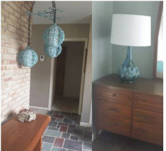
From the hall going back to the master is where I am adding purples
My office is between the hall and master suite hallI am using this painting and this area carpet to help transition from blue green to purple.

My dishes are a less blue green color than the colors in the rest of the house.
So going from the foyer, into the living room and then into the dining room I transitioned the blue greens with this carpet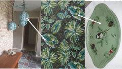
I have not yet decided how I want to use the red in the kitchen, but contemplating possibly using a dark red countertop. I have a couple of years until I will reach the kitchen - whole home renovation being done by me when I am not working - so every weekend I do what I can.
Sorry the foyer pictures still have the gold metallic wallpaper and the floors are covered in drywall dust.
This is my color plan as it stands right now - not all final decisions have been made, but I have a plan and will tweak it as I move from room to room.
The art represents the colors that I seem to love - it is what I buy. (You may also note that I like animals).
My goal is to have colors that I love flow from room to room in my home, bringing me joy as I walk through my home and see the colors that I love and the art that I love.
I think every home should make the occupants heart sing with joy.bondia
Original Author3 years agotartanmeup, you've done a good deed, you are very reassuring and are giving me confidence to make the leap of faith. The designer who mixed different whites - wow! I guess that's an impressive attention to detail but I actually enjoy the differences in paint color depending on the light, etc. As much as I am enjoying this process, I do look forward to the time when wall color can recede, as you said, and I can just enjoy living in a hopefully well put together house. Thank you so much for your help.
Jennifer, I have heard that people decorate with the colors they wear and it makes sense. You confirmed what I have been thinking, that I could do a different color in my bedroom, though it is right off my family room so I won't go too different, just a bit of color rather than a neutral. Your diagrams are impressive, good way to visualize. I love your hanging lamps! Having a home that makes my heart sing is my goal! Thank you for all your input.Jennifer Hogan
3 years agoThe hanging lamps were there in the home when I bought it - just spray painted them. Recolored the grout and cleaned the slate. I have removed the wallpaper and will be painting soon.
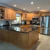
Listing picture:
bondia
Original Author3 years agoJennifer Hogan, the lamps are pretty in their original color but gorgeous painted! Looks like your home is truly a labor of love.






Jennifer Hogan