Shop Products
Houzz Logo Print
webuser_516118320

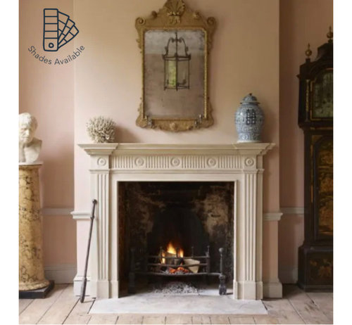
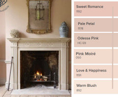
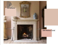
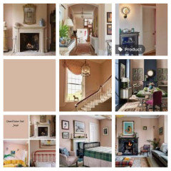
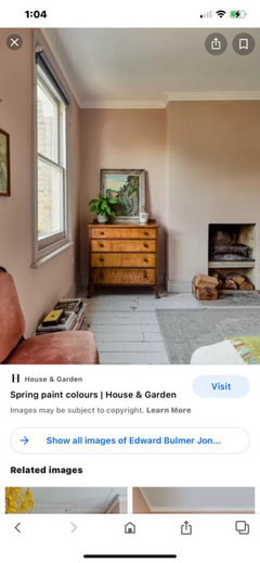
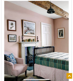
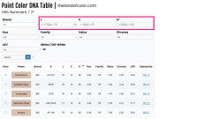
Edward Bulmer Jonquil paint equivalent

Justine Pojanowski-Todd
2 years ago
last modified: 2 years ago

I’m in love with Edward Bulmer Jonquil paint color, but can’t seem to even get a sample pot here in the US. Anyone know of an equivalent paint color in an American brand? Thanks!


Comments (24)

  • Marylee H
    2 years ago

    These are the nearest I could find after measuring Jonquil.


  • Justine Pojanowski-Todd
    Original Author
    2 years ago

    Wow, thank you SO much, Marylee! Mochachino looks very, very close.

  • houssaon
    2 years ago

    Here are some I found. I ran a line on the right of the color from the left side of the picture. Some are not close, but pretty pinks.


  • PRO
    Flo Mangan
    2 years ago

    Photos are difficult to figure out colors because they are artificially lighted for photography. From here I would go lighter than Mochachino to compensate for that lighting factor. I will look in my databases. Bbl

  • PRO
    Flo Mangan
    2 years ago

    There are 3-4 colors in this picture. Here are some. How much natural light do you have in your room?

  • Marylee H
    2 years ago

    The thing is, you have to decide if it is near to the factual colour you are after?


    If so, then Mochachino is closest - as I measured the paint chip with a device.

    (Factual colour)


    or, as Flo mentioned, how the colour appears in the photograph, which is not always a true representation of how the colour may render in your/every space.


    Something else to note about Edward Bulmer paints is that they offer, what they describe as ’different shades’ of the same colour.


    I haven’t yet measured these to work out just how they relate to the original.


    🌈


  • PRO
    Flo Mangan
    2 years ago

    Marylee and I use similar measuring devices I believe. Marylee, what Hue family did you get for this color? It is also what is called a Natural paint and so because paints in US use different base formulas, matching will be tricky. The colors Marylee and others post here are “best guesses” even with our measurement devices. So you would have to get samples and view in the light of the space you wish to use this color. Natural and artificial light will effect the look a lot. Here are some additional pictures I found on line.

  • houssaon
    2 years ago

    The pink in the last bedroom is so nice.

  • Marylee H
    2 years ago

    These are in the same Hue Family neighbourhood as Jonquil, only lighter.


    Pink Moire sits a few degrees anticlockwise to Jonquil and so is likely to read slightly more pink.


    Coastal Cottage sits between Pink Moire + Jonquil.

    A close sibling to Jonquil is Farrow & Ball’s Pink Ground


    Good Luck! 🌈

    Between us all, you have plenty to play with!

  • PRO
    Flo Mangan
    2 years ago

    Houssaon. All those pictures are Jonquil. See how different lighting is a huge factor in how this color looks.

  • Marylee H
    2 years ago

    Hi Flo - Jonquil - L = 78.033 C = 13.520 h = 63.181° = Yellow-Red Hue Family

    I took a multipoint average of the chip.

    🌈

  • PRO
    Flo Mangan
    2 years ago

    Thanks. Good job!

  • RedRyder
    2 years ago

    Beautiful color! I could definitely live with that.

  • Justine Pojanowski-Todd
    Original Author
    2 years ago

    Thank you all SO much for your expertise! This gives me a lot to work with. I just ordered samples of Odessa Pink, Love and Happiness, Coastal Cottage, Pink Moire, and Warm Blush. I've never actually seen Jonquil in person, and I see it can look quite different from photo to photo, but these color suggestions really have helped me gather a good selection of options to try to get the effect I want. The room I am painting is West facing with some redwoods outside, so it does not get flooded with light. I'll try some lighter hues to keep it bright.


    I am so grateful to you all taking the time to help me!

  • Sarah Varnell
    last year

    Justine, can I ask what color you landed on? I've also fallen in love with the look of Jonquil online and wondered what color I could get stateside to match. Thanks!

  • PRO
    Lori A. Sawaya
    last year

    Jonquil - L = 78.033 C = 13.520 h = 63.181°


    I used Marylee's LCh values to search ranges for each in The Paint Color DNA Table.


    >=(number)&&<=(number) is how you search ranges in the Table. I highlighted the ranges i searched in pink.


  • Justine Pojanowski-Todd
    Original Author
    last year

    Hi Sarah! Coastal Cottage and Love and Happiness were the closest to Jonquil in my room, though i did not test every color suggested. They were wuite pretty. However, they all felt really PINK in my room, which is small, and I ended up going with a soft peach that I’m also not crazy about.

  • Sarah Varnell
    last year

    Lori and Justine, thank you so much! These are all great tips. And Justine, I'm in the same boat - my biggest reservation is that a color may look more saturated than I'd like. My vision is for a very muted, dusty pink (feminine without being girly). But this gives me a great starting point and has all been so helpful. Thank you both!

  • Connecticut Yankeeeee
    last year

    Saving for me. Thank you to all those who contribute their wonderful knowledge of colors !

  • Katie Spreng
    8 months ago

    @Sarah Varnell - did you decide on a color? If so, what did you go with? How it it turn out?

  • RedRyder
    7 months ago

    That room looks very pretty!

  • Katie Spreng
    6 months ago

    @Sarah Varnell, it’s beautiful and provides such nice contrast to that gorgeous bed frame! Thank you!

  • Kerry B
    3 months ago

    farrow & ball setting plaster