


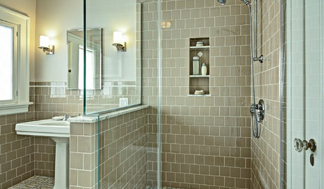
Would you consider this tile job modern and edgy or a flop?
ilikefriday
last year
last modified: last year
Featured Answer
Sort by:Oldest
Comments (41)

ilikefriday
last yearRelated Professionals
Eagan Furniture & Accessories · Frisco Furniture & Accessories · Paramus Furniture & Accessories · Kansas City Furniture & Accessories · Linton Hall Interior Designers & Decorators · Anchorage Architects & Building Designers · Holtsville Architects & Building Designers · Saint James Architects & Building Designers · Schiller Park Architects & Building Designers · Parkway Home Builders · Atlanta Professional Organizers · Fort Worth Professional Organizers · New York City Professional Organizers · Roselle Professional Organizers · Suwanee Professional Organizersilikefriday
last yearilikefriday
last year
nicole___
last year
Jilly
last yearlast modified: last year


Related Stories
TILE10 Reasons to Consider 4-by-4-Inch Tile
Designers are embracing the once common but recently overlooked square tile in kitchens and bathrooms
Full Story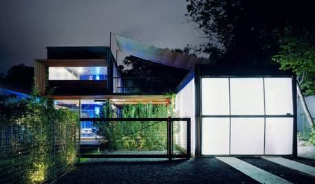
ARCHITECTUREWhat’s Fueling Austin’s Edgy Modern Architecture?
A look at the blossoming design scene in Texas’ capital city — and what’s behind all the experimentation
Full Story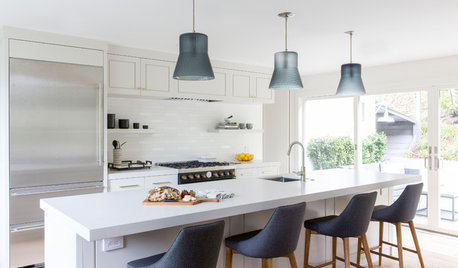
KITCHEN DESIGNA Modern Farmhouse Kitchen, With an Emphasis on ‘Modern’
Clean lines and sculptural pendants combine with shiplap and wide-plank oak floors in this Northern California kitchen
Full Story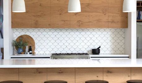
TILELet’s Talk Tile: An Alphabetical Guide to Tile Terminology
Get set for a tile project with this handy glossary of shapes, materials, finishes and more
Full Story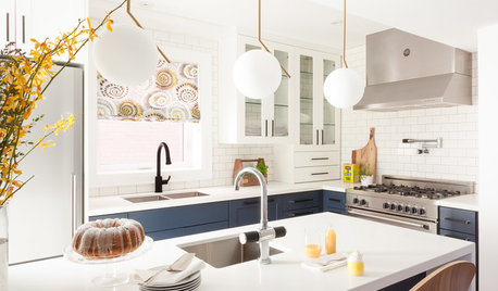
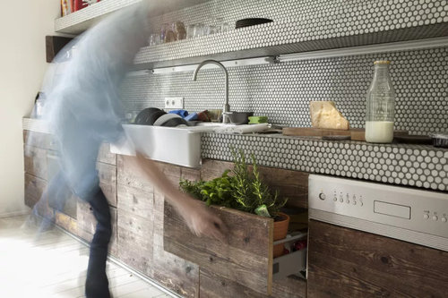
KITCHEN DESIGNKitchen of the Week: Modern Cottage Style in 88 Square Feet
Mixing traditional and edgy elements creates a space that’s classic yet dramatic, cozy yet crisp
Full Story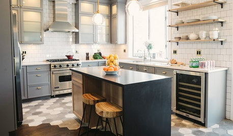
MOST POPULAR10 Tile Layouts You Haven’t Thought Of
Consider fish scales, hopscotch and other patterns for an atypical arrangement on your next project
Full Story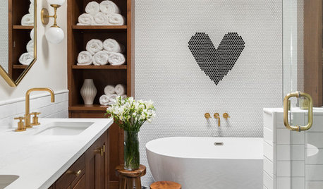
MOST POPULAR13 Tile Ideas You’ll Want to See
Playful patterns, fun colors, fresh layouts — consider these tile suggestions for tricking out kitchens and bathrooms
Full Story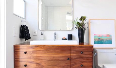
BATHROOM MAKEOVERSMidcentury Modern Style in a 56-Square-Foot Bathroom
The bright blue tile floor steals the show in this California bath with a sleek shower-tub combo
Full Story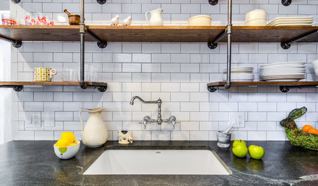
KITCHEN DESIGNNew This Week: 3 Modern Kitchens With Something Special
Looking to make your kitchen feel unique? Look to these spaces for inspiration for tile, style and more
Full Story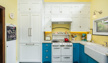
COLORFUL KITCHENSYellow-and-Blue Kitchen Mixes Modern Amenities With Vintage Charm
A vintage stove, encaustic cement floor tiles and a breakfast banquette star in this cheerful Los Angeles space
Full Story

Feathers11