


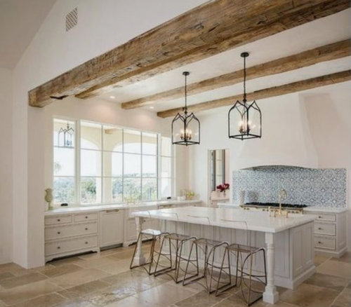
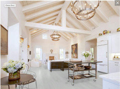
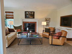
Mystery White-ish Paint Color!
dietcokediva
last year
last modified: last year
Featured Answer
Sort by:Oldest
Comments (21)
Related Professionals
New Territory Painters · Chico Painters · Avocado Heights Cabinets & Cabinetry · Brea Cabinets & Cabinetry · Dorchester Flooring Contractors · Bell Gardens Architects & Building Designers · Roswell Furniture & Accessories · American Fork Architects & Building Designers · Newington Home Builders · North Richland Hills Home Builders · Westwood Home Builders · La Marque General Contractors · Pocatello General Contractors · Wolf Trap General Contractors · Wyomissing General Contractors
dietcokediva
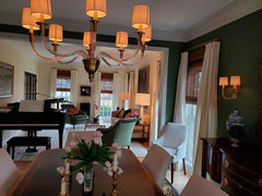
last yeardietcokediva
last yeardietcokediva
last year


Related Stories
WHITEWhat to Know Before You Paint Your Walls White
A coat of white paint can do wonders in one room and wreak havoc in another. Here are tips for using the popular hue
Full Story
COLORWhite vs. Cream: Which Neutral Paint Color Is Right for You?
Do bright white rooms give you the chills? Are off-whites too drab and boring? Let’s see which is a better fit for you
Full Story
WHITEHow to Pick the Right White Paint
White is white, right? Not quite. See 8 white paint picks for 8 very different effects
Full Story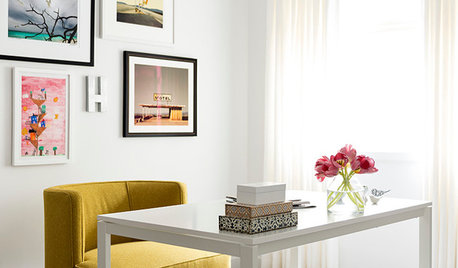
DECORATING GUIDESDesigner Secrets: 10 Pros Share Their Favorite White Paints
Decorating experts look to these hues when they want a go-to white they can count on
Full Story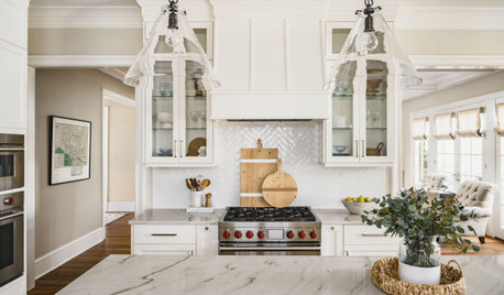
LATEST NEWS FOR PROFESSIONALSDesign Pros Share 10 Favorite Creamy White Paints
These off-white color choices include versatile tones, warming hues and pleasingly soft shades
Full StoryDECORATING GUIDESDesign Pros Share 10 Favorite Creamy White Paints
These off-white color choices include versatile tones, warming hues and pleasingly soft shades
Full Story
MOST POPULARMust-Try Color Combo: White With Warm Off-White
Avoid going too traditional and too clean by introducing an off-white palette that brings a touch of warmth and elegance
Full Story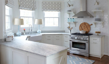
KITCHEN DESIGNHow to Keep Your White Kitchen White
Sure, white kitchens are beautiful — when they’re sparkling clean. Here’s how to keep them that way
Full Story
PAINTINGWhat to Know About Milk Paint and Chalk Paint — and How to Use Them
Learn the pros, cons, cost and more for these two easy-to-use paints that are great for giving furniture a vintage look
Full Story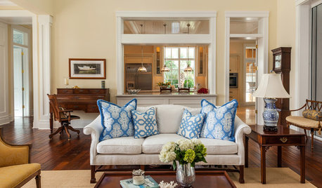
COLORThe Best White and Pastel Colors for Every Kind of Natural Light
Understand how sunlight affects your rooms and get tips on choosing paint colors for each type of exposure
Full Story


dietcokedivaOriginal Author