Shop Products
Houzz Logo Print
webuser_250784160

Designing a kitchen that has yellow/orange original floors…

C A
last month
last modified: last month

Hi

I am designing a kitchen in this space which has original hexagon yellow/orange floors with a burgundy border. They are over 100 years old and I am NOT ripping them out.


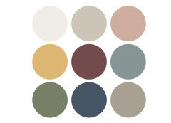
I am thinking of going for a blue/periwinkle color to be opposite in the color wheel of the floor color, complimentary. I was thinking either do all the walls and the cabinets in this light periwinkle, including the window/doors. There are two doors, one that leads into the kitchen and one that leads out where the inner building courtyard is. There is not a lot of natural light reaching the kitchen. Or I would do the light color on the walls and go a couple shades darker for the cabinets and doors/window.


I love decorative arts so the one wall on the render that is not showing will have a vintage cabinet that will tie in the yellows, blues and burgundy in some folk art type decorative painting that reflects locally. I am not in USA, not making an ikea kitchen btw. Going for color and North African vibe where I am at.


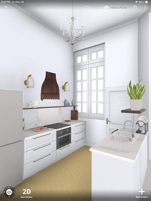
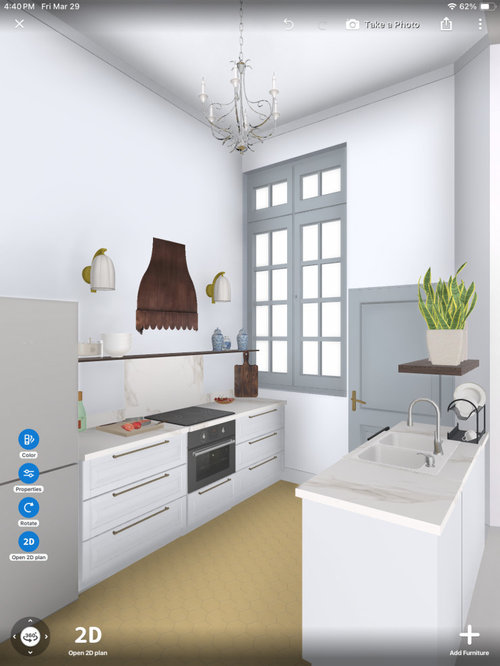
The renders do NOT accurately show the type of cabinets exactly I want to build cause the application only has ikea kitchens and sconces and shapes I would not choose. But I’m showing it cause it shows the layout and the color samples I got at my local paint store for walls and cabinets. One render shows light periwinkle shade for walls and cabinets and the other shows if I did a different tone for the cabinets and window/door.


I want to go for colors and I love blue and white china pieces and thought they could feature well. The yellow/orange floors are a bit weird but wondering if an opposite color on the wheel would be interesting and I could tie them in with local ceramic arts as well as the decorative cabinet.


Curious what other pros would do working with these color floors.


The original floors and the paint sample, excuse the renovation mess!


Cabinets, trim and walls same periwinkle


Darker on cabinets and trim


Trim dark but cabinets and wall in lighter periwinkle


Comments (44)

  • PRO
    Sabrina Alfin Interiors
    last month

    Google "Kitchens by Justina Blakeney" and you'll get some great ideas for colorful kitchens with a retro/boho vibe.

  • C A
    Original Author
    last month

    Thanks so much! I'm not going for boho for sure. But I'm trying to understand the idea of complimentary colors...what do you think of that? I know the floor color is strange to begin with.

  • Isaac
    last month

    Moroccan design often mixes warm oranges with pistachio greens, which seems like it shouldn’t work but somehow it does.

    C A thanked Isaac
  • apple_pie_order
    last month

    The blue sample is not quite right. Take a look at these two plates to see some blue and green options. Or search for "Majorica pottery" or "Mallorica pottery". https://www.etsy.com/listing/1703102099/2-antique-griffen-smith-hill-etruscan

    Buying an inspiration piece is often a great way to obtain color choices made by a professional designer.

  • apple_pie_order
    last month

    Be sure to have the floor professionally cleaned before making final paint choices. It could be a lot lighter and brighter than it currently appears.

  • KW PNW Z8
    last month

    A search on ”Majolica” gave me this definition of the colors in the style. I think @apple_pie_order suggestion is a great one based on those colors. See the description I copied in below. The antimony yellow & iron red could very well be the colors in your marvelous tile floor!

    .. Majolica makers usually focused on five signature colors: cobalt blue, antimony yellow, iron red, copper green, and manganese purple, and a white tin enamel was often used for highlights.

    C A thanked KW PNW Z8
  • Lyn Nielson
    last month
    last modified: last month

    I would choose a light Ochre, not too dark, without seeing it in person, I would start sampleing with Behr Moonlit Yellow and see how dark it is with your room lighting.

    and introduce some SW Polished Mahagony


  • PRO
    Kristin Petro Interiors, Inc.
    last month

    I just designed a laundry room with similar tile using a very soft green cabinet.


  • HU-402831377
    last month

    I would go navy or green on the cabinets, doors, and trim and white on the walls.

  • C A
    Original Author
    last month

    @apple_pie_order I know the color of the floors very well, they don't need professional clean, they simply need a mop after the dust from the recent reno. I've seen them clean and dusty too. :-)

    Why do you think the blue is not right? In person it looked right to me. I'm not making blue like a plate. But I might put a couple plates on the shelf. But it's not the wall color I'm going for.

  • C A
    Original Author
    last month

    Thanks for the thoughts everyone! Really interesting. :-)

  • C A
    Original Author
    last month

    @lyn Nielson I do'nt have Behr paint in my country. Not sure about using the same yellow and same burgundy that's already on the floor either...

  • PRO
    BeverlyFLADeziner
    last month

    If you're committed to that floor, then the best you can hope for is a Provence color scheme. Harvest gold with royal blue. Blue and white IMO will never work with the heavy floor colors. I would not even consider white on the cabinets.


    C A thanked BeverlyFLADeziner
  • PRO
    Debbi Washburn
    last month
    last modified: last month

    The blue you show doesn't look quite right on my monitor.

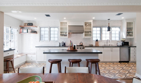
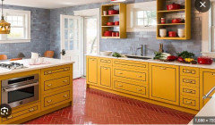
    It was hard finding pics with yellow floors. I did find some that had yellow cabinets and colored floors - just so you can see how the colors mix


    Green , blue or red cabinets might be really nice, then add in some wood elements to ground it all.

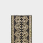
    I found a picture of a beautiful cloth that shows multiple colors blended. Maybe that will help


    Good luck! When you are done, please post after photos!

    C A thanked Debbi Washburn
  • C A
    Original Author
    last month
    last modified: last month

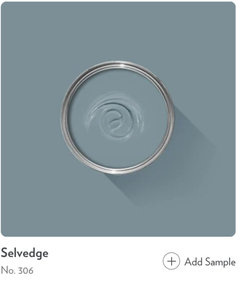
    Debbi WashburnAh ok! now I understand why others questioned the blue. It doesn't read so strong on the computer. The lighter one is called Rain Sky by Jotun, it's a light periwinkle. The other one is Gustavian Blue which is a nice dusty blue.

    Thanks for the inspo photos!


  • C A
    Original Author
    last month

    @BeverlyFLADeziner Yes thank you! I definitely ruled out white for sure, It's not going to work, even for the wood trim and window/door. When I said blue and white, I meant some china pieces I had to put on the shelf as well as some decorative items that will have a little yellow in them to echo the floor.

  • C A
    Original Author
    last month

    @BeverlyFLADeziner BTW, if I went for a dark red kitchen kind of like the last inspo photo, what would you think the wall should be? A cream?

  • PRO
    BeverlyFLADeziner
    last month

    IMO the paint is selected after all the other items like countertops and backsplash is selected because it's the easiest to adjust. Maybe you want wallpaper?

    I have to say that 100-year-old house or not, I would not let that floor dictate decisions that cost me $$$$. There's nothing that says the floor was the right decision to begin with.

  • Kendrah
    last month

    I think your second rendering that shows "darker on cabinets and trim" is pretty right on as far as color and where to place it - at least as far as the color goes in the rendering and on my screen. I'm not sure how true to real life it is.


    Your floors are incredible and I do like the idea of blue, and a light-ish blue at that, but I'd go perhaps for a more moody grey-ish blue than a pastel-like periwinkle. I'm not digging the cobalt blue others are suggesting. Are any of these Farrow and Ball colors right?


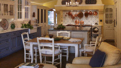
    This was an image from Etsy that seemed to show nice examples alongside mustard and burgundy.


    C A thanked Kendrah
  • JP L
    last month

    Ignore the haters - option 2 (the second rendering with darker cabinets and trim) is the way to go. It looks awesome!

    C A thanked JP L
  • C A
    Original Author
    last month

    BeverlyFLADeziner thanks! yes i would not let a hard finish dictate what to do, but that is if i own the place. this is a super long term rental that i am allowed to renovate for a business im doing. i am keeping anything in it thats original and i only replaced the very bad flooring in a couple other rooms only. im sticking to overall budget so im not gutting this floor. i am not gonna do wallpapwe cause the ceilings are 13 feet high.

  • C A
    Original Author
    last month

    KendrahNice! thanks for the feedback. sadly we dont have farrow and ball in my country but im also feeling a gray blueish vibe and not super bright

  • PRO
    JAN MOYER
    last month
    last modified: last month

    The floor is not " incredible," it is simply old, quilte a lot dreary, whether clean or dirty and it is limiting all other selections. Sorry......jmho.

    What is the flooring in the remainder of the home, and where did you replace flooring and with what other flooring?

    Perhaps some landlord assistance in order. Definitely not this- there is NO relationship in intensity and the floor simply looks drearier.


    C A thanked JAN MOYER
  • Nancy R z5 Chicagoland
    last month

    If you want to add a cool color, I think you would be better off with a green than a blue. I like the color combo in Debbi's fabric photo.

  • deegw
    last month
    last modified: last month

    Can you wipe off a big patch of the floor and post another picture? Your photo makes it hard to tell what is dirt and what is floor color.

  • deegw
    last month

    Not sure where you live but the burgundy and gold are giving off a Mexican tile vibe.


  • taliaferro
    last month
    last modified: last month

    Teal, burgundy and cool gray complement ochre.


    What is the composition of the floor? Is it ceramic tile?

  • john3582
    last month

    A bluish green or a teal. Like the sunflower tile in Dregs is

    C A thanked john3582
  • Paul F.
    last month


    C A thanked Paul F.
  • C A
    Original Author
    last month

    JAN MOYER i hear you! i almost wanted to rip it out and yes its not incredible. but in my country our tile choices are limited anwyay. i thought since i love decorative arts i would go with it and play with color. in the hallway and entryway are also original cement tiles and they have a bit of the same red and orange as the kitchen, exactly the same shade.


  • C A
    Original Author
    last month

    Paul F. i like that blue!

  • Hope Stewart
    last month

    What about a pale blush pink? It could go really well with both the mustard/ochre yellow and the burgundy and would be warmer than blue (even though I love blue and the right blue could look great too)! I love and feel inspired by British interior design and think the color combinations are often both unexpected and lovely!


    Here is a British interior designer I enjoy who's kitchen may inspire you... Sophie Robinson.

    Maybe not your style entirely but the colors are more what I was paying attention to.


  • C A
    Original Author
    last month

    Kendrah so glad you said that, thank you. i was hating the color for a while, but the truth is, where i live these little hex tiles are special to us cause new tiles here are all large sizes. and i do think the burgundy border just gives it a different feel. im gonna appreciate them and work with them. i will check out if green could be an avenue. im still leaning blue as i want to feature some ceramics that have blue and yellow.

  • C A
    Original Author
    last month


    Hope Stewart thanks!! i absolutely LOVE british interiors. that is why i thought of using some decorative arts but in a north african twist of course. i love how homey and moody english interiors are.

  • mnmamax3
    last month

    I think the floor is awesome and it connects with the rest of the house. I am still not a fan of the pale periwinkle color. I feel like it needs to be darker or more saturated to stand up to that bossy floor. The darker blues in your hallway picture really pop the colors of that framed art (I like the one on the left). Try putting your periwinkle up to that art and see how you like it. I think it does not have enough richness.


    The gustavian blue may work for cabinets (feels like blue jeans with a nice yellow/burgundy top) but I think you need to keep looking for the light color. I don't think your rendering has captured the intensity of the floor.

    C A thanked mnmamax3
  • C A
    Original Author
    last month

    mnmamax3 thanks for the feedback! im not fully convinced either on the periwinkle, but i did notice in the paint store that it was considered a similar shade to the gustavian blue, just lighter but similar undertones. in the render it looks light but in the actual space, it reads richer cause the kitchen faces a building inner courtyard and does not get a lot of sun. The dark blue im considering in the large entryway room. that room does not have a lot of sun either so it looks super dark and moody.

  • Kendrah
    last month

    I hope you find a blue you love and that you'll post pictures of it after you paint. Love the other floor pics too. Great to see homes that are so different than what's common in North American.

    C A thanked Kendrah
  • C A
    Original Author
    7 days ago

    I am giving up on all those crazy blues cause it’s looking like an Easter egg. This render is a bit wonky and doesn’t show the red border tile in the floor, but I choose a burgundy cabinet color that is just like the burgundy border tile in the floor…


  • C A
    Original Author
    7 days ago

    Either that or i make the cabinets a dusky blue but keep the walls a creamy color. (Again, burgundy border tile is not on the render right now)


  • k8cd
    7 days ago

    Would you post a picture with the part of the floor cleaned off? It’s hard to tell the true color under the construction dust.


    Does your paint brand have a color visualizer? That might help give a better idea about how a color would look with the floor.


    I think a medium green would look really nice.

    C A thanked k8cd
  • C A
    Original Author
    7 days ago

    @k8cd ok will try. It's not construction dust. it needs to be mopped a bit, but in the one part of the corner its clear, it's an ochre orange color.

  • k8cd
    7 days ago

    What brand of paint will you use?

  • Hellogardener
    6 days ago

    Can you show a rendering with the navy you posted earlier? I liked that color.