Shop Products
Houzz Logo Print
cdm01

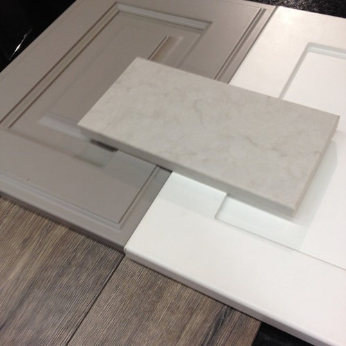
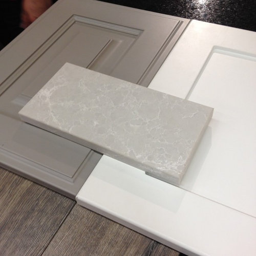
Counter top selection help, please and thanks!!

cdm01
10 years ago
Here's the story - planning a new build. Looking to go with warm white shaker cabs for the perimeter and a grey for the island. I am down to three quartz options - piatra grey, london grey or alpine mist. Any insights or comments re: pics attached? Really going for that transitional, easy, clean look that we all see here on houzz. Thinking subway tile (white) for the bs, also looking for suggestions for this area too. Floor is a laminate (heathered oak with some grey/black undertones). Thanks in advance for your help!!

Comments (43)

  • alfonsi
    10 years ago
    Lighter gray countertop
    cdm01 thanked alfonsi
  • Tess Wakefield
    10 years ago
    Lighter gray.
    cdm01 thanked Tess Wakefield
  • njschaefer78
    10 years ago
    Lighter!
    cdm01 thanked njschaefer78
  • PRO
    FK Interior Design
    10 years ago
    I love white kitchens, a classic and I prefer the lighter gray counter top.
    cdm01 thanked FK Interior Design
  • PRO
    Stylehaven
    10 years ago
    Great selections ! The lighter shade in the middle picks up the floors' undertones and works great with the gray island . Also it will look nice with the white backsplash.
    cdm01 thanked Stylehaven
  • Patricia Kent
    10 years ago
    How about the lighter gray over the white for the perimeter and black over the gray for the island?
    cdm01 thanked Patricia Kent
  • ambate
    10 years ago
    The darker one
    cdm01 thanked ambate
  • lovedesign2
    10 years ago
    The first question to you is how much natural light do you get in the space? If you have a lot of natural light in, then you could go with the darker gray which will look very nice with the white subway (classic timeless look). If darker kitchen, small windows, north facing etc. for instance, then I would go with option 2. Never look at finishes alone without taking into considerations some other factors. Best of luck!
    cdm01 thanked lovedesign2
  • lopipopi
    10 years ago
    I like the middle one for the countertop.

    I love the flooring you've picked - can you tell me supplier?
    cdm01 thanked lopipopi
  • Misty Clausen
    10 years ago
    I love your choices, my vote is the dark...feels both classic and modern.
    cdm01 thanked Misty Clausen
  • bgfuqua
    10 years ago
    I like lighter - picture 2.
    cdm01 thanked bgfuqua
  • Natalie
    10 years ago
    Dark... Good Luck!
    [houzz=
    Palmetto Bluff - Private Residence · More Info
    ][houzz=
    Palmetto Bluff - Private Residence · More Info
    ]
    cdm01 thanked Natalie
  • PRO
    Darla Scheuerman
    10 years ago
    Darker, you don't want your entire kitchen to "blend" or be as some say. "Matchy, Matchy" definitely darker.
    cdm01 thanked Darla Scheuerman
  • cdm01
    Original Author
    10 years ago
    @lopipopi - thanks! The floor is from Torly's - English Heathered Oak. Thought it gave me some room for flexibility, it's a little brown, a little grey and has black weathering. I've looked at it installed and does look like one of the more realistic laminates I've seen!
  • cdm01
    Original Author
    10 years ago
    @lovedesign2, I do have a big slider just off the kitchen and a window in front of the sink. Because it's a new build, I don't have an exact "idea" of the amount of light, but do think it will be sufficient to pull off the darker countertop. Ah, so many choices!
  • cdm01
    Original Author
    10 years ago
    @Natalie - thanks for the pics! I don't think I've seen those ones before. Going into my ideabook right now. I love the pulls too, going to switch my original selection over to this type before it's too late. thanks again!
  • lopipopi
    10 years ago
    cdm, thanks for the flooring info. It is a nice colour.
  • Ian Rosenberg
    10 years ago
    I really like the darker option. I think it does a great job of adding another color element to this mix and think that it would look great, especially standing alone on an island. I believe it adds another dimension to the image.
    cdm01 thanked Ian Rosenberg
  • PRO
    DirectSinks
    10 years ago
    I like the middle choice!
    cdm01 thanked DirectSinks
  • Maria P
    10 years ago
    I prefer the darker countertop for contrast. Not to confuse things, but your flooring looks like it has a slightly warmer undertone. Have you considered Lagos Blue from Caesarstone? It's not blue as the name suggests, but has warmer gray undertones that would compliment your flooring and cabinets.

    Santa Barbara Hope Ranch · More Info
  • cdm01
    Original Author
    10 years ago
    Hmm, no I hadn't considered that one. Might have to take a look! Thanks for the suggestion!
  • thealings
    10 years ago
    I like the last option, especially if you go ahead with a white subway tile for the backsplash.
    cdm01 thanked thealings
  • Tess Wakefield
    10 years ago
    What is brand name of laminate?
  • cdm01
    Original Author
    10 years ago
    Tess, the brand is "Torly's"
  • uyenduc
    9 years ago
    What did uou decide to go with? I was also debating between the London gray and Alpine Mist and went with the latter. It looks so organic to me and has the perfect amount of movement. Love your colour selection!
  • cdm01
    Original Author
    9 years ago
    I ended up going with the piatra grey. All of them were great options wish I could switch out countertops every couple of years!! Do you have a pic to post?would love to see!
  • uyenduc
    9 years ago
    Hi There, house isn't built yet, but will try to remember to post once it is. Is that kitchen craft nimbus for the grey? If it is that's what I am going with for my lower cabs. Also, good choice on Pietra Grey, it was my second favourite after alpine mist!
  • PRO
    Dulles Kitchen and Bath
    9 years ago
    If your kitchen counter top is bigger than 80 s/f go with darker color, if less go with lighter grey:)
  • Koel Das
    9 years ago
    last modified: 9 years ago

    Did you go with Piatra Grey? We are looking at the same options ( Piatra Grey/Alpine Mist/London Grey) for the island and are leaning heavily on Alpine Mist. And are thinking of a dark grey granite countertop ( on the straight kitchen side) to contrast (in case of Alpine Mist) and complement in case of a Piatra Grey,. ( The below pic is a rendering and the tiles or color of wall is not decided yet.)

    cdm01 thanked Koel Das
  • cdm01
    Original Author
    9 years ago

    @tuffkins20 We did go with the piatra grey. I love it. The contrast off of the white cabinets is very nice and ties in the veining of the stone. Love your pic...good luck!


  • uyenduc
    9 years ago

    @tuffkins20 We went with alpine mist and I love it. The counters are covered right now as they are painting, but the house should be done in a couple weeks and I will try to remember to post pics for you!


  • Koel Das
    9 years ago

    We are also in love with it..nowadays are confusing ourselves with the Coastal Grey too..:( Basically if we can decide on a light versus dark color then we can whittle ourselves down to the last 2

  • Koel Das
    9 years ago

    uyenduc please do share me the pics..would love to see them. We have another 2 weeks to decide. Though I am also thinking the prices will help us decide since Caesarstone is 3 times more expensive than the granite available with our dealer

  • uyenduc
    9 years ago

    I haven't seen the coastal grey as I made my selection last year, but what I like about alpine mist is that it has movement and is more organic looking than a lot of the other caesarstone (IMO anyways).


  • uyenduc
    9 years ago
    last modified: 9 years ago

    I will take some photos for sure in a couple weeks if the counters are uncovered, even if flooring is not in yet - perhaps you can nudge me with a comment? We are moving and expecting a baby so things are crazy.

  • Steven Cronson
    9 years ago

    I prefer the 3rd one because its light whitish lines would go with the white cabinets and the rest with the gray cabinet area. So bringing them both together.


  • columbia93
    9 years ago

    What is the look you are going for? The dark counter is used in country kitchens. The greys would tend more toward modern. Of the two greys, I prefer the one with the darker veins. The one with the white veins is a little too "bathroom" for my tastes. You might want to lay out the white tiles with your choices - they will likely be fine with the dark choice but I would reconsider white for the other two options.

  • Meg
    9 years ago
    I like 3 the best! I like the way the "veins" are a whitish color-very cool!- and think this will look great with your other selections. I like dark counters in pictures but have you ever had them? They are tough to keep looking nice (at least in my experience).
  • uyenduc
    8 years ago
    last modified: 8 years ago

    @tuffkins20 - not sure if you made a selection yet, but here is a photo of our alpine mist in the kitchen:

    We went with 2 cm and absolutely love it.

  • Koel Das
    8 years ago

    Thanks we did. do you have more pics? So the thickness is 2cm

  • okhalifa37
    8 years ago

    We are going with exact same design (soft white kitchen cabinets and grey island both with alpine mist countertops) and was wondering what type of hardware people suggest...we were thinking either oiled rubbed bronze or brass...any thoughts would be much appreciated.

  • hjbull
    8 years ago
    last modified: 8 years ago

    I have that same flooring..love it! I have an all white kitchen. Any suggestions on a grey colour for the walls? So many undertones In grey to deal with not sure what goes. Help ..thanks :)