


Merry Mardi Gras: Smile-Inducing Paint Palettes From New Orleans
Let the good times roll with happy hues and paint selections to jolt you out of the winter blues

It’s been an especially dark, wet, gloomy winter here in San Francisco, where I reside, so I’ve taken to searching out and collecting images of bold, bright and colorfully painted homes in New Orleans in an effort to perk myself up — just in time for Mardi Gras (February 28).
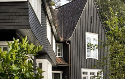
1. Bold blues and greens. The color scheme shown here is a bit over the top for most homes in most locations, but you likely could add at least one, maybe two, of these hues as an accent color on or inside your home.
If you love these colors but desire a more restrained look, pair the bolder hue or hues with plenty of neutrals. Stick to small accents of the bolder hues for a dash of fun color.
For a similar palette: Sweet Grass, Soft Turquoise and Superior Blue, all from Behr.
For a similar palette: Sweet Grass, Soft Turquoise and Superior Blue, all from Behr.
Photo by marneejill, via Flickr
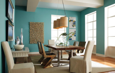
2. Lemon, lime and teal. The color scheme on the second house from the right in the image above is a great example of using vibrant colors in a harmonious way.
Because these three colors reside next to one another on the color wheel, they meld together well, rather than fight with one another, as high-contrast colors tend to do.
For a similar palette: Pale Sea Mist, Parrot Green and Teal Ocean, all from Benjamin Moore.
Because these three colors reside next to one another on the color wheel, they meld together well, rather than fight with one another, as high-contrast colors tend to do.
For a similar palette: Pale Sea Mist, Parrot Green and Teal Ocean, all from Benjamin Moore.
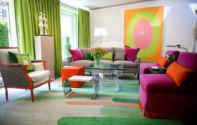
3. Purples and pinks. On April Fool’s Day last year, I rendered an exterior with wild, juicy colors, not dissimilar to those shown here, and then posted it on social media with a comment that I was going to be meeting with a client later that day to pitch the scheme.
My friend Cliff from New Orleans initially fell for it. Once he realized he had fallen for my prank, he pointed out, in his defense, that in his neighborhood it would not be considered a crazy color combination at all.
My friend Cliff from New Orleans initially fell for it. Once he realized he had fallen for my prank, he pointed out, in his defense, that in his neighborhood it would not be considered a crazy color combination at all.
This luscious color scheme, while bold, is definitely pretty in pinks and purples. If you go for such a palette, be sure to pick a pink that has a bit of gray in it, which will keep it from looking too sugary sweet — unless that’s the vibe you are going for, of course!
For a similar palette: Wedding Flowers, Pleasure and Thirsty Thursday, all from Kelly-Moore Paints.
For a similar palette: Wedding Flowers, Pleasure and Thirsty Thursday, all from Kelly-Moore Paints.
4. Orange with shades of blue. I like that the primary house color here is a neutral dark navy. It’s still a dramatic hue, but not as in-your-face as many of the other house colors profiled so far.
The more vibrant orange and watery blue are used as accents, keeping the vibe toned down.
For a similar palette: Determined Orange, Lakeshore and Naval, all from Sherwin-Williams.
The more vibrant orange and watery blue are used as accents, keeping the vibe toned down.
For a similar palette: Determined Orange, Lakeshore and Naval, all from Sherwin-Williams.
Photo by Allen Brewer, via Flickr
5. Turquoise and ruby. Blue and red can be tough colors to bring together, because they contrast each other so highly, which often culminates in a rather busy color scheme.
Make it work by keeping one of them a softer, lighter shade, such as the turquoise shown here. A warm gray background color also helps to bridge the two hues.
For a similar palette: Pure Turquoise, Camping Tent and Dark Crimson, all from Behr.
Make it work by keeping one of them a softer, lighter shade, such as the turquoise shown here. A warm gray background color also helps to bridge the two hues.
For a similar palette: Pure Turquoise, Camping Tent and Dark Crimson, all from Behr.
6. Soft green with orange and blue accents. I love the vintage, midcentury modern vibe of this color scheme. The green is rather neutral, due to its gray undertones, so it’s a terrific choice as the main hue on a home’s exterior or interior.
Add small splashes of blue or orange to give it a little zing.
For a similar palette: Pumpkin Spice, Fairy Tale Blue and Landscape, all from Benjamin Moore.
Add small splashes of blue or orange to give it a little zing.
For a similar palette: Pumpkin Spice, Fairy Tale Blue and Landscape, all from Benjamin Moore.
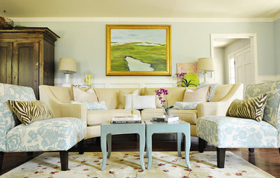
7. Robin’s egg blue with butter yellow and bold gold. Here’s an example of a colorful scheme that is a bit softer than some of the previous ones. The buttery yellow and pretty blue are rather light yet still saturated, so they have a nice whimsical quality.
Any of these hues would make a terrific accent wall in a home, with the other two colors serving as solid supporting hues.
Any of these hues would make a terrific accent wall in a home, with the other two colors serving as solid supporting hues.
8. Sea of greens. Leafy green is trending for 2017. If you are a fan, now is a good time to stock up on furnishings for your home in this fresh hue, as they will be more plentiful. Of course, if you worry you might tire of this color sooner rather than later, stick to paint or other easy-to-change items when injecting the vibrant hue.
For a similar palette: Woodland Fern, Lime Green and Gray Heron, all from PPG Pittsburgh Paints.
Your turn: How have you used a vibrant New Orleans-style color on or in your home?
More
They’re All Here: Paint Colors of the Year for 2017
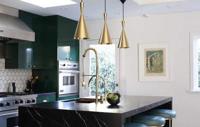
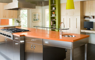
Choosing Color: See How 3 Bold Palettes Change 1 Kitchen
Browse the latest exterior photos uploaded to Houzz
For a similar palette: Woodland Fern, Lime Green and Gray Heron, all from PPG Pittsburgh Paints.
Your turn: How have you used a vibrant New Orleans-style color on or in your home?
More
They’re All Here: Paint Colors of the Year for 2017
Choosing Color: See How 3 Bold Palettes Change 1 Kitchen
Browse the latest exterior photos uploaded to Houzz