


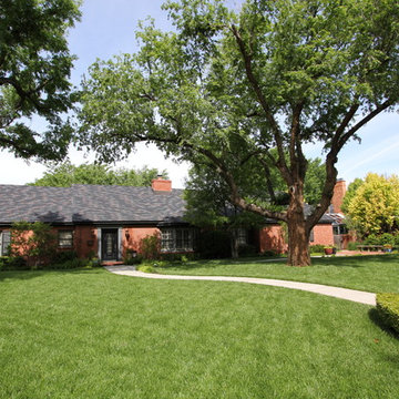
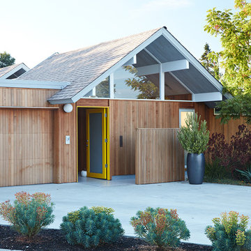
Search results for "1950s ranch exterior remodeling contemporary" in Home Design Ideas
This project was a 6,800 square foot addition to a 1950s ranch home and it’s loaded with character. The remodeled spaces include new bedrooms, bathrooms, a kitchen, bar, wine room and other living areas. There are some very unique touches found in this remodel such as the custom stained glass windows of the homeowner’s family crest.
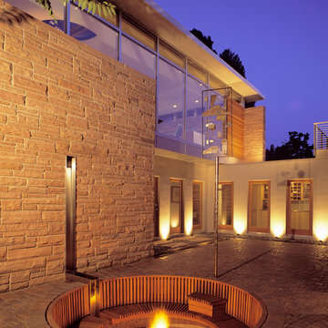
This Ranch Hacienda hillside estate boasts well over 13,000 square feet under roof. A loggia serves as the backbone for the design. Each space, both interior and exterior, has a direct response to the linear expression of outdoor space.
The exterior materials and detailing are rustic and simple in nature. The mass and scale create drama and correspond to the vast desert skyline and adjacent majestic McDowell mountain views.
Features of the house include a motor court with dual garages, a separate guest quarters, and a walk-in cooler.
Silverleaf is known for its embodiment of traditional architectural styles, and this house expresses the essence of a hacienda with its communal courtyard spaces and quiet luxury.
This was the first project of many designed by Architect C.P. Drewett for construction in Silverleaf, located in north Scottsdale, AZ.
Project Details:
Architecture | C.P. Drewett, AIA, DrewettWorks, Scottsdale, AZ
Builder | Sonora West Development, Scottsdale, AZ
Photography | Dino Tonn, Scottsdale, AZ
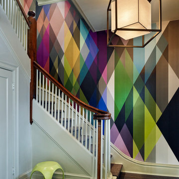
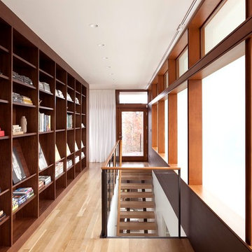
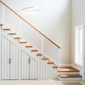
A modern wall paper lining the hard wood stair case in this historic Denver home.
Trendy staircase photo in Denver
Trendy staircase photo in Denver
Find the right local pro for your project
Remodeling and adding on to a classic pristine 1960’s ranch home is a challenging opportunity. Our clients were clear that their own sense of style should take precedence, but also wanted to honor the home’s spirit. Our solution left the original home as intact as possible and created a linear element that serves as a threshold from old to new. The steel “spine” fulfills the owners’ desire for a dynamic contemporary environment, and sets the tone for the addition. The original kidney pool retains its shape inside the new outline of a spacious rectangle. At the owner’s request each space has a “little surprise” or interesting detail.
Photographs by: Miro Dvorscak
Free ebook, Creating the Ideal Kitchen. DOWNLOAD NOW
The Klimala’s and their three kids are no strangers to moving, this being their fifth house in the same town over the 20-year period they have lived there. “It must be the 7-year itch, because every seven years, we seem to find ourselves antsy for a new project or a new environment. I think part of it is being a designer, I see my own taste evolve and I want my environment to reflect that. Having easy access to wonderful tradesmen and a knowledge of the process makes it that much easier”.
This time, Klimala’s fell in love with a somewhat unlikely candidate. The 1950’s ranch turned cape cod was a bit of a mutt, but it’s location 5 minutes from their design studio and backing up to the high school where their kids can roll out of bed and walk to school, coupled with the charm of its location on a private road and lush landscaping made it an appealing choice for them.
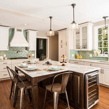
“The bones of the house were really charming. It was typical 1,500 square foot ranch that at some point someone added a second floor to. Its sloped roofline and dormered bedrooms gave it some charm.” With the help of architect Maureen McHugh, Klimala’s gutted and reworked the layout to make the house work for them. An open concept kitchen and dining room allows for more frequent casual family dinners and dinner parties that linger. A dingy 3-season room off the back of the original house was insulated, given a vaulted ceiling with skylights and now opens up to the kitchen. This room now houses an 8’ raw edge white oak dining table and functions as an informal dining room. “One of the challenges with these mid-century homes is the 8’ ceilings. I had to have at least one room that had a higher ceiling so that’s how we did it” states Klimala.
The kitchen features a 10’ island which houses a 5’0” Galley Sink. The Galley features two faucets, and double tiered rail system to which accessories such as cutting boards and stainless steel bowls can be added for ease of cooking. Across from the large sink is an induction cooktop. “My two teen daughters and I enjoy cooking, and the Galley and induction cooktop make it so easy.” A wall of tall cabinets features a full size refrigerator, freezer, double oven and built in coffeemaker. The area on the opposite end of the kitchen features a pantry with mirrored glass doors and a beverage center below.
The rest of the first floor features an entry way, a living room with views to the front yard’s lush landscaping, a family room where the family hangs out to watch TV, a back entry from the garage with a laundry room and mudroom area, one of the home’s four bedrooms and a full bath. There is a double sided fireplace between the family room and living room. The home features pops of color from the living room’s peach grass cloth to purple painted wall in the family room. “I’m definitely a traditionalist at heart but because of the home’s Midcentury roots, I wanted to incorporate some of those elements into the furniture, lighting and accessories which also ended up being really fun. We are not formal people so I wanted a house that my kids would enjoy, have their friends over and feel comfortable.”
The second floor houses the master bedroom suite, two of the kids’ bedrooms and a back room nicknamed “the library” because it has turned into a quiet get away area where the girls can study or take a break from the rest of the family. The area was originally unfinished attic, and because the home was short on closet space, this Jack and Jill area off the girls’ bedrooms houses two large walk-in closets and a small sitting area with a makeup vanity. “The girls really wanted to keep the exposed brick of the fireplace that runs up the through the space, so that’s what we did, and I think they feel like they are in their own little loft space in the city when they are up there” says Klimala.
Designed by: Susan Klimala, CKD, CBD
Photography by: Carlos Vergara
For more information on kitchen and bath design ideas go to: www.kitchenstudio-ge.com
Contemporary artist Gustav Klimpt’s “The Kiss” was the inspiration for this 1950’s ranch remodel. The existing living room, dining, kitchen and family room were independent rooms completely separate from each other. Our goal was to create an open grand-room design to accommodate the needs of a couple who love to entertain on a large scale and whose parties revolve around theater and the latest in gourmet cuisine.
The kitchen was moved to the end wall so that it became the “stage” for all of the client’s entertaining and daily life’s “productions”. The custom tile mosaic, both at the fireplace and kitchen, inspired by Klimpt, took first place as the focal point. Because of this, we chose the Best by Broan K4236SS for its minimal design, power to vent the 30” Wolf Cooktop and that it offered a seamless flue for the 10’6” high ceiling. The client enjoys the convenient controls and halogen lighting system that the hood offers and cleaning the professional baffle filter system is a breeze since they fit right in the Bosch dishwasher.
Finishes & Products:
Beech Slab-Style cabinets with Espresso stained alder accents.
Custom slate and tile mosaic backsplash
Kitchenaid Refrigerator
Dacor wall oven and convection/microwave
Wolf 30” cooktop top
Bamboo Flooring
Custom radius copper eating bar
The key goal in developing the design for the renovation of this existing 50-year-old residence was to provide a livable house, which would frame and accentuate the owner’s extensive collection of Mid-century modern furnishings and art while blending its existing character into a modern 21st century version of the style. The kitchen was artfully collaborated on with the home's owner, who is the owner and chef of one of Austin's premiere restaurants. Extensive living areas were recouped and added to from the home's original design. The master suite was taken to the second floor and wrapped in glass to take advantage of the coveted Texas Hill Country vistas. Approximately seventy percent of the original home was kept, replacing only the small existing kitchen and master bedroom. Material selections were chosen based on sustainable criteria to make this remodel a "green" gem as well as a museum of modern furniture.
Photography by Adam Steiner
Remodeling and adding on to a classic pristine 1960’s ranch home is a challenging opportunity. Our clients were clear that their own sense of style should take precedence, but also wanted to honor the home’s spirit. Our solution left the original home as intact as possible and created a linear element that serves as a threshold from old to new. The steel “spine” fulfills the owners’ desire for a dynamic contemporary environment, and sets the tone for the addition. The original kidney pool retains its shape inside the new outline of a spacious rectangle. At the owner’s request each space has a “little surprise” or interesting detail.
Photographs by: Miro Dvorscak
In this 1905 Tudor home, the intent of this design was to take advantage of the classic architecture of the home and incorporate modern conveniences.
Located in the Joseph Berry Subdivision in Detroit, this stellar home presented several design challenges. The most difficult challenge to overcome was the 11” slope from one end of the kitchen to the other, caused by 110 years of settling. All new floor joists were installed and the floor by the side door was then recessed down one step. This created a cozy nook when you first enter the kitchen. A tiered ceiling with strategically planned cabinetry heights and crown molding concealed the slope of the walls at the ceiling level.
The second challenge in this historic home was the awkward foot print of the kitchen. It’s likely that this kitchen had a butler’s pantry originally. However it was remodeled sometime in the 70’s and all original character was erased. Clever pantry storage was added to an awkward corner creating a space that mimicked the essence of a butler’s pantry, while providing storage desired in kitchens today.
Keeping the large footprint of the kitchen presented obstacles with the working triangle; the distance from the sink to the cooktop is several feet. The solution was installation of a pot filler over the cooktop that added convenience and elegance (not sure about this word). Not everything in this project was a challenge; the discovery of a brick chimney hiding behind plaster was a welcome surprise and brought character back honoring the historic charm of this beautiful home.
Kitchen Designer: Rebekah Tull of Whiski Kitchen Design Studio
Remodeling Contractor: Renaissance Restorations, Inc.
Counter Top Fabricator: Lakeside Solid Surfaces - Cambria
Cabinetry: Legacy Crafted Cabinets
Photographer: Shermin Photography
Lighting: Rejuvenation
Tile: TileBar.com
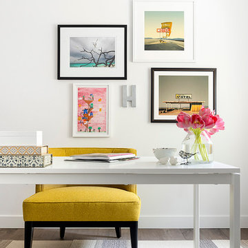
DESIGN BUILD REMODEL | Home Office Transformation | FOUR POINT DESIGN BUILD INC.
This space was once a child's bedroom and now doubles as a professional home photography post production office and a dressing room for graceful ballerinas!
This completely transformed 3,500+ sf family dream home sits atop the gorgeous hills of Calabasas, CA and celebrates the strategic and eclectic merging of contemporary and mid-century modern styles with the earthy touches of a world traveler!
AS SEEN IN Better Homes and Gardens | BEFORE & AFTER | 10 page feature and COVER | Spring 2016
To see more of this fantastic transformation, watch for the launch of our NEW website and blog THE FOUR POINT REPORT, where we celebrate this and other incredible design build journey! Launching September 2016.
Photography by Riley Jamison
#ballet #photography #remodel #LAinteriordesigner #builder #dreamproject #oneinamillion
As a conceptual urban infill project, the Wexley is designed for a narrow lot in the center of a city block. The 26’x48’ floor plan is divided into thirds from front to back and from left to right. In plan, the left third is reserved for circulation spaces and is reflected in elevation by a monolithic block wall in three shades of gray. Punching through this block wall, in three distinct parts, are the main levels windows for the stair tower, bathroom, and patio. The right two-thirds of the main level are reserved for the living room, kitchen, and dining room. At 16’ long, front to back, these three rooms align perfectly with the three-part block wall façade. It’s this interplay between plan and elevation that creates cohesion between each façade, no matter where it’s viewed. Given that this project would have neighbors on either side, great care was taken in crafting desirable vistas for the living, dining, and master bedroom. Upstairs, with a view to the street, the master bedroom has a pair of closets and a skillfully planned bathroom complete with soaker tub and separate tiled shower. Main level cabinetry and built-ins serve as dividing elements between rooms and framing elements for views outside.
Architect: Visbeen Architects
Builder: J. Peterson Homes
Photographer: Ashley Avila Photography
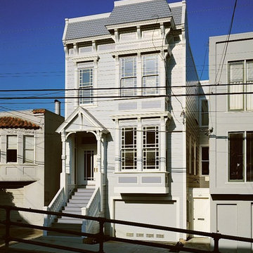
Major Renovation and Addition to a Victorian House in San Francisco, California’s Noe Valley Neighborhood
“Respectful but not reverential” was the phrase which guided our work in restoring and remodeling this Noe Valley Victorian residence. Once a single-family residence, the home had been clumsily divided into two flats in an earlier remodel. The owners wished to re-combine the two upper floors to create a single-family residence and create a small au pair unit at the rear of the ground floor, behind the garage. This work resulted in doubling the size of the house and completely gutting and reconfiguring the interior. Period hardware and light fixtures combine with custom casings and moldings to respect the existing architecture. Skylights and limestone counters introduce contemporary touches. Complete restoration of the façade included new custom windows with colored glass and new entry stairs.
Klopf Architecture, Outer Space Landscape Architects, Sezen & Moon Structural Engineer and Flegels Construction updated a classic Eichler open, indoor-outdoor home.
Everyone loved the classic, original bones of this house, but it was in need of a major facelift both inside and out. The owners also wanted to remove the barriers between the kitchen and great room, and increase the size of the master bathroom as well as make other layout changes. No addition to the house was contemplated.
The owners worked with Klopf Architecture in part because of Klopf’s extensive mid-century modern / Eichler design portfolio, and in part because one of their neighbors who had worked with Klopf on their Eichler home remodel referred them. The Klopf team knew how to update the worn finishes to make a more sophisticated, higher quality home that both looks better and functions better.
In conjunction with the atrium and the landscaped rear yard / patio, the glassy living room feels open on both sides and allows an indoor / outdoor flow throughout. The new, natural wood exterior siding runs through the house from inside to outside to inside again, updating one of the classic design features of the Eichler homes.
Picking up on the wood siding, walnut vanities and cabinets offset the white walls. Gray porcelain tiles evoke the concrete slab floors and flow from interior to exterior to make the spaces appear to flow together. Similarly the ceiling decking has the same white-washed finish from inside to out. The continuity of materials and space enhances the sense of flow.
The large kitchen, perfect for entertaining, has a wall of built-ins and an oversized island. There’s plenty of storage and space for the whole group to prep and cook together.
One unique approach to the master bedroom is the bed wall. The head of the bed is tucked within a line of built-in wardrobes with a high window above. Replacing the master closet with this wall of wardrobes allowed for both a larger bathroom and a larger bedroom.
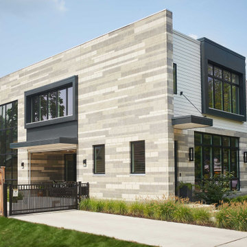
This 1,953 square foot, 4 bedroom, 2 bathroom Double Gable Eichler remodeled single-family house is located in Mountain View in the heart of the Silicon Valley.
Klopf Architecture Project Team: John Klopf, AIA, Klara Kevane, and Yegvenia Torres-Zavala
Landscape Architect: Outer Space Landscape Architects
Structural Engineer: Sezen & Moon
Contractor: Flegels Construction
Landscape Contractor: Roco's Gardening & Arroyo Vista Landscaping, Inc.
Photography ©2016 Mariko Reed
Location: Mountain View, CA
Year completed: 2015
Reload the page to not see this specific ad anymore
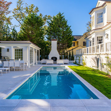
This whole house remodel updated and expanded a 1950’s contemporary. In addition to making the home more comfortable and energy efficient, the remodel added fabulous finishes. The owners were interested in creating multiple outdoor spaces for entertaining. This pond is a home for rescued turtles. Architect: Harrison Design; Landscape Design/Construction: Grace Design Associates; Photography: Jake Cryan Photography
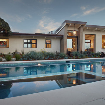
The remodel of this mid-century ranch house in an established Aspen neighborhood takes the opportunity to reuse sixty percent of the original roof and walls. Raising the roofline and adding clerestory windows and skylights flood the living spaces and master suite with natural light. Removing walls in the kitchen, living room and dining room create a generous and flowing open floor plan. Adding an entire wall of exterior glass doors to the centralized living room.
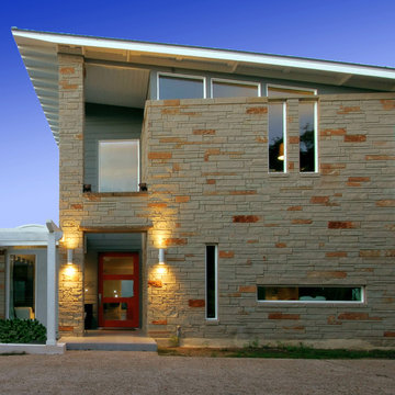
The Council Crest Residence is a renovation and addition to an early 1950s house built for inventor Karl Kurz, whose work included stereoscopic cameras and projectors. Designed by prominent local architect Roscoe Hemenway, the house was built with a traditional ranch exterior and a mid-century modern interior. It became known as “The View-Master House,” alluding to both the inventions of its owner and the dramatic view through the glass entry.
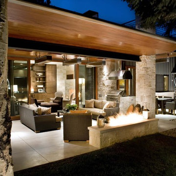
Approached from a small neighborhood park, the home was re-clad maintaining its welcoming scale, with privacy obtained through thoughtful placement of translucent glass, clerestory windows, and a stone screen wall. The original entry was maintained as a glass aperture, a threshold between the quiet residential neighborhood and the dramatic view over the city of Portland and landscape beyond. At the south terrace, an outdoor fireplace is integrated into the stone wall providing a comfortable space for the family and their guests.
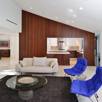
Within the existing footprint, the main floor living spaces were completely remodeled. Raised ceilings and new windows create open, light filled spaces. An upper floor was added within the original profile creating a master suite, study, and south facing deck. Space flows freely around a central core while continuous clerestory windows reinforce the sense of openness and expansion as the roof and wall planes extend to the exterior.
Images By: Jeremy Bitterman, Photoraphy Portland OR
Installed James Hardie Lap Siding in ColorPlus Technology Deep Ocean, James Hardie Crown Mouldings, Frieze Boards & Trim (Smooth Texture) both in ColorPlus Technology Arctic White, Beechworth Fiberglass Double Hung Replacement Windows in Frost White on Home and Detached Garage.
Installed ProVia Front Entry Door and Back Door, New Gutters & Downspouts to (Front Elevation only) and Built new Portico Cover to Front Entry.
Showing Results for "1950S Ranch Exterior Remodeling Contemporary"
Item 3 of 7
This home remodel is a celebration of curves and light. Starting from humble beginnings as a basic builder ranch style house, the design challenge was maximizing natural light throughout and providing the unique contemporary style the client’s craved.
The Entry offers a spectacular first impression and sets the tone with a large skylight and an illuminated curved wall covered in a wavy pattern Porcelanosa tile.
The chic entertaining kitchen was designed to celebrate a public lifestyle and plenty of entertaining. Celebrating height with a robust amount of interior architectural details, this dynamic kitchen still gives one that cozy feeling of home sweet home. The large “L” shaped island accommodates 7 for seating. Large pendants over the kitchen table and sink provide additional task lighting and whimsy. The Dekton “puzzle” countertop connection was designed to aid the transition between the two color countertops and is one of the homeowner’s favorite details. The built-in bistro table provides additional seating and flows easily into the Living Room.
A curved wall in the Living Room showcases a contemporary linear fireplace and tv which is tucked away in a niche. Placing the fireplace and furniture arrangement at an angle allowed for more natural walkway areas that communicated with the exterior doors and the kitchen working areas.
The dining room’s open plan is perfect for small groups and expands easily for larger events. Raising the ceiling created visual interest and bringing the pop of teal from the Kitchen cabinets ties the space together. A built-in buffet provides ample storage and display.
The Sitting Room (also called the Piano room for its previous life as such) is adjacent to the Kitchen and allows for easy conversation between chef and guests. It captures the homeowner’s chic sense of style and joie de vivre.
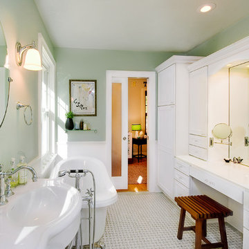
Complete bathroom remodel and restoration in 1920's home
Freestanding bathtub - victorian freestanding bathtub idea in St Louis
Freestanding bathtub - victorian freestanding bathtub idea in St Louis
The existing 1950’s ranch house was remodeled by this firm during a 4-year period commencing in 1997. Following the Phase I remodel and master bedroom loft addition, the property was sold to the present owners, a retired geologist and freelance artist. The geologist discovered the largest gas reserve in Wyoming, which he named ‘Jonah’.
The new owners program included a guest bedroom suite and an office. The owners wanted the addition to express their informal lifestyle of entertaining small and large groups in a setting that would recall their worldly travels.
The new 2 story, 1,475 SF guest house frames the courtyard and contains an upper level office loft and a main level guest bedroom, sitting room and bathroom suite. All rooms open to the courtyard or rear Zen garden. The centralized fire pit / water feature defines the courtyard while creating an axial alignment with the circular skylight in the guest house loft. At the time of Jonahs’ discovery, sunlight tracks through the skylight, directly into the center of the courtyard fire pit, giving the house a subliminal yet personal attachment to the present owners.
Different types and textures of stone are used throughout the guest house to respond to the owner’s geological background. A rotating work-station, the courtyard ‘room’, a stainless steel Japanese soaking tub, the communal fire pit, and the juxtaposition of refined materials and textured stone reinforce the owner’s extensive travel and communal experiences.
Photo: Frank Ooms
5