


Search results for "Active dwelling" in Home Design Ideas
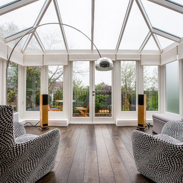
Breakfast in style in this glamorous first floor conservatory. Floor standing speakers provide superb audio quality. Blinds lower and raise at the touch of a button, and can be integrated to activate when the overhanging light is switched on.
homas Alexander
Photography by Richard Chivers https://www.rchivers.co.uk/
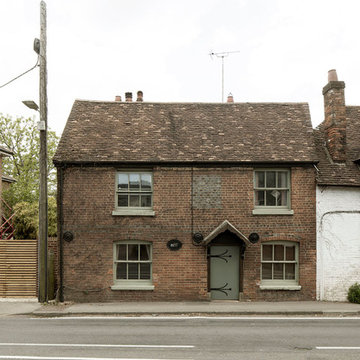
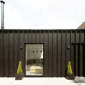
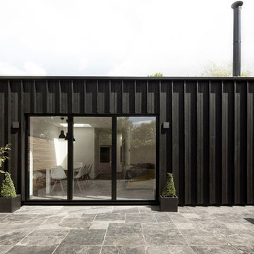
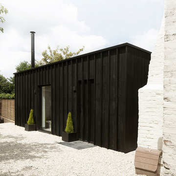
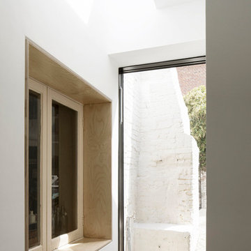
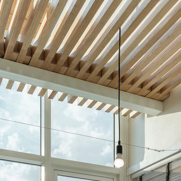
Marshall House is an extension to a Grade II listed dwelling in the village of Twyford, near Winchester, Hampshire. The original house dates from the 17th Century, although it had been remodelled and extended during the late 18th Century.
The clients contacted us to explore the potential to extend their home in order to suit their growing family and active lifestyle. Due to the constraints of living in a listed building, they were unsure as to what development possibilities were available. The brief was to replace an existing lean-to and 20th century conservatory with a new extension in a modern, contemporary approach. The design was developed in close consultation with the local authority as well as their historic environment department, in order to respect the existing property and work to achieve a positive planning outcome.
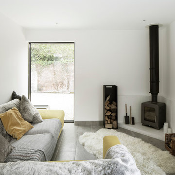
Like many older buildings, the dwelling had been adjusted here and there, and updated at numerous points over time. The interior of the existing property has a charm and a character - in part down to the age of the property, various bits of work over time and the wear and tear of the collective history of its past occupants. These spaces are dark, dimly lit and cosy. They have low ceilings, small windows, little cubby holes and odd corners. Walls are not parallel or perpendicular, there are steps up and down and places where you must watch not to bang your head.
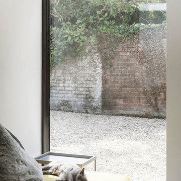
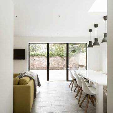
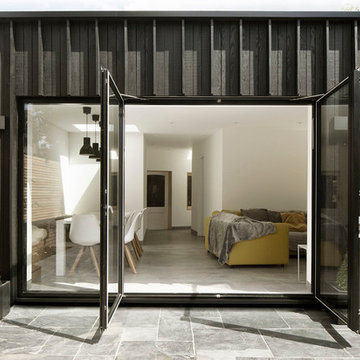
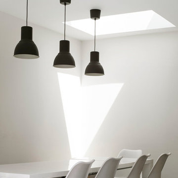
The extension is accessed via a small link portion that provides a clear distinction between the old and new structures. The initial concept is centred on the idea of contrasts. The link aims to have the effect of walking through a portal into a seemingly different dwelling, that is modern, bright, light and airy with clean lines and white walls. However, complementary aspects are also incorporated, such as the strategic placement of windows and roof lights in order to cast light over walls and corners to create little nooks and private views. The overall form of the extension is informed by the awkward shape and uses of the site, resulting in the walls not being parallel in plan and splaying out at different irregular angles.
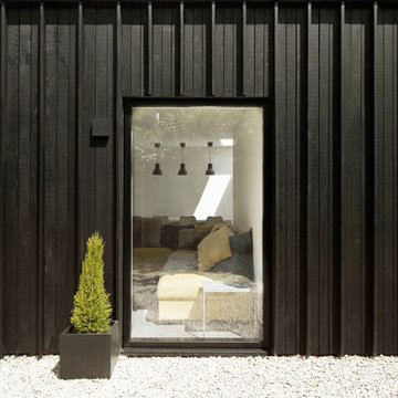
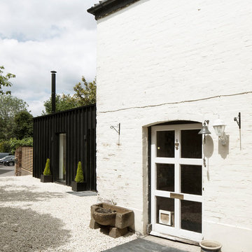
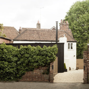
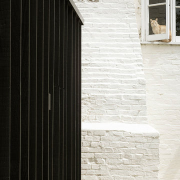
Externally, timber larch cladding is used as the primary material. This is painted black with a heavy duty barn paint, that is both long lasting and cost effective. The black finish of the extension contrasts with the white painted brickwork at the rear and side of the original house. The external colour palette of both structures is in opposition to the reality of the interior spaces. Although timber cladding is a fairly standard, commonplace material, visual depth and distinction has been created through the articulation of the boards. The inclusion of timber fins changes the way shadows are cast across the external surface during the day. Whilst at night, these are illuminated by external lighting.
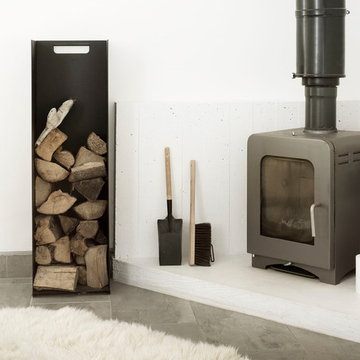
A secondary entrance to the house is provided through a concealed door that is finished to match the profile of the cladding. This opens to a boot/utility room, from which a new shower room can be accessed, before proceeding to the new open plan living space and dining area.
Photography by Richard Chivers https://www.rchivers.co.uk/
Marshall House is an extension to a Grade II listed dwelling in the village of Twyford, near Winchester, Hampshire. The original house dates from the 17th Century, although it had been remodelled and extended during the late 18th Century.
The clients contacted us to explore the potential to extend their home in order to suit their growing family and active lifestyle. Due to the constraints of living in a listed building, they were unsure as to what development possibilities were available. The brief was to replace an existing lean-to and 20th century conservatory with a new extension in a modern, contemporary approach. The design was developed in close consultation with the local authority as well as their historic environment department, in order to respect the existing property and work to achieve a positive planning outcome.
Like many older buildings, the dwelling had been adjusted here and there, and updated at numerous points over time. The interior of the existing property has a charm and a character - in part down to the age of the property, various bits of work over time and the wear and tear of the collective history of its past occupants. These spaces are dark, dimly lit and cosy. They have low ceilings, small windows, little cubby holes and odd corners. Walls are not parallel or perpendicular, there are steps up and down and places where you must watch not to bang your head.
The extension is accessed via a small link portion that provides a clear distinction between the old and new structures. The initial concept is centred on the idea of contrasts. The link aims to have the effect of walking through a portal into a seemingly different dwelling, that is modern, bright, light and airy with clean lines and white walls. However, complementary aspects are also incorporated, such as the strategic placement of windows and roof lights in order to cast light over walls and corners to create little nooks and private views. The overall form of the extension is informed by the awkward shape and uses of the site, resulting in the walls not being parallel in plan and splaying out at different irregular angles.
Externally, timber larch cladding is used as the primary material. This is painted black with a heavy duty barn paint, that is both long lasting and cost effective. The black finish of the extension contrasts with the white painted brickwork at the rear and side of the original house. The external colour palette of both structures is in opposition to the reality of the interior spaces. Although timber cladding is a fairly standard, commonplace material, visual depth and distinction has been created through the articulation of the boards. The inclusion of timber fins changes the way shadows are cast across the external surface during the day. Whilst at night, these are illuminated by external lighting.
A secondary entrance to the house is provided through a concealed door that is finished to match the profile of the cladding. This opens to a boot/utility room, from which a new shower room can be accessed, before proceeding to the new open plan living space and dining area.
Find the right local pro for your project
Photography by Richard Chivers https://www.rchivers.co.uk/
Marshall House is an extension to a Grade II listed dwelling in the village of Twyford, near Winchester, Hampshire. The original house dates from the 17th Century, although it had been remodelled and extended during the late 18th Century.
The clients contacted us to explore the potential to extend their home in order to suit their growing family and active lifestyle. Due to the constraints of living in a listed building, they were unsure as to what development possibilities were available. The brief was to replace an existing lean-to and 20th century conservatory with a new extension in a modern, contemporary approach. The design was developed in close consultation with the local authority as well as their historic environment department, in order to respect the existing property and work to achieve a positive planning outcome.
Like many older buildings, the dwelling had been adjusted here and there, and updated at numerous points over time. The interior of the existing property has a charm and a character - in part down to the age of the property, various bits of work over time and the wear and tear of the collective history of its past occupants. These spaces are dark, dimly lit and cosy. They have low ceilings, small windows, little cubby holes and odd corners. Walls are not parallel or perpendicular, there are steps up and down and places where you must watch not to bang your head.
The extension is accessed via a small link portion that provides a clear distinction between the old and new structures. The initial concept is centred on the idea of contrasts. The link aims to have the effect of walking through a portal into a seemingly different dwelling, that is modern, bright, light and airy with clean lines and white walls. However, complementary aspects are also incorporated, such as the strategic placement of windows and roof lights in order to cast light over walls and corners to create little nooks and private views. The overall form of the extension is informed by the awkward shape and uses of the site, resulting in the walls not being parallel in plan and splaying out at different irregular angles.
Externally, timber larch cladding is used as the primary material. This is painted black with a heavy duty barn paint, that is both long lasting and cost effective. The black finish of the extension contrasts with the white painted brickwork at the rear and side of the original house. The external colour palette of both structures is in opposition to the reality of the interior spaces. Although timber cladding is a fairly standard, commonplace material, visual depth and distinction has been created through the articulation of the boards. The inclusion of timber fins changes the way shadows are cast across the external surface during the day. Whilst at night, these are illuminated by external lighting.
A secondary entrance to the house is provided through a concealed door that is finished to match the profile of the cladding. This opens to a boot/utility room, from which a new shower room can be accessed, before proceeding to the new open plan living space and dining area.
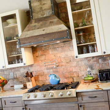
Sponsored
Columbus, OH
The Creative Kitchen Company
Franklin County's Kitchen Remodeling and Refacing Professional
Photography by Richard Chivers https://www.rchivers.co.uk/
Marshall House is an extension to a Grade II listed dwelling in the village of Twyford, near Winchester, Hampshire. The original house dates from the 17th Century, although it had been remodelled and extended during the late 18th Century.
The clients contacted us to explore the potential to extend their home in order to suit their growing family and active lifestyle. Due to the constraints of living in a listed building, they were unsure as to what development possibilities were available. The brief was to replace an existing lean-to and 20th century conservatory with a new extension in a modern, contemporary approach. The design was developed in close consultation with the local authority as well as their historic environment department, in order to respect the existing property and work to achieve a positive planning outcome.
Like many older buildings, the dwelling had been adjusted here and there, and updated at numerous points over time. The interior of the existing property has a charm and a character - in part down to the age of the property, various bits of work over time and the wear and tear of the collective history of its past occupants. These spaces are dark, dimly lit and cosy. They have low ceilings, small windows, little cubby holes and odd corners. Walls are not parallel or perpendicular, there are steps up and down and places where you must watch not to bang your head.
The extension is accessed via a small link portion that provides a clear distinction between the old and new structures. The initial concept is centred on the idea of contrasts. The link aims to have the effect of walking through a portal into a seemingly different dwelling, that is modern, bright, light and airy with clean lines and white walls. However, complementary aspects are also incorporated, such as the strategic placement of windows and roof lights in order to cast light over walls and corners to create little nooks and private views. The overall form of the extension is informed by the awkward shape and uses of the site, resulting in the walls not being parallel in plan and splaying out at different irregular angles.
Externally, timber larch cladding is used as the primary material. This is painted black with a heavy duty barn paint, that is both long lasting and cost effective. The black finish of the extension contrasts with the white painted brickwork at the rear and side of the original house. The external colour palette of both structures is in opposition to the reality of the interior spaces. Although timber cladding is a fairly standard, commonplace material, visual depth and distinction has been created through the articulation of the boards. The inclusion of timber fins changes the way shadows are cast across the external surface during the day. Whilst at night, these are illuminated by external lighting.
A secondary entrance to the house is provided through a concealed door that is finished to match the profile of the cladding. This opens to a boot/utility room, from which a new shower room can be accessed, before proceeding to the new open plan living space and dining area.
PROJECT | Duplicate-Duplex
TYPE | private residence / home-studio
LOCATION | Phayathai Rd., Bangkok, Thailand
OWNER | Ms. Najaree Ratanajiajaroen / Chanon Treenet
ARCHITECT | TOUCH Architect Co.,Ltd.
FLOOR AREA | 64 sq.m.
FLOOR AREA (by proposing) | 75 sq.m.
COMPLETION | 2018
PHOTOGRAPHER | Chalermwat Wongchompoo
CONTRACTOR | Legend Construction Group
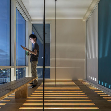
A major pain point of staying in 64 sq.m. of duplex condominium unit, which is used for a home-studio for an animator and an artist, is that there is not enough space for dwelling. Moreover, a double-volume space of living area with a huge glass curtain wall, faces West. High temperature occurs all day long, since it allows direct sunlight to come inside.
In order to solve both mentioned problems, three addition items are proposed which are, GRID PARTITION, EXTENSION DECK, and STEPPING SPACE.
A glass partition not only dividing space between kitchen and living, but also helps reduce electricity charge from air-condition. Grid-like of double glass frame is for stuff and stationery hanging, as to serve the owners’ activities.
Extension deck would help filtrating heat from direct sunlight, since an existing high glass facade facing West.
An existing staircase for going up to the second-floor bedroom, is added by a proposed space above, since this condominium unit has no enough space for dwelling or storage. In order to utilize the space in a small condominium, creating another staircase above the existing one helps increase the space.
The grid partition and the extension deck help ‘decrease’ the electricity charge, while the extension deck and the stepping space help ‘increase’ the space for 11 sq.m.
Showing Results for "Active Dwelling"
PROJECT | Duplicate-Duplex
TYPE | private residence / home-studio
LOCATION | Phayathai Rd., Bangkok, Thailand
OWNER | Ms. Najaree Ratanajiajaroen / Chanon Treenet
ARCHITECT | TOUCH Architect Co.,Ltd.
FLOOR AREA | 64 sq.m.
FLOOR AREA (by proposing) | 75 sq.m.
COMPLETION | 2018
PHOTOGRAPHER | Chalermwat Wongchompoo
CONTRACTOR | Legend Construction Group
A major pain point of staying in 64 sq.m. of duplex condominium unit, which is used for a home-studio for an animator and an artist, is that there is not enough space for dwelling. Moreover, a double-volume space of living area with a huge glass curtain wall, faces West. High temperature occurs all day long, since it allows direct sunlight to come inside.
In order to solve both mentioned problems, three addition items are proposed which are, GRID PARTITION, EXTENSION DECK, and STEPPING SPACE.
A glass partition not only dividing space between kitchen and living, but also helps reduce electricity charge from air-condition. Grid-like of double glass frame is for stuff and stationery hanging, as to serve the owners’ activities.
Extension deck would help filtrating heat from direct sunlight, since an existing high glass facade facing West.
An existing staircase for going up to the second-floor bedroom, is added by a proposed space above, since this condominium unit has no enough space for dwelling or storage. In order to utilize the space in a small condominium, creating another staircase above the existing one helps increase the space.
The grid partition and the extension deck help ‘decrease’ the electricity charge, while the extension deck and the stepping space help ‘increase’ the space for 11 sq.m.
5