


Search results for "Double height staircase ideas" in Home Design Ideas
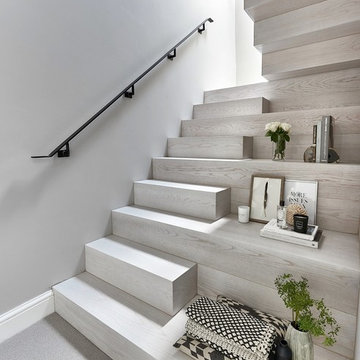
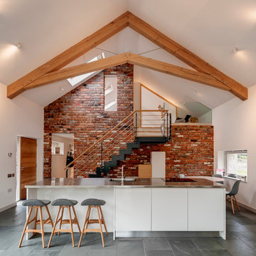
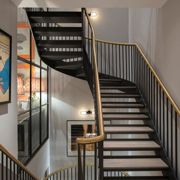
Our brief for this new monolithic staircase was to look more like a piece of art than a staircase. The staircase sits in a Grade 2 listed building and complements the period interior beautifully! The once old makeshift staircase which accessed the former servant’s quarters of the property was transformed to give them access to the loft space which they had totally renovated. After sitting down with the Donohoe’s and looking through mood boards, we came up with this design and colour wash. The substrate of the staircase was made from solid oak with our new arctic white wash finish, giving it a clean, fresh Scandinavian look. What do you think?
Photo credit: Matt Cant
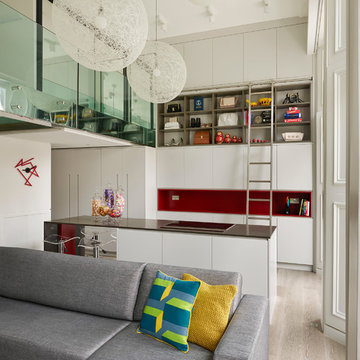
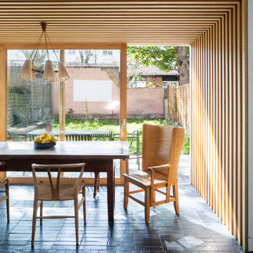
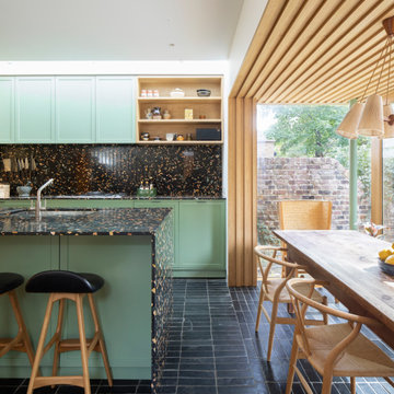
Open plan kitchen & living area
A double height kitchen with rolling library style steel ladder, brings dramatic style to this space.
Multiple pendant lights add texture and mood lighting, whilst adjustable spotlights light up key shelves and spots on the island at nightime.
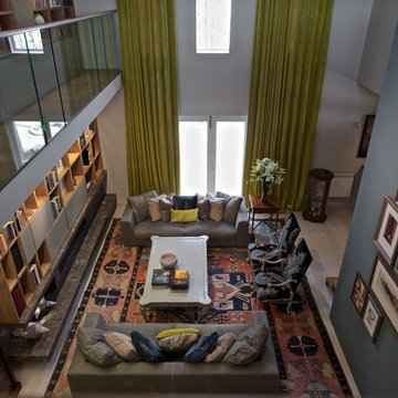
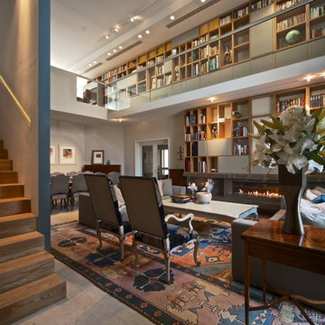
camilleriparismode projects and design team were approached to rethink a previously unused double height room in a wonderful villa. the lower part of the room was planned as a sitting and dining area, the sub level above as a tv den and games room. as the occupants enjoy their time together as a family, as well as their shared love of books, a floor-to-ceiling library was an ideal way of using and linking the large volume. the large library covers one wall of the room spilling into the den area above. it is given a sense of movement by the differing sizes of the verticals and shelves, broken up by randomly placed closed cupboards. the floating marble fireplace at the base of the library unit helps achieve a feeling of lightness despite it being a complex structure, while offering a cosy atmosphere to the family area below. the split-level den is reached via a solid oak staircase, below which is a custom made wine room. the staircase is concealed from the dining area by a high wall, painted in a bold colour on which a collection of paintings is displayed.
photos by: brian grech
Find the right local pro for your project
camilleriparismode projects and design team were approached to rethink a previously unused double height room in a wonderful villa. the lower part of the room was planned as a sitting and dining area, the sub level above as a tv den and games room. as the occupants enjoy their time together as a family, as well as their shared love of books, a floor-to-ceiling library was an ideal way of using and linking the large volume. the large library covers one wall of the room spilling into the den area above. it is given a sense of movement by the differing sizes of the verticals and shelves, broken up by randomly placed closed cupboards. the floating marble fireplace at the base of the library unit helps achieve a feeling of lightness despite it being a complex structure, while offering a cosy atmosphere to the family area below. the split-level den is reached via a solid oak staircase, below which is a custom made wine room. the staircase is concealed from the dining area by a high wall, painted in a bold colour on which a collection of paintings is displayed.
photos by: brian grech
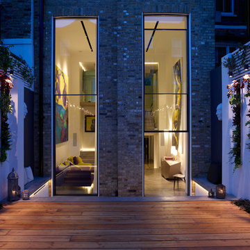
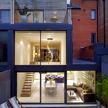
And finally, this night-time view, taken from the rear garden, shows the double-height Vitrocsa 'guillotine' windows and the living room beyond.
The lighting design, by Tim Fonfara of Luxologie, as throughout the project, accentuates the architecture of the spaces and the connection between the interior and exterior.
Photographer: Rachael Smith
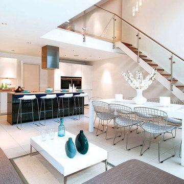
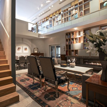
Comfortable modern kitchen / living / dining room. With large double void leading to formal living / reception room above, linked by feature glass, powder coated metal and walnut tread staircase. The deep grey centre island of the kitchen offsets the minimal palette of the rest of the room,


Item 3 of 7
Richard Downer
Trendy slate floor eat-in kitchen photo in Devon with flat-panel cabinets, white cabinets, stainless steel countertops and an island
Trendy slate floor eat-in kitchen photo in Devon with flat-panel cabinets, white cabinets, stainless steel countertops and an island
Rear external of contemporary townhouse in London. The space features a double height void including a statement contemporary chandelier over the kitchen. The Living Room above is linked to the Kitchen by a feature glass, powered coated steel and walnut open tread staircase. Dramatic two story floor to ceiling glazing on the back of the house gives views to the garden from both the kitchen and living room.
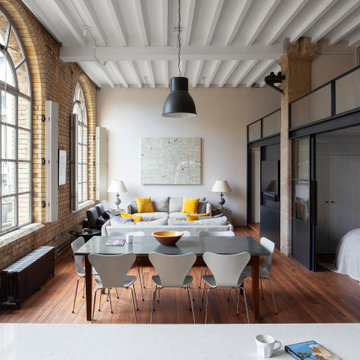
Bankside Lofts, opposite the iconic Tate Modern building, was one of the first projects developed by the Manhattan Loft Corporation. They pioneered an unusual model, selling flats as ‘shells’ for owners to fit out themselves. Bankside Lofts was once of their earliest developments. We were asked to reconfigure and update one of the apartments in the Victorian section of the building, for a couple who wanted more privacy and better entertaining space.
The existing apartment had lots of character and architectural features, including three huge arched windows with steel frames overlooking Tate Modern, exposed brick, timber beams and concrete columns. Our design reinforces the architectural qualities of the space and uses robust materials that are in keeping with the industrial aesthetic of the building. We wanted to create a project which felt like it fitted with the building and would last for many years, without looking out of date.
The layout of the apartment was the main reason for the refurbishment. There were two open plan mezzanine bed space overlooking the main space, which had no walls or privacy and had very low ceiling heights. This worked for the owners when they had younger children, but now they were adults they needed a proper enclosed bedroom space, more storage and a bigger kitchen for entertaining. They also wanted to retain a space for guests but keep the space as open as possible when not in use. Creating the main bedroom was particularly difficult, because the ceiling height was not quite large enough for two full stories to be inserted, meaning somewhere there would be a very compromised ceiling height.
Our solution was a complex puzzle of interlocking storage units, varying in height which maximise the ceiling height where it is needed, but also increase the amount of usable floor space. Wardrobes were reduced in height in order to gain standing space in the room above. A library allows ample height to sit and read a book and allows a full ceiling height to the bedroom below. The guest bed is on a raised platform above the entrance hall.
The new structure for the mezzanine is completely free-standing with the perimeter walls of the apartment, made from large sections of timber. These mirror the existing ceiling beams, so the new elements feels like a part of the existing building, blending in to create a sense of a unity. We included a hidden bedroom for the owners dog, Ruby, a double height shower and lots of hidden storage. The yellow staircase up to the mezzanine adds a pop of colour to the otherwise monochrome palette, and the steps double up as drawers for shoes.
We used a simple palette of materials to complement those already found in the apartment. Steel crittall sliding doors and windows enclose the bedroom but allow the space to feel open and be filled with natural light. A hidden curtain can be drawn for privacy. The bathroom is seamlessly finished in Moroccan Tadelakt plaster, reminiscent of the concrete columns which were left exposed. Reeded glass on the mezzanine level offers a sense of privacy to the upper level whilst allowing light to flood the space.
A playful re-imagining of a Victorian terrace with a large rear extension.
The project started as a problem solving exercise – the owner of the house was very tall and he had never been able to have a shower in the pokey outrigger bathroom, there was simply not enough ceiling height. The lower ground floor kitchen also suffered from low ceilings and was dark and uninviting. There was very little connection to the garden, surrounded by trees, which felt like a lost opportunity. The whole house needed rethinking.
The solution we proposed was to extend into the generous garden at the rear and reconstruct the existing outrigger with an extra storey. We used the outrigger to relocate the staircase to the lower ground floor, moving it from the centre of the house into a double height space in the extension. This gave the house a very generous sense of height and space and allows light to flood into the kitchen and hall from high level windows. These provide glances of the surrounding tress as you descent to the dining room.
The extension allows the kitchen and dining room to push further into the garden, making the most of the views and light. A strip rooflight over the kitchen wall units brings light deep into the space and washes the kitchen with sunlight during the day. Behind the kitchen, where there was no access to natural light, we tucked a utility room and shower room, with a second sitting room at the front of the house. The extension has a green sedum roof to ensure it feels like part of the garden when seen from the upper floors of the house. We used a pale white and yellow brick to complement the colour of the London stock brickwork, but maintain a contemporary aesthetic. Oak windows and sliding door add a warmth to the extension and tie in with the materials we used internally.
Internally there is a palette of bold colours to define the living spaces, including an entirely yellow corridor the client has named ‘The Yolky Way’ leading from the kitchen to the front reception room, complete with hidden yellow doors. These are offset against more natural materials such as the oak batten cladding, which define the dining space and also line the back wall of the kitchen concealing the fridge door and larder units. A bespoke terrazzo counter unites the colours of the floor, oak cladding and cupboard doors and the tiled floor leads seamlessly to the outside patio, leading the eye back into the garden.
A new bathroom with a generous ceiling height was placed in the reconstructed outrigger, with triple aspect windows, including a picture window at the end of the bath framing views of the trees in the garden.
Upstairs we kept the traditional Victorian layout, refurbished the windows and shutters, reinstating cornice and ceiling roses to the principal rooms. At every point in the project the ergonomics of the house were considered, tall doors, very high kitchen worktops and always maximising ceiling heights, ensuring the house was more suited to its tall owner.
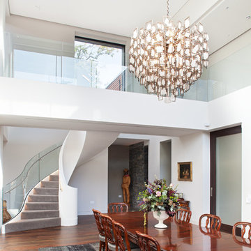
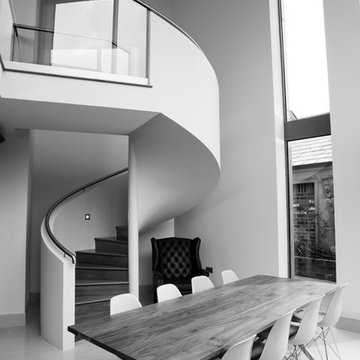
This open plan property in Kensington studios hosted an impressive double height living room, open staircase and glass partitions. The lighting design needed to draw the eye through the space and work from lots of different viewing angles
Photo by Tom St Aubyn
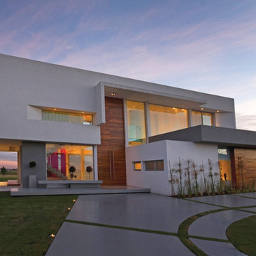
Concrete House (2010)
Project, Works Management and Construction
Location Los Pintores Gated Neighborhood, El Nacional Country Club, General Rodriguez, Buenos Aires, Argentina
Total Area 488 m²
Photo Luis Abregú
Principal> Arq. Alejandro Amoedo
Lead Designer> Arq. Lucas D’Adamo Baumann
Project Manager > Luis Brazzola
Collaborators > Federico Segretin Sueyro, Nicolas Villoria
The land’s characteristics made it possible to plan the design of this weekend house through vast glass façades that are benefited by the empty area surrounding it and integrate large visual fields towards the golf course and the immediate environment. The access to the house features a paneling made of lapacho boards set horizontally. The house is organized around a very simple layout, composed of two crossed volumes: the first one runs parallel to the front, floating over the sitting room and the second one runs perpendicular to the former and supported on the only side that has a nearby neighbor.
From the double-height hall, access is gained to the public areas aligned on the rear façade with open views onto the golf course. The sitting room, dining room, kitchen and barbecue area may be fully integrated by means of movable panels to create a suitable space for social gatherings. The access area is completed with a toilet and a home theater room that leads us to the staircase, made in concrete, from which we get to the master suite and the children’s area. This sector is made up of two en-suite bedrooms and a common playroom separated from the parents’ area by the double height and connected by means of a steel and glass bridge.
The ground floor is completed with the service area, made up of a roofed double garage, laundry, storage area, machine room, service bedroom, bathroom and changing room for the pool.
Exclusive graphic applications supplied by the company Hachetresele were designed for the toilet, kitchen and home theater room in this house, thus incorporating graphic design to the proposed architecture and emphasizing the customization of its rooms.
Showing Results for "Double Height Staircase Ideas"
Pool House (2010)
Project and Works Management
Location Los Castores I, Nordelta, Tigre, Buenos Aires, Argentina
Total Area 457 m²
Photo Luis Abregú
Pool House>
Principal> Arq. Alejandro Amoedo
Lead Designer> Arq. Lucas D’Adamo Baumann
Project Manager> Hernan Montes de Oca
Collaborators> Federico Segretin Sueyro, Luciana Flores, Fausto Cristini
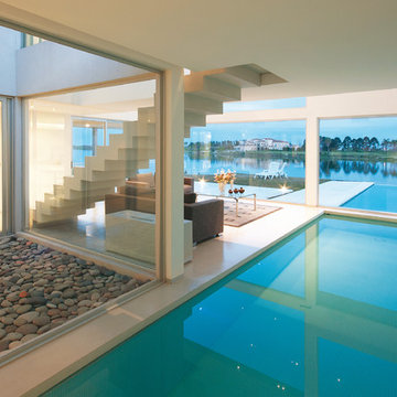
The main condition suggested by the owner for the design of this permanent home was to direct the views to the vast lagoon that is on the rear façade of the land.
To this end, we designed an inverted L layout, withdrawing the access to the house towards the center of the lot, allowing for wider perspectives at the rear of the lot and without limits to the environment.
Aligned on the front façade are the garages, study, toilet and service rooms: laundry, pantry, one bedroom, one bathroom and the barbecue area.
This geometry created a long path towards the entrance of the house, which was designed by combining vehicle and pedestrian access.
The social areas are organized from the access hall around an inner yard that integrates natural light to the different environments. The kitchen, the dining room, the gallery and the sitting room are aligned and overlooking the lagoon. The sitting room has a double height, incorporating the stairs over one of the sides of the inner yard and an in-out swimming pool that is joined to the lake visually and serves as separation from the master suite.
The upper floor is organized around the double-height space, also benefiting from the views of the environment, the inner yard and the garden. Its plan is made up of two full guest suites and a large study prepared for the owners’ work, also enjoying the best views of the lagoon, not just from its privileged location in height but also from its sides made of glass towards the exterior and towards the double height of the sitting room.
Our house in the Aravali range is a project that is close to our hearts. It has
been designed in keeping with our design ethos of sustainability hence both the material and the color palette appears raw yet refined. We have used natural wood and earthy materials throughout the house— from floor to furniture and fleshed them out with intricate details. Everything that shares a footprint in the house is thoughtfully worked into, hand-cut or hand-sawn and meticulously put
While the overall theme of the house is contemporary, we have further
aestheticized it through the contrasting interplay of minimalism and maximalism. This aesthetic dichotomy is achieved by using a minimal neutral palette and dramatic styling of oversized mirrors, sculptures, and art. Sumptuous finishes like that of muted and antiqued brass add accent to doors, sculptures, furniture, and chandeliers. Vintage switches lend an air of old-world elegance into the mix. The diverse inventory of antiques, art, and artifacts we have collected over the years from our travels across India and abroad show up everywhere in the
house.
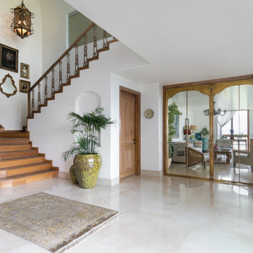
Packed with custom touches and artisanal craftsmanship, our house boasts four defined spaces: double height foyer, double height terrace, living room, and bar.
While each of these areas has its own soul and spirit — we have used sliding doors to demarcate as well as to unify the spaces. One look at the home and
you know it belongs to designers, it goes without saying that the decor is ..
forever in flux—whether it is to reflect the change in season or design attitude
The vertical volume of the terrace incorporates wooden paneling seducing the
eye to roam all the way to the top. During winters, this area morphs into a dining room. Wood and brass accents create a contemporary yet earthy vibe in the
bar/family lounge. The living area is completely steeped in the
minimalism-meets-maximalism-style with the wooden bay window area,
brass-accentuated double door, and larger-than-life vignettes; this is a meeting point for rich material interaction. The lobby, again, double height invites pools of natural light. An intricate cast railing enhances the staircase—the captivating reflection of which is captured in an imposing 20-FOOT mirror. The lobby area
also has a fireplace which is enlivened with fresh blooms and birdcage mirrors.
6