


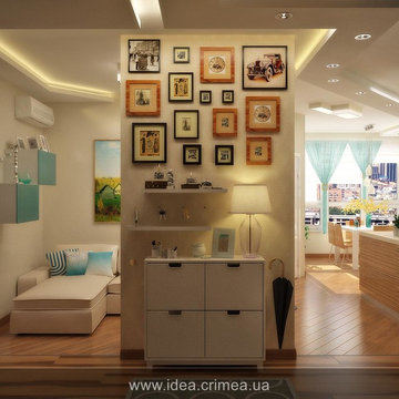
Search results for "Small apartment sunroom ideas" in Home Design Ideas
This apartment is designed by Black and Milk Interior Design. They specialise in Modern Interiors for Modern London Homes. https://blackandmilk.co.uk
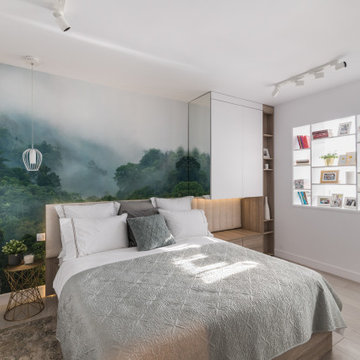
Inspiration for a contemporary gray floor and wallpaper bedroom remodel in Other with white walls
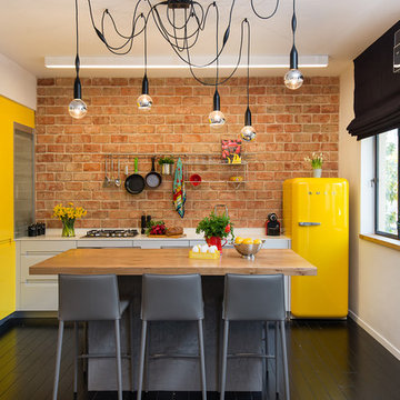
Photo: Aviv Kurt
Enclosed kitchen - small eclectic l-shaped painted wood floor enclosed kitchen idea in Tel Aviv with an island, flat-panel cabinets, yellow cabinets and colored appliances
Enclosed kitchen - small eclectic l-shaped painted wood floor enclosed kitchen idea in Tel Aviv with an island, flat-panel cabinets, yellow cabinets and colored appliances
Find the right local pro for your project
photographer : tomer rubens
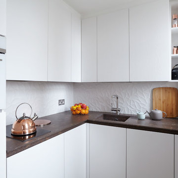
Trendy kitchen photo in Tel Aviv with flat-panel cabinets, white cabinets, gray backsplash and glass sheet backsplash
Trendy kitchen photo in Tel Aviv with flat-panel cabinets, white cabinets, gray backsplash and glass sheet backsplash
photographer : tomer rubens
Inspiration for a contemporary kitchen remodel in Tel Aviv
Inspiration for a contemporary kitchen remodel in Tel Aviv
Reload the page to not see this specific ad anymore
Graham Atkins-Hughes
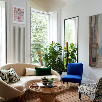
Example of a small eclectic formal dark wood floor living room design in London with white walls
Example of a small eclectic formal dark wood floor living room design in London with white walls
A house is one’s sanctuary of dreams, emotions & hope. And what better way to bring this etymology to life than a home that expresses just this. Drive down about hundred kilometers off the coast of the bustling city of Mumbai and nestled amidst the Sahyadris Mountains, is interior designer Rohit Bhoite’s recent heartfelt project. When he was approached for the Linear House Project, it was simply barren land and the creative brief was to design a space that reflected the diverse yet cognitive personalities of the home owners keeping in mind that it had to be kid friendly too.
From the day Rohit’s team started ideating and drafting their initial thoughts to where the complete home stands today, its been an overwhelming and fulfilling journey of over two years. Layout orientation diagrams and computer simulations where discussed with the homeowners, iterated and concluded with great detailing, keeping in mind the philosophy and personas of all.
The pristine architectural structure, pool deck, landscaping, interior design and execution, each aspects of the project had been well planned and executed with timelines. Nature and urban contemporary visuals had to blend extremely well into each other. It was the perfect opportunity to create an abode of tranquility with a colour palette of industrial shades with earthy hues and tones that evoke a sense of clam.
Overlooking the expansive mountain range the house was designed in a horizontally stretch with the living room & dining being placed right in the centre as the focal point where family and friends would love to spend time together. The two master bedrooms fondly knows as the Black and White rooms put at extreme ends. There is also a kids room and a guest bedroom apart from the comprehensive kitchen.
The living space practically has no walls but folding shuttered glass paned French windows on custom designed track channels that allow them to fully open up on both sides. One side being the landscaped lawns and the other being the pool and the barbeque gazebo. The idea was that one can embrace the feeling of sitting outdoors even while inside the leisure of the living room… literally re-creating an inside out look. The flooring selected was a blended ash grey shade with Diesel tiles to offset with the industrial feel. The chalet style sloping pitched roof is as capacious with an 18 feet height at its highest point in the center running through the entire living and dining area. Walls were hand crafted in textured grey and subway tiles as one of the highlighters, with the couch in pure linen fabric and relaxed rattan wicker chairs to offset the colours of the walls. Planters that are about nine feet in height were placed strategically. The icing on the cake was the handmade glass mesh chandelier discovered by Rohit on one of his travels and literally an instant hit with the home owners too. Apart from this, canescent lighting has always been a must have on his projects. He strongly recommends this offering to his clients at most times.
The dining table is a solid wood plank and polished off in a complimenting natural wood tinge with a clear glass bottom to ensure that the dimensional view of the house does not get blocked. It is fondly known as the floating table in the family!
Geometry with tiles and forms has been a focal point in Rohit’s structural designs, especially when it comes to bathrooms. The powder bathroom is a classic example of just that with extensive use of hexagonal tiling. A custom granite sink with brass details around the periphery and edges of the mirror is the focal point and forms the visual balance of the small yet utilitarian space.
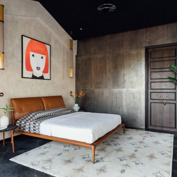
There are 4 bedrooms to the Uday Villa. Two Master bedrooms, one kids room and a guest room. One bedroom which the team terms as ‘His Black Room’ was designed simply to the preference of the gentleman and ‘Her White Room’ designed to the choice of the lady of the house. The black and white room have the same layout but are situated at both the extreme ends of the house, each overlooking the greens and the azure pool with tall glass retractable French top to bottom windows.
The black room has a beautiful choice of natural hues of deep and tan browns, greens and a grey concrete wall giving the room an industrial look. The opposite wall holds the much loved yet tricky to use aluminium checked Tiles. Polished kadappa (slate) flooring holds the visual identity together and almost completes the look of the black shera(cement) board panel with a deep wooden texture. A tan cosy corner chair, which happens to be one of Rohit’s steals while scouting for local designer portfolios, at the rear end; Adds to the eccentric highlight that you see in the other details as well, such as the bed frame and the word work around the room. A metal mesh light weight glass tube adds a fantastic delicate highlight almost completing the room to perfection.
Apart from keeping the bathroom clutter free, practical and trendy, it incorporates the palette of the room, here as well with brass detailing, Diesel tiles and fittings in a clean and trend setting chrome finish.
The white room made to the choice of the lady of the family, has a strong feminine voice yet keeps to the integrity of Rohit’s design style. The walls are textured with concrete finish light grey colour with Diesel tiles and the ceiling is masked with shera board in an ash wood shade. The industrial looks is softened with a smart chic choice in upholstery to add warmth. A signature Rohit Bhoite custom designed four poster urban bed with light sheers was a mush have for the lady in the house and it was honoured. It was created in house from scratch and holds a natural veneer polish. To offset the industrial grey, earthy tones of greens were used by way of planters and browns in the carpet. The bathroom door adds a touch of nature to the entire space. The pendant & ceiling light fittings have a touch of brass to compliment the room and add finesse.
The bathroom was designed with granite and hued concrete that supports the industrial tone of design language that Rohit is trying to bring about to the project.
The kids room is a eclectic blend of yellow, grey and tan brown. The little home owners insisted on slumber party bunk beds and given this fun brief, custom made beds were designed with a height of 15 feet so they do not need to bend over or have heads hitting the roofs when at play. The lights form yet another highlight of this room, that juxtapose floating cloud formations, symbolizing ideas that can creatively flow in thin air. Cement tiles in the flooring, textured walls and fabrics in earthy tones truly complete this room.
Shades of blue are the highlight of the guest room. The angular yet non symmetrical geometric patterned flooring offsets the colour tones of the custom-made bed, the head board and the roof. Concrete tiles form the base and the half and half wall , cuts the monotony of a plain white wall that runs across the length and height of the room. The colours of the room spill over the bathroom with the coloured concrete walls and flooring. The raw look with refined designer fittings was Rohit’s way of incorporating technique into his art form.
The pool being a highlight for the kids in the family, was designed in the length of 15 mts. x 5 meters to cover the exact expanse of the house, so it is visible not only from the living and dining areas, but also both the black and white rooms at both ends of the constructed structure. There is a practical and aesthetically clear glass porch with matt black gazebo work where the open to air bar, BBQ grill and open to air outdoor furniture has been placed for outdoor dining on a beautiful winter day or a hot summer evening. The family hopes to spend much of their time here as the kids love to make a splash on most days.
The landscape design holds a special place for Rohit. This was a design avenue he had been assigned for the very first time. With a lot of in-depth research about flora and fauna with climate durability in mind, the plan was all about juxtaposing natural elements with the existing rock formations originally found in the same space as discovered. Everything was designed around the original being of these mini boulders to represent his ideology of aligning it all into a beautifully orchestrated form without having to compromise on the integrity of the design planned.
To finish off the project Rohit and the home owners added the final touches to the bold hues with customized furniture elements, paintings and eye-catching curios from all across the world. A dream realized… an idea fulfilled… a happy family.
A house is one’s sanctuary of dreams, emotions & hope. And what better way to bring this etymology to life than a home that expresses just this. Drive down about hundred kilometers off the coast of the bustling city of Mumbai and nestled amidst the Sahyadris Mountains, is interior designer Rohit Bhoite’s recent heartfelt project. When he was approached for the Linear House Project, it was simply barren land and the creative brief was to design a space that reflected the diverse yet cognitive personalities of the home owners keeping in mind that it had to be kid friendly too.
From the day Rohit’s team started ideating and drafting their initial thoughts to where the complete home stands today, its been an overwhelming and fulfilling journey of over two years. Layout orientation diagrams and computer simulations where discussed with the homeowners, iterated and concluded with great detailing, keeping in mind the philosophy and personas of all.
The pristine architectural structure, pool deck, landscaping, interior design and execution, each aspects of the project had been well planned and executed with timelines. Nature and urban contemporary visuals had to blend extremely well into each other. It was the perfect opportunity to create an abode of tranquility with a colour palette of industrial shades with earthy hues and tones that evoke a sense of clam.
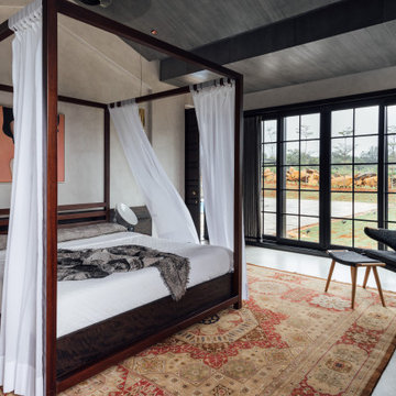
Overlooking the expansive mountain range the house was designed in a horizontally stretch with the living room & dining being placed right in the centre as the focal point where family and friends would love to spend time together. The two master bedrooms fondly knows as the Black and White rooms put at extreme ends. There is also a kids room and a guest bedroom apart from the comprehensive kitchen.
The living space practically has no walls but folding shuttered glass paned French windows on custom designed track channels that allow them to fully open up on both sides. One side being the landscaped lawns and the other being the pool and the barbeque gazebo. The idea was that one can embrace the feeling of sitting outdoors even while inside the leisure of the living room… literally re-creating an inside out look. The flooring selected was a blended ash grey shade with Diesel tiles to offset with the industrial feel. The chalet style sloping pitched roof is as capacious with an 18 feet height at its highest point in the center running through the entire living and dining area. Walls were hand crafted in textured grey and subway tiles as one of the highlighters, with the couch in pure linen fabric and relaxed rattan wicker chairs to offset the colours of the walls. Planters that are about nine feet in height were placed strategically. The icing on the cake was the handmade glass mesh chandelier discovered by Rohit on one of his travels and literally an instant hit with the home owners too. Apart from this, canescent lighting has always been a must have on his projects. He strongly recommends this offering to his clients at most times.
The dining table is a solid wood plank and polished off in a complimenting natural wood tinge with a clear glass bottom to ensure that the dimensional view of the house does not get blocked. It is fondly known as the floating table in the family!
Geometry with tiles and forms has been a focal point in Rohit’s structural designs, especially when it comes to bathrooms. The powder bathroom is a classic example of just that with extensive use of hexagonal tiling. A custom granite sink with brass details around the periphery and edges of the mirror is the focal point and forms the visual balance of the small yet utilitarian space.
There are 4 bedrooms to the Uday Villa. Two Master bedrooms, one kids room and a guest room. One bedroom which the team terms as ‘His Black Room’ was designed simply to the preference of the gentleman and ‘Her White Room’ designed to the choice of the lady of the house. The black and white room have the same layout but are situated at both the extreme ends of the house, each overlooking the greens and the azure pool with tall glass retractable French top to bottom windows.
The black room has a beautiful choice of natural hues of deep and tan browns, greens and a grey concrete wall giving the room an industrial look. The opposite wall holds the much loved yet tricky to use aluminium checked Tiles. Polished kadappa (slate) flooring holds the visual identity together and almost completes the look of the black shera(cement) board panel with a deep wooden texture. A tan cosy corner chair, which happens to be one of Rohit’s steals while scouting for local designer portfolios, at the rear end; Adds to the eccentric highlight that you see in the other details as well, such as the bed frame and the word work around the room. A metal mesh light weight glass tube adds a fantastic delicate highlight almost completing the room to perfection.
Apart from keeping the bathroom clutter free, practical and trendy, it incorporates the palette of the room, here as well with brass detailing, Diesel tiles and fittings in a clean and trend setting chrome finish.
The white room made to the choice of the lady of the family, has a strong feminine voice yet keeps to the integrity of Rohit’s design style. The walls are textured with concrete finish light grey colour with Diesel tiles and the ceiling is masked with shera board in an ash wood shade. The industrial looks is softened with a smart chic choice in upholstery to add warmth. A signature Rohit Bhoite custom designed four poster urban bed with light sheers was a mush have for the lady in the house and it was honoured. It was created in house from scratch and holds a natural veneer polish. To offset the industrial grey, earthy tones of greens were used by way of planters and browns in the carpet. The bathroom door adds a touch of nature to the entire space. The pendant & ceiling light fittings have a touch of brass to compliment the room and add finesse.
The bathroom was designed with granite and hued concrete that supports the industrial tone of design language that Rohit is trying to bring about to the project.
The kids room is a eclectic blend of yellow, grey and tan brown. The little home owners insisted on slumber party bunk beds and given this fun brief, custom made beds were designed with a height of 15 feet so they do not need to bend over or have heads hitting the roofs when at play. The lights form yet another highlight of this room, that juxtapose floating cloud formations, symbolizing ideas that can creatively flow in thin air. Cement tiles in the flooring, textured walls and fabrics in earthy tones truly complete this room.
Shades of blue are the highlight of the guest room. The angular yet non symmetrical geometric patterned flooring offsets the colour tones of the custom-made bed, the head board and the roof. Concrete tiles form the base and the half and half wall , cuts the monotony of a plain white wall that runs across the length and height of the room. The colours of the room spill over the bathroom with the coloured concrete walls and flooring. The raw look with refined designer fittings was Rohit’s way of incorporating technique into his art form.
The pool being a highlight for the kids in the family, was designed in the length of 15 mts. x 5 meters to cover the exact expanse of the house, so it is visible not only from the living and dining areas, but also both the black and white rooms at both ends of the constructed structure. There is a practical and aesthetically clear glass porch with matt black gazebo work where the open to air bar, BBQ grill and open to air outdoor furniture has been placed for outdoor dining on a beautiful winter day or a hot summer evening. The family hopes to spend much of their time here as the kids love to make a splash on most days.
The landscape design holds a special place for Rohit. This was a design avenue he had been assigned for the very first time. With a lot of in-depth research about flora and fauna with climate durability in mind, the plan was all about juxtaposing natural elements with the existing rock formations originally found in the same space as discovered. Everything was designed around the original being of these mini boulders to represent his ideology of aligning it all into a beautifully orchestrated form without having to compromise on the integrity of the design planned.
To finish off the project Rohit and the home owners added the final touches to the bold hues with customized furniture elements, paintings and eye-catching curios from all across the world. A dream realized… an idea fulfilled… a happy family.
This sky home with stunning views over Brisbane's CBD, the river and Kangaroo Point Cliffs captures the maturity now
found in inner city living in Brisbane. Originally from Melbourne and with his experience gain from extensive business
travel abroad, the owner of the apartment decided to transform his home to match the cosmopolitan lifestyle he has
enjoyed whilst living in these locations.
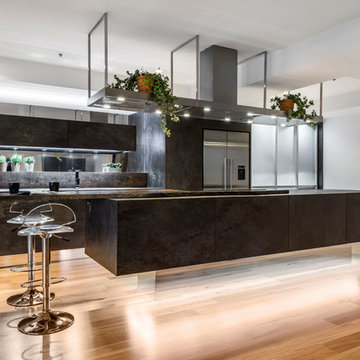
The original layout of the kitchen was typical for apartments built over 20 years ago. The space was restricted by a
collection of small rooms, two dining areas plus kitchen that did not take advantage of the views or the need for a strong
connection between living areas and the outdoors.
The new design has managed to still give definition to activities performed in the kitchen, dining and living but through
minimal detail the kitchen does not dominate the space which can often happen in an open plan.
A typical galley kitchen design was selected as it best catered for how the space relates to the rest of the apartment and
adjoining living space. An effortless workflow is created from the start point of the pantry, housing food stores as well as
small appliances, and refrigerator. These are within easy reach of the preparation zones and cooking on the island. Then
delivery to the dining area is seamless.
There are a number of key features used in the design to create the feeling of spaces whilst maximising functionality. The
mirrored kickboards reflect light (aided by the use of LED strip lighting to the underside of the cabinets) creating the illusion
that the cabinets are floating thus reducing the footprint in the design.
The simple design philosophy is continued with the use of Laminam, 3mm porcelain sheets to the vertical and horizontal
surfaces. This material is then mitred on the edges of all drawers and doors extenuate the seamless, minimalist, cube look.
A cantilevered bespoke silky oak timber benchtop placed on the island creates a small breakfast/coffee area whilst
increasing bench space and creating the illusion of more space. The stain and other features of this unique piece of timber
compliments the tones found in the porcelain skin of the kitchen.
The half wall built behind the sinks hides the entry point of the services into the apartment. This has been clad in a
complimentary laminate for the timber benchtop . Mirror splashbacks help reflect more light into the space. The cabinets
above the cleaning zone also appear floating due to the mirrored surface behind and the placement of LED strip lighting
used to highlight the perimeter.
A fully imported FALMAC Stainless Rangehood and flyer over compliments the plasterboard bulkhead that houses the air
conditioning whilst providing task lighting to the island.
Lighting has been used throughout the space to highlight and frame the design elements whist creating illumination for all
tasks completed in the kitchen.
Achieving "fluid motion" has been a major influence in the choice of hardware used in the design. Blum servo drive
electronic drawer opening systems have been used to counter act any issues that may be encounter by the added weight
of the porcelain used on the drawer fronts. These are then married with Blum Intivo soft close drawer systems.
The devil is in the detail with a design and space that is so low profile yet complicated in it's simplicity.
Steve Ryan - Rix Ryan Photography
Project Description
Set on the 2nd floor of a 1950’s modernist apartment building in the sought after Sydney Lower North Shore suburb of Mosman, this apartments only bathroom was in dire need of a lift. The building itself well kept with features of oversized windows/sliding doors overlooking lovely gardens, concrete slab cantilevers, great orientation for capturing the sun and those sleek 50’s modern lines.
It is home to Stephen & Karen, a professional couple who renovated the interior of the apartment except for the lone, very outdated bathroom. That was still stuck in the 50’s – they saved the best till last.
Structural Challenges
Very small room - 3.5 sq. metres;
Door, window and wall placement fixed;
Plumbing constraints due to single skin brick walls and outdated pipes;
Low ceiling,
Inadequate lighting &
Poor fixture placement.
Client Requirements
Modern updated bathroom;
NO BATH required;
Clean lines reflecting the modernist architecture
Easy to clean, minimal grout;
Maximize storage, niche and
Good lighting
Design Statement
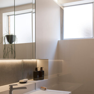
You could not swing a cat in there! Function and efficiency of flow is paramount with small spaces and ensuring there was a single transition area was on top of the designer’s mind. The bathroom had to be easy to use, and the lines had to be clean and minimal to compliment the 1950’s architecture (and to make this tiny space feel bigger than it actual was). As the bath was not used regularly, it was the first item to be removed. This freed up floor space and enhanced the flow as considered above.
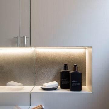
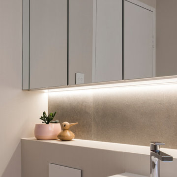
Due to the thin nature of the walls and plumbing constraints, the designer built up the wall (basin elevation) in parts to allow the plumbing to be reconfigured. This added depth also allowed for ample recessed overhead mirrored wall storage and a niche to be built into the shower. As the overhead units provided enough storage the basin was wall hung with no storage under. This coupled with the large format light coloured tiles gave the small room the feeling of space it required. The oversized tiles are effortless to clean, as is the solid surface material of the washbasin. The lighting is also enhanced by these materials and therefore kept quite simple. LEDS are fixed above and below the joinery and also a sensor activated LED light was added under the basin to offer a touch a tech to the owners. The renovation of this bathroom is the final piece to complete this apartment reno, and as such this 50’s wonder is ready to live on in true modern style.
Project Description
Set on the 2nd floor of a 1950’s modernist apartment building in the sought after Sydney Lower North Shore suburb of Mosman, this apartments only bathroom was in dire need of a lift. The building itself well kept with features of oversized windows/sliding doors overlooking lovely gardens, concrete slab cantilevers, great orientation for capturing the sun and those sleek 50’s modern lines.
It is home to Stephen & Karen, a professional couple who renovated the interior of the apartment except for the lone, very outdated bathroom. That was still stuck in the 50’s – they saved the best till last.
Structural Challenges
Very small room - 3.5 sq. metres;
Door, window and wall placement fixed;
Plumbing constraints due to single skin brick walls and outdated pipes;
Low ceiling,
Inadequate lighting &
Poor fixture placement.
Client Requirements
Modern updated bathroom;
NO BATH required;
Clean lines reflecting the modernist architecture
Easy to clean, minimal grout;
Maximize storage, niche and
Good lighting
Design Statement
You could not swing a cat in there! Function and efficiency of flow is paramount with small spaces and ensuring there was a single transition area was on top of the designer’s mind. The bathroom had to be easy to use, and the lines had to be clean and minimal to compliment the 1950’s architecture (and to make this tiny space feel bigger than it actual was). As the bath was not used regularly, it was the first item to be removed. This freed up floor space and enhanced the flow as considered above.
Due to the thin nature of the walls and plumbing constraints, the designer built up the wall (basin elevation) in parts to allow the plumbing to be reconfigured. This added depth also allowed for ample recessed overhead mirrored wall storage and a niche to be built into the shower. As the overhead units provided enough storage the basin was wall hung with no storage under. This coupled with the large format light coloured tiles gave the small room the feeling of space it required. The oversized tiles are effortless to clean, as is the solid surface material of the washbasin. The lighting is also enhanced by these materials and therefore kept quite simple. LEDS are fixed above and below the joinery and also a sensor activated LED light was added under the basin to offer a touch a tech to the owners. The renovation of this bathroom is the final piece to complete this apartment reno, and as such this 50’s wonder is ready to live on in true modern style.
Reload the page to not see this specific ad anymore
Project Description
Set on the 2nd floor of a 1950’s modernist apartment building in the sought after Sydney Lower North Shore suburb of Mosman, this apartments only bathroom was in dire need of a lift. The building itself well kept with features of oversized windows/sliding doors overlooking lovely gardens, concrete slab cantilevers, great orientation for capturing the sun and those sleek 50’s modern lines.
It is home to Stephen & Karen, a professional couple who renovated the interior of the apartment except for the lone, very outdated bathroom. That was still stuck in the 50’s – they saved the best till last.
Structural Challenges
Very small room - 3.5 sq. metres;
Door, window and wall placement fixed;
Plumbing constraints due to single skin brick walls and outdated pipes;
Low ceiling,
Inadequate lighting &
Poor fixture placement.
Client Requirements
Modern updated bathroom;
NO BATH required;
Clean lines reflecting the modernist architecture
Easy to clean, minimal grout;
Maximize storage, niche and
Good lighting
Design Statement
You could not swing a cat in there! Function and efficiency of flow is paramount with small spaces and ensuring there was a single transition area was on top of the designer’s mind. The bathroom had to be easy to use, and the lines had to be clean and minimal to compliment the 1950’s architecture (and to make this tiny space feel bigger than it actual was). As the bath was not used regularly, it was the first item to be removed. This freed up floor space and enhanced the flow as considered above.
Due to the thin nature of the walls and plumbing constraints, the designer built up the wall (basin elevation) in parts to allow the plumbing to be reconfigured. This added depth also allowed for ample recessed overhead mirrored wall storage and a niche to be built into the shower. As the overhead units provided enough storage the basin was wall hung with no storage under. This coupled with the large format light coloured tiles gave the small room the feeling of space it required. The oversized tiles are effortless to clean, as is the solid surface material of the washbasin. The lighting is also enhanced by these materials and therefore kept quite simple. LEDS are fixed above and below the joinery and also a sensor activated LED light was added under the basin to offer a touch a tech to the owners. The renovation of this bathroom is the final piece to complete this apartment reno, and as such this 50’s wonder is ready to live on in true modern style.
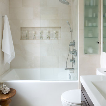
This small space bathroom features many small space tricks, including the perfect combination of mirror and glass, a beautiful floating vanity and an ample amount of storage in all of the right places. Photography by Brandon Barre.
Dr. Shah works as a physician, and Mrs. Shah is a stay-at-home mom. Mrs. Shah was given the task of making their home colourful, upbeat, and bright in keeping with her personality. She was used to visiting her husband's clinic frequently, which had the traditional decor, therefore she didn't want to go mainstream with the typical dark wood and white interiors. Mr. Shah wanted the expenditure budget to be moderate, so we were free to experiment with colours and finishes.
We turned the client's four-bedroom flat, which was builder-ready, into a three-bedroom one. We replaced the apartment's old tile flooring using Nexion "Coniwood Cedro" tiles throughout the entire space in a herringbone pattern. The builder left the kitchen in its original condition, and we replaced the sink and faucet in the dry areas of the two bathrooms and the powder room to freshen them up. The master bathroom received a total remodel. All free-standing furniture is created in-house and is customised for size and style.
We immediately enter the spacious living area, which has big front windows that extend from end to end. A nesting coffee table and an L-shaped sofa make up the furniture arrangement. On the left, a movable-back upholstered swing, and two armchairs just across from it. The L-shaped sofa and the installation of a hardwood ceiling above the swing bring warmth to the room's plain, white ceiling. A tall highlighted mint green boxed panel with a modern design notion was inspired by old antique village doors and is located next to the armchairs. The boxed panel doubles as a closet and a door to one bedroom.
The bedroom next to the living area serves as a guest room as well as a temporary residence for their oldest daughter's American family. She requested a dark green sofa and a Scandinavian aesthetic, which is how this space was designed. Since this room is the smallest of the others, we had to design a couch bed that can be converted into a comfortable queen-sized bed for visitors. We only added a pastel-coloured splash of paint art wallpaper in a wood frame at the back of the sofa since we wanted the room to be as tidy and white on the walls. The clients wanted more seats so they could utilise the space as a den and perhaps host small gatherings. Because of this, we placed a wooden bench with storage within and an upholstered seating ledge on top by the window. A white-finished dresser and desk with a bespoke design are placed next to the sofa. Wardrobes guide the way through the room's white and mirror-finished hallway.
After passing through a little corridor with a textured, side-lit wall panel made of white Indian stone, we enter the living area once more. On the Indian stone wall, a teak wood console unit with an organic mirror above it and a little drawer for knick-knacks was mounted. The existing powder room, which was light grey and white in colour, is located just across from it. We replaced the sink and the faucet added a specially-made mirror and added a black and white drawer unit underneath.
The large dining room has a table that accommodates eight people. A table with a veneer finish and a huge tile top is part of the setting. A dramatic and asymmetrical feeling is created by 5 dining chairs in white with 2 different types. An upholstered bench with an upholstered back was resting against the wall. To increase the size of the master bedroom, we moved the shared wall between the dining area and the master bedroom in the direction of the dining area. The dining area's constructed niche was the perfect location for the client's intended temple.
The temple has veneer arched panels, a white door with a fluted finish for storage beneath the shelf, and an aqua-blue quartz inlay on a white stone back that serves as the temple's back. From the scraps of the composite stone, we also made the stairs to support the idol.
The doors with a disguised white and mirror frame are next to the dining area. A tall storage unit, the kitchen, a second tall storage unit, and a third bedroom are all accessible starting from the right.
The younger daughter and her husband, who frequently pays a visit to the couple, will use this bedroom. The layout of this bedroom, which is reached by a lengthy corridor, features a queen-size teak wood bed in the front, a headboard made of upholstered wood with a wooden frame, a side table with a fluted design panelled from top to bottom, and wardrobes with louvred designs on the right. A teak wood dresser with a drawer at the bottom is next to the closet. Streamlined profile lighting built into the mirror. Our client was particular that her room is made of wood and has straightforward ideas, therefore there is a ladder desk directly across from the bed in the corner.
Then we make our way back to the dining room. A dramatic blue door that goes into the master bedroom is located next to the hidden mirror and white-framed doors. This bedroom was created by combining two tiny bedrooms into one, giving the enormous king-size bed and wardrobes space on both sides. The bed and the white dressing area with the white wood-finished wardrobes for the clients' everyday use are visible upon arrival on the left. Next to this wardrobe is the master bathroom, which features a colour scheme of aqua blue, wood, and cream with gold fixtures and decorations. A shelf made of unfinished wood with lighting fixtures was added as a feature. For the clients' outerwear, there is another wardrobe section completed in bolivar green wood across from the bed.
Each bedroom has a large window that lets in enough natural light to brighten the room.
Showing Results for "Small Apartment Sunroom Ideas"
Sponsored
Westerville, OH
Fresh Pointe Studio
Industry Leading Interior Designers & Decorators | Delaware County, OH
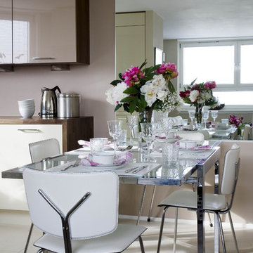
Dining area in small central London apartment is opened up by using mirror. The glass and chrome table sits well with the leather and chrome chairs.
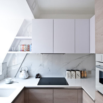
Small trendy u-shaped kitchen photo in London with an undermount sink, flat-panel cabinets, white cabinets, quartz countertops, white backsplash, white appliances, no island and stone slab backsplash
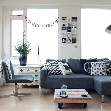
Photo: Louise de Miranda © 2013 Houzz
Inspiration for a scandinavian living room remodel in Amsterdam with white walls, no fireplace and no tv
Inspiration for a scandinavian living room remodel in Amsterdam with white walls, no fireplace and no tv
9