


Houzz Tour: Neutral and Natural
nosoccermom
10 years ago
Sort by:Oldest
Comments (48)
Related Stories
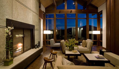
HOUZZ TOURSHouzz Tour: Contemporary, Natural Style in Idaho
Neutral colors and natural materials transform a large three-level home in Sun Valley into a comfy family retreat
Full Story
HOUZZ TOURSMy Houzz: Neutral and Natural Elegance in Texas
Creamy hues, plush furnishings and vintage touches create a serene setting for a stylist and her family
Full Story
MODERN HOMESHouzz Tour: Organic and Natural in an Island Cottage
Organic linens and an all-white palette create a refreshing summer home on a remote island
Full Story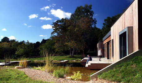
MODERN HOMESHouzz Tour: Nature and Efficiency Inspire a Woodland Home
This English design plays up simplicity, natural light and its spectacular forest setting
Full Story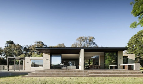
MODERN HOMESHouzz Tour: Nature Dictates a Dynamic Australian Design
Earthy materials and a respect for trees are just the start of how this modern home embraces the beauty of the outdoors
Full Story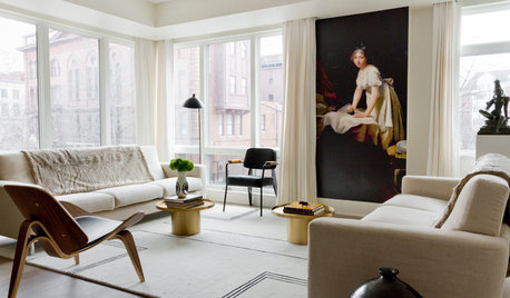
CONTEMPORARY HOMESHouzz Tour: Art and Natural Light Shine in a Contemporary Apartment
A designer helps create a peaceful and soothing home environment for a jet-setting D.C.-based professional
Full Story
HOUZZ TOURSHouzz Tour: Beachy Casualness in Landlocked Minneapolis
Neutrals, natural materials and winks to nautical imagery help this home ride a tide of laid-back style
Full Story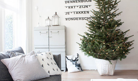
HOUZZ TOURSMy Houzz: Soothing Neutrals Calm in an Airy Netherlands Home
This perfectly pale interior exudes tranquility and holiday charm with subtle touches of nature
Full Story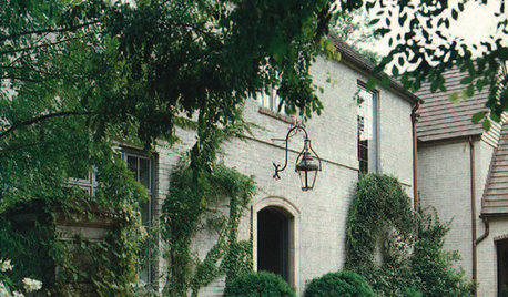
HOUZZ TOURSHouzz Tour: Casually French in Birmingham
Neutral colors and antiques go lush in distinguished Norman-style home
Full Story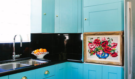
COLORFUL HOMESHouzz Tour: Nixing Neutrals to Create a Colorful Craftsman
L.A. homeowners toss beige and white to make way for vibrant blue, purplish gray and cheery peach
Full Story

mitchdesj
Fun2BHere
Related Professionals
Liberty Township Interior Designers & Decorators · Chambersburg Furniture & Accessories · Hastings Furniture & Accessories · Tampa Furniture & Accessories · Crofton Furniture & Accessories · Naples Furniture & Accessories · Springville Custom Artists · Miami Lighting · Oak Lawn Lighting · Walker Lighting · Berkley Window Treatments · Brenham Window Treatments · Colorado Springs Window Treatments · San Jose Window Treatments · Inwood Window TreatmentsLaurie
nancybee_2010
luckygal
rpets
Gooster
nosoccermomOriginal Author
patricianat
hhireno
mtnrdredux_gw
jmc01
jackson2348
Annie Deighnaugh
runninginplace
Bumblebeez SC Zone 7
Jules
Bumblebeez SC Zone 7
User
Gooster
mtnrdredux_gw
nancybee_2010
amck2
Bumblebeez SC Zone 7
crl_
jjam
justsaying
peony4
mtnrdredux_gw
nosoccermomOriginal Author
Fun2BHere
Bumblebeez SC Zone 7
mtnrdredux_gw
Mmmbeeer
Jules
jjam
nancybee_2010
nosoccermomOriginal Author
violetwest
hhireno
ineffablespace
CEFreeman
Oaktown
bpath
patty_cakes
Boopadaboo
Jules
lazy_gardens