


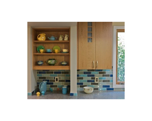
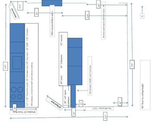
Color choices!! Bring ideas based on my inspiration
BalTra
12 years ago


Sort by:Oldest
Comments (28)
Related Stories
MATERIALSHumble Corrugated Metal Brings Modern Style to the Garden
This sustainable material is not just for rooftops. See these ideas for using it for fences, beds and rain barrels in your yard
Full Story
KITCHEN DESIGN12 Farmhouse Touches That Bring Homeyness to a Kitchen
Shaker cabinetry, country-store-inspired hardware, barn elements or a key piece of art will add homestead appeal to your kitchen
Full Story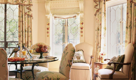
DECORATING STYLES18 Ways to Bring English Country Charm Home
From topiaries and climbing roses to toile and tea, these design ideas can skew cozy casual or manor formal
Full Story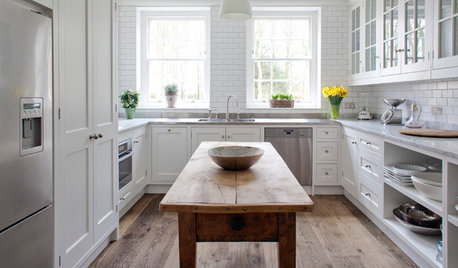
DECORATING GUIDESBring in Warmth and Character With Reclaimed Wood
Got a hankering for that natural touch? Go rough or refined with these ideas for using salvaged wood indoors and out
Full Story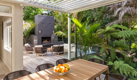
BACKYARD IDEAS6 Backyards Designed to Bring Living Outdoors
These award-winning New Zealand gardens create inviting areas for entertaining, bathing and intimate gatherings
Full Story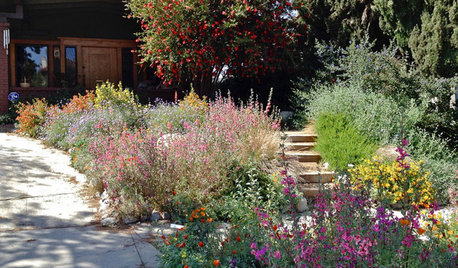
INSPIRING GARDENSNative Plants Bring 10 Southern California Front-Yard Gardens to Life
Rare plants, rain gardens and wildlife habitats are just a few of the features showcased on the 2016 Theodore Payne Native Plant Garden Tour
Full Story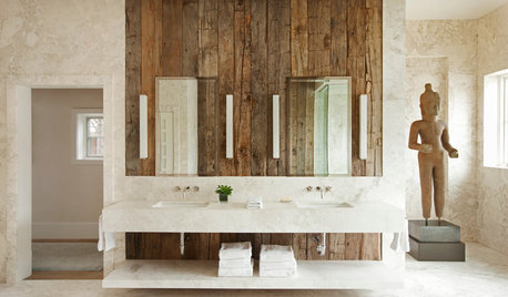
DECORATING GUIDESHow to Bring the Beauty of Reclaimed Wood to the Bath
Beautiful salvaged wood adds warmth and texture to a bathroom. Here's how to get the look right
Full Story
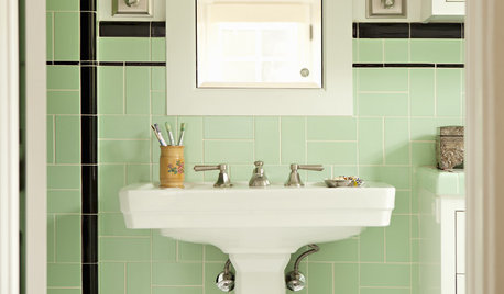
DECORATING STYLESSplendor in the Bath: Art Deco Brings on the Elegance
Give your bathroom a graceful air with the curves and motifs of the ever-popular 1920s style
Full Story
HOUZZ TOURSMy Houzz: See How a Garden Author Brings Nature to the City
Garden designer and author Baylor Chapman shows her love of nature in her San Francisco apartment and deck
Full Story
enduring
enduring
Related Professionals
Haslett Kitchen & Bathroom Designers · Adelphi Kitchen & Bathroom Remodelers · Deerfield Beach Kitchen & Bathroom Remodelers · Eagle Kitchen & Bathroom Remodelers · Emeryville Kitchen & Bathroom Remodelers · Garden Grove Kitchen & Bathroom Remodelers · Las Vegas Kitchen & Bathroom Remodelers · Pico Rivera Kitchen & Bathroom Remodelers · Palestine Kitchen & Bathroom Remodelers · Allentown Cabinets & Cabinetry · Little Chute Cabinets & Cabinetry · Ridgefield Cabinets & Cabinetry · Universal City Cabinets & Cabinetry · Dana Point Tile and Stone Contractors · Calumet City Design-Build Firmsremodelfla
marcolo
sochi
BalTraOriginal Author
dianalo
BalTraOriginal Author
cawaps
marcolo
User
cawaps
lisa0527
BalTraOriginal Author
User
cawaps
BalTraOriginal Author
User
Circus Peanut
Circus Peanut
cawaps
cawaps
mtnfever (9b AZ/HZ 11)
mtnfever (9b AZ/HZ 11)
User
BalTraOriginal Author
boxerpups
joaniepoanie