Shop Products
Houzz Logo Print
mike_lee2

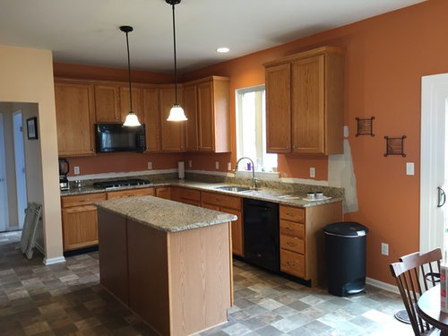
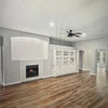
Need help with kitchen paint color

mike_lee2
9 years ago
last modified: 9 years ago

Hi - hoping someone can help me - I just had granite installed and now I'm looking for a new paint color. Issue is i'm not sure where to go.

The orange doesn't work - not sure if it ever did to be honest... I tried gray shades and I didn't like the contrast to the beige counters. I tried a couple beige tones and I feel like they just blend in. Although I do kind of like vintage linen from Behr.

The peach color works, but I want to keep the kitchen bump out a different color the rest of the area.

We are having company over tomorrow night so I was hoping to have something selected by today if possible.

Comments (19)

  • roarah
    9 years ago

    I love chocolate browns with oak. Just a thought. The counters look great!

  • jlc712
    9 years ago

    Your new countertops look great! I agree, a medium to dark brown would be really pretty. Or a brownish-gray, like BM River Gorge Gray or Wildwood Crest.

    I think blues and greens look good with oak too. Maybe BM Mount Saint Anne, or SW Grassland? If you put the paint name into Google Images, you can get an idea of what they'd look like.

  • grapefruit1_ar
    9 years ago

    Our cabinets and countertops are very similar to your colors. Our wall are SW Practical Beige. We have a ORB lights and drawer pulls. That color allows me to use different accent colors without having to repaint.

  • nosoccermom
    9 years ago
    last modified: 9 years ago

    Blue, either alight blue, like Wythe Blue or Yarmouth Blue or Wedgewood Gray (or even a darker blue, like navy).

    navy and oak

    or maybe even teal

    Vibrant Kitchen Backsplash · More Info

    Teal kitchen in duplex · More Info


  • theclose
    9 years ago

    The counters look beautiful! I would do navy, as nosoccer posted. That would be stunning. On the more neutral end, I would do a blue or green.

  • mike_lee2
    Original Author
    9 years ago
    last modified: 9 years ago

    Thanks for the replies! I really like the first photo with the vibrant blue - that is actually really close to our master bathroom color. We don't have a lot of lighting in the kitchen (previous owner opted out of the recessed lighting when the house was built for some reason) so I wanted to keep it as light as possible since our only light source is the hanging table chandelier and the island pendant lights.

    I decided on this color - the sample was more on the beige side, but i'm finding today that it looks light green in the morning, light blue in early afternoon, and gray by mid-afternoon / night. I was nervous painting it, but once it dried I think it came out ok. I'm not sure how it blends with the peach color which is the main color in the open floor plan, but it's definitely better then the orange.

    What are your thoughts?

    Before:


    After:


  • jlc712
    9 years ago

    It looks great! What a tremendous improvement from the orange walls and teal counters!! I like your new pendants too. Nice job, and you did it all so fast, wow.

  • grapefruit1_ar
    9 years ago

    I think that looks great! As I mentioned before , you can use/change accent colors without being locked into ONE color. I have burgundy painted pieces, chair cushions, etc. Black accents work well, too.

  • nosoccermom
    9 years ago

    Very, very nice! It sure lightens the kitchen quite a bit.

    I'm wondering whether black cabinet hardware may look sharp. Also, could you hang the valance higher to maximize light?

    May I ask how side your aisles are and the size of the island? I'm thinking about ditching my peninsula but am not sure if my kitchen is wide enough for an island


  • mike_lee2
    Original Author
    9 years ago

    Thanks for the compliments! The island is 28" wide and there is 40" from the counter edge to the fridge and 36" from the other side of the island edge to the counter with the sink.


    Hope that helps you any!

  • nosoccermom
    9 years ago

    Thank you for your quick reply! Do you find the island practical as is?


  • roarah
    9 years ago

    That looks wonderful! You sure work fast!


  • emmarene9
    9 years ago

    Care to share the paint name and manufacturer?

  • mike_lee2
    Original Author
    9 years ago
    last modified: 9 years ago

    We love the island - we use it all the time for prepping food and entertaining. My only complaint is I wish I had more width space. It can get a little tight if people are standing around and someone needs to walk by. I also wish I had room for stools. But a small party or when it's just us it's perfect.

    We hosted a small gathering tonight and I found that it's near impossible to see food on it. I was wiping it down and a bunch of crumbs flew off that I couldn't see - oh well I guess.

    The paint color is vintage linen from Behr - PPU7-16

  • User
    9 years ago

    I was was thinking something rich like navy when I saw the kitchen, but I like the color you went with. Brightens the room. It kind of reminds me of RH's Silver Sage color. It's amazing how paint can help transform a room!

  • wiggimama
    9 years ago

    I really like the paint that you chose. I agree with another comment that the valance could be higher.

    Off topic but how do you like your gas cooktop? What brand?

  • mike_lee2
    Original Author
    9 years ago

    Thanks! Yeah, it was a spring loaded rod so it was the highest it could go. I took it down for now and the light is a lot better. I'll have to buy a regular rod so it can hang higher.

    So far, so good. I like the metal knobs - others I've seen were plastic and I didn't like that. The center burner boiled a medium pot of water for spaghetti in 4 minutes.


    Kitchenaid - model KCGS559ESS

  • nosoccermom
    9 years ago

    Thank you so much for your feedback on the island.

    Overall, it's amazing how much brighter and spacious the kitchen looks with the new pendants, counter, and paint job. Very inspirational!

  • mike_lee2
    Original Author
    9 years ago

    Thanks! I forgot to add a photo from a different angle - I added chalkboard paint on the wall too. It's pretty cheap and fun to use. Highly recommend it!


Sponsored
Davidson Builders
Average rating: 5 out of 5 stars1 Review
Franklin County's Full-Scale General Contractor