Shop Products
Houzz Logo Print
numbersjunkie

Cabinets Ordered - opinions on my other selections?

numbersjunkie
7 years ago

I ordered the Ikea Bodbyn gray for my vacation rental home. Its a brick rancher on a lake, but not in the mountains. I'm going for informal, but not rustic. Comfortable, but not dark/heavy. Maybe a farmhouse look?

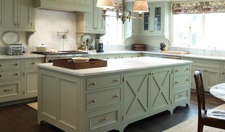
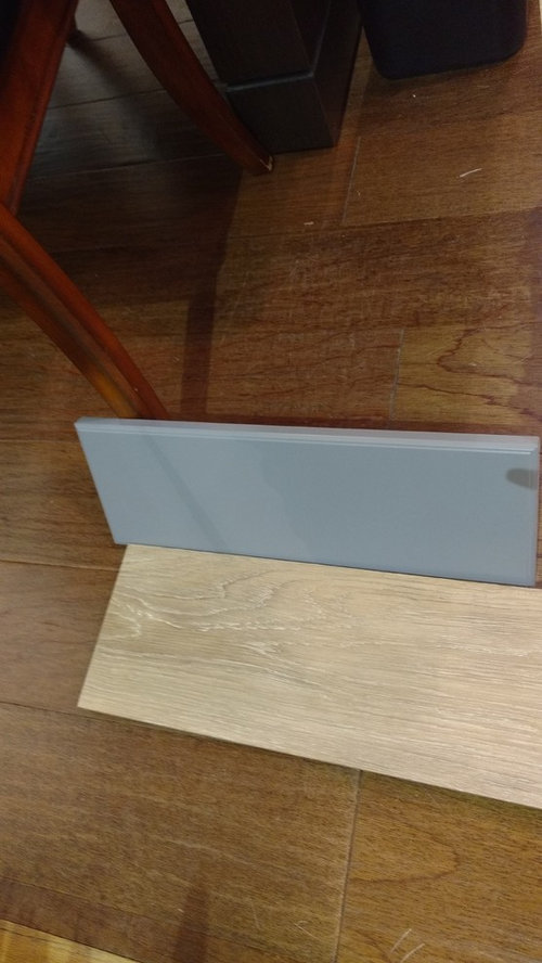
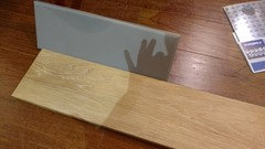
Here is the cabinet with the floor I want to use. Its a LVP and will be throughout the living areas. Should hide everything - I hope!


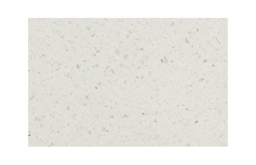
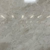
The counter I am thinking about is a solid surface Livingstone Rocksalt which is fairly plain but not solid white
Color Swatches - LivingStone® · More Info

I want to use a Silgranit sink and was thinking cinder? I'm scared to death of getting white....

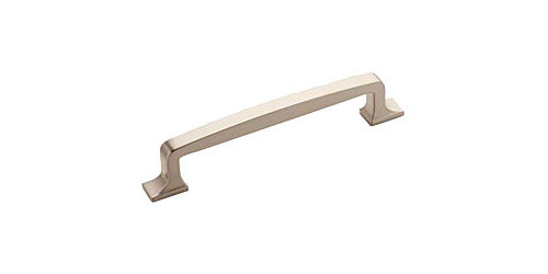
For pulls, I really liked the chrome ones Ikea shows with my cabinets but they seem small to me and I'm afraid of fingerprints on the bright chrome. I found a few others that I like and would probably go with brushed- nickel stainless or chrome. The first one is very much like the Ikea pull and I love it but its discontinued in the brushed finish. I think the last one my be too traditional/formal?


Amerock BP55346G10 Satin Nickel Revitalize 5 Inch Center to Center Handle Cabine · More Info

20% OFF Westerly 128mm Pull (#53721-G10) by Amerock at Kitchen-Cabinet-Hardware. · More Info


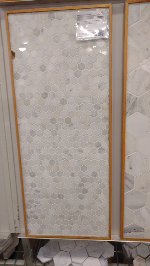
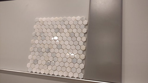
And then the dreaded back splash! I looked at plain white subway but it almost seemed too formal to me. Then I found this at The Tile shop and thought it had the right vibe, but I was trying to avoid anything too busy and this definitely is busy - but it seemed to pull the color of the floor so.....

I feel like I'm really struggling here.... can anyone help to guide me?

Comments (18)

  • aprilneverends
    7 years ago

    Well..I'm not next to the materials, see them only through my screen..but it does seem to work together:) All of your choices.

    (I must add though that your gray seems blue to me, so I might be really off))

    The backsplash is not that busy, and the countertop is actually pretty quite. So in this case, I wouldn't worry too much.

    As for the sink..I don't know whether you saw Silgranit tool where you can play with the colors trying to imagine how the sink will work?

    If no, here's the link: http://www.blanco-germany.com/en_us/en_us/sinks/how_to_choose_the_right_sink/interactive_countertop_tool/Tool.html

    Both cinder and metallic gray seem like contenders to me, with your color scheme

    As for the handles..I know they need them at the time of cabinets' installation, but make it your last choice, after you're done picking everything else. You'll have your samples together, will have time to figure out the handles.

    The last one, actually, seems nice to me. No-nonsense. (I love nonsense by the way; but I do appreciate no-nonsense when I see it))

    Or you can decide to go for darker finish, to add a bit of pizzaz. Will work nicely with darker gray sink.

    Did you choose your faucet?

  • numbersjunkie
    Original Author
    7 years ago

    aprilneverends - yes, the picture with the flooring does make the cabinet look more blue than it really is - here is another picture from a different angle -

    And here is the faucet I was thinking about - the Delta Talbott. I like that its not super tall and very reasonable in price (since I will have a 2 sinks).

    Delta 16968-SSSD-DST Brilliance Stainless Kitchen Faucet - Build.com · More Info


    And I was also contemplating a schoolhouse light/pendant for over the sink. Recessed lighting and under cabinet lights as well.

  • aprilneverends
    7 years ago

    Schoolhouse light might be really charming.

    numbersjunkie thanked aprilneverends
  • enduring
    7 years ago

    Cabinets look good with the tile in the link that @april posted. The counter will look good, I imagine. While I love the floor, it just "doesn't sing" with the cabinets IMO. The color of the floor might be off. Or maybe it's due to not enough contrast (for me, anyway). I do like contrast. The cabinets read bluish gray on my screen, in both of your postings.

    I have the 1st Amerock handle the you posted in the guilded finish in a 5" handle. Love them. I have them with the Black/Brown Laxarby, from IKEA. I used these cabinets in an office space.

    numbersjunkie thanked enduring
  • crcollins1_gw
    7 years ago

    I really like all your choices, nice and soothing for a lake vacation property. I personally would want to bring in some bolder color somewhere but maybe you have planned that in paint or accessories, which are much easier to change out. I'd go with a more simple pull/knob for a rental, too - brushed finish, larger so it's easy to grab, and clean lines so easy to keep clean.

    Where is this? I want to come visit when it's all done! :)

    numbersjunkie thanked crcollins1_gw
  • numbersjunkie
    Original Author
    7 years ago
    I sure hope it all comes together. I did Google Bodbyn gray and saw quite a few with light wood tone floors and they seemed to go fine. I agree more contrast would be ideal but I didn't think any of the other colors for the floor would be something I woukd want throughout the living areas.
    I would love some suggestions on paint color and/or ways to add that needed punch of color!
  • cpartist
    7 years ago

    I like all your choices. They all coordinate well together and it will be gorgeous when done. Your backsplash will add just a bit of interest without competing especially since your countertop really is quiet.

    numbersjunkie thanked cpartist
  • enduring
    7 years ago

    Numbers, regarding the light colored floor and your light colored cabinets. Is this light floor the absolute best light floor you have seen. I love both those elements, cabinets and floor, but I am wondering if you can find a light colored floor that will work even better. There is just something about the color of the light floor that is off with the cabinets on my screen, and my screen is a pretty good read. Or maybe I would feel totally different about that in real life. I am wondering if the tan in the tile reads a bit olive in color.

  • m_gabriel
    7 years ago

    I think it looks very pretty. We chose the IKEA Tyda handles in, I think, stainless? I liked the way they feel to the hand - they come sort of to a triangle inside. What color/brand is the LVT? It has a nice pattern to it.

  • numbersjunkie
    Original Author
    7 years ago

    Enduring, I saw the floor and cabinet front in person and it didn't reasd olive to me, but I'm no color expert!. I think the pics seem off in terms of color- they do make the cabinets appear more blue than they are I think.

    I'm really pretty fixed on the flooring brand (it's Raskin Elevations - Hampton White Oak) and didn't see other colors that I thought would work. They were either too brown or too dark or too something else! But I am planning to check a local (to the vacation house) store this weekend to see what they have so maybe I can be swayed. Thanks!

    m_gabriel, those handles are nice! And a good length too. Did you put them on the Bodbyn gray? do you have pics you can share?


  • cpartist
    7 years ago
    last modified: 7 years ago

    here is just something about the color of the light floor that is off with the cabinets on my screen, and my screen is a pretty good read. Or maybe I would feel totally different about that in real life. I am wondering if the tan in the tile reads a bit olive in color.

    As an artist my screen is color calibrated and on my screen the colors look fine and appear to coordinate very well.

    However even I wouldn't say one way or the other if the color is "off" or if t's the perfect match because what I'm seeing still may not be what she is seeing in real life. At some point we have to trust that the OP's can discern the color differences or have a friend or family member who can help them.

    This is the one problem with the internet and people coming here to ask about color. :)

  • m_gabriel
    7 years ago

    Re the Tyda handles - we have not done our installation yet. We are going with the Bjorket light birch cabinets. Do you have an IKEA nearby? We used to live 10 minutes from one but now it's 90 minutes away. I am going on Friday, though. Do you want a pic of the Tyda with the Bodbyn?

  • enduring
    7 years ago

    Cpartist. I too have artist in me and a very strong color sense. That's why I bring it up. The collection in real life and lighting is the determining factor for sure. Your post almost sounds as if you think I am being critical. I can assure you I am not. I have lived through extensive project critiques and lived to tell about it, lol. I stress this issue with color nuance because it is a valid point, and @numbers knows I am sincere and not just posting to complicate things.

  • numbersjunkie
    Original Author
    7 years ago

    I really could use some thoughts from those with color sense about wall colors. I know the Bodbyn gray us supposed to match BM cinder, so dies that give a clue as to undertones and what wall color would work? Also looking for something that would work throughout the living and dining areas. Thanks!

  • cpartist
    7 years ago

    Cpartist. I too have artist in me and a very strong color sense. That's why I bring it up. The collection in real life and lighting is the determining factor for sure. Your post almost sounds as if you think I am being critical. I can assure you I am not. I have lived through extensive project critiques and lived to tell about it, lol. I stress this issue with color nuance because it is a valid point, and @numbers knows I am sincere and not just posting to complicate things.

    Absolutely color nuance is a valid and important consideration. As you and I know, a gray, a blue, a beige, a tan (or any color) can vary considerably depending on the undertone within it and as you correctly point out, it has to be taken into consideration.

    My point was just to let the OP realize that we can give our opinions on color based on what we see on our own screens but that it may or may not be an accurate opinion because of monitor and color calibration differences. As an example, there have been times when I've posted one of the photos of my drawings and color calibrated it so the monitor color matches the drawing exactly on my screen. Then I go to a friend's house, pull it up to show the friend and the colors in my drawing on the screen are off because the friend's monitor is not calibrated the same as mine.

    My concern was that many times someone comes on and asks what color gray tile works with my counters, or what color should I paint my walls to match my tile, or... Then the OP will get 20 different opinions and much of the opinions are based on how the respondent's monitors see the color the OP posted. And who's to say if the OP's posted colors are correct in the photo? While it's great to get color ideas, there are times when two posters will contradict one another, confusing the OP. (I'm not saying it happened here)

    Ultimately any OP needs to look at their choices in their own house, under their lighting conditions to make a final decision and that was really what I was trying to get across.