


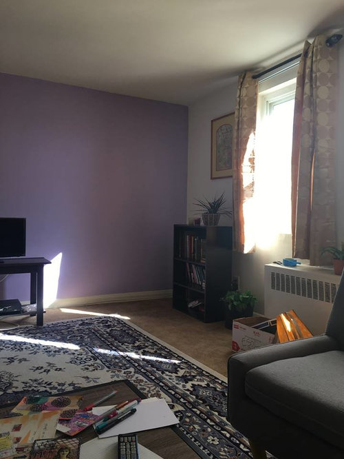
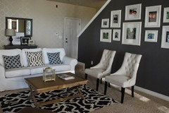
Paint job in living room turned out horrible, need advice
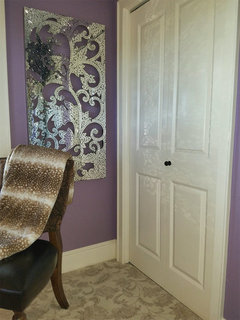
I decided to paint an accent wall in my living room a lavender color. I painted it "lilac bouquet" by Glidden, it's an eggshell paint and primer in one paint. I really hate it. I was hoping it would be lighter or more subtle. I feel like it looks tacky especially with my gold curtains and blue rug. I thought it would bring those colors out, but the paint color pops out so much and looks really girly, way to purple-ish, version of pepto bismol. I really want to go for a warm, comforting vibe in the living room, and I think I'm going to repaint the wall. But this was my first time painting and I don't have much experience in choosing colors. I don't want to make another mistake, spend a ton and keep redoing the wall. I really want a more calming look in here.
I'm just really unsure what color to paint it that would go with my beige furniture, gold curtains, and blue rug. I am thinking about a calming or smokey grey color, dark blue or a beige/shade of gold. But I'm also not sure what type of paint to use. If I choose a lighter color, I want to avoid using a primer, i was thinking of just buying another glidden paint and primer all in 1 but im nervous that the purple will still show through.
Does anyone have any suggestions on a color that would look better in the room or a specific brand/paint? Or any advice on how to fix this mess without too much trouble would help!
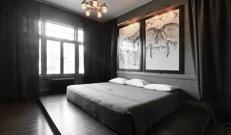
Here is what it looks like:
Comments (39)

IdaClaire
7 years agolast modified: 7 years agoYep, I see what you mean and I feel your pain. As one who has painted many, many times, it's still not easy to always get it exactly right the first time. I once painted several walls in a previous kitchen in a white-with-a-touch-of-lavender/pink called "String of Pearls." I thought it would give a beautiful glow to the room, and even though I didn't like it immediately I thought my opinion would improve if I just kept going with the paint. It didn't. It actually made me feel a little nauseous, it was so sickening sweet. Later on I looked at the paint can again and noticed that the man at the paint store had labeled it "STING of Pearls", which was actually a pretty apt description.
But I digress. It's only paint, and it's only an accent wall. No biggie, and a "mistake" that many if not most of us here have made. Take a look at these shades in the Glidden violet and indigo family. As you can see by comparing Lilac Bouquet to some of the other colors in this family, there are quite a few that are much more sophisticated looking. I'm wondering how Mineral Violet (Link)would work in your room, if you still desire just a touch of purple. There are some very pretty muted blues here as well.
In the blue/teal family, Smoke Grey is also nice ...
 PRO
PROAnglophilia
7 years agoNOT a fan of "accent walls" and this one is a disaster, as you know.
I'm assuming that this is not a large home so I'd keep the ALL walls the same neutral that allows your other things to be the focus, not the walls.
Related Professionals
Westbury Interior Designers & Decorators · Franklin Furniture & Accessories · Fargo Furniture & Accessories · Duluth Furniture & Accessories · Atlantic Beach Furniture & Accessories · Chino Hills Furniture & Accessories · Dumont Furniture & Accessories · Eureka Furniture & Accessories · Highland Park Furniture & Accessories · Salem Custom Artists · Springville Custom Artists · Whittier Lighting · East Setauket Window Treatments · Mount Sinai Window Treatments · Oklahoma City Window Treatments
aprilneverends
7 years agoDon't worry, I'd say we've all been there
You can't predict how the color will look like from the chip or even the can of paint when you open it. every color will behave differently depending on the space, light, etc.
The only way to get it right-is to paint large samples on pure white background(since the different background changes our perception of the same color). and look at them in your room, in your light, both natural and artificial.
There are couple things you might consider though, to make the process of choice easier. For example, the muddier and less interesting the color looks on the chip-the better chance it has to turn to a good choice in the room. Bright colors tend to feel too flat, unless they have enough depth in them. That, especially, is right for shades of purple. I'm a devoted purple lover-so that's how I know..:)
Try them on big sheets of paper-the samples of paint you like I mean-leave the white border around them so you'll see them surrounded by white, don't forget to put two layers of paint so the representation will be the closest to what the color will look when on the wall.
And don't go too much with how they call the color. Looking for purple? Check also their blues, reds, and grays. Even browns:) You never know. You won't know until that paint will be up that wall.

gsciencechick
7 years agoPurples are really challenging from what I've seen here. What does look good are darker purples.
Yes, it's a lot to repaint, but at least it's only an accent wall.

blfenton
7 years agoI think for an accent wall you really have to go bold or not bother.
We used Raphael CC-2 Benjamin Moore in our DR and it looks like a really deep deep eggplant. It took 4 coats to do it properly. I'm one of those that does like an accent wall if there is a purpose to it. For us, it set off a specific piece of art.
eld6161
7 years agoOnly you alone can figure out what looks best. I am assuming that you did not do a sample on the wall and look at it at various times of the day? I suspect though that this color was a "mistake" right away. I put mistake in quotes because there we'll may be someone out there that loves that shade of purple.
Light is so important when choosing colors. As someone new to the paint world, I would suggest you google the most popular lavender colors. Start your research there. I like Bfl's idea of eggplant.
I don't think there is anyone here that hasn't been surprised with an outcome and had to have a do over.
Sometimes it just all about trial and error.
artemis_ma
7 years agoI do enjoy accent walls -- I'd get a few sample colors -- many places will allow you to mix up small batches of samples -- and try again with a variety before picking The One. The problem I see here is that you will need to get some of the regular room color paint to have a basis to put the accent against, on that wall.

ingrid_vc so. CA zone 9
7 years agoThis is just my personal bent, but I would choose grey, unless you just paint it the same color as the rest of the room, which does not strike me as a bad idea. I would liven it up with art, perhaps a gallery wall, which will give it a lot of impact color-wise and yet keep the room cohesive.

Bunny
7 years agolast modified: 7 years agoI'm a big fan of painting large, movable samples to test in your room. Someone upthread suggested paper, but I recommend foam core board, which you can pick up at Target and most art/craft stores. It holds up well to several coats. You can repaint with another color, or flip it over to make use of both sides. Because it's stiff, it will stand up on its own, like over a mantel. You can cut down a large board, but don't go too small. You really want it big enough to get a good idea of what it might be like on a wall.
Gia N
Original Author7 years agolast modified: 7 years agoThanks for all the tips so far. I hear you all on maybe an accent wall wasn't a good idea and i should just paint it back to the regular color, however, i have no idea what the regular color of the wall is, so i'm worried i'd get the wrong white paint.
The lavender does look pretty awful. I thought about maybe eggshell, or deep purple as some of you also suggested, but i also get what someone told me that the color should be one that is already in the room such as a shade from the curtains or rug.
Maybe I should just do grey. Do samples cost money? I'm just unsure about spending on a ton on samples. I just got a bunch of chips from the Home Depot, probably 20 ranging from golds, deep blues & deep purples, greys and beiges. I'm at the point where I don't even know which samples to get and how to narrow it down.
aprilneverends
7 years agosamples cost money, yes. not necessarily too much-depends on a brand. between 2.50 for a very small sample and 6-7 for a big one(if I remember correctly). some companies don't sell very small samples, some do.
but chips are just for determining your direction and narrowing choices. they tell you next to nothing about how a real color will look like. they're also tiny. you simply can't get feel of how it will look like, looking on a chip
"should just go grey" is in no way easier than going any other color. greys can be elusive and hard to pinpoint just the same.
Listen, once when young we repainted half of the house in most wonderful cream. Come morning-it's some strange shade of peachy pink. We were like you-took the chip that looked the best to us..
I didn't even repaint you know. Decided to live surrounded by this peachy pink.
You at least want to re try:)
Maybe take a couple days. To rest, to think, which color you want to see in your room and why. See it in your mind first. Then try to get samples that give you a chance to get to this color.
I just recently had to paint the whole house, empty at that, no flooring yet, nothing..I had samples-and my current place. So I took samples from house to house, because the new one had only one but most important thing-its own unique light. And the one I still live in has all the stuff that the colors are supposed to be background for.
It was extremely tiresome. And yet, in three days my choices were done. To sample is tiresome, but faster than you think.
The harder part was deciding for months in advance what do I want from the colors in my new place.
Yes, it still can be that you fall in love with something and go with it when it wasn't on the plan..or discover that your plan won't work because the significant other has his doubts.
But overall-first you need to be inspired by something. Anything. Then you think what to take from your inspiration, and how to implement it. And it takes much longer(at least to me) than choosing the color after I know what I want from it. With all the samples, two layers, blah-blah-believe me I write it longer that it will take you to do it. After that-move it around the wall, look at it morning noon and evening..see how it goes with this curtain, with that art, next to the floor, in the darkest corner..just stare and think.
And it will come to you.
Don't redo things when you're tired as hell. Take a break. Then when you figure out what bothers you in your wall, and what do you want to feel instead when looking at it-you try again. Who knows maybe you'll love your new choice so much you'll paint all the walls, not just one.
Bunny
7 years agoI don't recommend just going gray. Do you like gray walls? Gray is a whole other problem of getting right. Although...if you like mauve-ish, there are plenty of grays that lean that way, and not necessarily in the way people had intended, but it might be what you're looking for.
k9arlene
7 years agoIf you are intent on painting an accent wall, you really should pull a color from your rug, drapes or pillows so the accent wall makes sense in the room and doesn't appear random.
maries1120
7 years agoFor an off white, you could look at Behr Swiss Coffee. A bit more color is Behr Hazelnut Cream. I love both. I've used Behr paint and only needed 1 coat put you will likely need more over the purple wall. If you like the Glidden paint and bought this at Home Depot they can mix either color in Glidden paint. A nice creamy Glidden color is Cappucino White. None of these 3 have an obvious undertone that I can see that might cause an issue. There are a lot of great Benjamin Moore colors. HD can make samples of Benjamin Moore colors and mix them into gallons. If cost is a factor, I would use Behr paint. I know many like Sherwin Williams but I haven't had much success with their paint but Behr or Benjamin Moore can mix their colors in their paints.
i'm sorry you are going through this. I know its frustrating but at least it is just paint and an easier decorating crisis to fix.

maggiepatty
7 years agoI think a slightly more gray/taupe version of lilac might be what you were going for. You chose more of a pink/blue lavender and adding a little gray tone and maybe making it a shade or two lighter might give you the more subtle look you were going for.
Maybe something like a Benjamin Moore "Winter Gray" which has a purple cast, or Sherwin Williams "North Star" or "Lavender Haze" by Pittsburgh Paints at half strength. You can look at these colors on Pinterest to see what I mean by a grayed lavender, and then choose a similar color wherever you buy paint.
I learned the hard way that a grayed or taupe-y version of the color I thought I wanted usually ended up looking much better. At one point my daughter's room looked like a Disney store because I chose such clear colors. Toning them down with taupe-y versions of the same colors made it look much nicer.
Good luck, and enjoy the changes you can make with paint. No matter how bad it is, you can always cover it with more paint :)!
Steph
7 years agolast modified: 7 years agoIt will be almost impossible to find the a white paint that matches the existing, without knowing the name or level of sheen. And even if you find a close match, you will be able to tell the difference.
Just curious, are you renting, or are you the owner. Samples may cost a nominal fee, but will save you time, heartache, and more money latter. If you really hate the color and want to go lighter anyways, you could always paint primer over it, while you decide.
I'm not sure this is the best place for an accent wall.

robo (z6a)
7 years agoWhat about a navy from the rug? I think it would look nice with the gold drapes, kinda preppy, and would look good under big framed art.

ghostlyvision
7 years agoHome Depot sells 8 oz. Glidden samples for ~3.00 each, Behr samples for a little over 4.00 each, those would be plenty to paint some large testers and see what may work in your room. I like the idea of navy too (and maybe a change of drapes) but I could see a greyed version of violet looking very nice. With your other white walls though, any color with depth is going to stand out and be very 'there'.

Sherry8aNorthAL
7 years agoI have had success with taking a item to Home Depot and having them match the color I want. The rug would probably be a little large to get on top of their computer. LOL. You could take one of the drapes and they could match the darker gold. Look at BM color of the year. It is a dark purple and it can be mixed in anyones paint. I still would get samples and try.
blfenton
7 years agolast modified: 7 years agoI like the idea of a navy blue. You just have to be careful that the navy doesn't wind up looking black on your walls. Here are some periwinkle-type blues from benjamin moore. I like the Stratford and the Bluenose. It might give you another starting point.

Kippy
7 years agoEggshell is a surface finish. For this wall I would probably skip a sheen for a matte/flat finish
if you really want a lilac hint, maybe ask for greys that run that way. If you just pick from a chip, you may end up with a green tone and be just as unhappy. (If you really have a budget issue-some times you can get an employee to remix an oops paint pretty close to what you want and pay less than $10)
but those samples are really worth while. This is my favorite photo to share. Same color on both side. The difference is light and how it reflects off the floor
Gia N
Original Author7 years agolast modified: 7 years agoAll good suggestions. Maybe $3 glidden samples isn't a bad idea. I'm going to try that idea out. I just need to narrow it down to a few sample choices. @kippy, yeah maybe another reason it looks so bad now is because the eggshell gives it a glossy look, maybe I ought to go with matte/flat but I wonder how to cover it over the eggshell and if that would work out okay.
I've been thinking a lot about colors. I agree that I should try to choose a color that has a shade in the rug or drapes. I'm not sure I'm always going to always stick with gold drapes, but likely I will keep the rug or stay in the same realm of colors of the blue rug. So maybe I'm thinking a navy or yeah, greyed out lilac. I still like the idea of a deep purple/plum but I just don't want the room to look super colorful and mismatched. I guess now I'm having trouble narrowing it down to the color choices. If it's too dark i'm worried it will look overwhelming but if its too light, then I think maybe theres no point in having the accent wall.
I kind of which i didn't go for the accent wall but now its too late to go back to the regular color. I just felt the place looked kind of bland and really thought the pop of color would tie everything together.
Gia N
Original Author7 years agolast modified: 7 years agoblfenton, those periwinkle blues might be a good starting point. I'm now maybe thinking a blueish-gray might look good since there's some shades of it in the rug and it may go well with the gold curtains without being too overwhelming.
Here's what i'm thinking, something like this: Serenata by Benjamin Moore:
My only concern is that it may look too pastel-ly like the color that I have now. But maybe it could work if I get a flat paint. Hmm.
blfenton
7 years agoYou can go to benjamin moore and get the sample colour charts and then take them anywhere to be made up as a sample.
Gia N
Original Author7 years agolast modified: 7 years agoYeah I'm considering the Benjamin Moore, maybe I can print out the color sample from the computer and show them at Home Depot to match it since they don't sell Benjamin moore?
I'm between navy or blueish-grey and open to other options.
aprilneverends
7 years agolast modified: 7 years agobetween navy or blueish-gray-I'd do navy
especially if we still talking just one wall
(if go all the way navy-the ceiling should be tinted navy too..since it seems standard height to me(is it?), and the border between the colors will be too jarring with deep color like navy.
another idea, even more time consuming-navy for the walls, grayish blue for the ceiling..))
I'm not a fan of accent walls btw. Especially when it's not supported with architecture or anything else in the space. But I'm also not a fan of having too many rules when it comes to color...
It's going to be a pretty room.
aprilneverends
7 years agolast modified: 7 years agobtw amazing post about choosing the right blue color, posted in this forum just several hours ago. here's the link:
http://ths.gardenweb.com/discussions/4300155/picking-light-blue-paint
my favorite blogger Laurel Bern says pretty much the same. well it's like maggiepatty wrote too, and i did-muddier, grayed version of the color that doesn't look as impressive on a paint chip, might turn to be the one that sings on your wall
maries1120
7 years agoYou you don't need to print the color to have HD color match. Just give them the brand and a name and number and they will likely have it. I think there was one out of many they had to color match. Usually they come out very close to the Benjamin Moore color. If the drapes or furnishings might be changing on, I would just do all one color and look at adding an accent wall later if you want. When you get samples, paint a foam or poster board and move it around to see how lighting impacts the color at different times of the day and different walls. I used to think picking a paint color was easy but now I'm dealing with a room that has some things impacting the paint color. Hopefully the 4th painting will be the winner.
Gia N
Original Author7 years agolast modified: 7 years agoI think now I'm leaning strongly toward navy. I just have a feeling about it, but yeah I'm not sure i'm liking the accent wall in general. I'm a renter, so they don't allow me to paint the whole room and the regular color is unknown because I asked. So I guess I'm stuck with an accent wall. I'm thinking of looking into glidden navy's first and maybe I can get better furniture or something in the future to make it look half way decent. Because it's an apartment and the way it's built I don't like very much, it's just hard to make it look modern and sophisticated looking.
aprilneverends
7 years agoit's hard but you'll do it. navy likes gold, white, silver, mirrors, deep emerald green, scarlet red..indulge it. it will be amazing.
If the room is very nothing-special-the more art, books, textures it will have(even though I think every room should have it lol-but that's personal preference)-the more sophisticated it will become. So it won't have these Parisian crown moldings or high ceilings or other amazing details -but it will have a lot of interesting things around, things that reflect you and only you. You yourself will forget you used not to like it.
lascatx
7 years agoI'm glad you are leaning away from the lilac and grey -- they would be tough to pull off with gold and blues, especially if you don't have other items in the room with those colors -- in which case, you'd have something to be matching, in tone if not intensity of color.
My first thought was a gold or green (is there a green in the rug design?) but if you can be comfortable with navy, that's a good choice. Navy plays well with colors from all families, and you already have it in the room. Just look for a swatch that is similar in tone to the rug -- lighter or darker is okay, but you don't want it to have a lot more red or pink (be more purple) or more yellow/green.
lascatx
7 years agoDo you have a Lowe's or Sherwin Williams near you? The SW samples are a quart and we used them to test a few colors and then as primer before we painted the wall colors. We have a chair rail and were able to use the sample/primer and then a quart of flat wall paint for the portion below the chair rail. It might be enough for one wall that way. Otherwise, I would get a gallon of decent wall paint and not worry about a separate primer. You should have enough for 2-3 coats on one wall.
Hale Navy is a great color. Search here and you should be able to find it used in some other rooms. Looking at your room again, I don't the baby grey blue would work as well as navy. You have all light to mid tones in that room so there isn't much contrast. Adding another one will not look as interesting as going with a strong color.
Definitely go with a flat finish in a deep color like that. It will look better and any touch ups will be easier in a flat finish.

monicakm_gw
7 years agoGia, I totally feel your pain! And, with the the same color (kinda). Purples have to be one of the hardest colors to get right...and I didn't get it right :( I don't know if all purples have such multiple personalities or what but I can stand in my room and see 4 or 5 different colors at once :o Some I like, some I don't. And I'm not in love with the color during the bright daylight. I AM in love with it (now) in the evening with warm lighting. DH told me we could repaint it. The thought of going thru all that paint selection again (and not getting it right, again), moving the furniture and now having to make sure the carpet was protected..yuck! If I'm not going to repaint, I'm going to have to accept it's not the "look" I was going for but I do like it. Just have to mentally change lanes.
In my defense (and a precaution), the paint I used didn't get mixed like the paint sample I chose from. I chose my paint color from a Sherwin Williams paint from Lowes. It was also a SW color. The actual paint came from a SW store and was a different formula. It had more magenta in it. Could have also been the person mixing the paint.
And I SO agree with aprilneverend's quote, "the muddier and less interesting the color looks on the chip-the better chance it has to turn to a good choice in the room". How I wish I had read that before I had my bedroom painted. In fact, she has a lot of good advice I wish I had read before painting.
I also discovered the sheen makes a big difference. I used Lowe's samples which only came in satin. I was amazed at how that could change the look. I had to buy quart size cans to get the matte samples I wanted. I probably spent as much money on samples as I did paint. BTW, we used SW Emerald paint and love how thick and pigmented it is. Glides on the wall. I think it covered in one application but the painter wanted to do two.
I like accent walls in certain applications and agree that a darker color works best for accent walls. I like the navy suggestion or an eggplant.
I've never shown the new paint and carpet because it (paint) will look so different on everyone's screens and it's constantly changing colors during the day. The beautiful lamp is not really there YET. I have to sell an organ to afford it if Santa doesn't bring it.
See? I told you I feel your pain! This was supposed to be a grown up dusky purple :/
practigal
7 years agoIt looks like the floor, the picture frame and the curtains all have a rust color in them. I don't think you can get the blue to pop or even pull the room together with a bluish panel with the rust. Personally, I like the rust not the blue.
Gia N
Original Author7 years agolast modified: 7 years ago@lascatx, I just went to Home Depot and got a few samples of navy's with a flat finish, I got them matched. I got Hale Navy by BM, Royal Royal and Rich Navy by Glidden.
The Royal Navy seems like it has more of the rustic element @practigal is talking about but i'm not sure how it will look I do agree there are many rustic elements in the room and I do want to maintain that vibe while also making the room pop a little more. @practigal, Do you have any other suggestions besides a blue/navy that would maintain the rust?
monicakm_gw, I agree. That looks like a lovely room, it's a shame the color didn't work. I really thought the lavender was going to work out too, I thought well it goes with gold and blue so it should work, but purple is very hard and since I have no purples in the room, hopefully navy or another color will do the trick. I'm gonna try out the samples I got so far and see.
Here's another picture of the other side of the room (in not so good light) for any other suggestions. I'm actually thinking a diff. coffee table would help too.

aprilneverends
7 years agolast modified: 7 years agoI'm perplexed(c)-rust or rustic? as in: color or mood?
I have a good feeling about navy
Monitor shows me colors very dimly, but the tile reminds our current entry/kitchen tile-a bit busy but fairly neutral. beige..and it's hard to see an undertone. hell i can't even define the one in my own tile)) i just know it's not pink-already very helpful not because i hate pink(i love it especially in its purer form), but because it's much harder to work with pinky-beige tile than with any other. mine is probably gold beige?
Anyway, paint is much easier than say picking another tile that will work with the existing one. Thank you, paint, for that at least lol.
Coffee table..I agree would be interesting to make it a bit more "different" either in color, shape(oval? even though I'm sure rectangular is very functional here, so maybe that would be my first concern), finish, material(glass?), pattern(ottoman?) etc. But I wouldn't be in major hurry over that. I'd hunt it slowly or something. I hunted mine for several months. And when I finally saw it-It happened to be made by some artisan studio in Palm Springs. They also gave us a lamp made in the same studio, a very interesting one. ("they" -Craigslist sellers. wanted to change the decor. 400 for table and lamp..6 years ago.) I must add it's my first coffee table. We never had one before. I didn't even know what I was missing.
I'm yet to know what I was missing when I eventually buy my first ever rug. I don't have it yet..
But I bought a small one for the bathroom on ecarpetgallery site-thank you very much everybody who mentioned them! It's not in the place yet, but theoretically-I'm in love. The price was amazing too.
thank you for the kind words Monica. I read a ton since I was bitten by the "homes" bug. I think I was reading much more than I was decorating lol. Well books are much cheaper too..))
It'd be very useful to find these forums also before we started our remodel, and not more than a year after-I think would save us quite a lot of mistakes. The amount of things I learn here every day is mind blowing.
Gia if you will feel like sharing the process or/and the result with us-it'll be so cool to see.
Gia N
Original Author7 years agolast modified: 7 years ago@aprilneverends, thanks by the way for all of the helpful advice. I'm going for a rustic mood, I think I tried out the samples, and I think navy will be a good choice *hopefully*. I'm between royal navy - glidden or hale navy - BM, I'm leaning toward royal navy because the hale navy might be a bit too dark. I'm gonna try to decide between those two and I will show you guys the results once it's finally done.


Gia NOriginal Author